shape-image-threshold sets the alpha cut-off for a shape made from an image. When shape-outside is an image or a gradient, only pixels whose alpha is greater than the threshold belong to the shape. Text wraps around those pixels and may run over the rest.
.fade {
  float: left;
  width: 160px;
  height: 200px;
  shape-outside: linear-gradient(to right, black, transparent);
  shape-image-threshold: 0.5;
}
Drag the slider. The green block fades from opaque to transparent, and the dashed line marks where the alpha equals the threshold.
<!doctype html>
<html lang="en">
<head>
<meta charset="utf-8">
<meta name="viewport" content="width=device-width, initial-scale=1">
<title>shape-image-threshold on a gradient</title>
<style>
  body { margin: 0; padding: 14px; font-family: system-ui, sans-serif; background: #f4f5f7; color: #1d2330; }
  label { display: block; font-size: 14px; margin-bottom: 6px; }
  label input { vertical-align: middle; width: 170px; }
  code { font: 13px ui-monospace, Consolas, monospace; background: #e7ebf0; padding: 2px 5px; border-radius: 4px; }
  .text { position: relative; background: #fff; border-radius: 10px; padding: 12px; margin-top: 10px; font-size: 14px; line-height: 1.5; }

  .fade {
    float: left;
    width: 160px;
    height: 200px;
    /* the picture you see: green fading to transparent */
    background: linear-gradient(to right, #16a34a, transparent);
    /* the shape the text follows: the same fade */
    shape-outside: linear-gradient(to right, black, transparent);
    shape-image-threshold: 0.5;
  }
  /* dashed line where the alpha equals the threshold */
  .cut { position: absolute; top: 12px; height: 200px; border-left: 2px dashed #c2410c; }
</style>
</head>
<body>
<label>shape-image-threshold
  <input id="t" type="range" min="0" max="1" step="0.05" value="0.5">
  <b id="out">0.5</b></label>
<code id="css">shape-image-threshold: 0.5;</code>

<div class="text">
  <div class="fade" id="fade"></div>
  <div class="cut" id="cut"></div>
  The green block fades from fully opaque on the left to fully transparent on the right, and its shape comes from the same gradient. The threshold decides which pixels count as part of the shape: only pixels more opaque than the threshold are inside. Raise it and the edge moves left, into the solid part. Lower it and the edge moves right, into the faint part. At 1 no pixel is more opaque than the threshold, so the shape is empty and the text runs over the block.
</div>

<script>
  const t = document.getElementById('t');
  const cut = document.getElementById('cut');
  function update() {
    const v = t.value;
    // swap in a fresh float so the shape is rebuilt with the new threshold
    const old = document.getElementById('fade');
    const fresh = old.cloneNode();
    fresh.style.shapeImageThreshold = v;
    old.replaceWith(fresh);
    // alpha falls from 1 to 0 across 160px, so alpha = v at x = (1 - v) * 160
    cut.style.left = (12 + (1 - v) * 160) + 'px';
    document.getElementById('out').textContent = v;
    document.getElementById('css').textContent = 'shape-image-threshold: ' + v + ';';
  }
  t.addEventListener('input', update);
  update();
</script>
</body>
</html>
The property belongs to shape-outside. If you have not used shape-outside yet, CSS shape-outside covers the circle, polygon and image shapes first. This guide covers the threshold itself.
What the threshold compares
Every pixel has an alpha value from 0, fully transparent, to 1, fully opaque. The browser keeps each pixel whose alpha is greater than the threshold and builds the shape from those.
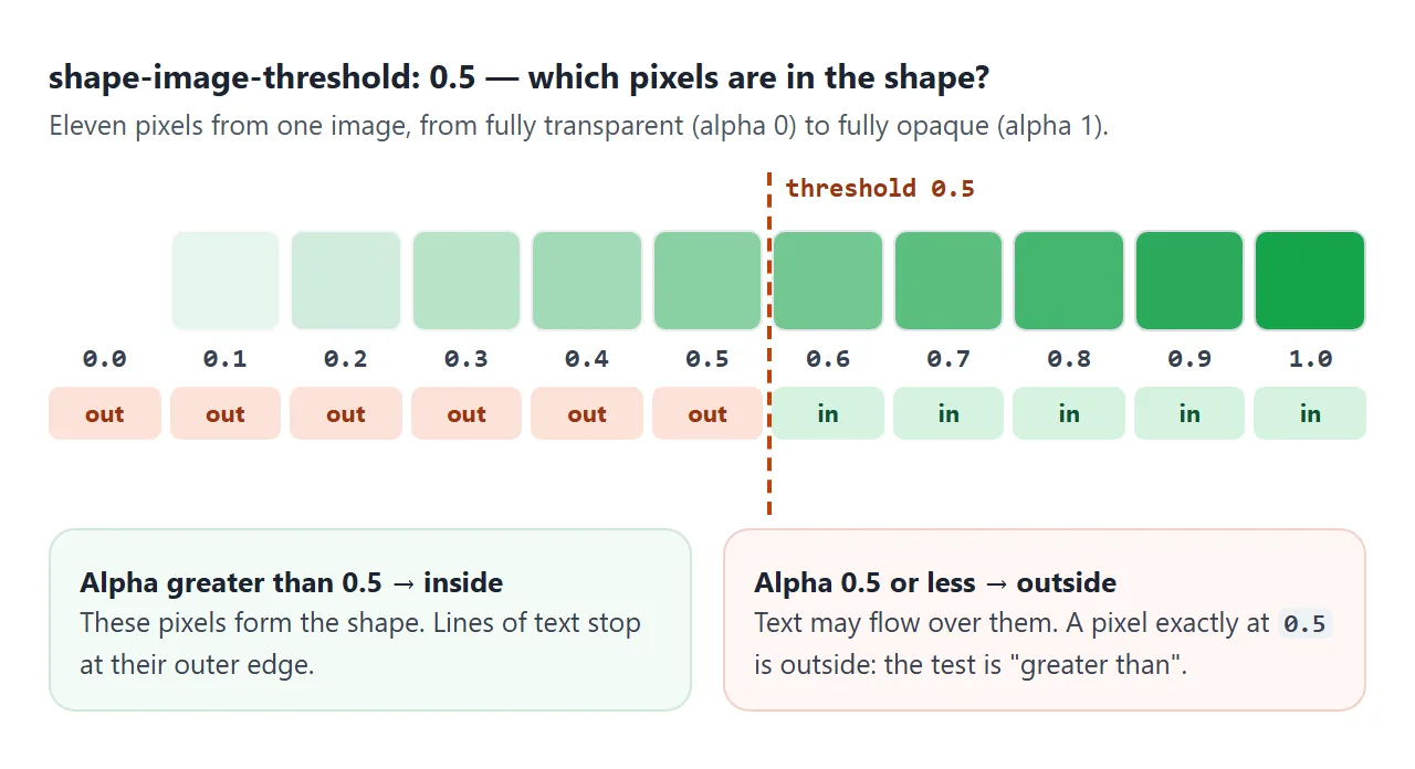
The test is "greater than", not "greater than or equal". A pixel at exactly 0.5 is outside a 0.5 threshold. That is why a threshold of 1 selects nothing at all.
The threshold reads only the alpha channel. Color and brightness play no part, so a dark pixel and a light pixel with the same alpha are treated the same. The spec notes that a future level may add a switch to use luminance instead.
Gradients: image shapes with no image file
shape-outside accepts any CSS image, and a gradient is an image. A gradient that fades to transparent gives you a smooth alpha ramp, and the threshold picks a point on it. There is no file to load, so there is no request that can fail.
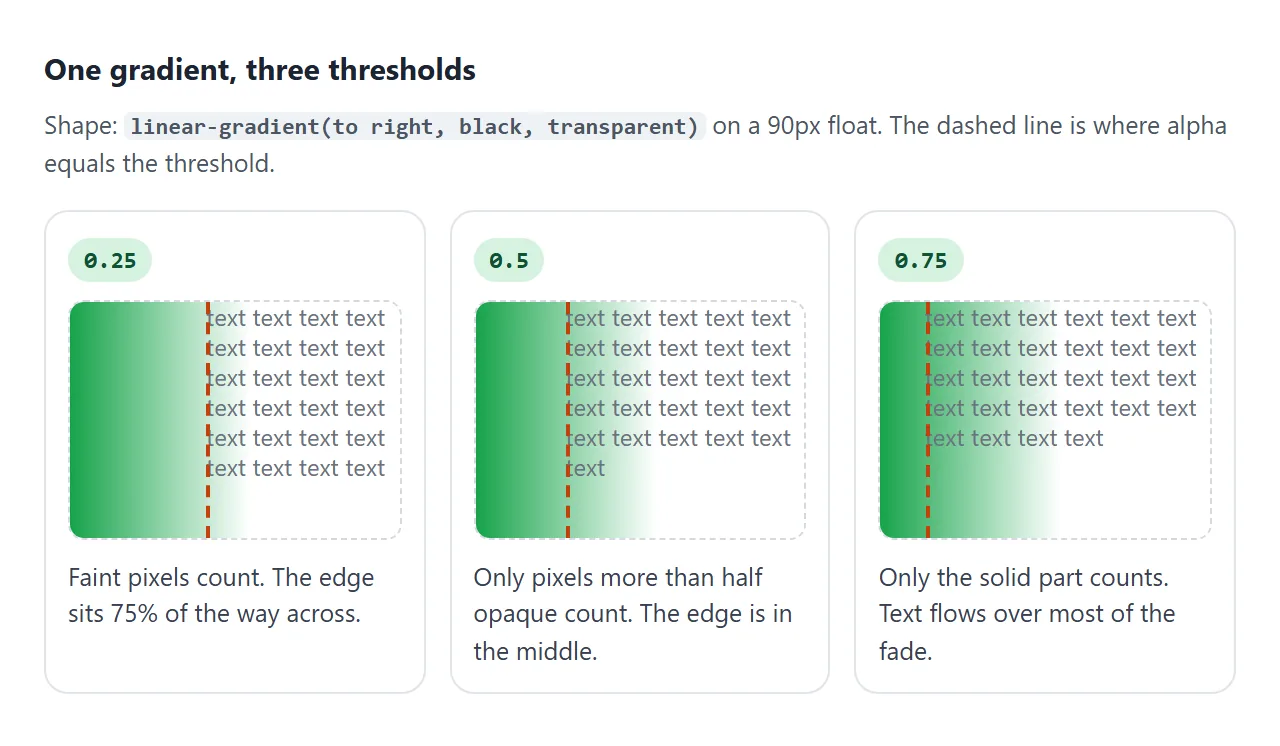
In the first demo the gradient runs from black to transparent, so alpha falls evenly from 1 to 0 across the width. The edge therefore sits at (1 - threshold) × width. On a 160px float, 0.5 puts it at 80px and 0.25 at 120px.
The image is sized to the float's content box, so the gradient stretches with the element. To paint the same fade, repeat the gradient in background with your own color, as the demos here do. For more gradient syntax, see CSS gradient backgrounds.
A real picture works the same way. Use url() with a PNG or SVG that has transparent areas, or embed it as a data: URI. The spec requires CORS for URLs in shape-outside, so an image from another site needs the right header.
Numbers, percentages and out-of-range values
The value is an opacity value: a number, or a percentage where 100% equals 1. The card below reads each value back with getComputedStyle in your own browser.
<!doctype html>
<html lang="en">
<head>
<meta charset="utf-8">
<meta name="viewport" content="width=device-width, initial-scale=1">
<title>shape-image-threshold values in your browser</title>
<style>
  body { margin: 0; padding: 14px; font-family: system-ui, sans-serif; background: #f4f5f7; color: #1d2330; }
  p.note { font-size: 13px; margin: 0 0 10px; }
  .grid { display: grid; grid-template-columns: repeat(auto-fill, minmax(165px, 1fr)); gap: 10px; }
  .card { background: #fff; border-radius: 10px; padding: 10px; font-size: 12px; line-height: 16px; }
  .card h3 { margin: 0 0 4px; font: 700 12px ui-monospace, Consolas, monospace; }
  .card .got { color: #4b5563; margin-bottom: 6px; }
  .wrap { height: 80px; overflow: hidden; }
  .fade {
    float: left;
    width: 80px;
    height: 80px;
    background: linear-gradient(to right, #2563eb, transparent);
    shape-outside: linear-gradient(to right, black, transparent);
  }
</style>
</head>
<body>
<p class="note">Each card sets a different value. The grey line reads it back with <b>getComputedStyle</b> in the browser you are using now.</p>
<div class="grid" id="grid"></div>

<template id="card">
  <div class="card">
    <h3></h3>
    <div class="got"></div>
    <div class="wrap"><div class="fade"></div>
      text text text text text text text text text text text text text text text text text text text text text text text text text text text text text text text text text text text text text text text text text
    </div>
  </div>
</template>

<script>
  const values = ['0', '0.5', '0.9', '1', '2', '-1', '50%'];
  const grid = document.getElementById('grid');
  const tpl = document.getElementById('card');
  for (const v of values) {
    const card = tpl.content.firstElementChild.cloneNode(true);
    const fade = card.querySelector('.fade');
    fade.style.shapeImageThreshold = v;   // a value the browser rejects is ignored
    card.querySelector('h3').textContent = v;
    grid.append(card);
    card.querySelector('.got').textContent =
      'computed: ' + getComputedStyle(fade).shapeImageThreshold;
  }
</script>
</body>
</html>
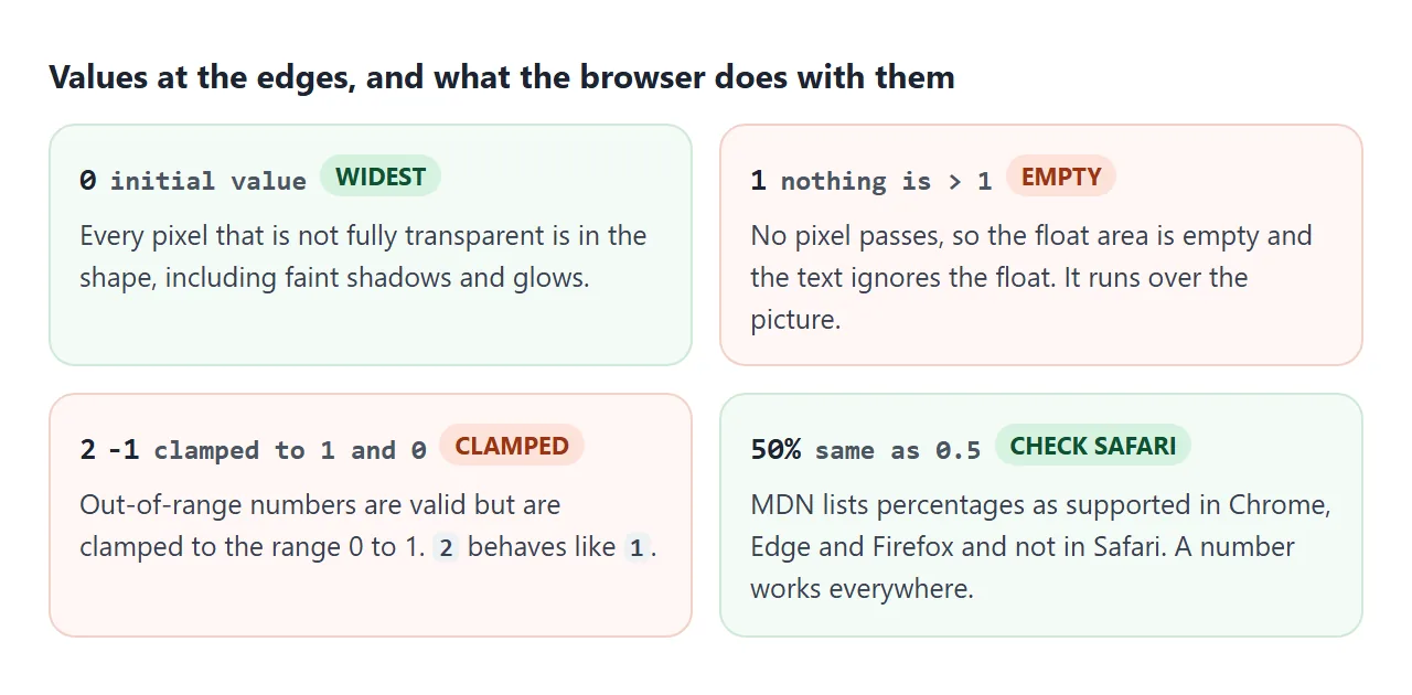
| Value | Computed | What the text does |
|---|---|---|
0 (initial) |
0 |
Wraps around every pixel that is not fully transparent |
0.5 |
0.5 |
Wraps around pixels more than 50% opaque |
1 |
1 |
No pixel qualifies, so the float area is empty and text ignores it |
2 |
1 |
Clamped to 1 |
-1 |
0 |
Clamped to 0 |
50% |
0.5 where supported |
Same as 0.5 in Chrome and Firefox; ignored in our WebKit test |
An empty float area does not remove the float. The element still paints its background, and the text simply runs over it, as in the 1 and 2 cards.
Browser support
MDN marks shape-image-threshold as Baseline, widely available. Its compatibility data lists the property as supported in Chrome, Edge, Firefox and Safari, including their mobile versions.
Percentage values are the exception. MDN's data lists them as supported in Chrome, Edge and Firefox, and not in Safari. When we ran the values demo in Chromium, Firefox and WebKit, WebKit ignored 50% and kept the initial 0. Write numbers to stay safe.
The property is defined in CSS Shapes Module Level 1. The W3C's latest published version is a Candidate Recommendation Draft.
A finished example: a slanted text edge
This card uses a gradient at 100 degrees as both the painted band and the shape. The threshold slides the edge along the fade, and shape-margin adds a gap between the edge and the words.
<!doctype html>
<html lang="en">
<head>
<meta charset="utf-8">
<meta name="viewport" content="width=device-width, initial-scale=1">
<title>Slanted text edge from a gradient</title>
<style>
  body { margin: 0; padding: 14px; font-family: system-ui, sans-serif; background: #f4f5f7; color: #1d2330; }
  .controls { display: grid; grid-template-columns: auto 1fr auto; gap: 6px 10px; align-items: center; font-size: 13px; max-width: 460px; }
  .controls input { width: 100%; }
  pre { font: 12px/1.45 ui-monospace, Consolas, monospace; background: #1d2330; color: #e5e7eb; padding: 10px; border-radius: 8px; overflow-x: auto; margin: 10px 0; }

  .card { background: #fff; border-radius: 12px; padding: 14px; line-height: 1.55; font-size: 15px; }
  .card h2 { margin: 0 0 8px; font-size: 20px; }
  .slope {
    float: left;
    width: 45%;
    height: 250px;
    /* painted: a slanted band that fades out */
    background: linear-gradient(100deg, #f59e0b 30%, transparent 75%);
    /* wrapped: the same band, cut where alpha > threshold */
    shape-outside: linear-gradient(100deg, black 30%, transparent 75%);
    shape-image-threshold: 0.4;
    shape-margin: 8px;
  }
</style>
</head>
<body>
<div class="controls">
  <span>threshold</span><input id="t" type="range" min="0" max="0.95" step="0.05" value="0.4"><b id="tOut">0.4</b>
  <span>shape-margin</span><input id="m" type="range" min="0" max="30" step="2" value="8"><b id="mOut">8px</b>
</div>
<pre id="code"></pre>

<article class="card">
  <div class="slope" id="slope"></div>
  <h2>Autumn opening hours</h2>
  From October the shop opens at ten and closes at six on weekdays. On Saturdays we open at nine for the market and close at four. Sundays stay closed. The text on this card follows a slanted edge made from a gradient, so there is no image file to host. Drag the threshold to slide the edge along the fade, and the margin to add room.
</article>

<script>
  const t = document.getElementById('t');
  const m = document.getElementById('m');
  function update() {
    // swap in a fresh float so the shape is rebuilt with the new values
    const old = document.getElementById('slope');
    const fresh = old.cloneNode();
    fresh.style.shapeImageThreshold = t.value;
    fresh.style.shapeMargin = m.value + 'px';
    old.replaceWith(fresh);
    document.getElementById('tOut').textContent = t.value;
    document.getElementById('mOut').textContent = m.value + 'px';
    document.getElementById('code').textContent =
`.slope {
  float: left;
  width: 45%;
  height: 250px;
  background: linear-gradient(100deg, #f59e0b 30%, transparent 75%);
  shape-outside: linear-gradient(100deg, black 30%, transparent 75%);
  shape-image-threshold: ${t.value};
  shape-margin: ${m.value}px;
}`;
  }
  t.addEventListener('input', update);
  m.addEventListener('input', update);
  update();
</script>
</body>
</html>
- Width in percent:
width: 45%keeps the band in proportion on a phone, because the shape image is sized to the float's content box. - shape-margin: it grows the shape outward by the given length. It works on top of whatever the threshold selected.
- Floats only: the text wraps around the shape because the band is floated. For the float basics, see CSS float.
If you want the picture itself to fade or be cut, that is a painting job for mask-image, not for the threshold.
When it does not work
| What you see | Cause | Fix |
|---|---|---|
| Changing the threshold changes nothing | shape-outside is a basic shape such as circle(), or none |
Use url() or a gradient |
| Text wraps as if the shape were not there | The element is not floated | Add float: left or right |
| Text runs over the whole image | Threshold is 1 or more, so no pixel qualifies | Lower it below 1 |
| The shape is the full rectangle | The image has no transparent pixels, such as a JPEG | Use a PNG, SVG or gradient with transparency |
| Soft shadow pushes text too far | The initial 0 counts faint pixels | Raise the threshold, for example to 0.3 |
50% works in one browser only |
Percentages are not listed for Safari | Write 0.5 |
| An image shape from another site is ignored | The server does not send a CORS header | Serve it with CORS or embed it |
Share it as a link
A wrap shape is easier to judge by dragging a slider than by reading numbers. A screenshot freezes one threshold, and the person you send it to cannot try another.
To send the working version, paste the page into a NOS document and choose Create share link. HTML to link walks through it.
The page renders as written and its scripts run, so the sliders work for whoever opens the link. If you change the code later, the same link shows the new version.