border-shape is a CSS property that draws an element's border along a shape instead of the box edge. You give it a basic shape, such as circle(), polygon() or shape(), and the border, background and shadow follow that outline.
Try it first. The line under the shapes says whether your browser supports the property.
<!doctype html>
<html lang="en">
<head>
<meta charset="utf-8">
<meta name="viewport" content="width=device-width, initial-scale=1">
<title>CSS border-shape basics</title>
<style>
  body { margin: 0; padding: 16px; font-family: system-ui, sans-serif; background: #f4f5f7; color: #1d2330; }
  .row { display: flex; flex-wrap: wrap; gap: 14px; align-items: center; }
  .item { text-align: center; font-size: 12px; color: #5b6270; }
  .item code { display: block; margin-top: 8px; }

  /* 1. One shape: the border is drawn as a stroke along the circle */
  .circle {
    width: 78px; height: 78px; display: grid; place-items: center;
    background: #ffe27a; border: 8px solid #0a7d55;
    border-shape: circle(50%);
  }

  /* 2. Any basic shape works, here an arrow-shaped tag */
  .tag {
    width: 108px; height: 66px; display: grid; place-items: center;
    background: #dcebff; border: 5px solid #1d4ed8;
    border-shape: polygon(0 0, 80% 0, 100% 50%, 80% 100%, 0 100%);
  }

  /* 3. Two shapes: the border color fills the area between them */
  .ring {
    width: 78px; height: 78px; display: grid; place-items: center;
    background: #fff; border: 16px solid #e0457b;
    border-shape: inset(0 round 18px) circle(50%);
  }

  /* Browsers without border-shape: at least keep the circle round */
  @supports not (border-shape: circle(50%)) {
    .circle { border-radius: 50%; }
  }

  #status { margin: 16px 0 0; font-size: 13px; padding: 8px 10px; border-radius: 8px; }
  .yes { background: #d6f2df; color: #0f5132; }
  .no { background: #fde2da; color: #9a3412; }
</style>
</head>
<body>
<div class="row">
  <div class="item"><div class="circle">Hi</div><code>circle(50%)</code></div>
  <div class="item"><div class="tag">Sale</div><code>polygon(...)</code></div>
  <div class="item"><div class="ring">In</div><code>two shapes</code></div>
</div>
<p id="status"></p>

<script>
  // Feature check: tells the reader what their browser is doing
  const ok = CSS.supports('border-shape', 'circle(50%)');
  const status = document.getElementById('status');
  status.className = ok ? 'yes' : 'no';
  status.textContent = ok
    ? 'This browser supports border-shape. You are seeing the real shapes.'
    : 'This browser does not support border-shape, so you see plain boxes (the circle uses a border-radius fallback).';
</script>
</body>
</html>
The rule is one line on top of a normal border:
.circle {
  border: 8px solid #0a7d55;
  border-shape: circle(50%);
}
Browser support: check before you rely on it
MDN marks border-shape as experimental and not Baseline. It is defined in CSS Borders and Box Decorations Module Level 4, which is still a Working Draft.
MDN's compatibility data, checked on 30 September 2026, lists support in Chrome and in browsers that share its engine, such as Edge and Opera. It lists no support in Firefox or Safari.
We ran every example on this page in a Chromium build that supports the property.
In a Firefox build, the same pages showed the fallback: plain boxes, with the circle kept round by border-radius. Those browsers ignore the unknown property and draw an ordinary rectangular border.
For that reason, give each shaped element a fallback inside @supports:
@supports not (border-shape: circle(50%)) {
  .circle { border-radius: 50%; }
}
In JavaScript, CSS.supports() returns the same answer. The first example uses it to print the status line:
CSS.supports('border-shape', 'circle(50%)'); // true or false
One shape or two: stroke mode and fill mode
The number of shapes you give changes what the border becomes.
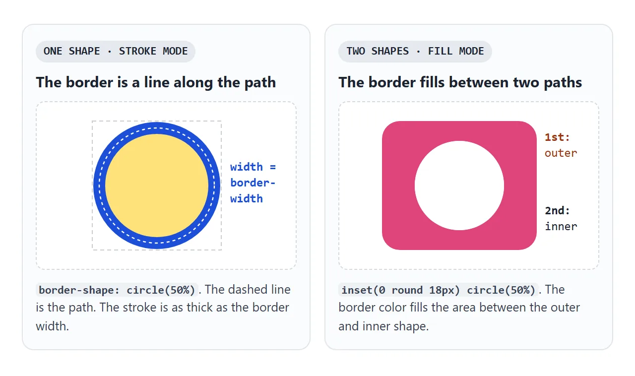
| You write | Mode | What is drawn |
|---|---|---|
| One shape | Stroke | A line along the path, as thick as the border width |
| Two shapes | Fill | The area between the first (outer) and second (inner) shape |
In both modes the color is the border color. In fill mode, the border width does not set a stroke. It moves the inner shape, as the next section shows.
/* stroke: a line along a circle */
border-shape: circle(50%);

/* fill: a rounded square with a round hole */
border-shape: inset(0 round 18px) circle(50%);
Which box the shape is measured on
A percentage such as circle(50%) needs a box to be measured against. You can name one after each shape, for example circle(50%) content-box. If you do not, the defaults depend on the mode.
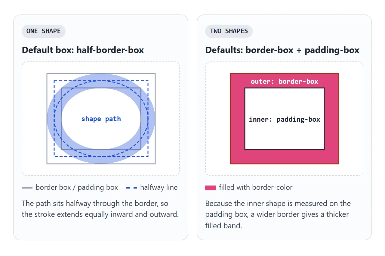
- One shape: the default is
half-border-box, a box halfway through the border. The stroke extends equally inward and outward from the path, the same way a normal border sits. - Two shapes: the outer shape is measured on the border box and the inner one on the padding box. A wider border therefore gives a thicker filled band.
border-shape vs clip-path
clip-path also takes basic shapes, so the two look alike in code. They do different things. clip-path hides every part of the element outside the shape. border-shape moves the border onto the shape.
<!doctype html>
<html lang="en">
<head>
<meta charset="utf-8">
<meta name="viewport" content="width=device-width, initial-scale=1">
<title>border-shape vs clip-path</title>
<style>
  body { margin: 0; padding: 14px; font-family: system-ui, sans-serif; background: #f4f5f7; color: #1d2330; }
  .pick { display: flex; flex-wrap: wrap; gap: 6px; margin-bottom: 14px; }
  .pick button { font: inherit; font-size: 13px; padding: 6px 10px; border-radius: 8px; border: 1px solid #c9cdd4; background: #fff; cursor: pointer; }
  .pick button[aria-pressed="true"] { background: #1d2330; color: #fff; border-color: #1d2330; }
  .cols { display: grid; grid-template-columns: 1fr 1fr; gap: 12px; }
  .col { text-align: center; }
  .col h3 { margin: 0 0 12px; font-size: 14px; font-family: ui-monospace, Consolas, monospace; }
  .col p { margin: 12px 0 0; font-size: 12px; color: #5b6270; }

  .box {
    --s: polygon(50% 0, 100% 38%, 82% 100%, 18% 100%, 0 38%);
    width: 130px; height: 120px; margin: 0 auto;
    display: grid; place-items: center; font-weight: 600;
    background: #ffe27a; border: 6px solid #1d4ed8;
    box-shadow: 8px 8px 0 rgba(0, 0, 0, .25);
  }
  .shaped { border-shape: var(--s); }  /* border and shadow follow the shape */
  .clipped { clip-path: var(--s); }    /* everything outside the shape is cut off */
</style>
</head>
<body>
<div class="pick" id="pick">
  <button aria-pressed="true" data-s="polygon(50% 0, 100% 38%, 82% 100%, 18% 100%, 0 38%)">Pentagon</button>
  <button data-s="polygon(0 0, 80% 0, 100% 50%, 80% 100%, 0 100%)">Arrow</button>
  <button data-s="ellipse(50% 40%)">Ellipse</button>
</div>
<div class="cols">
  <div class="col"><h3>border-shape</h3><div class="box shaped">Box</div><p>Border and shadow follow the edge.</p></div>
  <div class="col"><h3>clip-path</h3><div class="box clipped">Box</div><p>The border and shadow are cut away.</p></div>
</div>

<script>
  const boxes = document.querySelectorAll('.box');
  const buttons = document.querySelectorAll('#pick button');
  buttons.forEach((btn) => {
    btn.addEventListener('click', () => {
      // one custom property feeds both properties
      boxes.forEach((b) => b.style.setProperty('--s', btn.dataset.s));
      buttons.forEach((x) => x.setAttribute('aria-pressed', x === btn));
    });
  });
</script>
</body>
</html>
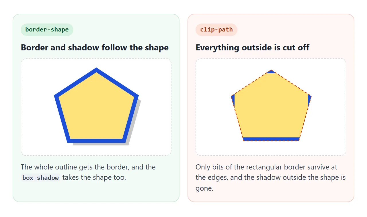
With border-shape, an outer box-shadow is cast as if the outer shape were solid, so the shadow takes the shape too. With clip-path, the rectangular border is only visible where it overlaps the shape, and the shadow outside the shape is removed.
Use clip-path to cut something out, such as a photo in a hexagon. Use border-shape when the shape needs a visible outline or a shadow.
What it does not change
border-shape is a purely visual effect. The element keeps its rectangular size in the layout, worked out from the normal border widths. Text inside the box flows as it would in a rectangle.
That has three consequences you will run into:
- Content can stick out. A long line can cross the shaped edge. Add
padding, or setoverflow: hidden, which clips content to the inner shape. - border-radius is ignored. When
border-shapeis notnone, the spec treatsborder-radiusas 0 and ignorescorner-shape. Round corners inside the shape instead:inset(0 round 18px). The border-radius guide covers the rectangular case. - Only some border properties apply. MDN lists
border-colorandborder-widthas used.border-imageis not applied, andborder-stylealways renders as solid, so a dashed border comes out as a solid line.
When the four sides have different borders, one side decides. The spec picks the first side, in logical order, whose style is not none. In a normal left-to-right page that is the top border, so its width and color are used.
A finished example: shaped buttons and callouts
These three pieces use nothing but border-shape: a speech bubble with a tail, a ticket button with notches, and a ring badge.
<!doctype html>
<html lang="en">
<head>
<meta charset="utf-8">
<meta name="viewport" content="width=device-width, initial-scale=1">
<title>Shaped buttons and callouts</title>
<style>
  body { margin: 0; padding: 16px; font-family: system-ui, sans-serif; background: #f4f5f7; color: #1d2330; }
  .grid { display: flex; flex-wrap: wrap; gap: 18px; align-items: flex-start; }

  /* Speech bubble: the tail is part of the shape, the box stays rectangular in layout */
  .bubble {
    width: 200px; padding: 14px 16px 34px; font-size: 14px; line-height: 1.4;
    background: #fff; border: 3px solid #1d4ed8;
    border-shape: polygon(0 0, 100% 0, 100% 78%, 34% 78%, 18% 100%, 20% 78%, 0 78%);
  }

  /* Ticket button: notches on both sides. Same vertex count in both states, so it animates */
  .ticket {
    font: 600 15px system-ui, sans-serif; color: #0f5132; cursor: pointer;
    padding: 16px 30px; background: #d6f2df; border: 3px solid #0f5132;
    border-shape: polygon(0 0, 100% 0, 100% 35%, 94% 50%, 100% 65%, 100% 100%, 0 100%, 0 65%, 6% 50%, 0 35%);
    transition: border-shape .25s ease;
  }
  .ticket:hover, .ticket:focus-visible {
    border-shape: polygon(0 0, 100% 0, 100% 30%, 88% 50%, 100% 70%, 100% 100%, 0 100%, 0 70%, 12% 50%, 0 30%);
  }

  /* Ring badge: two shapes, the border color fills between them */
  .badge {
    width: 70px; height: 70px; display: grid; place-items: center;
    font: 700 20px system-ui, sans-serif; color: #9a3412;
    background: #fff4ec; border: 12px solid #ea580c;
    border-shape: circle(50%) circle(38%);
  }

  /* Fallback: without border-shape, use rounded boxes so nothing looks broken */
  @supports not (border-shape: circle(50%)) {
    .bubble { border-radius: 12px; padding-bottom: 14px; }
    .ticket { border-radius: 10px; }
    .badge { border-radius: 50%; }
  }

  #log { margin-top: 14px; font-size: 13px; color: #5b6270; }
</style>
</head>
<body>
<div class="grid">
  <div class="bubble">The tail is drawn by border-shape. Layout still sees a rectangle.</div>
  <div>
    <button class="ticket" id="ticket">Get a ticket</button>
    <p id="log">Hover or focus the button to see the notches grow.</p>
  </div>
  <div class="badge" id="badge">3</div>
</div>

<script>
  // Clicking the ticket bumps the badge number
  const badge = document.getElementById('badge');
  document.getElementById('ticket').addEventListener('click', () => {
    badge.textContent = Number(badge.textContent) + 1;
    document.getElementById('log').textContent = 'Ticket added. Badge shows ' + badge.textContent + '.';
  });
</script>
</body>
</html>
- Speech bubble: the tail is part of the polygon. Extra bottom padding keeps the text out of the tail.
- Ticket: both polygons have ten points, so a transition animates between them.
- Ring badge: two circles, so the orange border fills the band between them.
- Fallback: without support, the
@supports notblock gives each piece rounded corners instead.
Animation only works between shapes that match. Two polygon() values need the same number of points. A circle() changing into a polygon() jumps instead of animating.
When it does not work
| What you see | Cause | Fix |
|---|---|---|
| A plain rectangle | The browser does not support border-shape |
Add an @supports not fallback |
| The dashed border is solid | border-style is not applied |
Expected. Draw dashes another way, such as SVG |
border-radius has no effect |
It is ignored when a shape is set | Use inset(0 round 18px) |
| Text crosses the shaped edge | The shape does not change layout | More padding, or overflow: hidden |
| The shape jumps instead of animating | The two shapes cannot interpolate | Same function, same number of points |
| The stroke has the wrong width | Another side decides | Use one border for all four sides |
Share it as a link
A shaped border is easier to judge in a browser than in a screenshot. Sending the page also lets the other person see whether their own browser draws the shape or the fallback.
To send the working version, paste the page into a NOS document and choose Create share link. HTML to link walks through it.
The page renders as written and its scripts run, so the people you send it to can hover and click the shapes themselves. If you change the code later, the same link shows the new version.