To put a gradient on an SVG shape, define a <linearGradient> or <radialGradient> with an id inside <defs>, give it two or more <stop> elements, and point the shape at it with fill="url(#id)".
<svg viewBox="0 0 320 140">
  <defs>
    <linearGradient id="grad">
      <stop offset="0" stop-color="#ff7a18" />
      <stop offset="1" stop-color="#6a3cff" />
    </linearGradient>
  </defs>
  <rect width="320" height="140" rx="16" fill="url(#grad)" />
</svg>
Try it. Change the direction, the colours and the offsets, and the markup below the controls updates.
<!doctype html>
<html lang="en">
<head>
<meta charset="utf-8">
<meta name="viewport" content="width=device-width, initial-scale=1">
<title>SVG linearGradient</title>
<style>
  body { margin: 0; padding: 16px; font-family: system-ui, sans-serif; background: #f4f5f7; color: #1d2330; }
  svg { display: block; width: 100%; max-width: 360px; height: auto; margin: 0 auto 12px; }
  .controls { display: grid; grid-template-columns: repeat(2, minmax(0, 1fr)); gap: 8px 14px; max-width: 360px; margin: 0 auto; font-size: 14px; }
  label { display: flex; flex-direction: column; gap: 3px; }
  input[type=range], select { width: 100%; }
  input[type=color] { width: 100%; height: 30px; padding: 0; border: 1px solid #ccd; }
  pre { max-width: 360px; margin: 12px auto 0; padding: 10px; background: #1d2330; color: #e6e9ef;
        border-radius: 8px; font-size: 12px; overflow-x: auto; }
</style>
</head>
<body>
<svg viewBox="0 0 320 140" aria-label="Rectangle filled with a gradient">
  <defs>
    <linearGradient id="grad" x1="0" y1="0" x2="1" y2="0">
      <stop id="s1" offset="0" stop-color="#ff7a18" />
      <stop id="s2" offset="1" stop-color="#6a3cff" />
    </linearGradient>
  </defs>
  <rect x="0" y="0" width="320" height="140" rx="16" fill="url(#grad)" />
</svg>

<div class="controls">
  <label>Direction
    <select id="dir">
      <option value="0 0 1 0">Left to right</option>
      <option value="0 0 0 1">Top to bottom</option>
      <option value="0 0 1 1">Corner to corner</option>
    </select>
  </label>
  <label>Stop 2 opacity <input id="op" type="range" min="0" max="1" step="0.05" value="1"></label>
  <label>Stop 1 colour <input id="c1" type="color" value="#ff7a18"></label>
  <label>Stop 2 colour <input id="c2" type="color" value="#6a3cff"></label>
  <label>Stop 1 offset <input id="o1" type="range" min="0" max="1" step="0.05" value="0"></label>
  <label>Stop 2 offset <input id="o2" type="range" min="0" max="1" step="0.05" value="1"></label>
</div>
<pre id="code"></pre>

<script>
  const $ = (id) => document.getElementById(id);
  const grad = $('grad'), s1 = $('s1'), s2 = $('s2');

  function update() {
    // x1 y1 x2 y2 are fractions of the shape's box (gradientUnits="objectBoundingBox")
    const [x1, y1, x2, y2] = $('dir').value.split(' ');
    grad.setAttribute('x1', x1); grad.setAttribute('y1', y1);
    grad.setAttribute('x2', x2); grad.setAttribute('y2', y2);
    s1.setAttribute('offset', $('o1').value);
    s1.setAttribute('stop-color', $('c1').value);
    s2.setAttribute('offset', $('o2').value);
    s2.setAttribute('stop-color', $('c2').value);
    s2.setAttribute('stop-opacity', $('op').value);
    // show the current markup
    $('code').textContent =
      `<linearGradient id="grad" x1="${x1}" y1="${y1}" x2="${x2}" y2="${y2}">\n` +
      `  <stop offset="${$('o1').value}" stop-color="${$('c1').value}" />\n` +
      `  <stop offset="${$('o2').value}" stop-color="${$('c2').value}" stop-opacity="${$('op').value}" />\n` +
      `</linearGradient>\n<rect ... fill="url(#grad)" />`;
  }
  document.querySelectorAll('input, select').forEach((el) => el.addEventListener('input', update));
  update();
</script>
</body>
</html>
A CSS gradient such as linear-gradient() does not work as an SVG fill. The fill property takes a colour or a url() to a paint server, and the gradient element is that paint server.
Plain fills, strokes and holes are covered in CSS fill on SVG.
How linearGradient places its colours
A linear gradient runs along a line from (x1, y1) to (x2, y2). The defaults are x1="0" y1="0" x2="1" y2="0", so with no attributes the colours run left to right across the shape.
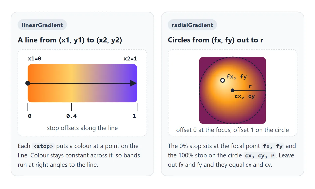
Each point on the line gets a colour from the stops, and that colour is carried straight across at a right angle to the line. That is why only the end points matter for the direction:
| Direction | Attributes |
|---|---|
| Left to right | x1="0" x2="1" (the default) |
| Right to left | x1="1" x2="0" |
| Top to bottom | x2="0" y2="1" |
| Corner to corner | x2="1" y2="1" |
Numbers from 0 to 1 and percentages both work, so x2="100%" means the same as x2="1".
stop offset, stop-color and stop-opacity
Every <stop> has three settings. offset says where it sits on the line, from 0 (or 0%) to 1 (or 100%). stop-color sets its colour, and stop-opacity makes that colour see-through.
- Offsets are clamped. A value above 1 is treated as 1 and a value below 0 as 0.
- Offsets never go backwards. If a stop's offset is smaller than the one before it, it is moved up to match. Two stops at the same offset give a hard edge, which is how you draw stripes.
- One stop paints a flat colour. A gradient with no stops paints nothing at all.
- stop-color is a CSS property. A class or a custom property can set it, so one stylesheet can theme every gradient.
.brand-start { stop-color: var(--brand-a); }
.brand-end   { stop-color: var(--brand-b); }
For a fade, keep the same colour on both stops and change only stop-opacity. Fading a colour to transparent can pass through a darker, greyer middle.
radialGradient: cx, cy, r and the focal point
A radial gradient is a set of circles. cx, cy and r set the outer circle, where the stop at offset 1 sits. fx and fy set the focal point, where offset 0 sits.
cx, cy and r default to 50% of the box, and fx, fy default to cx, cy.
<!doctype html>
<html lang="en">
<head>
<meta charset="utf-8">
<meta name="viewport" content="width=device-width, initial-scale=1">
<title>SVG radialGradient and spreadMethod</title>
<style>
  body { margin: 0; padding: 16px; font-family: system-ui, sans-serif; background: #f4f5f7; color: #1d2330; }
  svg { display: block; width: 100%; max-width: 220px; height: auto; margin: 0 auto 12px; border-radius: 12px; }
  .controls { display: grid; grid-template-columns: repeat(2, minmax(0, 1fr)); gap: 8px 14px; max-width: 360px; margin: 0 auto; font-size: 14px; }
  label { display: flex; flex-direction: column; gap: 3px; }
  input[type=range], select { width: 100%; }
  pre { max-width: 360px; margin: 12px auto 0; padding: 10px; background: #1d2330; color: #e6e9ef;
        border-radius: 8px; font-size: 12px; overflow-x: auto; }
</style>
</head>
<body>
<svg viewBox="0 0 200 200" aria-label="Square filled with a radial gradient">
  <defs>
    <radialGradient id="glow" cx="0.5" cy="0.5" r="0.25" fx="0.5" fy="0.5" spreadMethod="pad">
      <stop offset="0" stop-color="#fff6c2" />
      <stop offset="0.5" stop-color="#ff9f1c" />
      <stop offset="1" stop-color="#7b1e5a" />
    </radialGradient>
  </defs>
  <rect width="200" height="200" fill="url(#glow)" />
</svg>

<div class="controls">
  <label>spreadMethod
    <select id="spread">
      <option>pad</option><option>reflect</option><option>repeat</option>
    </select>
  </label>
  <label>r (radius) <input id="r" type="range" min="0.1" max="0.7" step="0.05" value="0.25"></label>
  <label>fx (focal x) <input id="fx" type="range" min="0.3" max="0.7" step="0.05" value="0.5"></label>
  <label>fy (focal y) <input id="fy" type="range" min="0.3" max="0.7" step="0.05" value="0.5"></label>
</div>
<pre id="code"></pre>

<script>
  const glow = document.getElementById('glow');
  const code = document.getElementById('code');

  function update() {
    ['r', 'fx', 'fy'].forEach((k) => glow.setAttribute(k, document.getElementById(k).value));
    // spreadMethod decides what fills the area outside the circle of radius r
    glow.setAttribute('spreadMethod', document.getElementById('spread').value);
    const a = (k) => glow.getAttribute(k);
    code.textContent =
      `<radialGradient id="glow" cx="0.5" cy="0.5"\n` +
      `  r="${a('r')}" fx="${a('fx')}" fy="${a('fy')}"\n` +
      `  spreadMethod="${a('spreadMethod')}">`;
  }
  document.querySelectorAll('input, select').forEach((el) => el.addEventListener('input', update));
  update();
</script>
</body>
</html>
Moving fx and fy away from the centre makes a highlight like light hitting a ball. SVG 2 also adds fr, the radius of the focal circle. Everything inside fr gets the first stop's colour.
spreadMethod: what happens past the end
When the gradient line or circle is smaller than the shape, some of the shape lies outside it. spreadMethod decides what goes there.
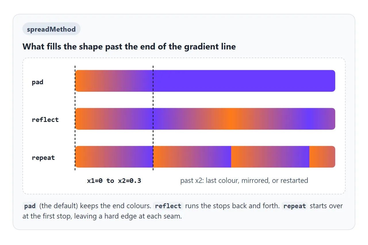
pad(the default) keeps the colour of the end stop.reflectplays the stops backwards, then forwards again, with no seams.repeatstarts again at the first stop, with a hard edge at every seam.
With repeat, a short line and four stops make even stripes without extra shapes: colour A at 0 and 0.5, colour B at 0.5 and 1.
gradientUnits: objectBoundingBox or userSpaceOnUse
gradientUnits decides what the numbers in x1, cx, r and the rest mean. The default, objectBoundingBox, measures them against each shape's own box. userSpaceOnUse measures them in the drawing's coordinates.
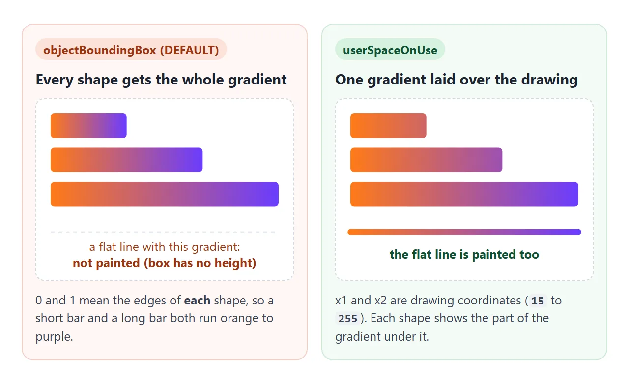
Bounding-box units are handy for one shape: 0 and 1 are its edges whatever its size. They have two costs:
- Straight lines lose the gradient. A horizontal line's box has no height, so the gradient cannot be mapped and the stroke is not painted. Add a fallback, as in
stroke="url(#g) #ef476f", or switch units. - Shared gradients restart. Three bars of different widths each show the full range, instead of one gradient running under all three.
With userSpaceOnUse, give real coordinates:
<linearGradient id="line" gradientUnits="userSpaceOnUse"
                x1="0" y1="0" x2="320" y2="0">
gradientTransform: rotating and scaling
gradientTransform takes the same functions as the SVG transform attribute: rotate(), scale(), translate() and skewX(). It moves the gradient, not the shape.
<linearGradient id="diag" gradientTransform="rotate(45 0.5 0.5)">
The two extra numbers in rotate() are the centre of rotation. Without them the gradient turns around the top-left corner and part of the shape can end up past the line's end.
With bounding-box units the rotation happens in a 1 by 1 square that is then stretched to the shape.
On a 400 by 100 rectangle, rotate(45 0.5 0.5) left the colour bands at 14 degrees from horizontal in Chromium and Firefox, not 45.
For an exact angle on a shape that is not square, use userSpaceOnUse and rotate around the shape's real centre.
Gradient text, gradient strokes and reusing a gradient
fill and stroke work the same way on every shape, including <text>. Set fill="url(#id)" on the text and the letters take the gradient. For gradient text in ordinary HTML headings, use background-clip: text from CSS background-clip instead.
<!doctype html>
<html lang="en">
<head>
<meta charset="utf-8">
<meta name="viewport" content="width=device-width, initial-scale=1">
<title>Gradient stat card</title>
<style>
  body { margin: 0; padding: 16px; font-family: system-ui, sans-serif; background: #0f1422; color: #e6e9ef; }
  .card { max-width: 380px; margin: 0 auto; padding: 16px; border-radius: 16px; background: #182033; }
  .top { display: flex; align-items: center; justify-content: space-between; gap: 12px; }
  .title { width: 190px; max-width: 60%; height: auto; }
  .ring { width: 88px; height: 88px; flex: none; }
  .chart { display: block; width: 100%; height: auto; margin-top: 12px; }
  .buttons { display: flex; gap: 8px; margin-top: 12px; }
  button { flex: 1; padding: 9px; border: 0; border-radius: 8px; background: #2a3550; color: #e6e9ef; font: inherit; cursor: pointer; }
</style>
</head>
<body>
<div class="card">
  <div class="top">
    <!-- Gradient text: the letters are filled with the gradient -->
    <svg class="title" viewBox="0 0 190 44" aria-label="Weekly visits">
      <defs>
        <linearGradient id="textGrad" x1="0" y1="0" x2="1" y2="0">
          <stop offset="0" stop-color="#ffd166" />
          <stop offset="1" stop-color="#ef476f" />
        </linearGradient>
      </defs>
      <text x="0" y="32" font-size="28" font-weight="800" fill="url(#textGrad)">Weekly visits</text>
    </svg>

    <!-- Gradient stroke on a circle: the ring shows progress -->
    <svg class="ring" viewBox="0 0 88 88" aria-label="Goal progress">
      <defs>
        <linearGradient id="ringGrad" x1="0" y1="0" x2="1" y2="1">
          <stop offset="0" stop-color="#06d6a0" />
          <stop offset="1" stop-color="#118ab2" />
        </linearGradient>
      </defs>
      <circle cx="44" cy="44" r="36" fill="none" stroke="#2a3550" stroke-width="10" />
      <circle id="ring" cx="44" cy="44" r="36" fill="none" stroke="url(#ringGrad)" stroke-width="10"
              stroke-linecap="round" pathLength="100" stroke-dasharray="0 100" transform="rotate(-90 44 44)" />
      <text id="pct" x="44" y="50" text-anchor="middle" font-size="17" font-weight="700" fill="#e6e9ef">0%</text>
    </svg>
  </div>

  <svg class="chart" viewBox="0 0 320 130" aria-label="Line chart">
    <defs>
      <!-- userSpaceOnUse: one gradient in chart pixels, so a flat line still gets it -->
      <linearGradient id="lineGrad" gradientUnits="userSpaceOnUse" x1="0" y1="0" x2="320" y2="0">
        <stop offset="0" stop-color="#ffd166" />
        <stop offset="1" stop-color="#ef476f" />
      </linearGradient>
      <!-- The area under the line fades out with stop-opacity -->
      <linearGradient id="areaGrad" x1="0" y1="0" x2="0" y2="1">
        <stop offset="0" stop-color="#ef476f" stop-opacity="0.45" />
        <stop offset="1" stop-color="#ef476f" stop-opacity="0" />
      </linearGradient>
    </defs>
    <path id="area" fill="url(#areaGrad)" />
    <path id="line" fill="none" stroke="url(#lineGrad)" stroke-width="4" stroke-linejoin="round" stroke-linecap="round" />
  </svg>

  <div class="buttons">
    <button id="rand" type="button">New data</button>
    <button id="flat" type="button">Flat week</button>
  </div>
</div>

<script>
  const W = 320, H = 130, PAD = 8;

  function draw(values) {
    const step = (W - 2 * PAD) / (values.length - 1);
    const pts = values.map((v, i) => [PAD + i * step, H - PAD - v * (H - 2 * PAD)]);
    const d = 'M' + pts.map((p) => p.join(' ')).join(' L');
    document.getElementById('line').setAttribute('d', d);
    document.getElementById('area').setAttribute('d', d + ` L${W - PAD} ${H} L${PAD} ${H} Z`);
    // the ring shows the average as a percentage
    const pct = Math.round(values.reduce((a, b) => a + b, 0) / values.length * 100);
    document.getElementById('ring').setAttribute('stroke-dasharray', `${pct} 100`);
    document.getElementById('pct').textContent = pct + '%';
  }

  document.getElementById('rand').addEventListener('click', () =>
    draw(Array.from({ length: 7 }, () => 0.15 + Math.random() * 0.8)));
  document.getElementById('flat').addEventListener('click', () => draw(Array(7).fill(0.5)));
  draw([0.3, 0.45, 0.4, 0.62, 0.55, 0.78, 0.7]);
</script>
</body>
</html>
In this card:
- The title is SVG text with
fill="url(#textGrad)". - The ring is a circle with
stroke="url(#ringGrad)". Its progress arc comes fromstroke-dasharray, explained in SVG stroke-dasharray. - The line uses
userSpaceOnUse, so a flat week still shows it. - The area under the line fades out with
stop-opacity.
To reuse a gradient's stops with a different direction, point a new gradient at it with href. The new one inherits the stops and overrides only the attributes you set:
<linearGradient id="down" href="#grad" x2="0" y2="1" />
When it does not work
| What you see | Cause | Fix |
|---|---|---|
| The shape is black | The fill was set to a CSS linear-gradient(), which is invalid for fill |
Define a <linearGradient> and use url(#id) |
| The shape has no fill at all | The id in url(#id) does not match, or the gradient has no stops |
Check the id spelling; add <stop> elements |
| A straight line with a gradient stroke vanishes | Bounding-box units on a box with no height or width | gradientUnits="userSpaceOnUse" |
| Every shape shows the whole gradient | Each shape has its own bounding box | Switch to userSpaceOnUse |
| The gradient ignores its definition | It sits in an svg with display: none |
Hide that svg with zero size instead |
| A shape shows another gradient's colours | Two gradients share one id; the first in the page wins | Give every gradient a unique id |
| A stop seems to be missing | Its offset is lower than the stop before it | Put stops in increasing offset order |
| The rotated angle looks wrong | gradientTransform is stretched with the bounding box |
Use userSpaceOnUse for exact angles |
The duplicate id case shows up when the same inline SVG icon is pasted twice, or when two components each define id="grad".
Share it as a link
Gradients are easy to see and hard to judge from a description, and the interactive ones need their scripts. A screenshot cannot be played with, and an .html attachment may open as plain code on a phone.
To send the working version, paste the page into a NOS document and choose Create share link. HTML to link walks through it.
The page renders as written and its scripts run, so the people you send it to can move the sliders and press the buttons themselves. If you change the code later, the same link shows the new version.