mix-blend-mode tells the browser to mix an element's colours with whatever is painted behind it, instead of covering it. multiply darkens, screen lightens, and difference inverts. Its sibling background-blend-mode does the same with the background layers of a single element.
Pick a mode below. The white word and the three circles form one layer over a rainbow backdrop.
<!doctype html>
<html lang="en">
<head>
<meta charset="utf-8">
<meta name="viewport" content="width=device-width, initial-scale=1">
<title>mix-blend-mode picker</title>
<style>
  body { margin: 0; padding: 12px; font-family: system-ui, sans-serif; background: #f4f5f7; color: #1d2330; }
  /* The backdrop: a white band on top, a black band at the bottom, colours in between */
  .stage {
    position: relative; height: 220px; border-radius: 12px; overflow: hidden;
    background:
      linear-gradient(#fff 0 22%, transparent 42% 58%, #000 78%),
      linear-gradient(90deg, #ff3b30, #ffcc00, #34c759, #00c7fb, #5856d6, #ff2d92);
  }
  /* The layer that blends with the stage. Its background stays transparent. */
  .layer { position: absolute; inset: 0; }
  .dot { position: absolute; width: 110px; height: 110px; border-radius: 50%; }
  .a { left: 6%;  top: 18px;  background: #ff7a00; }
  .b { left: 24%; top: 92px;  background: #0a84ff; }
  .c { right: 6%; top: 50px;  background: #808080; }
  .layer h2 {
    position: absolute; left: 0; right: 0; top: 64px; margin: 0; text-align: center;
    font: 900 clamp(48px, 16vw, 92px)/1 system-ui, sans-serif; color: #fff;
  }
  .modes { display: flex; flex-wrap: wrap; gap: 6px; margin: 12px 0 8px; }
  .modes button {
    font: 13px system-ui, sans-serif; padding: 6px 9px; border-radius: 8px;
    border: 1px solid #c9cdd4; background: #fff; cursor: pointer;
  }
  .modes button[aria-pressed="true"] { background: #1d2330; color: #fff; border-color: #1d2330; }
  code { font: 600 14px ui-monospace, Consolas, monospace; }
  #note { margin: 4px 0 0; font-size: 14px; line-height: 1.45; }
</style>
</head>
<body>
<div class="stage">
  <div class="layer" id="layer">
    <span class="dot a"></span><span class="dot b"></span><span class="dot c"></span>
    <h2>Blend</h2>
  </div>
</div>
<div class="modes" id="modes"></div>
<code id="code"></code>
<p id="note"></p>

<script>
  // Every mix-blend-mode value and what it does to the stage behind it
  const modes = {
    'normal': 'No blending. The layer covers what is behind it.',
    'multiply': 'Multiplies the colours. Never lighter. White text disappears, black stays black.',
    'screen': 'The opposite of multiply. Never darker. A black layer would disappear.',
    'overlay': 'Multiply where the backdrop is dark, screen where it is light.',
    'darken': 'Keeps the darker value of each colour channel.',
    'lighten': 'Keeps the lighter value of each colour channel.',
    'color-dodge': 'Brightens the backdrop. Over black it does nothing.',
    'color-burn': 'Darkens the backdrop. Over white it does nothing.',
    'hard-light': 'Multiply or screen, decided by the layer\'s colour.',
    'soft-light': 'A gentler hard-light.',
    'difference': 'Subtracts the darker colour from the lighter one. White text turns into the inverse of the backdrop.',
    'exclusion': 'Like difference, with lower contrast.',
    'hue': 'Hue of the layer, saturation and lightness of the backdrop.',
    'saturation': 'Saturation of the layer, hue and lightness of the backdrop.',
    'color': 'Hue and saturation of the layer, lightness of the backdrop.',
    'luminosity': 'Lightness of the layer, hue and saturation of the backdrop.'
  };
  const layer = document.getElementById('layer');
  const box = document.getElementById('modes');

  function pick(mode) {
    layer.style.mixBlendMode = mode;
    document.getElementById('code').textContent = 'mix-blend-mode: ' + mode + ';';
    document.getElementById('note').textContent = modes[mode];
    box.querySelectorAll('button').forEach(b => b.setAttribute('aria-pressed', b.textContent === mode));
  }

  Object.keys(modes).forEach(mode => {
    const b = document.createElement('button');
    b.textContent = mode;
    b.addEventListener('click', () => pick(mode));
    box.appendChild(b);
  });
  pick('difference');
</script>
</body>
</html>
.layer {
  mix-blend-mode: difference; /* normal, multiply, screen, overlay, ... */
}
Nothing about the layer changes except how it is painted. It keeps its size, its place in the layout and its click area.
mix-blend-mode vs background-blend-mode
The two properties take the same list of modes. What differs is what they blend with.
mix-blend-mode |
background-blend-mode |
|
|---|---|---|
| Set on | Any element, including text | An element with background layers |
| Blends with | Content painted behind the element | Its own lower background layers and background colour |
| Reaches other elements | Yes, up to the nearest stacking context | No |
| Creates a stacking context | Yes, for any value but normal |
No |
| Typical use | Text over images, overlapping shapes | Tinting an image, duotones |
If you want to tint one picture, reach for background-blend-mode. If you want an element to react to what scrolls or moves under it, you need mix-blend-mode.
What the blend modes do
The browser blends colour channel by colour channel. The element on top is the source, and what is behind it is the backdrop.
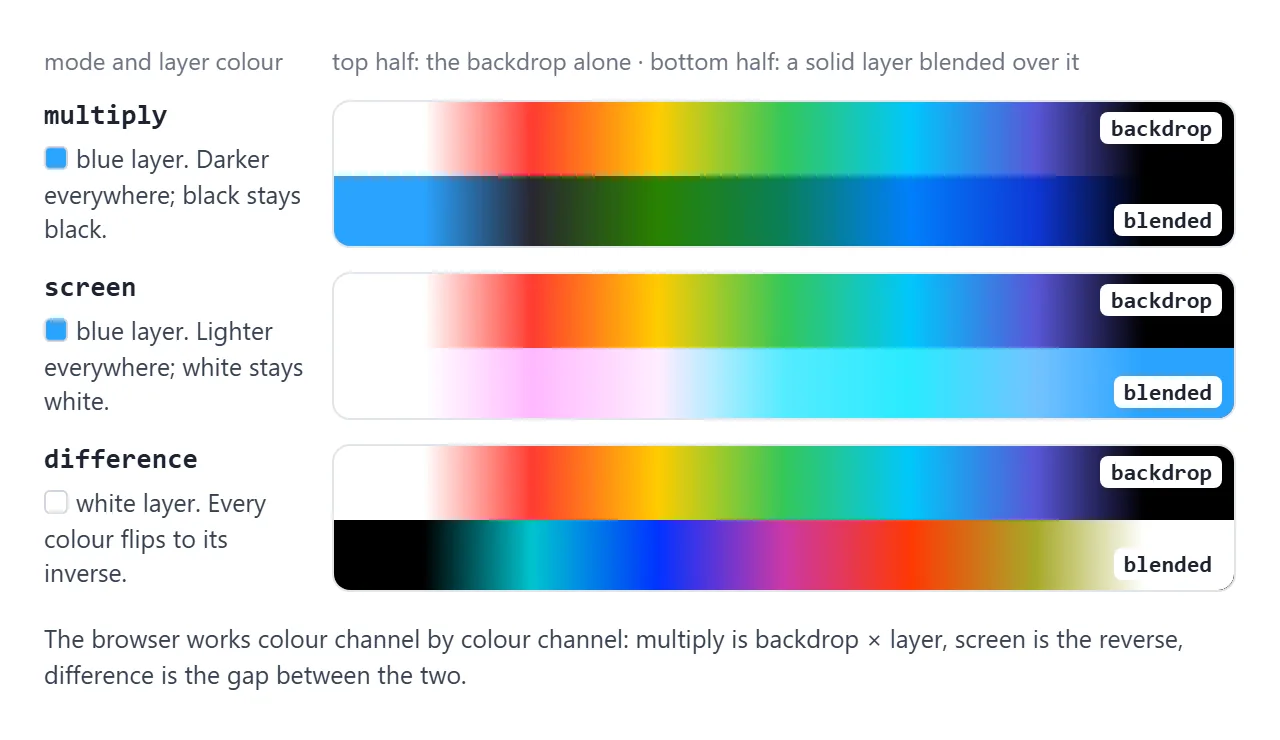
| Mode | What it does | Neutral colour |
|---|---|---|
multiply |
Multiplies the colours. Never lighter | White |
screen |
The reverse of multiply. Never darker | Black |
overlay |
Multiply on dark backdrop areas, screen on light ones | 50% grey |
darken / lighten |
Keeps the darker or lighter value of each channel | White / black |
color-dodge / color-burn |
Brightens or darkens the backdrop strongly | Black / white |
hard-light / soft-light |
Darkens or lightens, chosen by the source colour. Soft-light is gentler | 50% grey |
difference |
Subtracts the darker colour from the lighter one | Black |
exclusion |
Like difference, with lower contrast | Black |
hue, saturation, color, luminosity |
Take one part of the source colour and the rest from the backdrop |
"Neutral colour" means a source of that colour leaves the backdrop unchanged. That is why white text with multiply vanishes in the first example. color keeps the backdrop's lightness and takes hue and saturation from the source, which makes it good for tinting.
For effects that do not depend on what is behind, such as grayscale or blur, the CSS filter property is the simpler tool.
Contain the blend with isolation: isolate
A blended element does not stop at its parent. It blends with everything painted behind it, up to the nearest stacking context. On a plain page, that can be the page background itself.
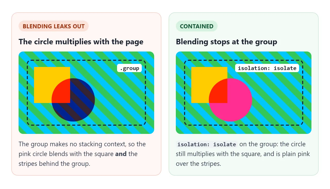
Add isolation: isolate to the wrapper. The wrapper becomes a stacking context, and its children blend only with each other. Where the wrapper is transparent, a blended child looks as if it had no blend mode.
.card { isolation: isolate; }                /* blending stops here */
.card .shape { mix-blend-mode: multiply; }   /* blends with the card's content only */
The same cut-off happens by accident. opacity below 1, transform, filter and a positioned element with a z-index all create a stacking context too. See CSS z-index.
When a blend seems to do nothing, check the ancestors for these first.
It also works the other way. Any mix-blend-mode other than normal makes the element itself a stacking context. A child with z-index: -1, which used to slide behind the parent's background, now paints above it.
Duotone images with background-blend-mode
A duotone maps the dark parts of an image to one colour and the light parts to another. background-blend-mode does it with no image editing, using three background layers on one element.
<!doctype html>
<html lang="en">
<head>
<meta charset="utf-8">
<meta name="viewport" content="width=device-width, initial-scale=1">
<title>isolation and background-blend-mode</title>
<style>
  body { margin: 0; padding: 12px; font-family: system-ui, sans-serif; background: #f4f5f7; color: #1d2330; }
  h3 { margin: 0 0 8px; font-size: 15px; }
  code { font: 600 13px ui-monospace, Consolas, monospace; }

  /* 1. The "page": stripes that sit behind both groups */
  .page {
    display: grid; grid-template-columns: 1fr 1fr; gap: 12px; padding: 14px; border-radius: 12px;
    background: repeating-linear-gradient(45deg, #34c759 0 14px, #00c7fb 14px 28px);
  }
  .group { position: relative; height: 150px; border: 2px dashed #1d2330; border-radius: 10px; }
  .group.isolated { isolation: isolate; }   /* blending stops at this box */
  .label { position: absolute; left: 6px; bottom: 6px; font: 600 12px ui-monospace, Consolas, monospace;
           background: #fff; padding: 3px 6px; border-radius: 6px; }
  .square { position: absolute; left: 10px; top: 12px; width: 70px; height: 70px; background: #ffcc00; }
  .circle {
    position: absolute; left: 44px; top: 36px; width: 84px; height: 84px; border-radius: 50%;
    background: #ff2d92; mix-blend-mode: multiply;
  }

  /* 2. Duotone: a grey "photo" (inline SVG) tinted by two colours in one background */
  .duo {
    --dark: #1b1464; --light: #ff5e7e;
    --photo: url("data:image/svg+xml,<svg xmlns='http://www.w3.org/2000/svg' viewBox='0 0 400 240' preserveAspectRatio='xMidYMid slice'><defs><linearGradient id='s' x2='0' y2='1'><stop offset='0' stop-color='%23888'/><stop offset='1' stop-color='%23eee'/></linearGradient></defs><rect width='400' height='240' fill='url(%23s)'/><circle cx='290' cy='84' r='36' fill='%23fff'/><path d='M0 170 L90 86 L160 150 L230 64 L330 160 L400 116 V240 H0Z' fill='%23666'/><path d='M0 204 L120 150 L220 196 L310 158 L400 196 V240 H0Z' fill='%23222'/></svg>");
    height: 200px; max-width: 440px; border-radius: 12px; margin-top: 10px;
    background-image:
      linear-gradient(var(--dark), var(--dark)),  /* shadows colour */
      var(--photo);                               /* the grey image */
    background-size: cover;
    background-position: center;
    background-color: var(--light);
    background-blend-mode: lighten, multiply;  /* one value per image layer, top first */
  }
  .duo.original { background-image: var(--photo); background-blend-mode: normal; }
  .controls { display: flex; flex-wrap: wrap; gap: 14px; align-items: center; margin-top: 10px; font-size: 14px; }
  .controls label { display: flex; align-items: center; gap: 6px; }
  input[type=color] { width: 40px; height: 30px; padding: 0; border: 1px solid #c9cdd4; border-radius: 6px; background: #fff; }
</style>
</head>
<body>
<h3>1. mix-blend-mode, with and without <code>isolation</code></h3>
<div class="page">
  <div class="group">
    <div class="square"></div><div class="circle"></div>
    <span class="label">no isolation</span>
  </div>
  <div class="group isolated">
    <div class="square"></div><div class="circle"></div>
    <span class="label">isolation: isolate</span>
  </div>
</div>

<h3 style="margin-top:16px">2. Duotone with <code>background-blend-mode</code></h3>
<div class="duo" id="duo" role="img" aria-label="Mountains and sun in two colours"></div>
<div class="controls">
  <label>Shadows <input type="color" id="dark" value="#1b1464"></label>
  <label>Highlights <input type="color" id="light" value="#ff5e7e"></label>
  <label><input type="checkbox" id="orig"> Show the grey original</label>
</div>

<script>
  const duo = document.getElementById('duo');
  // The two colours are custom properties, so the inputs only need to set them
  document.getElementById('dark').addEventListener('input', e => duo.style.setProperty('--dark', e.target.value));
  document.getElementById('light').addEventListener('input', e => duo.style.setProperty('--light', e.target.value));
  document.getElementById('orig').addEventListener('change', e => duo.classList.toggle('original', e.target.checked));
</script>
</body>
</html>
.duo {
  background-image:
    linear-gradient(#1b1464, #1b1464),   /* shadow colour */
    url(photo.jpg);                      /* a grey or greyscale image */
  background-color: #ff5e7e;             /* highlight colour */
  background-size: cover;
  background-blend-mode: lighten, multiply;
}
The modes are listed top layer first, one per image. Bottom up, the image multiplys with the pink background colour: white becomes pink, black stays black. Then the dark gradient lightens the result, lifting the blacks to dark blue.
This works best on a grey image. A colour photo still tints, but its own colours mix in. How background layers stack and size is covered in CSS background image.
Text that inverts over any background
White text with mix-blend-mode: difference shows the inverse of whatever is behind each letter. It is black over white, white over black, blue over yellow. One headline stays visible over stripes, photos and moving backgrounds.
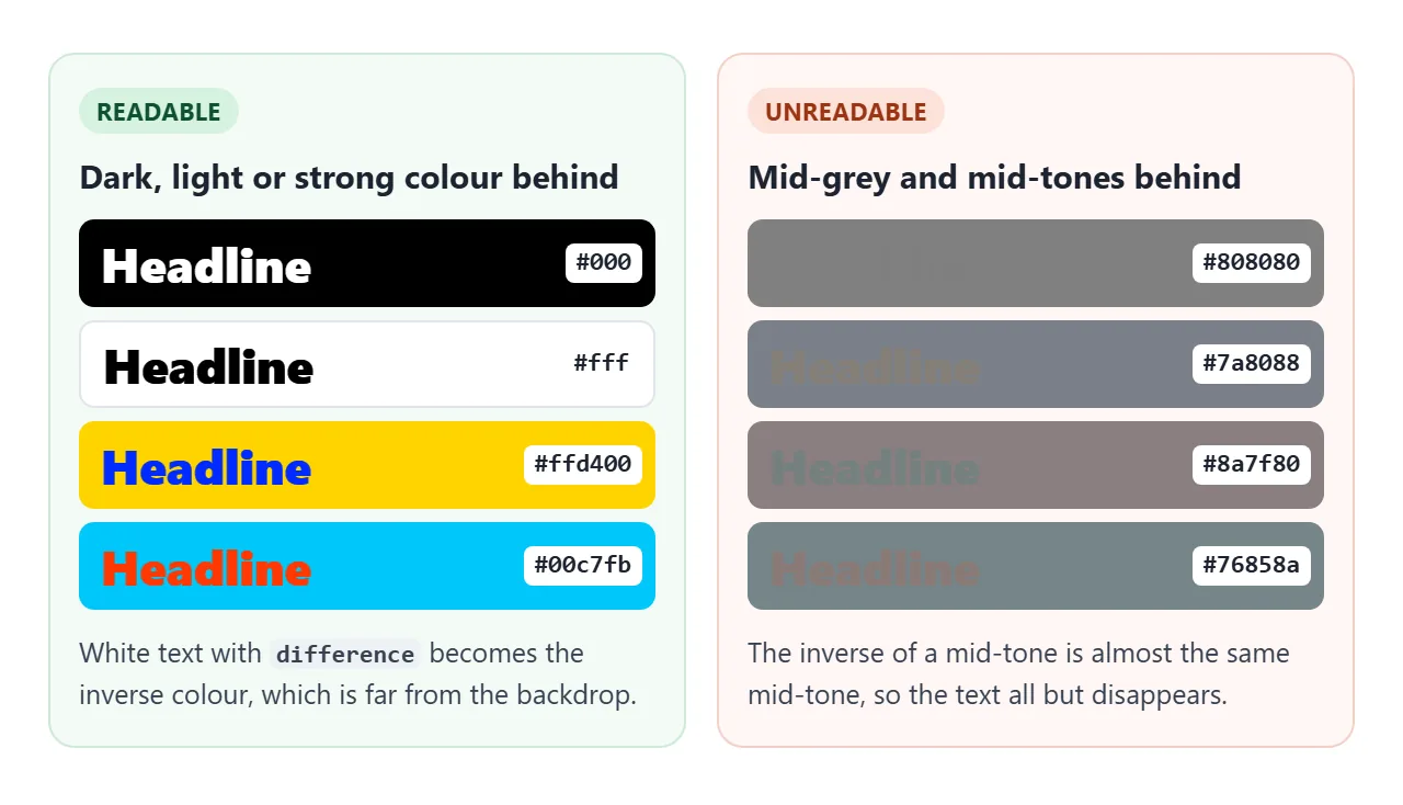
The catch is mid-grey. The inverse of a colour near the middle is another colour near the middle, so the text almost disappears. This is a real readability problem, not just a looks problem:
- Build the backdrop from dark, light and saturated colours.
- Check the text over the darkest, lightest and greyest spots.
- Keep small text out of blend modes. Put it on a solid panel.
- Stop a moving backdrop under
prefers-reduced-motion: reduce.
A finished example
The hero below has a moving backdrop of black and white stripes with yellow and cyan bands. The headline is white with difference, and the hero has isolation: isolate so the blend stays inside it. The cards are duotones of one grey image.
<!doctype html>
<html lang="en">
<head>
<meta charset="utf-8">
<meta name="viewport" content="width=device-width, initial-scale=1">
<title>Blend-mode hero and duotone cards</title>
<style>
  body { margin: 0; padding: 12px; font-family: system-ui, sans-serif; background: #f4f5f7; color: #1d2330; }

  /* Hero: its own stacking context, so the headline only blends with the hero */
  .hero {
    position: relative; height: 250px; border-radius: 14px; overflow: hidden;
    isolation: isolate; background: #000;
  }
  /* Moving backdrop built only from black, white and strong colours: no mid-grey */
  .bg {
    position: absolute; inset: 0;
    background:
      linear-gradient(100deg, transparent 0 30%, #ffd400 30% 48%, transparent 48% 70%, #00c7fb 70% 84%, transparent 84%),
      repeating-linear-gradient(-45deg, #000 0 40px, #fff 40px 80px);
    background-size: 200% 100%, 226.274px 226.274px;  /* 80px stripes x sqrt(2) x 2: tiles without seams */
    animation: slide 12s linear infinite;
  }
  @keyframes slide { to { background-position: -200% 0, 226.274px 0; } }
  @media (prefers-reduced-motion: reduce) { .bg { animation: none; } }

  .hero h1 {
    position: relative; margin: 0; padding: 40px 20px 0;
    font: 900 clamp(40px, 12vw, 76px)/1 system-ui, sans-serif;
    color: #fff;
    mix-blend-mode: difference;   /* white text = inverse of whatever is behind it */
  }
  /* Small text does not blend: it sits on a solid chip */
  .hero p {
    position: absolute; left: 20px; bottom: 18px; margin: 0; max-width: 80%;
    background: #fff; color: #1d2330; padding: 6px 10px; border-radius: 8px; font-size: 14px;
  }

  /* Duotone cards: same grey image, different colour pair per card */
  .cards { display: grid; grid-template-columns: repeat(auto-fit, minmax(110px, 1fr)); gap: 10px; margin-top: 12px; }
  .card {
    --photo: url("data:image/svg+xml,<svg xmlns='http://www.w3.org/2000/svg' viewBox='0 0 300 220' preserveAspectRatio='xMidYMid slice'><defs><linearGradient id='s' x2='0' y2='1'><stop offset='0' stop-color='%23777'/><stop offset='1' stop-color='%23f2f2f2'/></linearGradient></defs><rect width='300' height='220' fill='url(%23s)'/><circle cx='210' cy='70' r='30' fill='%23fff'/><path d='M0 150 L70 80 L130 130 L190 60 L300 140 V220 H0Z' fill='%23555'/><path d='M0 185 L100 140 L180 180 L300 150 V220 H0Z' fill='%23111'/></svg>");
    border: 0; padding: 0; border-radius: 12px; overflow: hidden; cursor: pointer;
    text-align: left; font: inherit; background: #fff; box-shadow: 0 4px 14px rgba(0, 0, 0, .1);
  }
  .img {
    height: 120px;
    background-image: linear-gradient(var(--dark), var(--dark)), var(--photo);
    background-size: cover; background-position: center;
    background-color: var(--light);
    background-blend-mode: lighten, multiply;
  }
  .card[aria-pressed="true"] .img { background-image: var(--photo); background-blend-mode: normal; }
  .card span { display: block; padding: 8px 10px; font-size: 13px; }
  .hint { font-size: 13px; color: #5b6270; margin: 8px 0 0; }
</style>
</head>
<body>
<header class="hero">
  <div class="bg"></div>
  <h1>Readable on any stripe</h1>
  <p>The headline is white with <b>mix-blend-mode: difference</b>.</p>
</header>

<div class="cards">
  <button class="card" aria-pressed="false" style="--dark:#1b1464; --light:#ff5e7e"><div class="img"></div><span>Sunset</span></button>
  <button class="card" aria-pressed="false" style="--dark:#003b36; --light:#9cf6c7"><div class="img"></div><span>Mint</span></button>
  <button class="card" aria-pressed="false" style="--dark:#3a0ca3; --light:#ffd166"><div class="img"></div><span>Gold</span></button>
</div>
<p class="hint">Tap a card to see the grey original.</p>

<script>
  document.querySelectorAll('.card').forEach(card => {
    card.addEventListener('click', () => {
      const on = card.getAttribute('aria-pressed') === 'true';
      card.setAttribute('aria-pressed', !on);
    });
  });
</script>
</body>
</html>
- Backdrop: two animated gradient layers with no mid-grey, so the headline stays readable.
- Small text: sits on a white chip with no blend mode.
- Cards: each card sets
--darkand--lightinline for one shared duotone rule.
A frosted panel is a different effect. It blurs what is behind rather than mixing colours, and glassmorphism CSS covers it.
When it does not work
| What you see | Cause | Fix |
|---|---|---|
| Nothing changes | Nothing is painted behind the element in its stacking context | Give the parent, or body, a background |
| Blending works on the page but not inside a card | An ancestor has opacity, transform, filter or z-index, which isolates it |
Move the blended element, or blend inside that ancestor |
| Other elements get tinted too | The blend reaches the page background | isolation: isolate on the wrapper |
| A solid rectangle blends, not just the text | The text element has its own background | Remove the background from the blended element |
| Blended text is hard to read | Mid-tone backdrop | Change the backdrop colours, or drop the blend for that text |
A child with negative z-index jumped in front |
Blend modes create a stacking context | Restructure, or blend a sibling instead |
The first row has a subtle case. In Chromium, a blended element on a page with no background colour at all showed no blending in our test. Setting background: #fff on body fixed it.
Share it as a link
Blend modes react to what is behind them, so a screenshot shows one moment and one screen size. A shared page lets people scroll, pick colours and watch the headline change over the stripes.
Paste the page into a NOS document and choose Create share link. HTML to link walks through it.
The page renders as written and its scripts run, so the people you send it to can try every mode themselves. If you change the code later, the same link shows the new version.