Glassmorphism in CSS is a card with a see-through background and backdrop-filter: blur(), placed over something colourful. A light border and a soft shadow finish the look. Here is the whole recipe:
.glass {
  background: rgb(255 255 255 / 0.2);                  /* see-through tint */
  -webkit-backdrop-filter: blur(12px) saturate(160%);  /* older Safari */
  backdrop-filter: blur(12px) saturate(160%);
  border: 1px solid rgb(255 255 255 / 0.35);
  border-radius: 16px;
  box-shadow: 0 8px 32px rgb(0 0 0 / 0.18);
}
Try it as a generator. Each slider changes one value, and the CSS under the preview updates so you can copy it.
<!doctype html>
<html lang="en">
<head>
<meta charset="utf-8">
<meta name="viewport" content="width=device-width, initial-scale=1">
<title>Glassmorphism CSS generator</title>
<style>
  body { margin: 0; padding: 14px; font-family: system-ui, sans-serif; background: #f4f5f7; color: #1d2330; }
  /* the colourful layer behind the glass: a gradient plus blurred SVG blobs */
  .stage {
    position: relative; height: 220px; border-radius: 14px; overflow: hidden;
    display: grid; place-items: center;
    background: linear-gradient(135deg, #4f46e5, #0ea5e9 55%, #22c55e);
  }
  .stage svg { position: absolute; inset: 0; width: 100%; height: 100%; }
  .glass {
    position: relative; width: min(260px, 80%); padding: 20px 22px; color: #fff;
    /* these five lines are what the sliders change */
    background: rgb(255 255 255 / 0.2);
    -webkit-backdrop-filter: blur(12px) saturate(160%);  /* older Safari */
    backdrop-filter: blur(12px) saturate(160%);
    border: 1px solid rgb(255 255 255 / 0.35);
    border-radius: 16px;
    box-shadow: 0 8px 32px rgb(0 0 0 / 0.18);
  }
  .glass b { font-size: 18px; }
  .glass p { margin: 6px 0 0; font-size: 14px; }
  .controls { display: grid; grid-template-columns: repeat(auto-fit, minmax(160px, 1fr)); gap: 8px 16px; margin: 14px 2px 10px; }
  label { font-size: 13px; display: grid; gap: 2px; }
  label span { color: #5b6270; }
  input[type=range] { width: 100%; }
  pre {
    margin: 0; padding: 12px 14px; border-radius: 10px; background: #111827; color: #d1fae5;
    font: 12.5px/1.5 ui-monospace, Consolas, monospace; white-space: pre-wrap;
  }
</style>
</head>
<body>
<div class="stage">
  <svg viewBox="0 0 400 220" preserveAspectRatio="xMidYMid slice" aria-hidden="true">
    <filter id="soft"><feGaussianBlur stdDeviation="18"/></filter>
    <g filter="url(#soft)">
      <circle cx="90" cy="60" r="60" fill="#f472b6"/>
      <circle cx="320" cy="170" r="70" fill="#facc15"/>
      <circle cx="250" cy="40" r="40" fill="#fb923c"/>
    </g>
  </svg>
  <div class="glass" id="glass"><b>Frosted glass</b><p>Move the sliders. The CSS below updates.</p></div>
</div>

<div class="controls">
  <label>Blur <span id="blurV"></span><input type="range" id="blur" min="0" max="30" value="12"></label>
  <label>Transparency (background alpha) <span id="alphaV"></span><input type="range" id="alpha" min="0" max="100" value="20"></label>
  <label>Saturation <span id="satV"></span><input type="range" id="sat" min="100" max="200" value="160"></label>
  <label>Border opacity <span id="bordV"></span><input type="range" id="bord" min="0" max="100" value="35"></label>
  <label>Corner radius <span id="radV"></span><input type="range" id="rad" min="0" max="40" value="16"></label>
</div>
<pre id="out"></pre>

<script>
  const $ = (id) => document.getElementById(id);
  const glass = $('glass');

  function update() {
    const blur = $('blur').value, alpha = $('alpha').value / 100, sat = $('sat').value;
    const bord = $('bord').value / 100, rad = $('rad').value;
    const filter = `blur(${blur}px) saturate(${sat}%)`;
    // apply to the card
    glass.style.background = `rgb(255 255 255 / ${alpha})`;
    glass.style.webkitBackdropFilter = filter;
    glass.style.backdropFilter = filter;
    glass.style.borderColor = `rgb(255 255 255 / ${bord})`;
    glass.style.borderRadius = rad + 'px';
    // show the values next to the sliders
    $('blurV').textContent = blur + 'px'; $('alphaV').textContent = alpha;
    $('satV').textContent = sat + '%'; $('bordV').textContent = bord; $('radV').textContent = rad + 'px';
    // the CSS to copy
    $('out').textContent =
`.glass {
  background: rgb(255 255 255 / ${alpha});
  -webkit-backdrop-filter: ${filter};
  backdrop-filter: ${filter};
  border: 1px solid rgb(255 255 255 / ${bord});
  border-radius: ${rad}px;
  box-shadow: 0 8px 32px rgb(0 0 0 / 0.18);
}`;
  }

  document.querySelectorAll('input[type=range]').forEach((r) => r.addEventListener('input', update));
  update();
</script>
</body>
</html>
The four layers of frosted glass
Each line in the recipe does one job. Taken away one at a time, the card stops looking like glass.
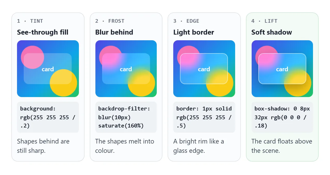
- Tint: a background colour with alpha below 1.
rgba(255, 255, 255, .2),rgb(255 255 255 / .2)andhsl(0 0% 100% / .2)are the same colour. CSS background color covers the colour formats. - Frost:
backdrop-filter: blur()blurs whatever is behind the card.saturate()above 100% makes the blurred colour richer, which keeps glass from looking grey. - Edge: a 1px border in white at partial opacity reads as the rim of a glass sheet. Round the corners with border-radius.
- Lift: a wide, soft box-shadow separates the card from the scene.
| Property | What it does | Starting value |
|---|---|---|
background |
Lets the backdrop show through | rgb(255 255 255 / 0.2) |
backdrop-filter |
Blurs and boosts what is behind | blur(12px) saturate(160%) |
border |
Draws the glass edge | 1px solid rgb(255 255 255 / 0.35) |
border-radius |
Rounds the sheet | 16px |
box-shadow |
Lifts the card | 0 8px 32px rgb(0 0 0 / 0.18) |
backdrop-filter accepts every function that filter does. CSS filter walks through each one and explains the difference between the two properties.
The glass needs something behind it
backdrop-filter only changes what is already behind the element. On a plain white page, the blurred result is the same white, and the card looks like a faint grey box.
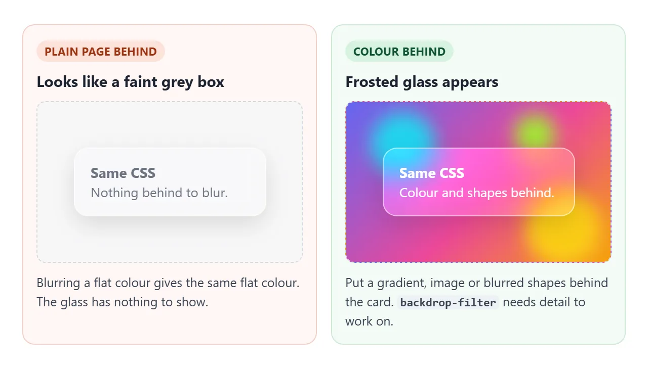
You do not need a photo. A CSS gradient plus a few soft shapes is enough, and it stays inside the page:
<svg class="blobs" viewBox="0 0 400 220" aria-hidden="true">
  <filter id="soft"><feGaussianBlur stdDeviation="18"/></filter>
  <g filter="url(#soft)">
    <circle cx="90" cy="60" r="60" fill="#f472b6"/>
    <circle cx="320" cy="170" r="70" fill="#facc15"/>
  </g>
</svg>
Position the SVG absolutely behind the card, under a gradient on the container. The generator above uses exactly this.
Keep the text readable
Glass puts text over a background you do not fully control. Over calm colour, a light tint is enough. Over stripes, photos or strong dark shapes, the same tint leaves the text hard to read.
<!doctype html>
<html lang="en">
<head>
<meta charset="utf-8">
<meta name="viewport" content="width=device-width, initial-scale=1">
<title>Glass card readability check</title>
<style>
  body { margin: 0; padding: 14px; font-family: system-ui, sans-serif; background: #f4f5f7; color: #1d2330; }
  .bar { display: flex; flex-wrap: wrap; gap: 8px 18px; align-items: center; margin-bottom: 12px; font-size: 14px; }
  .bar button { font: inherit; padding: 6px 12px; border-radius: 8px; border: 1px solid #c9cdd4; background: #fff; cursor: pointer; }
  .bar button[aria-pressed=true] { background: #1d2330; color: #fff; border-color: #1d2330; }
  .grid { display: grid; grid-template-columns: repeat(auto-fit, minmax(170px, 1fr)); gap: 12px; }
  .scene { position: relative; height: 190px; border-radius: 12px; overflow: hidden; display: grid; place-items: center; }
  .scene h3 { position: absolute; left: 10px; top: 8px; margin: 0; font-size: 12px; padding: 3px 7px; border-radius: 6px; background: #fff; }
  /* busy: hard stripes, bright and dark blobs */
  .busy { background:
      radial-gradient(circle at 20% 70%, #1e1b4b 0 45px, transparent 46px),
      radial-gradient(circle at 80% 30%, #f43f5e 0 50px, transparent 51px),
      repeating-linear-gradient(45deg, #fde047 0 14px, #22d3ee 14px 28px); }
  /* calm: one soft gradient */
  .calm { background: linear-gradient(135deg, #c7d2fe, #fbcfe8); }

  .glass {
    width: 78%; padding: 14px 16px; border-radius: 14px; color: #111827; font-size: 14px; line-height: 1.4;
    background: rgb(255 255 255 / var(--a));     /* --a is the tint strength */
    -webkit-backdrop-filter: blur(6px) saturate(140%);
    backdrop-filter: blur(6px) saturate(140%);
    border: 1px solid rgb(255 255 255 / 0.5);
  }
  .glass small { display: block; margin-top: 6px; font-weight: 600; }

  /* browsers without backdrop-filter get a near-solid card instead */
  @supports not ((backdrop-filter: blur(1px)) or (-webkit-backdrop-filter: blur(1px))) {
    .glass { background: rgb(255 255 255 / 0.9); }
  }
  /* the same rule, switched on by the checkbox so you can preview it */
  .fallback .glass { -webkit-backdrop-filter: none; backdrop-filter: none; background: rgb(255 255 255 / 0.9); }
</style>
</head>
<body>
<div class="bar">
  <span>Tint:</span>
  <button id="low" aria-pressed="true">Low (0.15)</button>
  <button id="high" aria-pressed="false">High (0.6)</button>
  <label><input type="checkbox" id="fb"> Preview the @supports fallback</label>
</div>
<div class="grid" id="grid">
  <div class="scene busy"><h3>Busy background</h3>
    <div class="glass">Your balance is ready. Check the new statement.<small class="ratio"></small></div></div>
  <div class="scene calm"><h3>Calm background</h3>
    <div class="glass">Your balance is ready. Check the new statement.<small class="ratio"></small></div></div>
</div>

<script>
  // darkest colour in each background: the worst place for dark text
  const darkest = { busy: [30, 27, 75], calm: [199, 210, 254] };
  const text = [17, 24, 39];

  const lum = (c) => {
    const [r, g, b] = c.map((v) => { v /= 255; return v <= 0.03928 ? v / 12.92 : ((v + 0.055) / 1.055) ** 2.4; });
    return 0.2126 * r + 0.7152 * g + 0.0722 * b;
  };
  const contrast = (a, b) => { const [x, y] = [lum(a), lum(b)].sort((p, q) => q - p); return (x + 0.05) / (y + 0.05); };

  function setTint(a) {
    document.body.style.setProperty('--a', a);
    document.getElementById('low').setAttribute('aria-pressed', a < 0.5);
    document.getElementById('high').setAttribute('aria-pressed', a >= 0.5);
    const fallback = document.getElementById('grid').classList.contains('fallback');
    const tint = fallback ? 0.9 : a;
    document.querySelectorAll('.scene').forEach((s) => {
      const bg = darkest[s.classList.contains('busy') ? 'busy' : 'calm'];
      // white tint laid over the darkest spot (ignores the blur, so it is the worst case)
      const mixed = bg.map((v) => v * (1 - tint) + 255 * tint);
      const r = contrast(mixed, text);
      s.querySelector('.ratio').textContent =
        `Worst-case contrast ${r.toFixed(1)}:1 ${r >= 4.5 ? '✓ readable' : '✗ below 4.5:1'}`;
    });
  }

  let tint = 0.15;
  document.getElementById('low').addEventListener('click', () => setTint(tint = 0.15));
  document.getElementById('high').addEventListener('click', () => setTint(tint = 0.6));
  document.getElementById('fb').addEventListener('change', (e) => {
    document.getElementById('grid').classList.toggle('fallback', e.target.checked);
    setTint(tint);
  });
  setTint(tint);
</script>
</body>
</html>
The contrast line in the example blends the tint over the darkest colour in each background and ignores the blur, so it shows the worst case. The WCAG guideline asks for at least 4.5:1 for normal text.
- Raise the opacity. Moving the tint from 0.15 to 0.6 is the simplest fix.
- Tint toward the text's opposite. Dark text wants a white tint, and light text wants a dark one.
- Calm the backdrop. Blurred shapes are easier to read over than hard stripes or a busy photo.
A fallback for browsers without backdrop-filter
A browser that does not support backdrop-filter ignores the line. The card then keeps only its thin tint, which is often too see-through to read. Older Safari versions only understand the -webkit- form, so write both.
Use @supports to give those browsers a near-solid card instead:
@supports not ((backdrop-filter: blur(1px)) or (-webkit-backdrop-filter: blur(1px))) {
  .glass { background: rgb(255 255 255 / 0.9); }
}
The checkbox in the example above applies the same background by hand, so you can see what those visitors get.
Glass inside glass
A glass menu inside a glass header often shows sharp stripes instead of blur.
backdrop-filter only sees content up to the nearest ancestor that has its own backdrop-filter, filter, opacity below 1, mask or clip-path. The Filter Effects spec calls that ancestor the backdrop root.
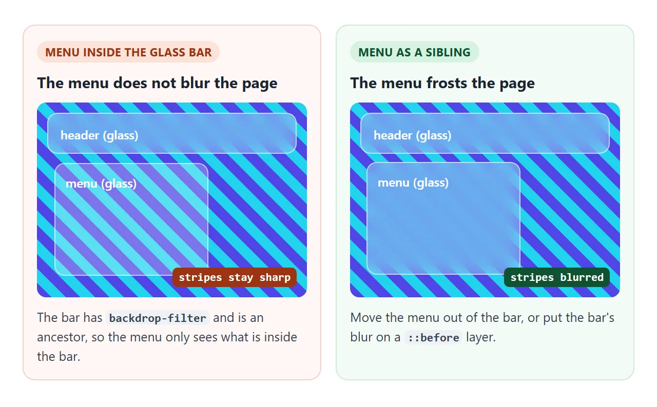
Move the menu out of the header so they are siblings, or put the header's blur on a ::before layer so the header element itself is not the backdrop root.
backdrop-filter also creates a stacking context, the same side effect CSS filter describes for filter.
Dark mode glass
In a dark theme, flip the tint: a dark, slightly transparent fill such as rgb(17 24 39 / 0.45), a faint white edge, and light text. Keep the colours in custom properties and switch them with a class or prefers-color-scheme.
<!doctype html>
<html lang="en">
<head>
<meta charset="utf-8">
<meta name="viewport" content="width=device-width, initial-scale=1">
<title>Glass login and dashboard cards</title>
<style>
  /* light theme values */
  body {
    --bg: linear-gradient(135deg, #a5b4fc, #f9a8d4 60%, #fde68a);
    --glass: rgb(255 255 255 / 0.35);
    --edge: rgb(255 255 255 / 0.6);
    --text: #111827; --muted: #374151;
    --field: rgb(255 255 255 / 0.55); --btn: #111827; --btn-text: #fff;
    --blob1: #8b5cf6; --blob2: #ec4899; --blob3: #f59e0b;
  }
  /* dark theme: darker tint over a darker scene, lighter text */
  body.dark {
    --bg: linear-gradient(135deg, #0f172a, #1e1b4b 60%, #312e81);
    --glass: rgb(17 24 39 / 0.45);
    --edge: rgb(255 255 255 / 0.12);
    --text: #f3f4f6; --muted: #cbd5e1;
    --field: rgb(255 255 255 / 0.08); --btn: #e0e7ff; --btn-text: #111827;
    --blob1: #7c3aed; --blob2: #db2777; --blob3: #0891b2;
  }
  body {
    margin: 0; min-height: 100vh; font-family: system-ui, sans-serif; color: var(--text);
    background: var(--bg); position: relative; overflow-x: hidden;
  }
  .blobs { position: absolute; inset: 0; width: 100%; height: 100%; z-index: 0; }
  .wrap { position: relative; z-index: 1; max-width: 640px; margin: 0 auto; padding: 14px; display: grid; gap: 12px; }

  .glass {
    background: var(--glass);
    -webkit-backdrop-filter: blur(16px) saturate(170%);
    backdrop-filter: blur(16px) saturate(170%);
    border: 1px solid var(--edge);
    border-radius: 16px;
    box-shadow: 0 8px 32px rgb(0 0 0 / 0.15);
  }
  @supports not ((backdrop-filter: blur(1px)) or (-webkit-backdrop-filter: blur(1px))) {
    .glass { background: rgb(255 255 255 / 0.9); }
    body.dark .glass { background: rgb(17 24 39 / 0.92); }
  }

  .top { display: flex; justify-content: space-between; align-items: center; padding: 10px 14px; }
  .top b { font-size: 16px; }
  button { font: inherit; cursor: pointer; }
  #theme { padding: 6px 12px; border-radius: 99px; border: 1px solid var(--edge); background: var(--field); color: var(--text); }

  .cols { display: grid; grid-template-columns: repeat(auto-fit, minmax(240px, 1fr)); gap: 12px; }
  form { padding: 18px; display: grid; gap: 10px; }
  form h2 { margin: 0; font-size: 18px; }
  form label { display: grid; gap: 4px; font-size: 13px; color: var(--muted); }
  form input { font: inherit; padding: 9px 11px; border-radius: 10px; border: 1px solid var(--edge); background: var(--field); color: var(--text); }
  form button { padding: 10px; border: 0; border-radius: 10px; background: var(--btn); color: var(--btn-text); font-weight: 600; }
  #result { margin: 0; font-size: 13px; color: var(--muted); min-height: 1.2em; }

  .stats { display: grid; gap: 12px; }
  .stat { padding: 14px 16px; }
  .stat span { font-size: 13px; color: var(--muted); }
  .stat strong { display: block; font-size: 24px; margin-top: 2px; }
</style>
</head>
<body>
<svg class="blobs" viewBox="0 0 600 600" preserveAspectRatio="xMidYMid slice" aria-hidden="true">
  <filter id="soft"><feGaussianBlur stdDeviation="40"/></filter>
  <g filter="url(#soft)">
    <circle cx="120" cy="160" r="110" style="fill: var(--blob1)"/>
    <circle cx="480" cy="120" r="90" style="fill: var(--blob2)"/>
    <circle cx="380" cy="470" r="130" style="fill: var(--blob3)"/>
  </g>
</svg>

<div class="wrap">
  <div class="glass top"><b>Northwind</b><button id="theme" type="button">Dark mode</button></div>
  <div class="cols">
    <form class="glass" id="login">
      <h2>Sign in</h2>
      <label>Email <input name="email" type="email" required value="sam@example.com"></label>
      <label>Password <input name="password" type="password" required value="glass123"></label>
      <button type="submit">Sign in</button>
      <p id="result" aria-live="polite"></p>
    </form>
    <div class="stats">
      <div class="glass stat"><span>Visitors today</span><strong>1,284</strong></div>
      <div class="glass stat"><span>Sign-ups</span><strong>37</strong></div>
      <div class="glass stat"><span>Open tickets</span><strong>5</strong></div>
    </div>
  </div>
</div>

<script>
  const themeBtn = document.getElementById('theme');
  // start in the visitor's system theme, then let the button switch it
  if (matchMedia('(prefers-color-scheme: dark)').matches) document.body.classList.add('dark');
  const label = () => themeBtn.textContent = document.body.classList.contains('dark') ? 'Light mode' : 'Dark mode';
  label();
  themeBtn.addEventListener('click', () => { document.body.classList.toggle('dark'); label(); });

  // demo only: show what would be sent instead of sending it
  document.getElementById('login').addEventListener('submit', (e) => {
    e.preventDefault();
    const data = new FormData(e.target);
    document.getElementById('result').textContent =
      `Would send email=${data.get('email')}, password=${'•'.repeat(data.get('password').length)}`;
  });
</script>
</body>
</html>
body       { --glass: rgb(255 255 255 / 0.35); --edge: rgb(255 255 255 / 0.6); }
body.dark  { --glass: rgb(17 24 39 / 0.45);    --edge: rgb(255 255 255 / 0.12); }
.glass     { background: var(--glass); border: 1px solid var(--edge); }
Dark mode in CSS covers the theme switch itself. The sign-in form in the example stops at preventDefault() and shows what it would send.
Performance
The browser has to blur the area behind each glass element, and redo it when what is behind changes. A larger glass area means more work, so the cost grows with full-screen panels and scrolling or animated backgrounds.
- Use glass for cards, bars and menus rather than whole pages.
- Avoid animating the blur value on large elements.
- A few glass cards on a page are a normal use.
When it does not work
| What you see | Cause | Fix |
|---|---|---|
| Nothing blurs; a solid box | The card's background is opaque | Use an alpha colour below 1 |
| A faint grey box, no glass | Only a plain colour behind the card | Put a gradient, image or shapes behind it |
| Glass in Chrome, clear box in older Safari | Only the unprefixed property is set | Add -webkit-backdrop-filter with the same value |
| Text is hard to read | Tint too thin over a busy backdrop | Raise the opacity or add a tint; check 4.5:1 |
| Square blur shows past rounded corners | The blur is on a child or pseudo-element of the rounded box | Put border-radius on the blurred element, or overflow: hidden on the parent |
| A nested glass menu shows sharp content | An ancestor has backdrop-filter, filter, opacity, mask or clip-path |
Make it a sibling, or move the ancestor's effect to ::before |
| Scrolling feels heavy | Large blurred areas over moving content | Shrink the glass area; do not animate the blur |
Share it as a link
Glass is hard to judge from a screenshot, because the effect depends on what moves behind it. Send the page itself instead of an image or an .html attachment.
Paste the page into a NOS document and choose Create share link. HTML to link walks through it.
The page renders as written and its scripts run, so the people you send it to can drag the sliders and switch the theme themselves. If you change the code later, the same link shows the new version.