isolation: isolate makes an element a stacking context and does nothing else. Every z-index and blend mode inside it is then worked out within that element, and the page only sees the element as a single layer.
The property has two values: auto, the default, and isolate. It is not inherited.
Start with the usual case. The card badges have z-index: 3 and cover the open account menu, which has z-index: 2. Tick the box.
<!doctype html>
<html lang="en">
<head>
<meta charset="utf-8">
<meta name="viewport" content="width=device-width, initial-scale=1">
<title>z-index leak</title>
<style>
body { margin: 0; padding: 12px; font-family: system-ui, sans-serif; background: #f4f5f7; color: #1d2330; }
label { display: inline-flex; gap: 8px; align-items: center; font-size: 14px; margin-bottom: 10px; }
.bar { position: relative; display: flex; justify-content: flex-end; padding: 8px 10px;
background: #1d2330; color: #fff; border-radius: 10px; }
.bar button { font: inherit; font-size: 14px; padding: 6px 12px; border-radius: 8px; border: 0; }
.menu { position: absolute; right: 10px; top: 46px; z-index: 2; /* page level 2 */
width: 170px; padding: 6px; background: #fff; color: #1d2330; border-radius: 10px;
box-shadow: 0 10px 30px rgba(0, 0, 0, .25); }
.menu a { display: block; padding: 9px 10px; color: inherit; text-decoration: none; border-radius: 6px; }
.menu a:hover { background: #eef1f5; }
.menu[hidden] { display: none; }
.cards { display: grid; grid-template-columns: 1fr 1fr; gap: 10px; margin-top: 10px; }
.card { position: relative; padding: 14px; height: 120px; box-sizing: border-box;
background: #fff; border-radius: 12px; box-shadow: 0 2px 8px rgba(0, 0, 0, .08); }
.badge { position: absolute; right: 8px; top: 8px; z-index: 3; /* meant for inside the card only */
padding: 4px 9px; border-radius: 99px; background: #e11d48; color: #fff;
font-size: 13px; font-weight: 700; }
/* The fix: each card becomes its own stacking context */
.isolated .card { isolation: isolate; }
</style>
</head>
<body>
<label><input type="checkbox" id="fix"> <code>isolation: isolate</code> on each card</label>
<div class="bar">
<button id="open" aria-expanded="true">Account ▾</button>
<nav class="menu" id="menu">
<a href="#">Profile</a><a href="#">Settings</a><a href="#">Sign out</a>
</nav>
</div>
<div class="cards" id="cards">
<div class="card"><b>Plan A</b><span class="badge">NEW</span></div>
<div class="card"><b>Plan B</b><span class="badge">SALE</span></div>
</div>
<script>
const menu = document.getElementById('menu');
const btn = document.getElementById('open');
btn.addEventListener('click', () => {
menu.hidden = !menu.hidden;
btn.setAttribute('aria-expanded', !menu.hidden);
});
document.getElementById('fix').addEventListener('change', (e) => {
document.getElementById('cards').classList.toggle('isolated', e.target.checked);
});
</script>
</body>
</html>
Nothing about the cards changes on screen, except that the menu now covers them. That is the point of the property: a layer with no side effects.
What isolation: isolate changes, and what it does not
A stacking context is a group that is stacked as one unit. Children are ordered by z-index inside it, and from outside the whole group has one level. The z-index guide covers the full model.
isolation: isolate switches that grouping on. Measured in Chromium, Firefox and WebKit, it:
- creates a stacking context, even on a plain
position: staticelement; - does not change how the element looks;
- does not clip children that overflow it;
- does not become the containing block for
position: fixedchildren, so fixed elements inside still stick to the window.
The group is painted like a positioned element with z-index: 0. A later sibling with a position, or any element with z-index 1 or more on the same level, paints over it.
Fixing z-index leaks in components
A z-index is compared inside the nearest stacking context. If a card is not a context, its inner numbers are compared with the page itself. That is how a badge meant to sit above a card photo ends up above the site menu.
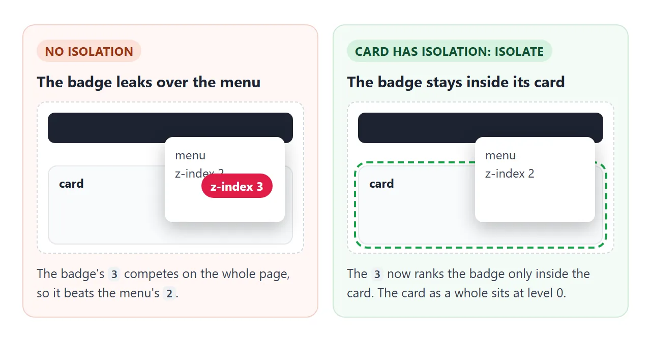
Put the fix on the component's root element, once:
.card { isolation: isolate; }
.card .badge { position: absolute; z-index: 3; } /* only ranks inside .card */
.site-menu { position: absolute; z-index: 2; }   /* beats every card */
Now each component can use small local numbers without knowing the page's scale. The page keeps its own short scale for headers, menus and overlays. This works well for design systems, where one team builds the card and another builds the page.
Containing mix-blend-mode
A blend mode mixes an element with whatever is painted behind it, up to the edge of its stacking context. Without a context in between, a blended heading mixes with the page background as well as its card.
.hero { isolation: isolate; }                 /* blending stops here */
.hero h1 { mix-blend-mode: difference; }
In a test with a white box set to difference over a red page, the box showed as cyan. With isolation: isolate on a transparent wrapper, it showed as plain white, because there was nothing inside the group to blend with.
The mix-blend-mode guide has live examples of the blend modes themselves.
Keeping negative z-index backgrounds visible
A common card pattern draws the background on a pseudo-element with z-index: -1, so the text sits on top. Without a stacking context on the card, the pseudo-element drops behind the card's ancestors and can disappear under a section background.
.card { position: relative; isolation: isolate; }
.card::before { content: ""; position: absolute; inset: 0; z-index: -1; }
With the card isolated, -1 means "behind the card's own content", never behind anything outside the card.
isolate vs other ways to create a stacking context
Many properties create a stacking context. Two old tricks are opacity: 0.99 and an empty transform. Pick each option below and watch what else changes.
<!doctype html>
<html lang="en">
<head>
<meta charset="utf-8">
<meta name="viewport" content="width=device-width, initial-scale=1">
<title>Ways to make a stacking context</title>
<style>
  body { margin: 0; padding: 12px; font-family: system-ui, sans-serif; background: #fff; color: #1d2330; }
  fieldset { border: 1px solid #e1e4ea; border-radius: 10px; padding: 8px 10px; margin: 0 0 8px;
             display: flex; flex-wrap: wrap; gap: 4px 14px; font-size: 14px; }
  legend { font-size: 13px; color: #6b7280; }
  label { display: inline-flex; gap: 6px; align-items: center; }
  #note { font-size: 14px; min-height: 58px; margin: 0 0 8px; line-height: 1.4; }
  /* A page with a striped background and a menu at level 2 */
  .page { position: relative; padding: 40px 16px 64px; border-radius: 12px;
          background: repeating-linear-gradient(45deg, #e5e7eb 0 10px, #f3f4f6 10px 20px); }
  .menu { position: absolute; left: 150px; top: 12px; z-index: 2; width: 130px; padding: 8px 10px;
          background: #1d2330; color: #fff; border-radius: 8px; font-size: 14px; }
  /* The component */
  .card { position: relative; width: 190px; height: 100px; padding: 14px; box-sizing: border-box; font-weight: 700; }
  .card::before { content: ""; position: absolute; inset: 0; z-index: -1;   /* background layer */
                  border-radius: 12px; background: linear-gradient(135deg, #bbf7d0, #93c5fd); }
  .badge { position: absolute; right: -14px; top: -10px; z-index: 3;       /* sticks out of the corner */
           padding: 4px 9px; border-radius: 99px; background: #e11d48; color: #fff; font-size: 13px; }
  .toast { position: fixed; right: 10px; bottom: 10px;                      /* meant for the window corner */
           padding: 6px 10px; border-radius: 8px; background: #0f5132; color: #fff;
           font-size: 13px; font-weight: 400; white-space: nowrap; }
</style>
</head>
<body>
<fieldset id="ways">
  <legend>Put this on .card</legend>
  <label><input type="radio" name="w" value="" checked> nothing</label>
  <label><input type="radio" name="w" value="isolation: isolate"> isolation: isolate</label>
  <label><input type="radio" name="w" value="z-index: 0"> z-index: 0</label>
  <label><input type="radio" name="w" value="opacity: .6"> opacity: .6</label>
  <label><input type="radio" name="w" value="transform: translateX(0)"> transform</label>
  <label><input type="radio" name="w" value="contain: paint"> contain: paint</label>
</fieldset>
<p id="note"></p>

<div class="page">
  <div class="menu">Menu (z-index 2)</div>
  <div class="card" id="card">Card
    <span class="badge">NEW</span>
    <span class="toast">Saved (position: fixed)</span>
  </div>
</div>

<script>
  const notes = {
    '': 'No stacking context. The gradient (z-index -1) falls behind the stripes, and the badge (z-index 3) covers the menu.',
    'isolation: isolate': 'A context and nothing else. Gradient visible, menu on top, badge corner still shows, toast stays in the window corner.',
    'z-index: 0': 'Same result here, because .card is already position: relative. On a static element it would do nothing.',
    'opacity: .6': 'Also a context, but the whole card fades.',
    'transform: translateX(0)': 'Also a context, but the fixed toast now sticks to the card instead of the window.',
    'contain: paint': 'Also a context, but the badge corner is clipped and the toast moves into the card.'
  };
  const card = document.getElementById('card');
  const note = document.getElementById('note');
  function apply(value) {
    card.style.cssText = value;  // for example "isolation: isolate"
    note.textContent = notes[value];
  }
  document.getElementById('ways').addEventListener('change', (e) => apply(e.target.value));
  apply('');
</script>
</body>
</html>
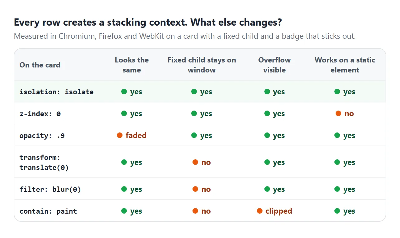
| Put on the element | Creates a context | Also does |
|---|---|---|
isolation: isolate |
Always | Nothing else |
z-index: 0 |
Only if positioned, or a flex or grid item | Nothing else |
opacity below 1 |
Always | Fades the element |
transform or filter |
Anything but none |
Traps position: fixed children |
contain: paint |
Always | Clips overflowing children |
will-change: transform |
Always | Hints the browser to prepare for animation |
Other triggers include position: fixed or sticky, mix-blend-mode, clip-path, mask, backdrop-filter and perspective. The CSS transform guide covers the fixed-position side effect in detail.
A stacking-context inspector
When a z-index "does nothing", the question is always the same: which ancestor is the stacking context? The reliable way to answer it is to walk up the tree and check each ancestor.
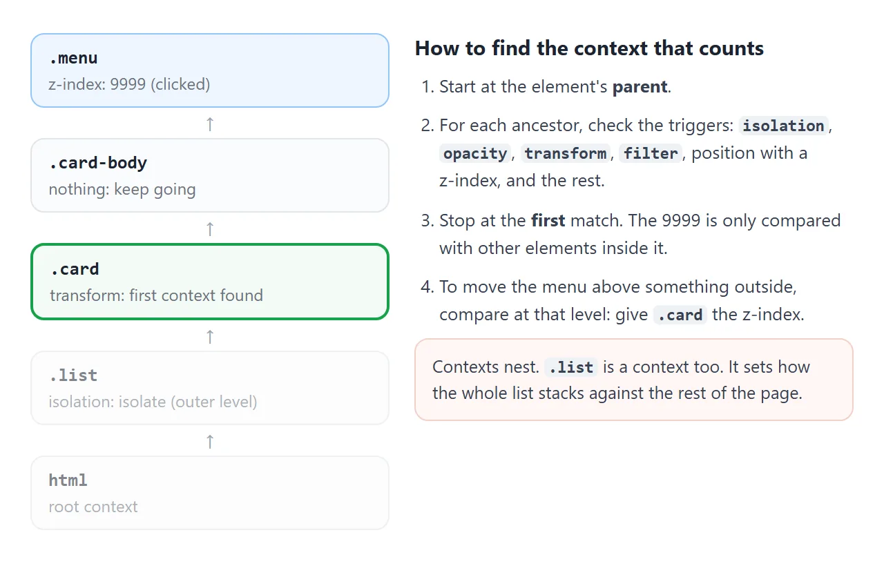
The demo below does the walk for you. Click any box and it lists the ancestors, marking the one that counts.
<!doctype html>
<html lang="en">
<head>
<meta charset="utf-8">
<meta name="viewport" content="width=device-width, initial-scale=1">
<title>Stacking context inspector</title>
<style>
body { margin: 0; padding: 12px; font-family: system-ui, sans-serif; background: #f4f5f7; color: #1d2330; }
p.hint { margin: 0 0 10px; font-size: 14px; line-height: 1.4; }
.app { display: grid; grid-template-columns: 1fr 1fr; gap: 10px; }
.box { padding: 10px; border-radius: 10px; background: #fff; border: 1px solid #e1e4ea;
font-size: 13px; cursor: pointer; }
.box .box { margin-top: 8px; background: #f8fafc; }
.lift { transform: translateY(-2px); }
.faded { opacity: .95; }
.iso { isolation: isolate; }
.raised { position: relative; z-index: 1; }
.picked { outline: 2px solid #2563eb; }
.ctx { outline: 2px dashed #16a34a; outline-offset: 2px; }
#out { margin-top: 12px; padding: 10px 12px; background: #fff; border-radius: 10px; border: 1px solid #e1e4ea;
font: 13px/1.5 ui-monospace, Consolas, monospace; overflow-wrap: anywhere; }
#out b { color: #0f5132; }
</style>
</head>
<body>
<p class="hint">Click any box. Blue: what you clicked. Green dashes: the stacking context its z-index is compared in.</p>
<div class="app">
<div class="box lift">.lift (transform)
<div class="box">plain child
<div class="box raised">.raised (z-index 1)</div>
</div>
</div>
<div class="box faded">.faded (opacity .95)
<div class="box">plain child</div>
</div>
<div class="box">plain
<div class="box iso">.iso (isolation)
<div class="box">plain child</div>
</div>
</div>
<div class="box">plain
<div class="box">plain child</div>
</div>
</div>
<div id="out">Click a box to list its ancestors.</div>
<script>
// Why does this element create a stacking context? '' means it does not.
// Covers the common triggers, not every case in the spec.
function contextReason(el) {
if (el === document.documentElement) return 'root element';
const s = getComputedStyle(el);
const parent = el.parentElement ? getComputedStyle(el.parentElement).display : '';
const hasZ = s.zIndex !== 'auto';
if (s.position === 'fixed' || s.position === 'sticky') return 'position: ' + s.position;
if (hasZ && s.position !== 'static') return 'position + z-index ' + s.zIndex;
if (hasZ && /flex|grid/.test(parent)) return 'flex or grid item + z-index';
if (parseFloat(s.opacity) < 1) return 'opacity: ' + s.opacity;
if (s.isolation === 'isolate') return 'isolation: isolate';
if (s.mixBlendMode !== 'normal') return 'mix-blend-mode';
for (const p of ['transform', 'translate', 'rotate', 'scale', 'filter',
'backdropFilter', 'perspective', 'clipPath', 'maskImage']) {
if (s[p] && s[p] !== 'none') return p;
}
if (/paint|layout|strict|content/.test(s.contain)) return 'contain: ' + s.contain;
if (/transform|opacity|filter|isolation/.test(s.willChange)) return 'will-change';
return '';
}
function label(el) {
const cls = [...el.classList].filter((c) => c !== 'picked' && c !== 'ctx');
return el.tagName.toLowerCase() + (cls.length ? '.' + cls.join('.') : '');
}
const out = document.getElementById('out');
document.addEventListener('click', (e) => {
const picked = e.target.closest('.box');
if (!picked) return;
document.querySelectorAll('.picked, .ctx').forEach((n) => n.classList.remove('picked', 'ctx'));
// Walk up: the first ancestor that creates a context is the one that counts
const lines = [];
let found = false;
for (let el = picked.parentElement; el; el = el.parentElement) {
const why = contextReason(el);
if (why && !found) {
found = true;
if (el !== document.documentElement) el.classList.add('ctx');
lines.push('<b>' + label(el) + ' ← ' + why + '</b>');
} else {
lines.push(label(el) + (why ? ' (' + why + ')' : ''));
}
}
const own = contextReason(picked);
out.innerHTML = label(picked) + ': ' + (own ? 'itself a context (' + own + ')' : 'not a context') +
'<br>' + lines.join('<br>');
picked.classList.add('picked');
});
</script>
</body>
</html>
The check itself is a function of computed styles. This version covers the common triggers, not every case in the specification:
function contextReason(el) {
  if (el === document.documentElement) return 'root element';
  const s = getComputedStyle(el);
  const parent = getComputedStyle(el.parentElement).display;
  const hasZ = s.zIndex !== 'auto';
  if (s.position === 'fixed' || s.position === 'sticky') return 'position';
  if (hasZ && s.position !== 'static') return 'position + z-index';
  if (hasZ && /flex|grid/.test(parent)) return 'flex or grid item + z-index';
  if (parseFloat(s.opacity) < 1) return 'opacity';
  if (s.isolation === 'isolate') return 'isolation';
  if (s.mixBlendMode !== 'normal') return 'mix-blend-mode';
  for (const p of ['transform', 'translate', 'rotate', 'scale', 'filter',
                   'backdropFilter', 'perspective', 'clipPath', 'maskImage'])
    if (s[p] && s[p] !== 'none') return p;
  if (/paint|layout|strict|content/.test(s.contain)) return 'contain';
  return '';
}
Paste it into the console of any page, then call it on each ancestor of the element you are debugging.
When it does not work
| What you see | Cause | Fix |
|---|---|---|
| The component still covers the menu | The menu has no z-index, or auto |
Give the menu z-index: 1 or more |
| The menu is inside the isolated card and hides under the next card | The menu cannot leave its card's level | Raise the open card, or use popover |
| A blend still reaches the page | isolation is on the blended element, not its wrapper |
Put it on the wrapper |
The z-index: -1 background vanished |
The card is not a context | isolation: isolate on the card |
| Adding it changes nothing | The z-index that wins sits higher up the tree than the isolated element | Use the inspector to find where the two meet |
| Content is cut off at the edge | Clipping comes from overflow or contain: paint |
Isolation never clips; check those instead |
For a menu that must escape every card, the popover attribute puts it in the top layer, above all z-index values. The HTML popover guide shows how.
Share it as a link
Layering bugs are hard to describe and easy to show. A screenshot shows that the menu is hidden, but nobody can tick the box or click through the ancestors to see why.
Paste the page into a NOS document and choose Create share link. HTML to link walks through it.
The page renders as written and its scripts run, so the people you send it to can toggle the fix themselves. If you change the code later, the same link shows the new version.