An SVG circle is one tag with three numbers: cx and cy place the centre, and r sets the radius. An ellipse swaps r for two radii, rx across and ry down. All of them are measured in the units of the viewBox.
<svg viewBox="0 0 300 160">
  <circle cx="80" cy="80" r="50" fill="#2563eb"/>
  <ellipse cx="220" cy="80" rx="60" ry="35" fill="#f59e0b"/>
</svg>
Move the sliders and watch the markup under the drawing change with them.
<!doctype html>
<html lang="en">
<head>
<meta charset="utf-8">
<meta name="viewport" content="width=device-width, initial-scale=1">
<title>SVG circle and ellipse attributes</title>
<style>
  body { margin: 0; padding: 14px; font-family: system-ui, sans-serif; background: #f4f5f7; color: #1d2330; }
  svg { display: block; width: 100%; max-width: 460px; background: #fff; border: 1px solid #dde1e7; border-radius: 10px; }
  .controls { display: grid; grid-template-columns: 1fr; gap: 4px; max-width: 460px; margin-top: 12px; }
  label { display: grid; grid-template-columns: 76px 1fr 34px; align-items: center; gap: 8px; font-size: 14px; }
  label b { font-family: ui-monospace, Consolas, monospace; }
  input { min-width: 0; }
  output { font: 13px ui-monospace, Consolas, monospace; text-align: right; }
  pre { max-width: 460px; margin: 12px 0 0; padding: 10px 12px; background: #1d2330; color: #e5e7eb; border-radius: 8px; font-size: 12.5px; white-space: pre-wrap; word-break: break-all; }
</style>
</head>
<body>
<svg viewBox="0 0 300 160" aria-label="A circle and an ellipse">
  <circle id="c" cx="80" cy="80" r="50" fill="#2563eb" />
  <ellipse id="e" cx="220" cy="80" rx="60" ry="35" fill="#f59e0b" />
</svg>

<div class="controls">
  <label><span>circle <b>cx</b></span><input type="range" data-el="c" data-attr="cx" min="0" max="300" value="80"><output></output></label>
  <label><span>circle <b>cy</b></span><input type="range" data-el="c" data-attr="cy" min="0" max="160" value="80"><output></output></label>
  <label><span>circle <b>r</b></span><input type="range" data-el="c" data-attr="r" min="0" max="80" value="50"><output></output></label>
  <label><span>ellipse <b>rx</b></span><input type="range" data-el="e" data-attr="rx" min="0" max="80" value="60"><output></output></label>
  <label><span>ellipse <b>ry</b></span><input type="range" data-el="e" data-attr="ry" min="0" max="80" value="35"><output></output></label>
</div>
<pre id="code"></pre>

<script>
  const code = document.getElementById('code');

  // print both tags exactly as their attributes stand now
  function show() {
    code.textContent = ['c', 'e'].map((id) => document.getElementById(id).outerHTML).join('\n');
  }

  document.querySelectorAll('input').forEach((input) => {
    const out = input.nextElementSibling;
    out.textContent = input.value;
    input.addEventListener('input', () => {
      document.getElementById(input.dataset.el).setAttribute(input.dataset.attr, input.value);
      out.textContent = input.value;
      show();
    });
  });
  show();
</script>
</body>
</html>
If you are new to the <svg> element itself, the SVG tag in HTML covers the viewBox and the other shapes. This page stays with circles, ellipses and round corners.
cx, cy, r, rx and ry
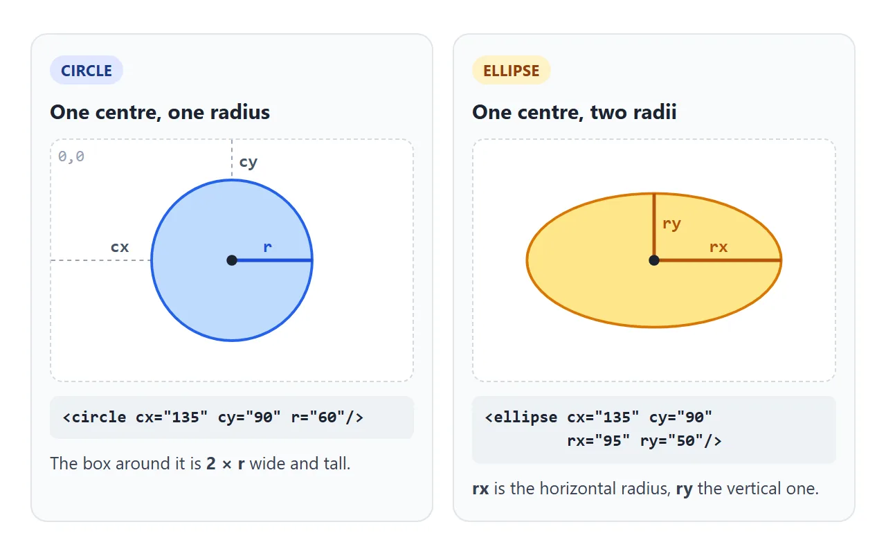
| Attribute | Used by | Meaning | If left out |
|---|---|---|---|
cx |
circle, ellipse | Horizontal position of the centre | 0 |
cy |
circle, ellipse | Vertical position of the centre | 0 |
r |
circle | Radius | 0, nothing is drawn |
rx |
ellipse, rect | Horizontal radius | auto: copies ry |
ry |
ellipse, rect | Vertical radius | auto: copies rx |
A few details decide whether you see anything:
- Zero draws nothing. A circle with
r="0", or with norat all, is not rendered. The same goes for an ellipse whoserxorryis 0. - The centre is the anchor. A circle at
cx="0"is cut in half by the left edge of a viewBox that starts at 0. To touch that edge, setcxequal tor. - The stroke sits on the outline. Half of
stroke-widthfalls outside the radius. A circle withr="50"and a 10-unit stroke reaches 55 units from the centre. - Percentages work.
cx="50%"is half the viewport width. Forr, a percentage is taken from the diagonal: the square root of (width² + height²) / 2.
An ellipse with one radius
In SVG 2, the default for rx and ry is auto, and an auto radius takes the value of the other one. So an ellipse with only ry="20" draws a circle 40 units wide.
We checked this in Chromium, Firefox and WebKit, and all three drew the circle.
To draw an oval on purpose, set both. Colouring the inside and the outline is covered in SVG fill and stroke.
cx, cy and r are CSS properties
SVG 2 turned the geometry attributes into CSS properties. That means a stylesheet can size and place a circle:
.dot { cx: 40px; cy: 40px; r: 12px; }
.dot:hover { r: 18px; }
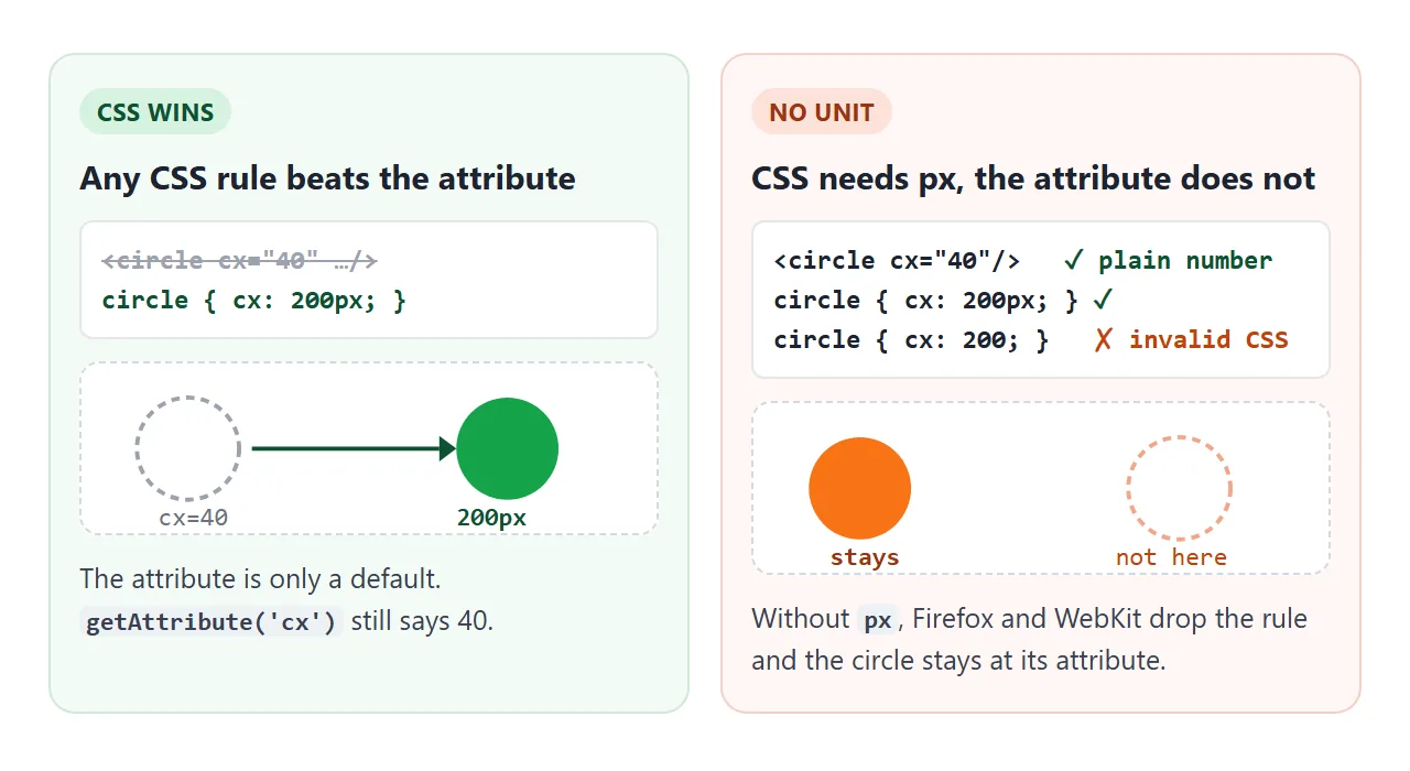
Two rules follow from this:
- Any CSS rule wins over the attribute. The attribute acts as a default with the lowest priority, so a plain class selector overrides it. An inline
styledoes too. - CSS needs a unit. Write
cx: 40px, notcx: 40. Onepxequals one user unit of theviewBox, so the circle lands where the attribute would have put it.
Without the unit the value is not valid CSS. In our test, Firefox and WebKit ignored the rule and the circle stayed at its attribute. Chromium accepted it. Always write the unit.
Animate cx and r with CSS
Because cx and r are CSS properties, a transition or a keyframe animation can move and grow a circle. The button below only toggles a class.
<!doctype html>
<html lang="en">
<head>
<meta charset="utf-8">
<meta name="viewport" content="width=device-width, initial-scale=1">
<title>Animate SVG circle cx and r with CSS</title>
<style>
  body { margin: 0; padding: 14px; font-family: system-ui, sans-serif; background: #f4f5f7; color: #1d2330; }
  svg { display: block; width: 100%; max-width: 460px; background: #fff; border: 1px solid #dde1e7; border-radius: 10px; }
  button { margin-top: 12px; font: 600 15px system-ui, sans-serif; padding: 9px 16px; border: 0; border-radius: 8px; background: #2563eb; color: #fff; cursor: pointer; }
  p { font-size: 14px; max-width: 460px; line-height: 1.5; }

  /* 1. cx is a CSS property: a class moves the ball, transition animates it */
  .ball { cx: 40px; fill: #2563eb; transition: cx .8s ease-in-out, fill .8s; }
  .moved .ball { cx: 260px; fill: #16a34a; }

  /* 2. r inside @keyframes: a pulsing ring */
  @keyframes pulse { from { r: 8px; opacity: 1; } to { r: 34px; opacity: 0; } }
  .ring { fill: none; stroke: #f59e0b; stroke-width: 3; animation: pulse 1.6s ease-out infinite; }

  /* 3. r with a transition on hover */
  .dot { r: 14px; fill: #db2777; transition: r .25s; cursor: pointer; }
  .dot:hover { r: 24px; }
</style>
</head>
<body>
<svg id="stage" viewBox="0 0 300 180" aria-label="Circles animated with CSS">
  <line x1="40" y1="55" x2="260" y2="55" stroke="#e5e7eb" stroke-width="2" />
  <circle class="ball" cy="55" r="22" />
  <circle class="ring" cx="80" cy="130" r="8" />
  <circle cx="80" cy="130" r="6" fill="#f59e0b" />
  <circle class="dot" cx="210" cy="130" r="14" />
</svg>
<button id="go" type="button">Move the ball</button>
<p>All three circles are animated by CSS. The button only toggles a class. Hover over the pink dot, or tap it on a phone.</p>

<script>
  const stage = document.getElementById('stage');
  document.getElementById('go').addEventListener('click', () => {
    stage.classList.toggle('moved');  // CSS does the rest
  });
</script>
</body>
</html>
.ball { cx: 40px; transition: cx .8s ease-in-out; }
.moved .ball { cx: 260px; }

@keyframes pulse {
  from { r: 8px; opacity: 1; }
  to   { r: 34px; opacity: 0; }
}
.ring { animation: pulse 1.6s ease-out infinite; }
The transition also runs when a script changes the attribute with setAttribute('cx', 200), since the attribute feeds the same property. In our test all three engines animated that change.
For timing functions and what else can be transitioned, see CSS transition and CSS keyframes.
Rounded corners on rect with rx and ry
<rect> uses the same rx and ry names for its corners. Each corner becomes a quarter of an ellipse with those radii.
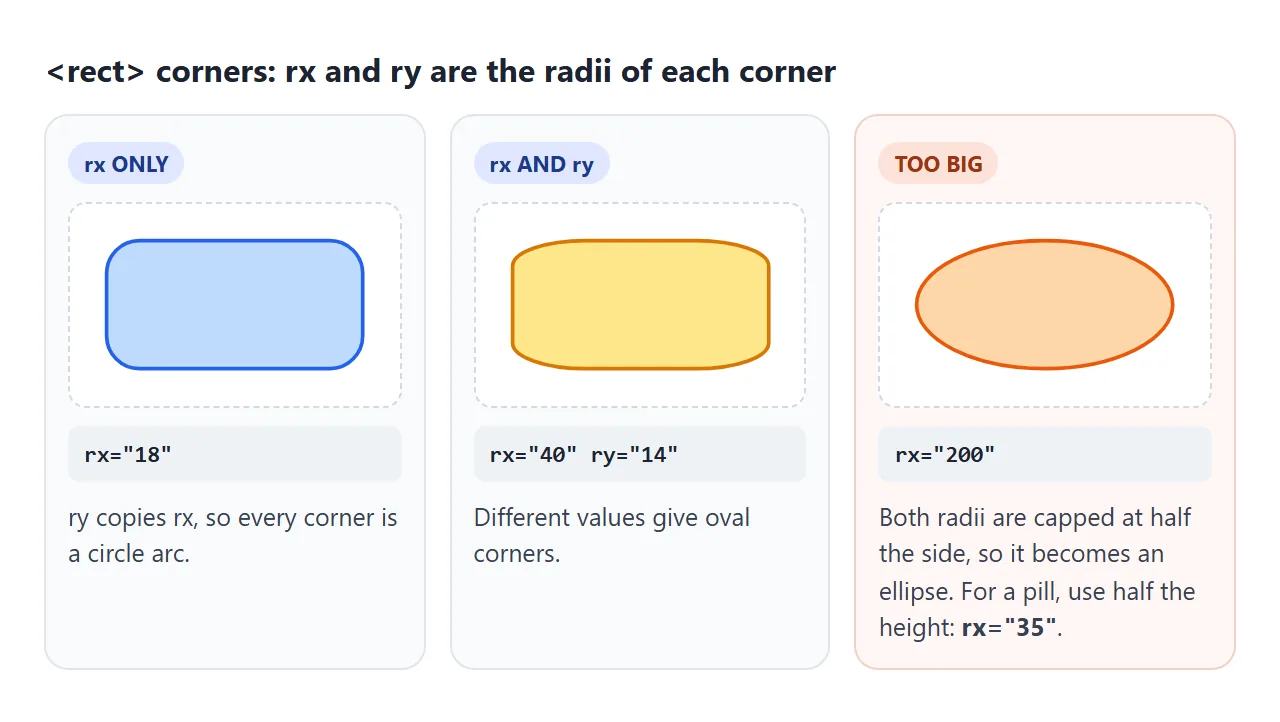
- Only
rx:rycopies it, so every corner is a circle arc. - Both: different values give flatter, oval corners.
- Too large:
rxis capped at half the width andryat half the height. Withrx="200"on a 140 × 70 rect, both caps apply and the result is an ellipse.
For a pill shape, set rx to half the height. On a rect 70 units tall, that is rx="35". Like the circle radius, rx and ry also work as CSS properties on a rect.
A draggable circle editor
The last example puts it together. Drag a circle to move it, drag the white handle to change its radius, and copy the markup from the box underneath.
<!doctype html>
<html lang="en">
<head>
<meta charset="utf-8">
<meta name="viewport" content="width=device-width, initial-scale=1">
<title>Draggable SVG circle editor</title>
<style>
  body { margin: 0; padding: 14px; font-family: system-ui, sans-serif; background: #f4f5f7; color: #1d2330; }
  svg {
    display: block; width: 100%; max-width: 480px; background: #fff;
    border: 1px solid #dde1e7; border-radius: 10px;
    touch-action: none;   /* a finger drags circles instead of scrolling the page */
    user-select: none;
  }
  .shape { cursor: grab; stroke: #1d2330; stroke-width: 0; }
  .shape.selected { stroke-width: 2; stroke-dasharray: 5 4; }
  .handle { fill: #fff; stroke: #1d2330; stroke-width: 2; cursor: ew-resize; }
  .bar { display: flex; gap: 8px; margin-top: 10px; }
  button { font: 600 14px system-ui, sans-serif; padding: 8px 14px; border: 0; border-radius: 8px; background: #2563eb; color: #fff; cursor: pointer; }
  button.ghost { background: #e5e7eb; color: #1d2330; }
  pre { max-width: 480px; margin: 10px 0 0; padding: 10px 12px; background: #1d2330; color: #e5e7eb; border-radius: 8px; font-size: 12.5px; white-space: pre-wrap; }
</style>
</head>
<body>
<svg id="svg" viewBox="0 0 320 200" aria-label="Circle editor">
  <circle class="shape" cx="90" cy="100" r="45" fill="#93c5fd" />
  <circle class="shape" cx="220" cy="80" r="30" fill="#fcd34d" />
  <circle id="handle" class="handle" r="7" />
</svg>
<div class="bar">
  <button id="add" type="button">Add circle</button>
  <button id="del" type="button" class="ghost">Delete selected</button>
</div>
<pre id="code"></pre>

<script>
  const svg = document.getElementById('svg');
  const handle = document.getElementById('handle');
  const code = document.getElementById('code');
  const colors = ['#93c5fd', '#fcd34d', '#86efac', '#f9a8d4', '#c4b5fd'];
  let selected = null, mode = null, dx = 0, dy = 0;

  // screen pixels -> SVG user units, at whatever size the SVG is shown
  function toSvg(e) {
    return new DOMPoint(e.clientX, e.clientY).matrixTransform(svg.getScreenCTM().inverse());
  }
  const num = (el, name) => Number(el.getAttribute(name));

  function render() {
    svg.querySelectorAll('.shape').forEach((c) => c.classList.toggle('selected', c === selected));
    handle.style.display = selected ? '' : 'none';
    if (selected) {
      // the handle sits on the right edge: cx + r
      handle.setAttribute('cx', num(selected, 'cx') + num(selected, 'r'));
      handle.setAttribute('cy', num(selected, 'cy'));
      svg.appendChild(handle);  // keep the handle on top
    }
    code.textContent = [...svg.querySelectorAll('.shape')]
      .map((c) => `<circle cx="${num(c, 'cx')}" cy="${num(c, 'cy')}" r="${num(c, 'r')}" fill="${c.getAttribute('fill')}"/>`)
      .join('\n');
  }

  svg.addEventListener('pointerdown', (e) => {
    const p = toSvg(e);
    if (e.target === handle) {
      mode = 'resize';
    } else if (e.target.classList.contains('shape')) {
      selected = e.target;
      mode = 'move';
      dx = p.x - num(selected, 'cx');  // grab point, so the circle does not jump
      dy = p.y - num(selected, 'cy');
    } else {
      selected = null; mode = null; render(); return;
    }
    svg.setPointerCapture(e.pointerId);
    render();
  });

  svg.addEventListener('pointermove', (e) => {
    if (!mode || !svg.hasPointerCapture(e.pointerId)) return;
    const p = toSvg(e);
    if (mode === 'move') {
      selected.setAttribute('cx', Math.round(p.x - dx));
      selected.setAttribute('cy', Math.round(p.y - dy));
    } else {
      // new radius = distance from the centre to the pointer
      const r = Math.hypot(p.x - num(selected, 'cx'), p.y - num(selected, 'cy'));
      selected.setAttribute('r', Math.max(4, Math.round(r)));
    }
    render();
  });

  svg.addEventListener('lostpointercapture', () => { mode = null; });

  document.getElementById('add').addEventListener('click', () => {
    const c = document.createElementNS('http://www.w3.org/2000/svg', 'circle');
    const n = svg.querySelectorAll('.shape').length;
    c.setAttribute('class', 'shape');
    c.setAttribute('cx', 60 + (n * 47) % 200);
    c.setAttribute('cy', 60 + (n * 31) % 80);
    c.setAttribute('r', 25);
    c.setAttribute('fill', colors[n % colors.length]);
    svg.insertBefore(c, handle);
    selected = c;
    render();
  });

  document.getElementById('del').addEventListener('click', () => {
    if (selected) { selected.remove(); selected = null; render(); }
  });

  selected = svg.querySelector('.shape');
  render();
</script>
</body>
</html>
The key step is turning a pointer position in screen pixels into SVG units. The SVG may be shown at any width, so pixels and user units rarely match. getScreenCTM() returns the matrix from SVG units to the screen, and its inverse goes back:
function toSvg(e) {
  const m = svg.getScreenCTM().inverse();
  return new DOMPoint(e.clientX, e.clientY).matrixTransform(m);
}
The rest follows the pattern from the draggable div:
- On
pointerdown, store the grab point: the pointer minus the circle's centre. Then callsetPointerCapture. - On
pointermove, setcxandcyto the pointer minus the grab point. - For the radius handle, set
rto the distance from the centre to the pointer, usingMath.hypot. - Put
touch-action: noneon the SVG so a finger drags instead of scrolling.
When it does not work
| What you see | Cause | Fix |
|---|---|---|
| Nothing appears | r is missing or 0 |
Give the circle a radius above 0 |
| Only half the circle shows | The centre is on the edge | Move cx or cy in by at least r |
| The CSS rule does nothing | cx: 40 has no unit |
Write cx: 40px |
| The attribute change is ignored | A CSS rule sets the same property | Remove the rule, or change the CSS instead |
getAttribute shows an old number |
CSS overrides but does not rewrite it | Read getComputedStyle(el).cx |
| A new circle from JS never shows | It was made with createElement |
Use createElementNS, shown below |
| The dragged circle drifts from the finger | Screen pixels used as SVG units | Convert with getScreenCTM().inverse() |
| An ellipse comes out round | Only one of rx, ry is set |
Set both |
A circle made by script must be in the SVG namespace, or the browser treats it as an unknown HTML element and draws nothing:
const NS = 'http://www.w3.org/2000/svg';
const c = document.createElementNS(NS, 'circle');
Share it as a link
An editor like this one is meant to be touched. A screenshot cannot be dragged, and an .html file sent as an attachment may open as plain code on a phone.
To send the working version, paste the page into a NOS document and choose Create share link. HTML to link walks through it.
The page renders as written and its scripts run, so the people you send it to can drag and resize the circles themselves. If you change the code later, the same link shows the new version.