SVG text is a <text> element with an x and a y. By default the text starts at x and its baseline sits on y, so a label placed at the centre of a circle ends up right of and above it.
Add text-anchor="middle" and dominant-baseline="central" and the centre of the text lands on the point.
Try it. The red dot is (x, y). Switch the two attributes and watch which part of the word moves onto the dot.
<!doctype html>
<html lang="en">
<head>
<meta charset="utf-8">
<meta name="viewport" content="width=device-width, initial-scale=1">
<title>SVG text: x, y, text-anchor, dominant-baseline</title>
<style>
  body { margin: 0; padding: 14px; font-family: system-ui, sans-serif; background: #f4f5f7; color: #1d2330; }
  svg { display: block; width: 100%; max-width: 420px; background: #fff; border-radius: 10px; }
  .row { display: flex; flex-wrap: wrap; gap: 6px; align-items: center; margin-top: 10px; font-size: 14px; }
  .row b { width: 140px; }
  button { font: inherit; padding: 5px 10px; border: 1px solid #c9ced8; border-radius: 7px; background: #fff; cursor: pointer; }
  button.on { background: #1d4ed8; border-color: #1d4ed8; color: #fff; }
  code { display: block; margin-top: 10px; font: 13px ui-monospace, Consolas, monospace; background: #fff; padding: 8px 10px; border-radius: 8px; overflow-x: auto; }
</style>
</head>
<body>
<svg viewBox="0 0 320 140" role="img" aria-label="The word Label placed at x 160, y 70">
  <!-- guide lines through the point (160, 70) -->
  <line x1="160" y1="0" x2="160" y2="140" stroke="#cbd5e1" />
  <line x1="0" y1="70" x2="320" y2="70" stroke="#cbd5e1" />
  <text id="label" x="160" y="70" font-size="36" fill="#1d2330">Label</text>
  <circle cx="160" cy="70" r="4" fill="#dc2626" />
</svg>

<div class="row" data-attr="text-anchor"><b>text-anchor</b>
  <button class="on">start</button><button>middle</button><button>end</button>
</div>
<div class="row" data-attr="dominant-baseline"><b>dominant-baseline</b>
  <button class="on">auto</button><button>middle</button><button>central</button><button>hanging</button>
</div>
<code id="out"></code>

<script>
  const label = document.getElementById('label');
  const out = document.getElementById('out');

  function show() {
    const a = label.getAttribute('text-anchor') || 'start';
    const b = label.getAttribute('dominant-baseline') || 'auto';
    out.textContent = `<text x="160" y="70" text-anchor="${a}" dominant-baseline="${b}">`;
  }

  document.querySelectorAll('.row').forEach((row) => {
    row.addEventListener('click', (e) => {
      if (e.target.tagName !== 'BUTTON') return;
      row.querySelectorAll('button').forEach((b) => b.classList.remove('on'));
      e.target.classList.add('on');
      // the red dot is (x, y); watch which part of the word lands on it
      label.setAttribute(row.dataset.attr, e.target.textContent);
      show();
    });
  });
  show();
</script>
</body>
</html>
This guide covers text only. For the <svg> element, shapes and paint, see the SVG tag in HTML. For arrowheads on lines, see SVG markers.
x, y and the two anchor attributes
text-anchor decides which end of the text sits on x: start (the default), middle or end. Use end for numbers on a right-aligned axis and middle for labels under bars.
dominant-baseline decides which horizontal line of the text sits on y. The default, auto, is the alphabetic baseline for horizontal text, so letters sit on y and descenders such as g hang below it.
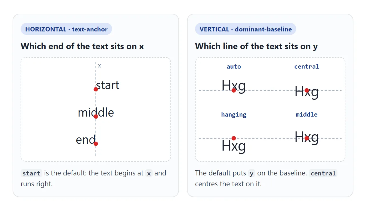
| Value | What lands on y | Use it for |
|---|---|---|
auto |
The baseline | Text on a line, axis labels |
central |
The centre of the em box | Numbers inside circles and buttons |
middle |
Half the x-height above the baseline | Lowercase labels |
hanging |
The hanging baseline, near the top | Text hung below a line |
Centring text vertically
For a number in the middle of a ring or a button, use central. middle is measured from lowercase letters, so capitals and digits sit a little high with it.
<circle cx="100" cy="100" r="70" />
<text x="100" y="100" text-anchor="middle"
      dominant-baseline="central">64%</text>
Older code often uses dy="0.35em" instead. It moves the baseline down by a fixed share of the font size, so the right value changes with the font. dominant-baseline states the intent directly.
Several lines with tspan
A <text> element is always drawn as one line. It never wraps, and the line breaks in your source code become single spaces. For more than one line, split the text into <tspan> elements.
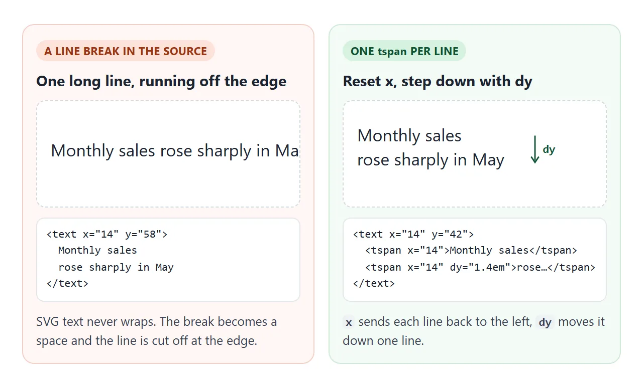
<text x="20" y="40">
  <tspan x="20">Monthly sales</tspan>
  <tspan x="20" dy="1.2em">rose in May</tspan>
</text>
xon a tspan sends the line back to the left edge.dymoves it down relative to the line above. Inem, the spacing follows the font size.- A tspan without
xordycontinues the same line. Use that to make one word bold or a different colour.
You choose where lines break. If the words come from data, split them in your script. For real paragraph wrapping, an HTML block inside <foreignObject> wraps like any other HTML.
Text on a curve with textPath
<textPath> lays the text along a path. Give the path an id, then point href at it from inside a <text> element. The path can be invisible: fill="none" with no stroke, or inside <defs>.
<path id="arc" d="M 30 120 Q 160 10 290 120" fill="none" />
<text text-anchor="middle">
  <textPath href="#arc" startOffset="50%">Text on a curve</textPath>
</text>
<!doctype html>
<html lang="en">
<head>
<meta charset="utf-8">
<meta name="viewport" content="width=device-width, initial-scale=1">
<title>SVG text on a path, and tspan lines</title>
<style>
  body { margin: 0; padding: 14px; font-family: system-ui, sans-serif; background: #f4f5f7; color: #1d2330; }
  svg { display: block; width: 100%; max-width: 420px; background: #fff; border-radius: 10px; }
  label { display: flex; align-items: center; gap: 8px; margin-top: 10px; font-size: 14px; }
  input[type=range] { flex: 1; max-width: 240px; }
  .hint { font-size: 13px; color: #555; margin: 6px 0 0; }
</style>
</head>
<body>
<svg viewBox="0 0 320 210">
  <!-- the curve the text follows; it is drawn here only so you can see it -->
  <path id="arc" d="M 30 120 Q 160 10 290 120" fill="none" stroke="#cbd5e1" stroke-width="2" />
  <text font-size="18" fill="#1d4ed8" text-anchor="middle">
    <textPath id="tp" href="#arc" startOffset="50%">Text that follows a curve</textPath>
  </text>

  <!-- x + dy on a tspan starts a new line; a tspan without them carries on -->
  <text x="160" y="160" font-size="15" text-anchor="middle" fill="#1d2330">
    <tspan x="160" font-weight="700">Line one is bold</tspan>
    <tspan x="160" dy="1.3em">then line two</tspan>
    <tspan fill="#c2410c">keeps going</tspan>
  </text>
</svg>

<label>startOffset <input id="off" type="range" min="0" max="100" value="50"> <span id="val">50%</span></label>
<label><input id="show" type="checkbox" checked> show the path</label>
<p class="hint">Push the slider to either end: letters that fall off the path are not drawn.</p>

<script>
  const tp = document.getElementById('tp');
  const arc = document.getElementById('arc');
  const off = document.getElementById('off');

  off.addEventListener('input', () => {
    tp.setAttribute('startOffset', off.value + '%');  // % of the path length
    document.getElementById('val').textContent = off.value + '%';
  });

  document.getElementById('show').addEventListener('change', (e) => {
    arc.setAttribute('stroke', e.target.checked ? '#cbd5e1' : 'none');
  });
</script>
</body>
</html>
startOffset is the point along the path where the text is anchored. A percentage is a share of the path length, so 50% with text-anchor="middle" centres the words on the curve. Letters that fall past the end of the path are not drawn.
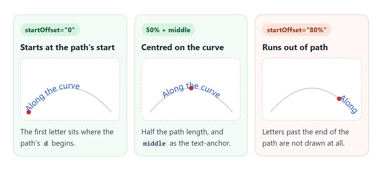
The text follows the direction the path was drawn in. If the words come out upside down, draw the path the other way round.
For an arc, swap the start and end points and flip the sweep flag. Older SVG code writes xlink:href in place of href.
Text that scales with the drawing
Inside an SVG, font-size="16" means 16 units of the viewBox, not 16 screen pixels.
When the SVG is drawn at twice its viewBox width, the text is twice as large, and it stays in the same place relative to the shapes. Scaling an SVG to fit explains the viewBox side.
That is what keeps labels lined up with bars and rings at any size.
The cost is on small screens: a drawing shrunk to a third of its width shrinks its text to a third as well. Check the smallest width you support, and raise the font-size in the viewBox if the labels get too small to read.
Accessibility: keep it real text
Text in a <text> element is real text. It can be selected and copied, and assistive technology can read it. Design tools that export text "as outlines" turn the letters into paths, and that text is gone.
For a chart or a gauge, give the whole drawing one name:
<svg viewBox="0 0 200 200" role="img" aria-labelledby="t">
  <title id="t">Storage used: 64%</title>
  ...
</svg>
With role="img", the SVG is announced as one image and its name comes from the title, not from the text elements inside. Put the actual values in the title and update it when they change. aria-label covers the naming attributes in more detail.
A finished example: a gauge
The gauge below uses each part of this guide: the number is centred with text-anchor and dominant-baseline, a smaller tspan adds the % sign, the caption runs along an arc with textPath, and the title changes with the value.
<!doctype html>
<html lang="en">
<head>
<meta charset="utf-8">
<meta name="viewport" content="width=device-width, initial-scale=1">
<title>SVG gauge with centred text</title>
<style>
  body { margin: 0; padding: 14px; font-family: system-ui, sans-serif; background: #f4f5f7; color: #1d2330; }
  .box { width: 100%; max-width: 300px; background: #fff; border-radius: 12px; padding: 8px; box-sizing: border-box; min-width: 140px; }
  svg { display: block; width: 100%; height: auto; }
  svg text { font-family: system-ui, sans-serif; }
  label { display: flex; align-items: center; gap: 8px; margin-top: 12px; font-size: 14px; }
  input { flex: 1; max-width: 220px; }
  .hint { font-size: 13px; color: #555; margin: 6px 0 0; }
</style>
</head>
<body>
<div class="box">
  <svg viewBox="0 0 200 200" role="img" aria-labelledby="gauge-title">
    <title id="gauge-title">Storage used: 64%</title>
    <!-- invisible circle for the label to follow, drawn clockwise from the left -->
    <path id="ring" d="M 15 100 A 85 85 0 0 1 185 100" fill="none" />
    <circle cx="100" cy="100" r="70" fill="none" stroke="#e5e7eb" stroke-width="16" />
    <circle id="bar" cx="100" cy="100" r="70" fill="none" stroke="#16a34a" stroke-width="16"
            stroke-linecap="round" stroke-dasharray="281.5 440"
            transform="rotate(-90 100 100)" />
    <!-- centred on (100, 100) both ways -->
    <text x="100" y="100" text-anchor="middle" dominant-baseline="central" font-size="44" font-weight="700" fill="#1d2330">
      <tspan id="num">64</tspan><tspan font-size="22" fill="#6b7280">%</tspan>
    </text>
    <text font-size="13" fill="#6b7280" letter-spacing="2">
      <textPath href="#ring" startOffset="50%" text-anchor="middle">STORAGE USED</textPath>
    </text>
  </svg>
</div>

<label>Value <input id="v" type="range" min="0" max="100" value="64"></label>
<label>Width <input id="w" type="range" min="140" max="300" value="300"></label>
<p class="hint">Change the width: the numbers and the curved label scale with the drawing.</p>

<script>
  const v = document.getElementById('v');
  v.addEventListener('input', () => {
    const n = v.value;
    document.getElementById('num').textContent = n;
    // ring length is 2 * PI * 70 = 439.8, so value% of it is drawn
    document.getElementById('bar').setAttribute('stroke-dasharray', (n * 4.398).toFixed(1) + ' 440');
    // screen readers read the title, not the text inside role="img"
    document.getElementById('gauge-title').textContent = 'Storage used: ' + n + '%';
  });

  const w = document.getElementById('w');
  w.addEventListener('input', () => {
    document.querySelector('.box').style.maxWidth = w.value + 'px';
  });
</script>
</body>
</html>
The ring is a circle with a radius of 70, so its outline is 2 × π × 70 ≈ 440 units long. Setting stroke-dasharray to the value's share of 440 draws that much of the ring.
The caption follows an invisible arc that sits just outside the ring.
When it does not work
| What you see | Cause | Fix |
|---|---|---|
| The label sits above the point | y is the baseline |
dominant-baseline="central" |
| The label starts at the centre instead of around it | text-anchor is start |
text-anchor="middle" |
| A long label is cut off at the edge | SVG text does not wrap | Split it into tspans |
| Line breaks in the source show as spaces | Whitespace collapses to one space | One tspan per line, with x and dy |
CSS color does nothing |
Text is painted with fill |
Set fill, or fill="currentColor" |
| Curved text is upside down | The path runs the other way | Reverse the path's direction |
| Part of the curved text is missing | It runs past the end of the path | Lower startOffset or lengthen the path |
| Text is tiny on a phone | Font size is in viewBox units | Raise font-size in the viewBox |
Share it as a link
Charts and gauges built from SVG text are easier to judge live than in a screenshot, which loses the selectable text and every state that changes. An .html attachment may open as plain code on a phone.
To send the working version, paste the page into a NOS document and choose Create share link. HTML to link walks through it.
The page renders as written and its scripts run, so the people you send it to can move the sliders themselves. If you change the code later, the same link shows the new version.