You can build HTML tabs without JavaScript using radio inputs and CSS sibling selectors, and the result works with scripting turned off entirely.
Three techniques exist. The radio one is the default choice, :target puts the state in the URL, and :has() produces the cleanest markup.
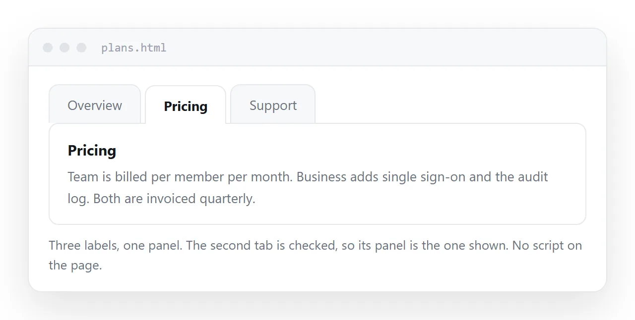
Three ways to build HTML tabs without JavaScript
| Method | State in the URL | Keyboard | Markup cost |
|---|---|---|---|
| Radio inputs | No | Arrow keys move tabs | Hidden inputs before the panels |
:target links |
Yes, as a fragment | Tab and Enter | Ids on every panel |
:has() |
Depends on the trigger | Same as the trigger | Lowest |
If the choice needs to be linkable, use :target. Otherwise use radios.
The radio method
One name shared by every input makes the group exclusive, which is the behaviour tabs want.
<div class="tabs">
  <input type="radio" name="t" id="t1" checked>
  <label for="t1">Overview</label>

  <input type="radio" name="t" id="t2">
  <label for="t2">Pricing</label>

  <input type="radio" name="t" id="t3">
  <label for="t3">Support</label>

  <div class="panel" data-for="t1">Overview content.</div>
  <div class="panel" data-for="t2">Pricing content.</div>
  <div class="panel" data-for="t3">Support content.</div>
</div>
The inputs come before the panels because the general sibling combinator only looks forwards.
.tabs { display: flex; flex-wrap: wrap; }
.tabs input { position: absolute; opacity: 0; width: 1px; height: 1px; }
.tabs label { padding: 8px 16px; cursor: pointer; border-bottom: 2px solid transparent; }
.tabs input:checked + label { border-bottom-color: #2563eb; font-weight: 600; }
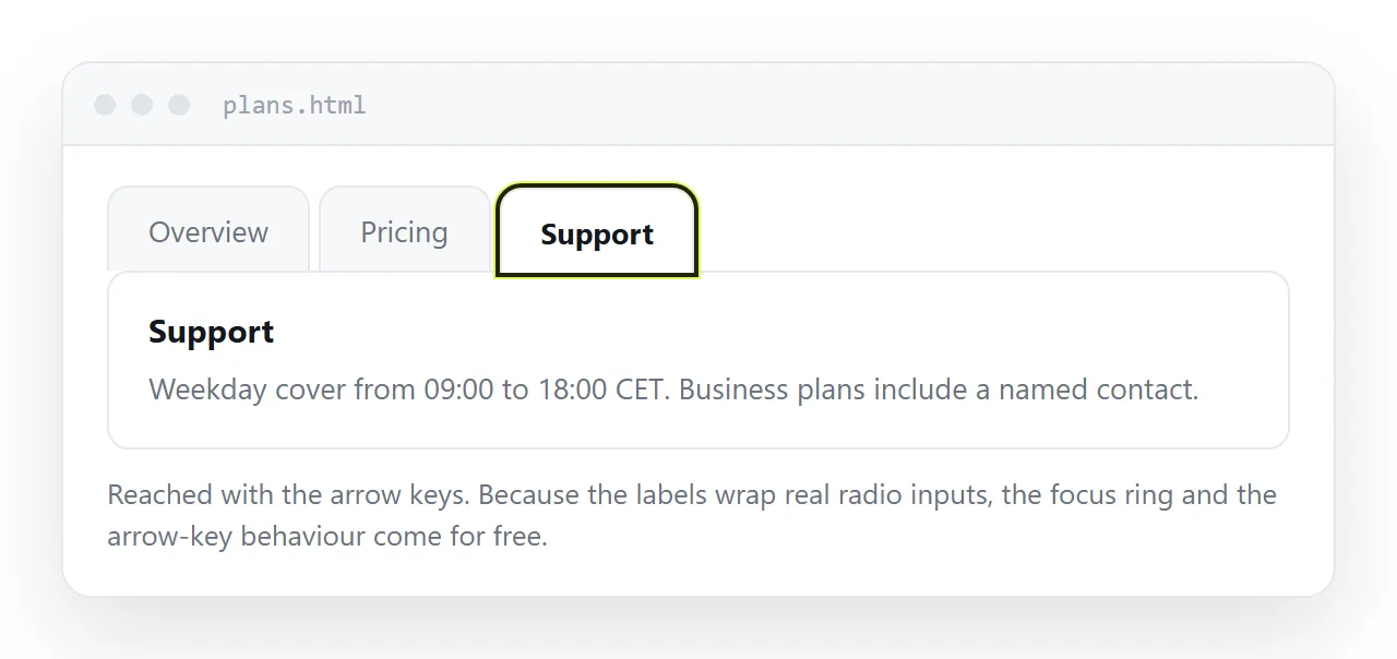
.tabs input:focus-visible + label { outline: 2px solid #2563eb; outline-offset: 2px; }
.panel { display: none; width: 100%; order: 99; }

#t1:checked ~ [data-for="t1"],
#t2:checked ~ [data-for="t2"],
#t3:checked ~ [data-for="t3"] { display: block; }
Two details carry weight. The inputs are positioned off-screen rather than set to display: none, because a hidden input cannot receive focus, and that would remove keyboard access.
order: 99 pushes the panels below the label row inside the flex container, so the tab strip stays on one line.
The :target method
Each tab is an ordinary link to an id in the same document.
<nav class="tabnav">
  <a href="#overview">Overview</a>
  <a href="#pricing">Pricing</a>
</nav>

<section id="overview" class="panel">Overview content.</section>
<section id="pricing" class="panel">Pricing content.</section>
.panel { display: none; }
.panel:target { display: block; }
.panel:first-of-type { display: block; }      /* default */
.panel:first-of-type:not(:target) { display: block; }
The state ends up in the address, so a colleague can be sent straight to the pricing tab. That is the one thing the radio method cannot do.
The cost is that the browser scrolls to the targeted element, which on a long page moves the view. Nothing in CSS stops that, so keep the tabs near the top.
The :has() method. Modern selectors let a parent respond to a child's state, which removes the need to order the markup around the combinator.
.tabs:has(#t2:checked) [data-for="t2"] { display: block; }
Same behaviour, and panels no longer have to be siblings placed after the inputs. Check your support baseline before relying on it, and keep the sibling version as the fallback if the page has to work in older browsers.
Making the strip work on a narrow screen
A tab strip is the layout most likely to break on a phone, because the labels have a fixed width and the screen does not.
Three workable responses, in order of how well they hold up:
- Wrap the labels. Let the flex container wrap and accept two rows of tabs. Plain, predictable, and nothing is hidden.
- Scroll the strip horizontally. Set
overflow-x: autoon the label row and addscroll-snap-type: x mandatory. Keep a visible edge fade so it is obvious there is more. - Collapse to an accordion below a breakpoint. The cleanest result and the most work, because the markup has to suit both forms.
@media (max-width: 40rem) {
  .tabs { flex-wrap: nowrap; overflow-x: auto; }
  .tabs label { white-space: nowrap; }
}
The one to avoid is shrinking the text until the labels fit. Four tabs at nine pixels is a strip nobody can use, and it looks like an accident rather than a decision.
What you give up on accessibility
Be straightforward about this rather than claiming the pattern is complete.
- Radio tabs are operable. They are in the tab order, arrow keys move the selection, and that is roughly the expected behaviour for a tab strip.
- The ARIA tab pattern is not achievable.
role="tab",aria-selectedandaria-controlsneed to change as the selection changes, and CSS cannot change attributes. :targettabs announce as links, because that is what they are. A screen reader user hears a set of links, not a tab group.- Hidden panels are hidden from everyone.
display: noneremoves them from the accessibility tree, which is correct here.
For an internal page, a report, or a set of product notes, the radio version is honest and usable. For a product interface where people expect standard tab semantics, script the real pattern.
Applying role="list" habits from unmarked lists and the rest of semantic markup still helps around the edges.
A default panel that always shows. The radio version needs one input marked checked, or the page loads with an empty space where the content should be.
The :target version has the opposite problem. Nothing is targeted on first load, so every panel is hidden until the reader clicks something.
.panel:first-of-type { display: block; }
.panel:first-of-type:target ~ .panel { display: none; }
Rules like that get fragile quickly. The practical alternative is to link to the first tab from wherever the page is referenced, so the fragment is present from the start.
Either way, decide what the page looks like with no interaction at all. That is the state search engines index, and the state a reader sees for the first second.
A blank rectangle there reads as a broken page rather than as a waiting one.
Checking it outside your folder
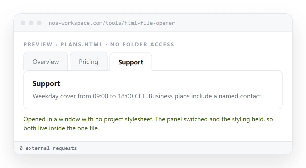
Open the file in the HTML file opener and click through every tab. If the panels all show at once, the CSS is in a separate file that did not travel, so move it into a <style> block.
Then press Tab from the address bar and use the arrow keys. If focus never reaches the strip, the inputs are hidden with display: none rather than positioned off-screen.
Sending the page to a reader
An .html file with tabs in it is still an .html file, so it gets filtered, opens in a code editor, or stalls on a phone.
Paste the HTML into a NOS document. It renders as written, tabs and CSS included, at its own address. Share, then Share link, then Create link, and send the link.
The panels stay interactive for the reader, which a PDF or a screenshot cannot manage. An accordion without JavaScript is the better structure if the sections are long rather than parallel.