A poetry link is a poem published at an address with its line breaks and spacing intact, so it reads on a phone the way it was written.
The line is the unit of poetry. A format that rewraps lines is not a format for poems.
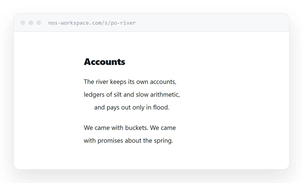
This guide covers marking lines so the browser cannot rewrap them, handling long lines on narrow screens, one poem per page, and what posting does to submissions.
Why phones damage poems
A browser fills the available width and breaks at the edge. For prose that is correct behaviour. For a poem it is destruction.
A reader on a phone sees a break after "the" and cannot know whether the poet put it there. Across a whole poem, the shape is gone.
<div class="poem">
  <p class="stanza">
    <span class="l">The river keeps its own accounts,</span>
    <span class="l">ledgers of silt and slow arithmetic,</span>
    <span class="l i1">and pays out only in flood.</span>
  </p>
</div>
Each line is its own element, so the break is explicit. The indent class carries any intentional indentation, rather than relying on spaces that collapse.
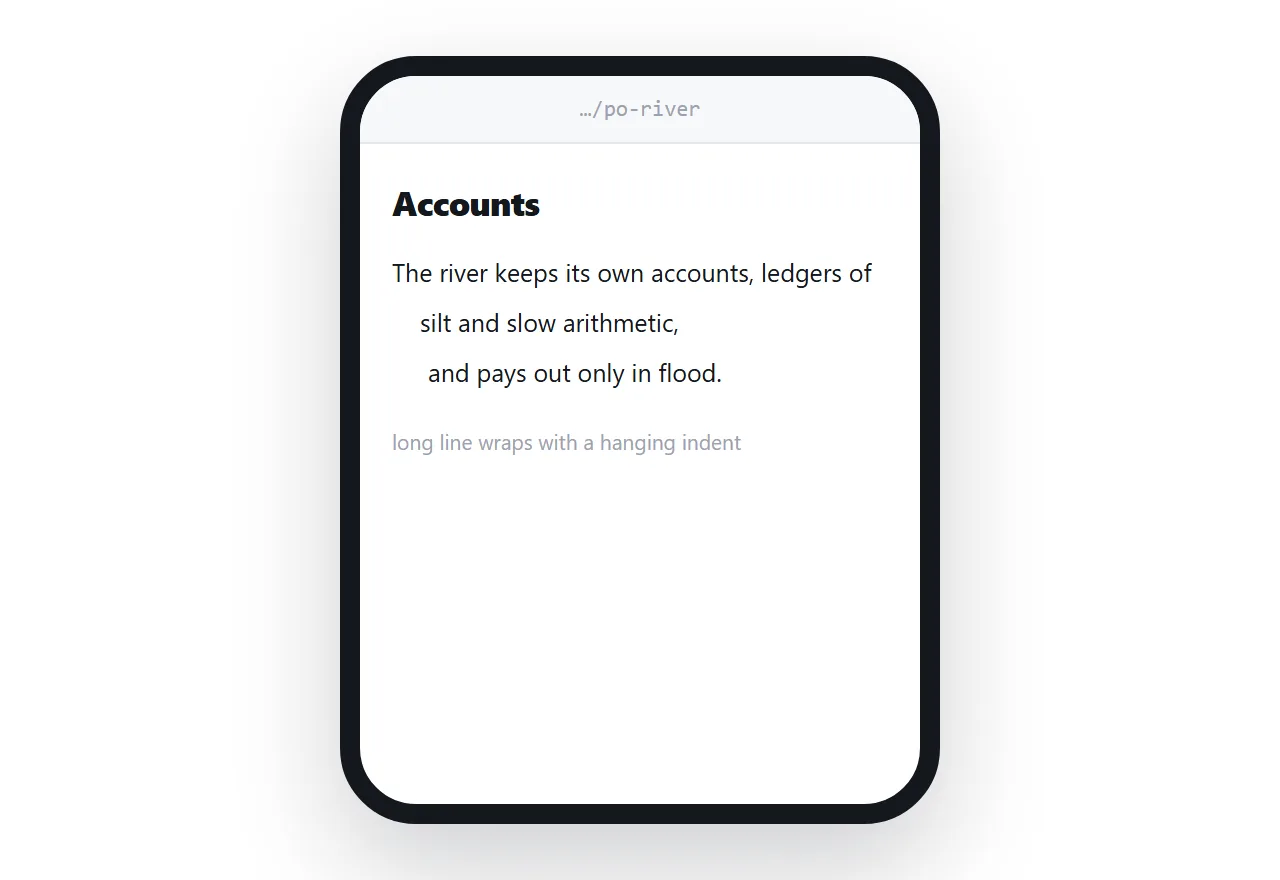
.poem .l { display: block; text-indent: -1.4em; padding-left: 1.4em; }
.poem .l.i1 { margin-left: 1.6em; }
.poem .stanza { margin-bottom: 1.6em; }
The negative indent with matching padding is the important part. A line too long for the screen wraps with a hanging indent, so a wrapped continuation looks continued rather than looking like a new line. That single rule preserves the poem's shape on any width.
When whitespace itself is the poem
For concrete poetry, or anything where the spatial arrangement carries meaning, preserve whitespace directly.
.poem.spatial { white-space: pre-wrap; font-family: inherit; }
This keeps every space and break as typed. The trade-off is that very wide arrangements will still overflow a narrow screen, so it suits work that fits a modest width or where horizontal scrolling is acceptable.
One poem per page
The instinct is to put a collection on one long page. Resist it.
Poems are sent individually, shared individually, and remembered individually. A reader who was told about one poem should open that poem, not arrive at the top of a sequence and scroll.
Keep a contents page linking each poem, with first lines rather than only titles. Readers often remember the first line and not the title.
Rights, before you post anything
Poetry journals are, if anything, stricter than fiction markets about prior publication.
Most want first publication rights and count a public page as publication. Many count social media posts too. Some explicitly ask whether a poem has appeared anywhere, including personal sites and workshops.
If you intend to submit, use an address nobody can guess and keep it out of search engines. If a poem has already been published, check whether rights have reverted before posting it, and credit the original publication when you do.
Typography that stays out of the way
Poetry benefits from restraint more than any other form.
One serif face, set at a comfortable size, in a column narrower than you would use for prose because the lines are shorter. Plenty of space above and below, and nothing else on the page.
Avoid centring the whole poem unless the poem asks for it. Centred text makes the left edge ragged, and in poetry the left edge is doing structural work.
If you are using a web font, make sure it loads without a flash of fallback that reflows the lines. Guidance in web fonts.
Printing
A print version should hold the same line structure.
@media print {
  nav { display: none; }
  @page { size: A5; margin: 20mm; }
  .poem .stanza { break-inside: avoid; }
}
Keeping a stanza whole across a page break matters. More in export HTML to PDF.
Put it at an address
Mark the lines explicitly, let long lines hang, write the poem as a page, and create a share link.
The poem arrives with its shape, on whatever screen opens it.