Web components here means the browser standard for making your own HTML tags, not the parts of a website in general. Custom elements define the tag, Shadow DOM gives it private markup and styles, and templates can hold its markup.
No framework or build step is needed. One HTML file with a class, customElements.define() and the new tag in the markup is a working component. Try it below.
<!doctype html>
<html lang="en">
<head>
<meta charset="utf-8">
<meta name="viewport" content="width=device-width, initial-scale=1">
<title>A web component in one HTML file</title>
<style>
  body { margin: 0; padding: 18px; font-family: system-ui, sans-serif; background: #f4f5f7; color: #1d2330; }
  /* Page CSS: this turns the page's own button orange,
     but it does not reach the buttons inside each counter. */
  button { background: #f97316; color: #fff; border: 0; border-radius: 8px; padding: 9px 14px; font: inherit; cursor: pointer; }
  #list { display: grid; gap: 10px; margin-bottom: 14px; }
</style>
</head>
<body>
<div id="list">
  <click-counter label="Coffees"></click-counter>
  <click-counter label="Glasses of water" start="2"></click-counter>
</div>
<button id="add">Add another counter</button>

<script>
  class ClickCounter extends HTMLElement {
    constructor() {
      super();                              // always first
      this.attachShadow({ mode: 'open' });  // a private DOM tree with its own CSS
    }

    // Runs when the element is put on the page: read attributes here
    connectedCallback() {
      if (this.shadowRoot.childElementCount) return;  // already built
      let count = Number(this.getAttribute('start')) || 0;

      this.shadowRoot.innerHTML = `
        <style>
          :host { display: flex; align-items: center; gap: 12px;
                  background: #fff; padding: 10px 14px; border-radius: 10px;
                  box-shadow: 0 2px 8px rgba(0,0,0,.08); }
          span { flex: 1; }
          button { background: #e8f0fe; color: #1a56db; border: 0; border-radius: 8px;
                   padding: 8px 14px; font: inherit; font-weight: 600; cursor: pointer; }
          b { min-width: 2ch; text-align: right; font-size: 1.2em; }
        </style>
        <span></span><button>+1</button><b></b>`;

      const out = this.shadowRoot.querySelector('b');
      this.shadowRoot.querySelector('span').textContent = this.getAttribute('label') || 'Clicks';
      out.textContent = count;
      this.shadowRoot.querySelector('button').addEventListener('click', () => {
        out.textContent = ++count;
      });
    }
  }

  // The name must contain a hyphen
  customElements.define('click-counter', ClickCounter);

  // Elements added later work too
  let n = 0;
  document.getElementById('add').addEventListener('click', () => {
    const c = document.createElement('click-counter');
    c.setAttribute('label', 'New counter ' + (++n));
    document.getElementById('list').append(c);
  });
</script>
</body>
</html>
The page CSS turns every button orange, yet the +1 buttons stay blue. Those buttons live in each counter's shadow root, where page selectors do not reach.
MDN describes web components as three technologies used together. You only need the first one to get a working tag. The second is what makes it self-contained.
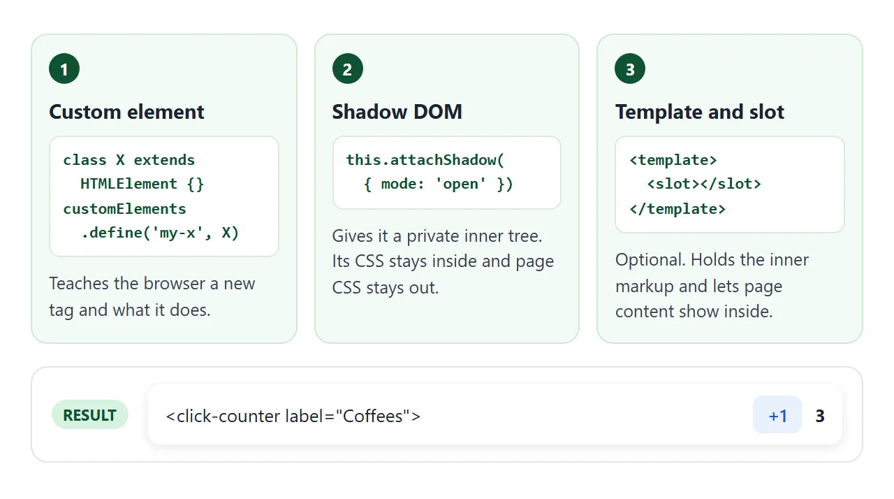
- Custom element. A class that
extends HTMLElement, registered under a tag name withcustomElements.define(). - Shadow DOM.
this.attachShadow({ mode: 'open' })attaches a private tree. Its styles do not leak out, and page styles do not leak in. - Template and slot. Optional. A
<template>holds markup to clone, and a<slot>shows the page's children inside the component. The HTML template tag covers both in detail.
The smallest working example, line by line
This is the core of the counter above, with the styles left out:
<click-counter label="Coffees"></click-counter>

<script>
  class ClickCounter extends HTMLElement {
    constructor() {
      super();
      this.attachShadow({ mode: 'open' });
    }
    connectedCallback() {
      if (this.shadowRoot.childElementCount) return;
      let count = 0;
      this.shadowRoot.innerHTML = '<span></span> <button>+1</button> <b>0</b>';
      this.shadowRoot.querySelector('span').textContent = this.getAttribute('label');
      const out = this.shadowRoot.querySelector('b');
      this.shadowRoot.querySelector('button')
        .addEventListener('click', () => { out.textContent = ++count; });
    }
  }
  customElements.define('click-counter', ClickCounter);
</script>
super()comes first in the constructor, before you touchthis.connectedCallbackruns each time the element is added to the page. The HTML standard recommends doing setup here, not in the constructor, so this is where attributes are read.- The guard line stops a second build when the element is moved, because moving it fires
connectedCallbackagain. textContentputs the label in as plain text. Building it into theinnerHTMLstring would parse any markup in it. See innerHTML.
The script can sit at the end of the body. Elements already on the page are upgraded when define() runs, and elements created later work too.
Lifecycle callbacks: when your code runs
A custom element class can have a few methods with fixed names. The browser calls them at set moments.
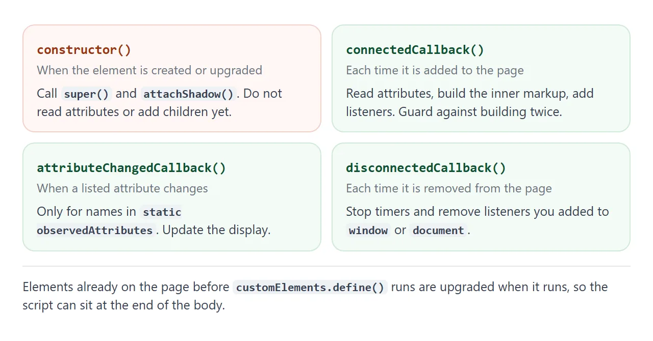
| Callback | When it runs | Use it to |
|---|---|---|
constructor() |
The element is created or upgraded | Call super(), attach the shadow root |
connectedCallback() |
Each time it is added to the page | Read attributes, build markup, add listeners |
disconnectedCallback() |
Each time it is removed | Stop timers, remove outside listeners |
attributeChangedCallback() |
A listed attribute changes | Update the display |
adoptedCallback() |
It moves to another document | Rarely needed |
attributeChangedCallback only runs for attributes named in a static list. Without that list, nothing happens and there is no error:
static observedAttributes = ['value'];
Styles: what crosses the shadow boundary
Shadow DOM is a wall for selectors, not for inheritance. Page rules such as button { ... } do not match elements inside the component. Inherited values, such as font-family and color, still flow in from the host element.
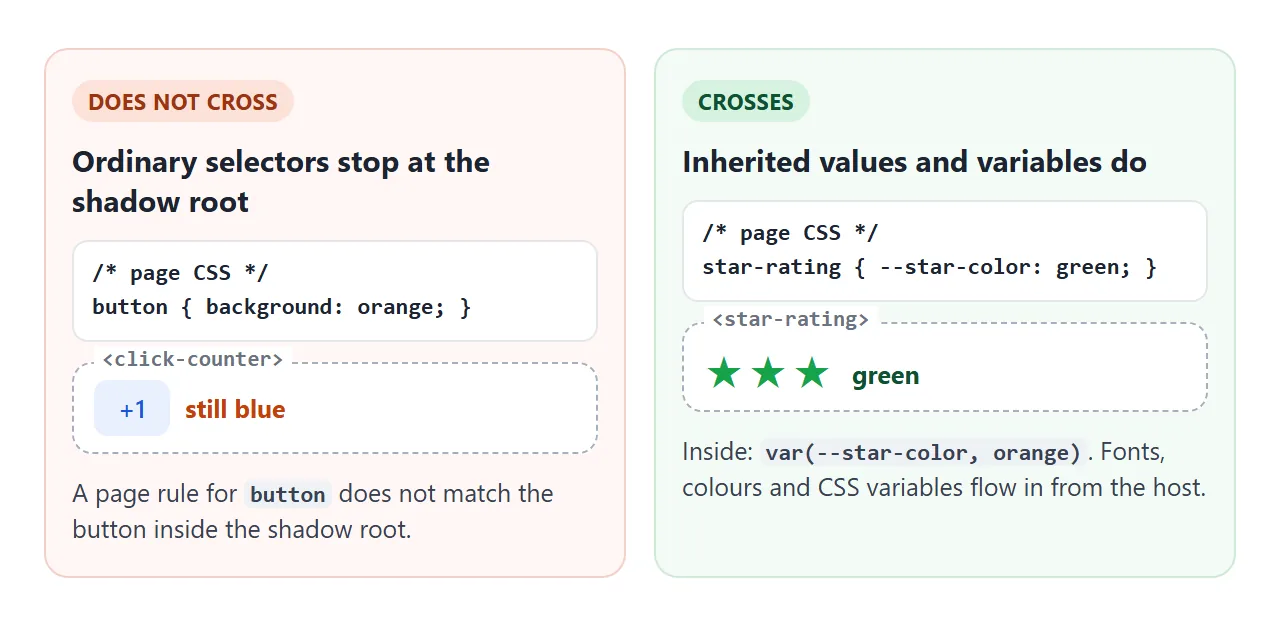
To let the page theme a component, use these doors:
- CSS variables. Inside, write
color: var(--star-color, #f59e0b). The page sets--star-coloron the tag. More in CSS variables. ::part(). Mark an inner element withpart="label", then the page can styleclick-counter::part(label).:host. Inside the shadow CSS,:hoststyles the custom element itself, for exampledisplay: block.
Custom elements are display: inline by default, like a span. Set :host { display: block; } or flex if the component should take a full row.
A library from a CDN: the same counter in Lit
Web components do not need a library, but some people prefer one to cut repeated code. Lit is one such library. Its docs list ready-made bundles on cdn.jsdelivr.net that load with <script type="module">, so they work in a single HTML file.
<!doctype html>
<html lang="en">
<head>
<meta charset="utf-8">
<meta name="viewport" content="width=device-width, initial-scale=1">
<title>The same counter with Lit from a CDN</title>
<style>
  body { margin: 0; padding: 18px; font-family: system-ui, sans-serif; background: #f4f5f7; color: #1d2330; }
  #list { display: grid; gap: 10px; }
  /* Until the script has loaded and defined the tag, show it faded */
  lit-counter:not(:defined) { display: block; height: 46px; border-radius: 10px; background: #e5e7eb; }
  p { font-size: 14px; color: #4b5563; }
</style>
</head>
<body>
<div id="list">
  <lit-counter label="Coffees"></lit-counter>
  <lit-counter label="Glasses of water" start="2"></lit-counter>
</div>
<p id="status">Loading Lit 3.3.3 from cdn.jsdelivr.net...</p>

<!-- type="module" is required: the file uses import -->
<script type="module">
  import { LitElement, html, css } from 'https://cdn.jsdelivr.net/gh/lit/dist@3.3.3/core/lit-core.min.js';

  class LitCounter extends LitElement {
    // Reactive properties: changing one re-renders the element
    static properties = {
      label: {},
      count: { type: Number, attribute: 'start' },
    };

    // Lit puts these styles in the shadow root for you
    static styles = css`
      :host { display: flex; align-items: center; gap: 12px;
              background: #fff; padding: 10px 14px; border-radius: 10px;
              box-shadow: 0 2px 8px rgba(0,0,0,.08); }
      span { flex: 1; }
      button { background: #e8f0fe; color: #1a56db; border: 0; border-radius: 8px;
               padding: 8px 14px; font: inherit; font-weight: 600; cursor: pointer; }
      b { min-width: 2ch; text-align: right; font-size: 1.2em; }
    `;

    constructor() {
      super();
      this.label = 'Clicks';
      this.count = 0;
    }

    render() {
      return html`
        <span>${this.label}</span>
        <button @click=${() => this.count++}>+1</button>
        <b>${this.count}</b>`;
    }
  }

  customElements.define('lit-counter', LitCounter);
  document.getElementById('status').textContent = 'Lit 3.3.3 loaded. Same counter, no innerHTML or listeners to wire by hand.';
</script>
</body>
</html>
<script type="module">
  import { LitElement, html, css } from
    'https://cdn.jsdelivr.net/gh/lit/dist@3.3.3/core/lit-core.min.js';

  class LitCounter extends LitElement {
    static properties = { label: {}, count: { type: Number, attribute: 'start' } };
    constructor() { super(); this.label = 'Clicks'; this.count = 0; }
    render() {
      return html`<span>${this.label}</span>
        <button @click=${() => this.count++}>+1</button> <b>${this.count}</b>`;
    }
  }
  customElements.define('lit-counter', LitCounter);
</script>
| Plain custom element | Lit | |
|---|---|---|
| Extra download | None | One module from a CDN |
| Re-rendering | You update the DOM yourself | Changing a reactive property re-renders |
| Styles | A <style> in the shadow root |
static styles = css |
| Licence | Browser feature | BSD-3-Clause |
Pin the full version, @3.3.3, rather than @3, so the page keeps using the release you tested. Lit's docs also say that if you install packages with npm, use the lit package instead of these bundles.
Two Lit details catch people. The script needs type="module", or import throws a syntax error. And Lit's docs warn that a class field with the same name as a reactive property stops it from updating, so set defaults in the constructor as above.
While a CDN script loads, the tag is still undefined. lit-counter:not(:defined) styles it during that moment, which the example uses for a grey placeholder.
A finished example: a star rating
This <star-rating> combines the pieces: an observed attribute, a custom event, and a CSS variable for its colour. The page reads ratings by listening for one event, and resets them by setting the attribute.
<!doctype html>
<html lang="en">
<head>
<meta charset="utf-8">
<meta name="viewport" content="width=device-width, initial-scale=1">
<title>A star-rating web component</title>
<style>
  body { margin: 0; padding: 18px; font-family: system-ui, sans-serif; background: #f4f5f7; color: #1d2330; }
  .row { display: flex; align-items: center; justify-content: space-between; gap: 10px;
         background: #fff; padding: 8px 14px; border-radius: 10px; margin-bottom: 8px; }
  /* CSS variables pass into the shadow root, so the page can theme the stars */
  .row:nth-child(2) star-rating { --star-color: #16a34a; }
  #summary { margin: 12px 0 8px; font-weight: 600; }
  #reset { background: #fff; border: 1px solid #cbd5e1; border-radius: 8px; padding: 8px 14px; font: inherit; cursor: pointer; }
</style>
</head>
<body>
<div class="row">Food <star-rating name="food" value="4"></star-rating></div>
<div class="row">Service <star-rating name="service" value="3"></star-rating></div>
<div class="row">Price <star-rating name="price"></star-rating></div>
<p id="summary" aria-live="polite">Click a star.</p>
<button id="reset">Reset all</button>

<script>
  class StarRating extends HTMLElement {
    // Only attributes listed here trigger attributeChangedCallback
    static observedAttributes = ['value'];

    constructor() {
      super();
      this.attachShadow({ mode: 'open' }).innerHTML = `
        <style>
          :host { display: inline-flex; gap: 2px; }
          button { background: none; border: 0; padding: 2px; font-size: 26px; line-height: 1;
                   cursor: pointer; color: #d1d5db; }
          button.on { color: var(--star-color, #f59e0b); }
        </style>`;
    }

    connectedCallback() {
      if (this.shadowRoot.querySelector('button')) return;  // already built
      for (let i = 1; i <= 5; i++) {
        const b = document.createElement('button');
        b.textContent = '★';
        b.setAttribute('aria-label', i + ' of 5');
        b.addEventListener('click', () => {
          this.setAttribute('value', i);  // goes through attributeChangedCallback
          // bubbles + composed: the event leaves the shadow root and reaches the page
          this.dispatchEvent(new CustomEvent('rating-change', {
            detail: { name: this.getAttribute('name'), value: i },
            bubbles: true, composed: true,
          }));
        });
        this.shadowRoot.append(b);
      }
      this.paint();
    }

    attributeChangedCallback() { this.paint(); }

    paint() {
      const value = Number(this.getAttribute('value')) || 0;
      this.shadowRoot.querySelectorAll('button').forEach((b, i) => {
        b.classList.toggle('on', i < value);
        b.setAttribute('aria-pressed', i < value);
      });
    }
  }
  customElements.define('star-rating', StarRating);

  // The page listens like it would for any other event
  const summary = document.getElementById('summary');
  document.addEventListener('rating-change', (e) => {
    summary.textContent = 'You gave ' + e.detail.name + ' ' + e.detail.value + ' of 5.';
  });

  document.getElementById('reset').addEventListener('click', () => {
    document.querySelectorAll('star-rating').forEach((r) => r.setAttribute('value', 0));
    summary.textContent = 'All ratings reset.';
  });
</script>
</body>
</html>
The event is what makes a component useful to the rest of the page. By default an event does not bubble and does not leave the shadow root, so set both options:
this.dispatchEvent(new CustomEvent('rating-change', {
  detail: { name: this.getAttribute('name'), value: i },
  bubbles: true,   // travels up through ancestors
  composed: true,  // crosses out of the shadow root
}));
The page then uses ordinary addEventListener on document and reads e.detail.
When it does not work
| What you see | Cause | Fix |
|---|---|---|
SyntaxError from define |
The name has no hyphen or has uppercase letters | Use a name like star-rating |
NotSupportedError from define |
The same name was defined twice | Define once, or check customElements.get(name) first |
| Everything after the tag ends up inside it | Written as <my-tag /> |
Write <my-tag></my-tag> |
Attributes are null on elements made with createElement |
Read in the constructor, before they are set | Read them in connectedCallback |
| Changing an attribute does nothing | The name is not in observedAttributes |
Add it to the static list |
| Page CSS has no effect inside | Selectors stop at the shadow root | Use CSS variables or ::part() |
| The page never hears the event | bubbles and composed are off |
Set both to true |
A syntax error about import outside a module |
CDN import in a plain <script> |
Use <script type="module"> |
| The tag shows nothing at all | The script failed before define |
Check the console. See HTML JavaScript not working |
The define-once check, for a script that may run twice:
if (!customElements.get('star-rating')) {
  customElements.define('star-rating', StarRating);
}
Share it as a link
A component is easier to try than to describe. A screenshot cannot be clicked, and an .html attachment may open as plain text on a phone.
To send the working version, paste the page into a NOS document and choose Create share link. HTML to link walks through it.
The page renders as written and its scripts run, so people can click the stars themselves without an account. Scripts from cdn.jsdelivr.net, such as the pinned Lit bundle, load too.
If you change the code later, the same link shows the new version.