An event page answers three questions and then asks for a decision. When, where, and how do I register.
Everything else on the page exists to support those three, and most event pages bury them.
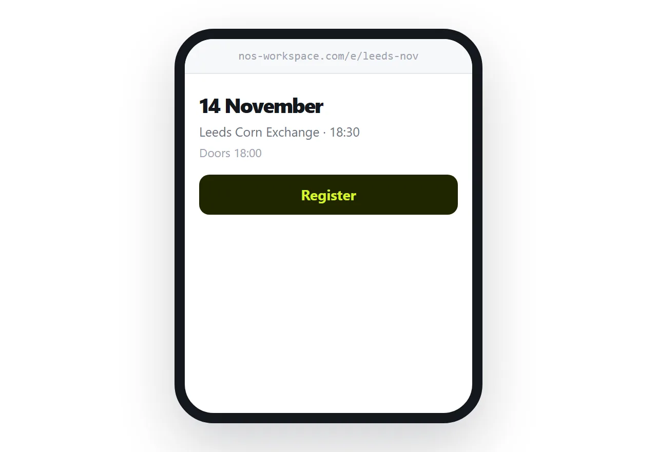
This guide covers the order of information, time zones, and what to do after the event.
The three facts come first
A person arriving at an event page is deciding whether it is possible for them to attend. That is a logistics question before it is an interest question.
Can I be there on that date. Can I get to that place. What do I have to do to come.
So: the date, prominently. The location, with a map link. A register action, visible. Then the reason to attend.
The common failure is a full-width hero image with the event name in elegant type, and the date somewhere below the fold. The visitor scrolls, does not find it immediately, and leaves. It happens constantly and it is entirely avoidable.
| Buried in the design | Above the fold | |
|---|---|---|
| Date | Scroll to find | Immediate |
| Location | In the footer | With a map link |
| Register | After the agenda | Visible on arrival |
| Decision possible | After scrolling | In four seconds |
Time zones
For anything online, state the zone next to every time, and say it the way attendees will read it rather than as an abbreviation nobody parses.
An event at two o'clock with no zone produces a proportion of attendees arriving an hour out, all of them on the day, all of them messaging you at once.
If the audience is genuinely international, give two or three zones explicitly. It is three words and it removes the problem.
The page stays correct
Venues change. Speakers drop out. Start times move. Capacity fills.
At an address, each of those is an edit, and every person holding the link gets it: the ones you emailed, the ones who saw the post, the ones a friend forwarded it to, and the one looking at a printed poster with the address on it.
That last one is the argument for putting the address on physical material rather than only the details. A poster with an address survives a venue change; a poster with a venue on it does not.
Keep it light
Event pages are opened on phones, often on mobile data, often from a social post.
A video background, a full-screen hero image and three web fonts produce a page that takes several seconds to become useful. A meaningful share of visitors do not wait, and they were the ones arriving from a link someone shared.
A photograph, the facts, the agenda and a form. That page loads immediately and converts better than the impressive one.
After the event
Do not delete it.
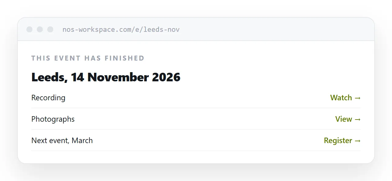
Mark it past at the top. Link to the recording, the slides or the photographs. Point at the next event.
Old event pages accumulate links from posts, listings and coverage. Left up, each one keeps sending people to the next thing you run. Deleted, each one is a dead link in somebody else's page.
Two neighbouring cases are worth a look: How to put an event at one link and How to send a calendar invite as a link.
Put it at an address
Date, location and register above the fold, time zones stated, the page kept light, the address on printed material, and the page marked past rather than removed.
Then the person deciding can decide in four seconds.