In short
An event recap website should let a reader understand what happened, find the useful materials, and see what happens next without searching through several messages.
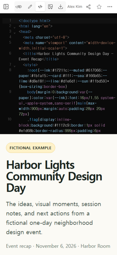
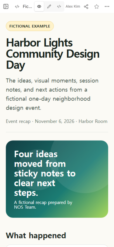
For our fictional Harbor Lights example, we put highlights, illustrated photo placeholders, session resources, decisions, and dated next actions on one page.
We shared it from NOS, changed the hero summary in Edit mode, and confirmed that the original public address showed the revision.
We built a fictional recap for a one-day neighborhood design event. The event, people, outcomes, dates, and visual moments were invented for the example; no attendee data or real photographs were used.
The goal was practical: someone who missed the event should be able to open one address and answer three questions. What happened? Which materials matter? What should happen next?
Start with the reader's three jobs
A recap can easily become a scrapbook. We instead outlined the page around the work a reader needs to do after the event:
- Catch up. A short opening explains the event and names the main outcomes.
- Find evidence. Photo moments, slide summaries, and session notes sit under clear labels.
- Continue the work. Each next action has a named role and a date, while the unresolved question stays visibly open.
The example contains four highlight cards, three illustrated photo moments, four resource cards, three next actions, and one open question. We kept the photo area honest by labeling the visuals as placeholders instead of presenting generated scenery as documentary photography.
What should an event recap website include?
Use a compact opening, not another event announcement. The date provides context, but the first screen should focus on outcomes. Our opening names the fictional event, describes the page as a recap, and leads into the strongest summary.
After that, give each type of material its own section:
- Highlights for the few ideas a reader should remember.
- Photo moments with captions that explain why each image belongs.
- Slides and notes labeled by session rather than stored in an unexplained file list.
- Next actions with a role and date.
- Open questions that must not be mistaken for decisions.
This differs from a meeting recap, where decisions, owners, and open questions carry most of the page. An event recap also needs the visual and presentation material that helps people revisit the program.
How do you organize event photos and slides?
Do not separate photos from meaning. A folder labeled “event photos” makes the reader inspect every file. A recap page can select a few moments and give each one a useful caption: the route-mapping wall, the material table, and the closing review in this example.
The same rule applies to presentation material. We grouped each resource by session and wrote one sentence about what it contains. The page therefore tells a reader whether “Arrival and access” or “Space layout” is the relevant item before they open anything else.
For a real event, use photographs and files you have permission to share. Keep private attendee information, internal discussion, and unapproved recordings off a public recap. If you are still planning the day rather than documenting its outcome, an event link or a conference programme is the better starting point.
How do you share an event recap as one website?
Once the page was ready, we opened the Share panel. It stated that anyone with the link could read this page without signing in and could not edit it. We used that viewer address for the public checks in this example.
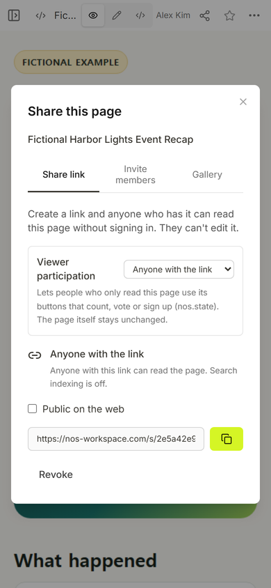
Keep the message that carries the address short. Name the event, say that the page contains highlights and resources, and call out the one next action that matters to that audience. The website holds the detail; the message tells the recipient why to open it.
Can you update an event recap after sharing it?
We tested this on the same fictional page. In Edit mode, we clicked the hero summary and replaced “Four ideas moved from sticky notes to clear next steps” with a clearer line about highlights, session resources, and next actions. We then chose Done.
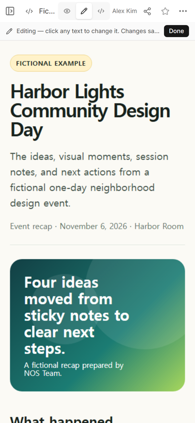
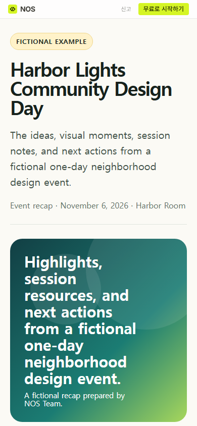
The first practical lesson was that the click target matters. The text we changed was inside the large hero card, not the introduction above it. Read the whole first screen after saving so that the revised sentence still fits its visual space and does not repeat the paragraph beside it.
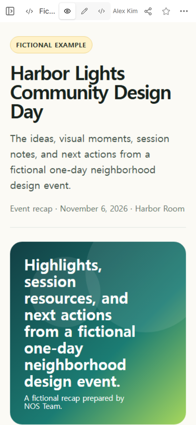
We then opened the original share address again. The revised hero summary appeared there, so the already-created viewer address represented the current version of this page during our test.
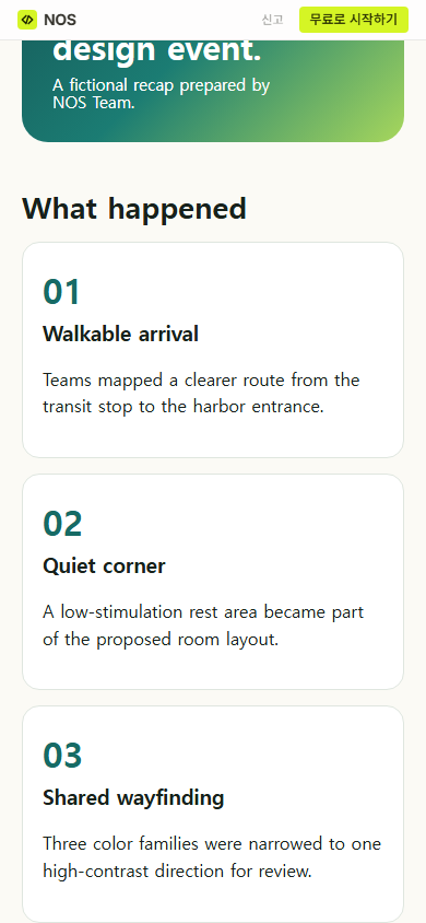
Another public capture farther down the page showed the numbered highlights beneath the new summary. That check mattered because a correct first screen would not reveal a broken or missing section below it.
Turn the recap into a useful handoff
A good closing section does not say only that the event was inspiring. It separates decided work from unfinished work. In our fictional example, three actions have roles and dates. The quiet-area location remains an open question because it depends on a route that has not been confirmed.
That distinction gives the page a job after the photographs have been viewed. A person returning later can see what changed, which resource explains it, and what still needs a decision.
When not to do this
Do not use a static recap website as a private archive, a ticketing system, or a place to collect attendee submissions. Use your approved private storage for restricted recordings, personal data, contracts, or unredacted participant lists. If people must register, pay, upload files, or receive individual access, use a service built for those transactions and link to it from the recap only when that is appropriate.
Where NOS fits
NOS let us keep the complete fictional recap in one page, inspect it in Code and View, create a viewer address, and revise visible text on the existing page. The screenshots above show the exact example and share state used for this article; the article files and image assets remain a local publishing draft.