In short
Give every icon a plain name, a one-line use, and a stable identifier.
Add search and a few task-based categories instead of making people scan an asset folder.
Show the same symbol in the states your interface uses.
Keep the complete SVG behind one copy button and test the shared page on a phone.
We built a fictional product icon library for a small interface team. The finished page held 12 symbols at first, grouped them into Actions, Status, Navigation, and Content, and let a reader search by either the icon name or its intended use. We then added an Archive symbol to the same page and checked that the existing share address showed the 13-icon version.
This is a different job from learning how to write SVG markup. The goal is to help another person choose the approved symbol, understand what it means, compare its states, and take the supplied markup without opening a design file.
What should an icon library website include?
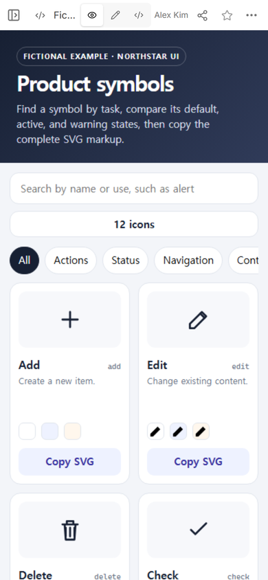
Start with the decisions a teammate must make. In our example, each card answers four questions: What is this called? When should it be used? Which identifier belongs in the interface? What does it look like in default, active, and warning states?
We used short verbs for actions, familiar nouns for content, and a usage sentence that describes the result. “Archive — Move a record out of the active list” is more useful than a card labeled only with a file name. The sentence distinguishes Archive from Delete without claiming a universal rule for every product.
Keep one source of markup per card
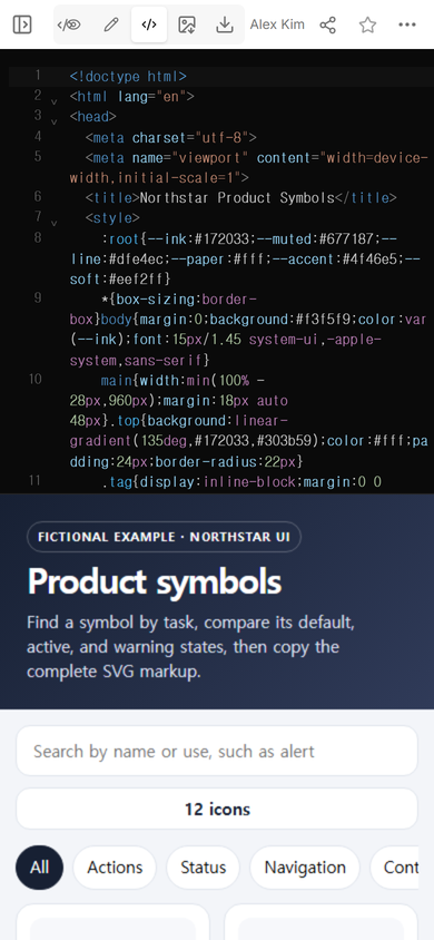
Every card in this example is generated from the same small record: name, identifier, category, usage note, and SVG paths. The large preview, the three state samples, and the copied markup all use that record. This keeps the visual sample and the copy action from drifting into two different versions inside the page.
How do you organize an icon library page?
Use categories for browsing and search for a known task. The categories in this example describe where a symbol helps: Actions, Status, Navigation, and Content. They are broad enough to scan on a phone and specific enough to shorten the list.
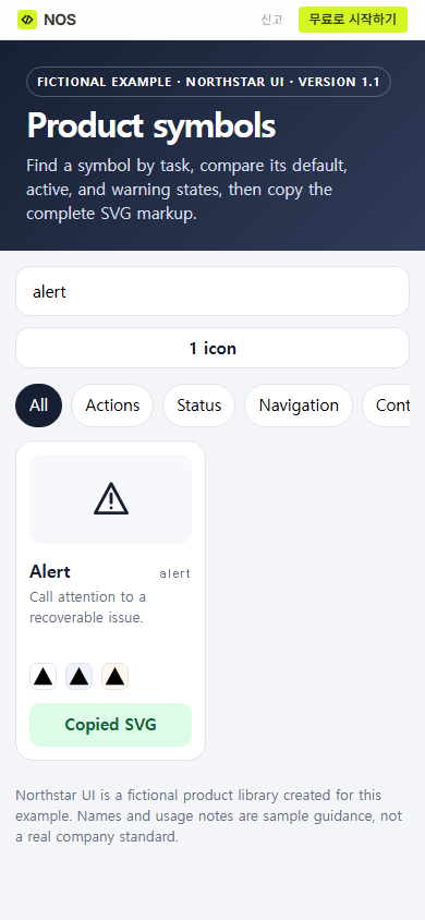
The search checks the name, identifier, and usage note. That matters when the reader knows the job but not your chosen label. Searching “alert” returns the Alert card, while its note explains that this fictional set uses it for a recoverable issue. A team could also search “previous” and reach an Arrow left card because that word appears in its usage note.
Do not turn the category list into another taxonomy project. If people need ten overlapping filters to locate one symbol, improve the names and use notes first.
How do teammates open the icon reference?
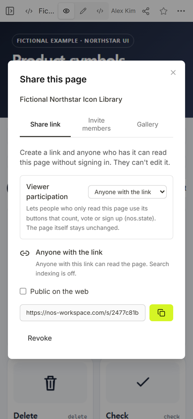
We opened Share on the finished NOS page and used the link created there. The captured panel says anyone with the link can read the page without signing in and cannot edit it. It also says search indexing is off for that link setting. Those conditions fit an internal reference that teammates should view but not change.
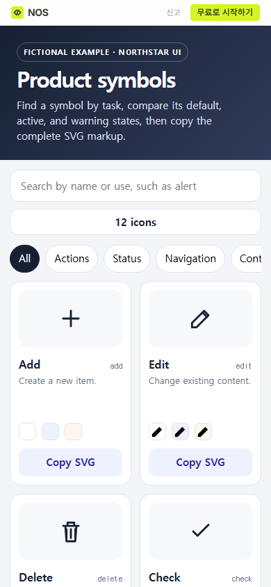
Opening that address at a phone width showed the full title, search field, count, category row, and the first cards without horizontal page overflow. The category row itself scrolls because all labels do not fit in one narrow line.
How should icon search and copy work?
Search should reduce the current results as the reader types. Do not send someone to a separate results page for a set this small. In the shared example, entering “alert” changed the count to one and left the matching card in place.
The copy button packages the complete SVG element rather than only the path data. It includes the view box and the attributes used by this fictional set. After we pressed the Alert card’s button, the visible label changed to “Copied SVG.” The capture verifies that feedback state; this run did not read the operating system clipboard back into the page.
Show state differences next to the symbol
A separate state gallery makes readers compare two distant sections. We placed three small samples inside every card, in the order default, active, and warning. That choice makes differences visible before anyone copies the icon. In a real system, label those states with the words your interface already uses and remove any state that the product does not have.
Can you update the library without replacing the link?
We used Code on the existing page to add one Archive record and change the fictional version label to 1.1. The preview below the editor then showed 13 icons. The editor remained in its normal browser sandbox during the change; we did not loosen the page’s isolation.
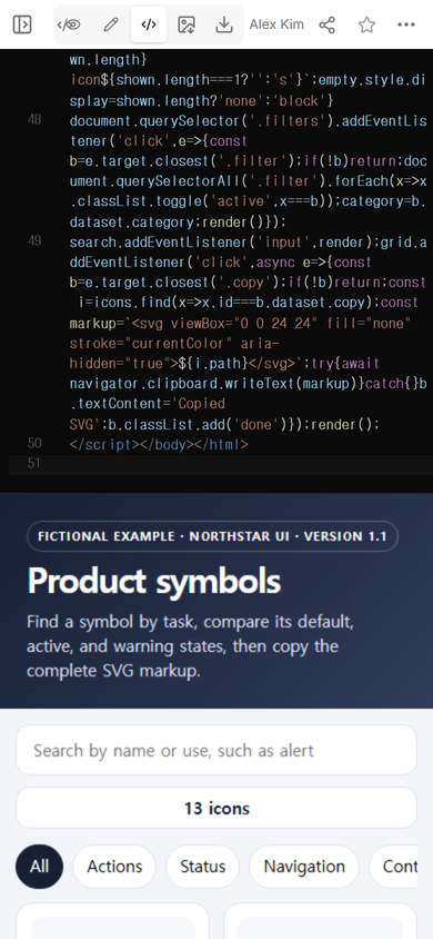
We reopened the original share address, searched for “archive,” and got one card with the new usage note. That checks both parts of the update: the new record exists, and readers using the existing address can find it.
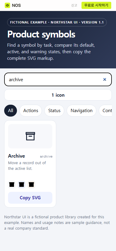
Result: the page now gives a teammate one route from task words to a named symbol, its state comparison, and its SVG copy action. The update added a symbol without creating another reference address.
What usually makes an icon library hard to use?
- Names describe the drawing, not the task. “Triangle” says less than “Alert” when someone is choosing a status symbol.
- Usage notes repeat the name. Write the interface decision the reader needs to make.
- States live on another page. Put the relevant states beside the base symbol so differences can be compared directly.
- The preview and copied source differ. Generate both from one icon record, then check the rendered result after an update.
- Every variation becomes a category. Prefer a small browse structure and stronger search terms.
When not to do this
- Do not use a static page as the source of truth when icons are generated and versioned by an existing package pipeline. Link to that maintained source instead.
- Do not publish proprietary artwork or internal product rules at a public address.
- Do not promise that a symbol is accessible by itself. A control still needs a text label or an accessible name that explains its action.
- Do not add a copy button if the supplied markup is incomplete or differs from the preview.
Use NOS for a shareable icon reference
NOS Workspace let us put this self-contained library at a share address, open its working search and copy controls, and revise the same page in Code. The current pricing page is the place to check plan details; this article does not quote a price. For the SVG itself, continue with HTML SVG icons and changing SVG color. If the icon page is one part of a wider component standard, use the design system documentation template.