Gather your evidence before you pick a layout
Templates for this phrase come in large numbers, mostly as slide decks and one- or two-page documents. Most let you change colors, fonts, and logos, which settles how the page looks. It doesn't settle what goes in each section, and that is usually where a draft stalls.
Before you choose a design, collect three things: the client's problem in their own words, the specific work you did, and any figure you can compare across equal stretches of time before and after. If you only have one or two of those, your case study will be short. A short page with specific details is still more useful than a long one padded with adjectives.
If the case study is for a class, a grant application, or a request for proposals that asks for a Word or PDF file, submit it in that format. The sorting work above helps either way.
A filled-in sample to work from
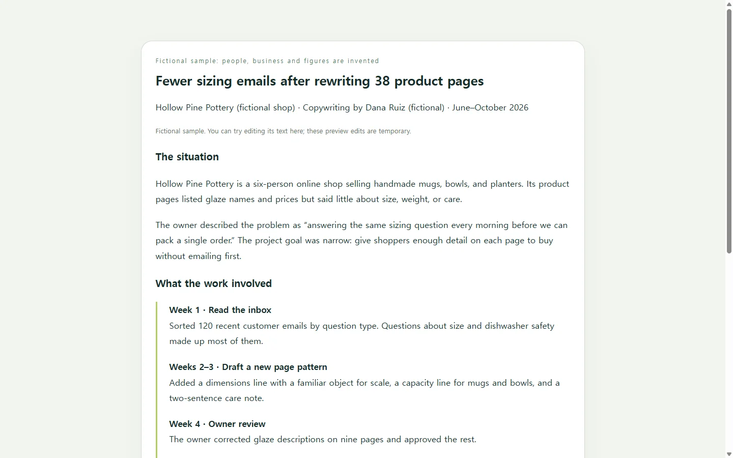
The sample case study on this page is fictional: a freelance copywriter rewrites product pages for a small online pottery shop. The people, dates, and figures are invented to show the structure, not to report a real result.
Three choices in it are worth copying. The before and after windows are both eight weeks, so neither side of the comparison is stretched. The page names what else changed during that time, a week-long sale, instead of crediting the rewrite with everything. And the owner's own description of the problem opens the page, in place of a paragraph of praise written on their behalf.
A careful reader tends to trust a number more when its limits sit right next to it. The layout matters less: a single narrow column reads comfortably on a phone, and a small table carries before-and-after figures better than a paragraph full of percentages.
Build your own version, by hand or with AI
You can fill in a word-processor template yourself, adapt a slide deck, or hire a designer if the case study will anchor a major pitch. Each is a reasonable choice depending on how much time and budget the page deserves. If you want a designed web page without learning a design tool, an AI chat assistant can write one as HTML, the code a browser reads to display a page. Save the result as a single file and open it in your browser to check it.
The prompt below limits the AI to layout and wording. Replace each bracketed placeholder with your own facts; anything you leave blank should come back marked as missing rather than filled with an invented number. Read every figure in the result before you share it, because the numbers have to be yours.
When better numbers arrive after you've sent it
A case study often keeps changing after you first share it. Say you send the page to a prospect with eight weeks of data, and a month later the twelve-week figures come in, or the client agrees to let you use the shop's name.
If the page lives in NOS, you can edit the text on it directly, changing “eight weeks” to “twelve weeks” and updating the table, without asking an AI to rebuild the whole page. The share link you already sent stays the same after those edits, so the prospect opens the current version from the message they already have. They don't need an account to read it.
If someone asks for a PDF for their records, make one separately and send it; the shared page is for people who just want to click and read the latest figures.
A prompt to adapt
Create a single, self-contained HTML file for a one-page client case study. Use only the facts I give below. If a fact is missing, show [MISSING: what is needed] in that spot instead of inventing it. Do not invent quotes, client names, metrics, dates, or logos.

Facts:
- My name or business: [YOUR NAME OR STUDIO]
- Client name, or an anonymous description (e.g., 'a six-person online shop'): [CLIENT]
- Permission to name the client: [YES / NO]
- The problem, in the client's words if possible: [PROBLEM]
- What I did, in order, with dates: [STEP 1 – DATE]; [STEP 2 – DATE]; [STEP 3 – DATE]
- Before/after figures over equal time windows: [MEASURE – BEFORE – AFTER – BOTH DATE RANGES]
- Other things that changed during those windows: [SALES, PRICE CHANGES, SEASONALITY, OR NONE]
- Approved client quote (optional): [QUOTE OR NONE]
- Who will read this: [E.G., OWNERS OF SMALL ONLINE SHOPS]
- Contact line: [EMAIL OR WEBSITE AS PLAIN TEXT]

Layout, in this order: a title stating the outcome in plain words; a one-sentence summary; a short 'The situation' section; a numbered timeline of the work; a results table; a 'What these numbers don't show' list; the contact line.

Requirements:
- Mobile first: one column, readable at 360px wide with no horizontal page scrolling. On small screens the table must scroll inside its own container or stack into labeled rows.
- Semantic HTML: exactly one h1, h2s for sections, an ordered list for the timeline, a real table with a caption and th header cells.
- Accessibility: text contrast of at least 4.5:1 against its background, body text 16px or larger, visible focus styles on any links, no information conveyed by color alone.
- Inline CSS only. No external fonts, scripts, images, analytics, forms, buttons, or download links.
- Plain, specific language. No superlatives, no exclamation marks, no claims beyond the facts above.