Write each project for two readers
It helps to write every project for two readers at once: someone skimming to decide whether to talk to you, and someone checking whether your numbers hold up. A short case study can serve both if it answers the same few questions in plain sentences. What decision or prediction did you work on? What data did you use? What simple baseline did you compare against, what did your final approach score on the same metric, and where does it fall short?
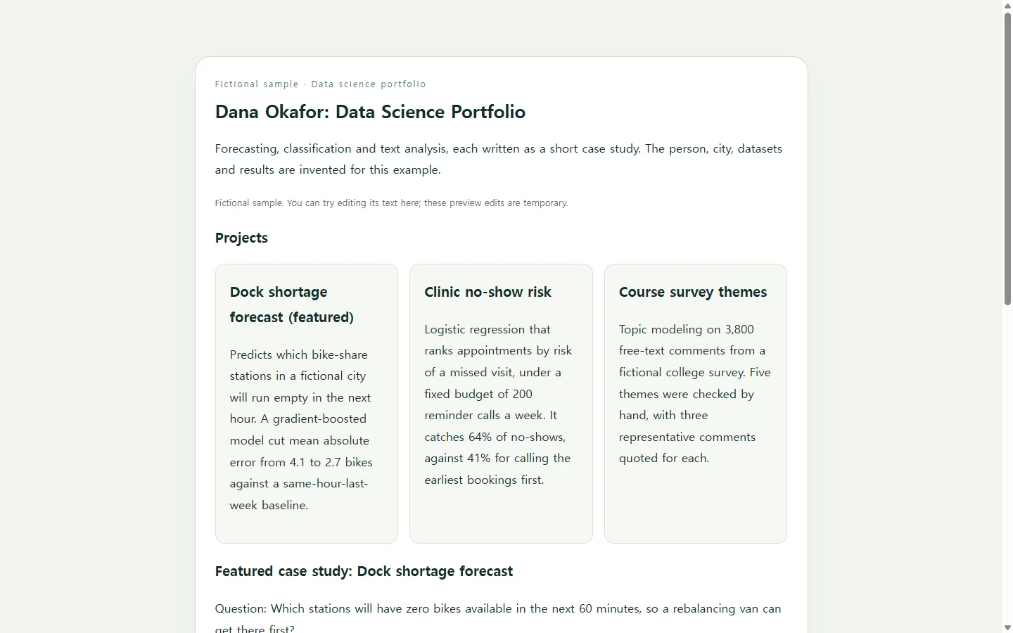
The baseline is what gives a score meaning. 'MAE of 2.7 bikes' says little on its own; 'down from 4.1 for a same-hour-last-week guess' shows the model earned its extra complexity. Limits work the same way: naming where the model fails shows you looked.
Résumé guidance from one university career office asks for language that is specific, fact-based and written for people who scan quickly. That is a résumé rule, not a portfolio standard, but the habit transfers well to a project summary. Keep the notebook in its repository as the evidence and link to it; the page is the readable layer on top.
A fictional sample, filled in
The example on this page belongs to an invented candidate, Dana Okafor. The name, the city, the datasets and every score are made up for illustration. The featured project forecasts which bike-share docks will run empty in the next hour, and two shorter projects sit beside it as cards.
Two parts are worth copying. The comparison table puts a naive baseline, a simple linear model and the chosen model in the same units on the same held-out weeks, so a reader sees the gain without opening code. The limits checklist says plainly that the model was only scored offline and struggles on event days. Swap in your own question and metric, and keep the shape.
Ways to build it
A pinned GitHub repository with a clear README keeps everything next to the code, and it works well when your readers are comfortable browsing repositories. Some dedicated portfolio builders let you bring in projects from GitHub, Jupyter notebooks or Tableau Public and publish them on a hosted page. A site you build yourself gives you full control, at the cost of setup and design time.
Asking an AI assistant to generate the page is another route, and a practical one if writing the case study comes easily but layout and styling don't. The facts still come from you. AI can arrange and style what you supply; it should not supply your results.
Build your page with AI
Gather your inputs before you open a chat. For each project you need the question, the data source and size, the baseline score, the final score on the same metric, one to three limits and the repository link. Then paste the prompt below and fill in the bracketed placeholders.
The prompt asks for HTML, the plain file format a web browser displays, delivered as one self-contained file so it is easy to open, check and move. It also asks for every number in plain text or a real table rather than inside a chart image, which matters later if a score changes. Read the output against your notes before you share it, and replace any [TODO] the assistant leaves behind.
When the application asks for a PDF
If a job posting asks for a résumé as a PDF or Word file, send that file. The portfolio page supports your application; it does not replace a required document. Put the link in your résumé header next to your email, or in a portfolio field when the form offers one. After converting the résumé to PDF, open the result and check that the formatting and the link came through.
When a score changes after you've applied
Suppose that two weeks after sending applications, you notice the dock model used the observed hourly weather instead of the forecast that would actually exist at prediction time. You fix the leak, retrain, and the error rises from 2.7 to 3.0 bikes. The honest number belongs on the page, and the people who already have your link are the ones who should see it.
If you keep the page as an HTML page in a NOS workspace, you can edit the rendered text directly, so correcting one row of the table doesn't mean regenerating the whole page with AI. The published sharing link stays the same after the edit, so the URL on résumés you already sent opens the corrected figure, and reviewers can open it without creating an account. Those are text edits only: if your page calculates anything with JavaScript, fix that code rather than expecting edited text to change the calculation.
When your next project is finished, add it as one more card. The link you have already handed out keeps pointing to your current work.
A prompt to adapt
Build a one-page data science portfolio as a single self-contained HTML file.

About me (use exactly as written; do not add facts):
- Name: [YOUR NAME]
- Target role: [e.g., junior data scientist]
- One-sentence summary: [THE KIND OF PROBLEMS YOU WORK ON]
- Contact: [EMAIL] · [GITHUB PROFILE URL] · [LINKEDIN URL]

Projects (2 to 4). For each one:
- Title: [PROJECT TITLE]
- Question: [ONE SENTENCE: THE DECISION OR PREDICTION]
- Data: [SOURCE, NUMBER OF ROWS OR RECORDS, TIME RANGE]
- Baseline: [SIMPLE METHOD] scored [SCORE] on [METRIC]
- Final approach: [MODEL OR METHOD] scored [SCORE] on the same metric
- Limits: [1 TO 3 HONEST LIMITATIONS]
- Code: [REPOSITORY URL]

Feature [PROJECT TITLE] as a full case study with these sections: Question, Data, Approach, a comparison table (approach, metric value, short note) with the baseline in the first row, and Limits and next steps. Show the other projects as short cards with the question, the headline result against its baseline, and a link to the repository.

Requirements:
- One HTML file with inline CSS. No external scripts, fonts, frameworks, analytics, embeds or forms.
- Put every number in plain text or an HTML table, never inside images or JavaScript-generated charts, so I can edit numbers later.
- Use only the facts above. If anything is missing, write [TODO] instead of inventing it. Do not add testimonials, employer names, awards or metrics I did not give you.
- Accessibility: one h1, an h2 for each section, real table markup with th header cells, descriptive link text (never 'click here'), text contrast of at least 4.5:1 against its background, and a visible focus style on links.
- Mobile: readable on a 360px-wide screen without zooming; single column on small screens; wide tables scroll horizontally inside their own container; no fixed-width layout.
- Design: calm and plain, generous spacing, one accent color; make the comparison table the visual focus of the featured project.