A mockup link is a draft interface published at an address, so reviewers click through it on the phone they will actually use rather than squinting at a flat image. Built in HTML and CSS, it resizes, responds, and can be corrected between rounds without resending anything.
That is the whole advantage over a flat image. Layout questions get answered rather than discussed.
Decide what it has to answer
A mockup is a question-answering device, not a deliverable. Write down the one or two questions first.
"Does the summary row still work when a client name is forty characters" is a question. "What do you think" is not, and it produces feedback about the button colour.
Everything not serving those questions gets faked. Fixed data, dead settings pages, and one working path through the flow.
What to build and what to fake
| Part | Build it | Fake it |
|---|---|---|
| Layout and spacing | Yes | Never |
| Navigation between 2 to 4 screens | Yes | No |
| Responsive behaviour | Yes | Never |
| Form validation messages | Static examples | The actual validation |
| Data | Realistic fixed rows | No live backend |
| Auth, settings, edge screens | No | A dead link is fine |
| Charts | Static SVG or CSS | No live query |
Faking is not cheating here. A mockup that took three days to wire up is a mockup nobody wants to change after the review.
Use hostile sample data
Three tidy rows make any table look good. Your mockup should carry the data that breaks it.
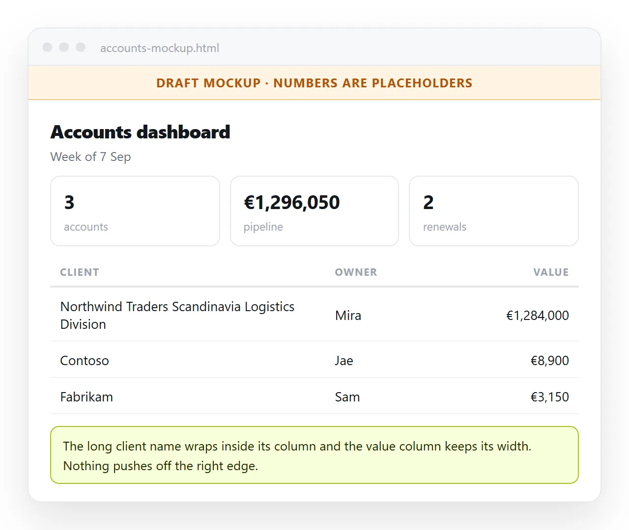
- The longest realistic name, not "Acme Ltd".
- A negative number and a number in the millions, so the column width is honest.
- An empty state, with the text that will actually appear.
- A loading state, if the real screen will have one.
- A row with a missing field, because production data has those.
This is where the HTML mockup earns its keep over a drawn design. Real text reflows and reveals the problem immediately.
Make it clickable
Two or three linked screens turn a picture into a walkthrough. Separate pages linked by ordinary anchors are enough.
If the screens are variations of one layout, a CSS-only tab pattern or the :target pseudo-class handles switching without script.
Keep transitions out. Animation in a mockup consumes review attention that should be going to structure.
Mark it as a draft
A convincing mockup gets forwarded, and then someone asks why the live product is missing a feature.
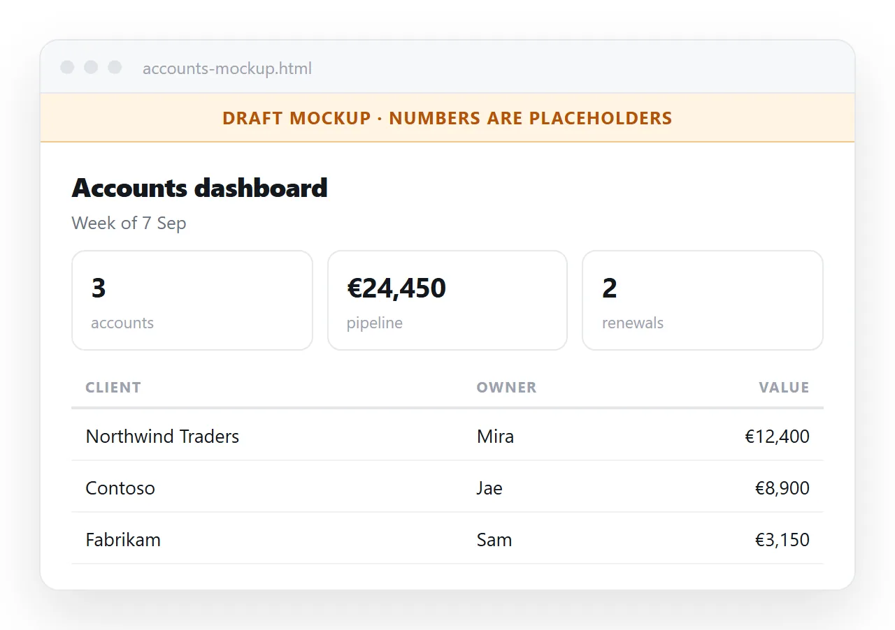
Put a visible band at the top: what this is, what state it is in, and the date. Two lines of CSS with position: sticky and a distinct background.
Add it to the <title> as well, since that is what appears in the browser tab and in any chat preview card.
Mockup, wireframe, prototype
The words get used loosely, so state which one you are handing over.
A wireframe is structure only, deliberately unstyled, used to argue about what is on the page and in what order.
A mockup is the styled version. It looks close to final and answers layout and content questions.
A prototype adds real behaviour, and it costs several times more than either. Build one only when the question is genuinely about interaction.
Run the review, do not just send it
A link with no question attached comes back as opinions about the colour scheme.
Send the two questions in the same message, numbered. Ask reviewers to answer those first and add anything else afterwards.
Give a deadline and a round number. "Round 2, comments by Thursday" produces replies; "let me know what you think" produces silence and then a late objection.
Collect feedback in one place rather than across three channels. A short list under the mockup link, updated as comments arrive, stops the same point being made four times.
Send the HTML mockup as a link
A mockup review has a short window. Anything that makes reviewers save a file and find it later loses half of them.
- Open the file in the HTML file opener to confirm the styles and images survive outside your project folder.
- Paste the HTML into a NOS document. It renders as a page of its own, scripts included.
- Share, then Share link, then Create link. Leave it unlisted, since a draft should not be in search results.
- Send the link with the two questions you want answered.
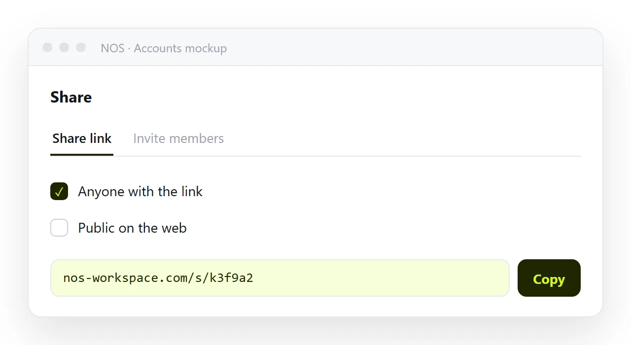
Reviewers open it on a phone in one tap. No install, no download, no file card that nobody clicks. Sharing an HTML file covers why the other routes lose people.
Revising between rounds
The address does not change when you edit, so round two goes out on the same link.
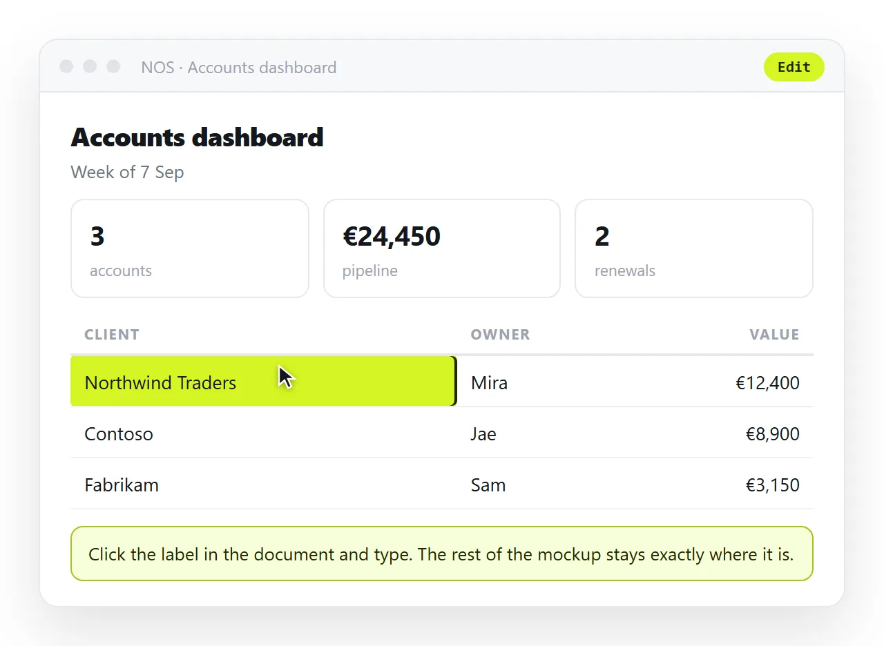
Small copy changes can be made by clicking the text in the document, with no return trip to the editor. That is often most of the feedback from a first review.
If the mockup came out of an assistant, the same applies. Editing AI generated HTML without code covers changing wording and numbers directly.
Before you send it
- Does the mockup answer the questions you wrote down?
- Does it hold at 390px wide as well as on a laptop?
- Is the sample data hostile rather than tidy?
- Is there a visible draft marker and a date?
- Do styles and images survive outside your folder?
- Is the link unlisted, given this is not shipped?