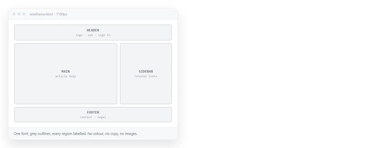
An HTML wireframe is a page that shows structure and content order with almost no styling, so the review argues about arrangement rather than colour.
Building it in HTML rather than drawing it adds one thing that matters. It reflows, so the phone layout is a fact instead of a promise.
Write the content before the boxes
Open a file and write the page as plain HTML with no stylesheet. Headings, paragraphs, lists, buttons, in the order a reader meets them.
Read it top to bottom. If the order does not make sense as a document, no layout will rescue it.
This is also when to get the elements right. A navigation block is <nav>, the main column is <main>, and each region gets a heading. Semantic HTML done here saves rework later.
The grey box stylesheet
Twenty lines, reused across every wireframe you make.
* { box-sizing: border-box; }
body { font: 15px/1.5 system-ui, sans-serif; color: #333; margin: 0; }
[data-box] { outline: 1px solid #bbb; padding: 12px; position: relative; }
[data-box]::before {
  content: attr(data-box);
  position: absolute; top: 0; right: 0;
  font-size: 11px; color: #888; padding: 2px 6px;
}
.ph { background: #e6e6e6; color: #888; display: grid; place-items: center; }
The data-box attribute labels each region in the corner, so a reviewer knows they are looking at the filter bar and not a random rectangle.
.ph is the grey placeholder block for images, charts, and anything not yet designed. Give it an aspect-ratio rather than a fixed height so it scales.
Lay out regions with named grid areas
Named areas make the structure readable in the CSS itself, which matters when someone else opens the file.
.page {
  display: grid; gap: 12px;
  grid-template-columns: 220px 1fr;
  grid-template-areas: "head head" "side main" "foot foot";
}
@media (max-width: 720px) {
  .page { grid-template-columns: 1fr;
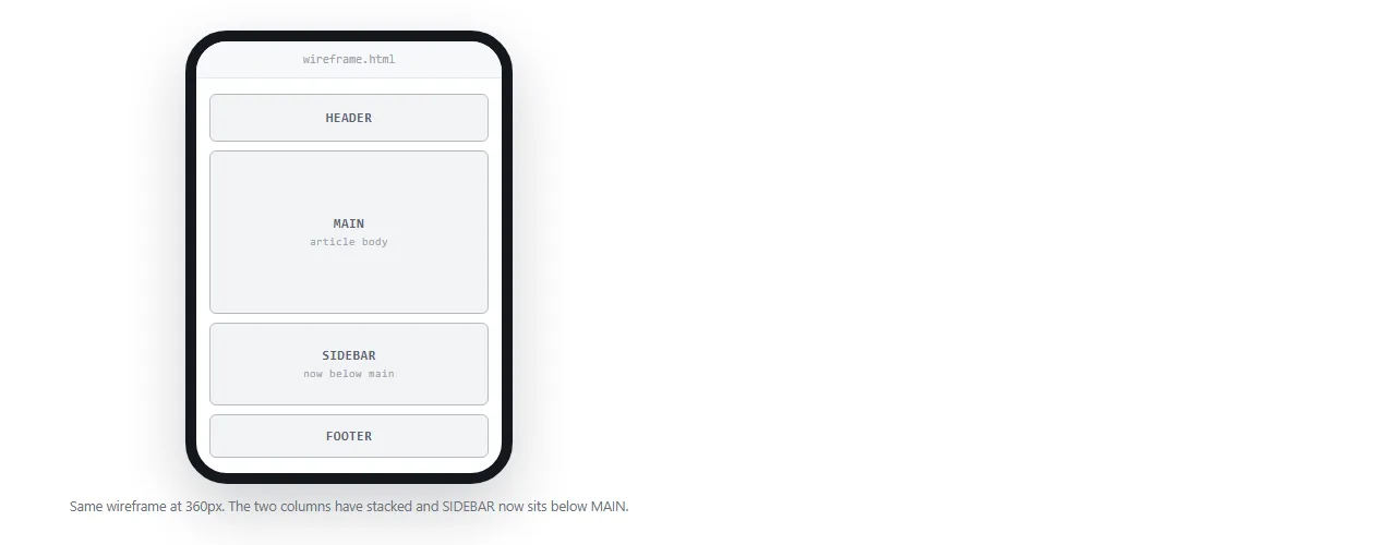
          grid-template-areas: "head" "main" "side" "foot"; }
}
Note the phone order. The sidebar moves below the main content, which is a structural decision and exactly the kind of thing a wireframe exists to settle.
CSS grid covers the property in more depth if the area syntax is new.
No lorem ipsum
Placeholder Latin makes every block look comfortable, and then real content arrives and nothing fits.
- Headings. Write the longest realistic one, not a three-word stand-in.
- Buttons. Use the actual label, including the long translated version if the product is localised.
- Lists. Include one item that wraps to two lines.
- Numbers. Use the widest plausible value, negative if that can happen.
- Empty states. Show at least one, with the text that will appear.
You are not designing the copy. You are checking that the structure survives it.
Wireframe or mockup
| Wireframe | Mockup | |
|---|---|---|
| Question it answers | What is on the page, in what order | Does it look and read right |
| Styling | Grey boxes, one font | Close to final |
| Colour | None, except one accent | Brand colours |
| Content | Approximate real text | Realistic sample data |
| Build time | An hour or two | A day or more |
| Feedback you get | Structure and priority | Everything |
Show a styled screen and the feedback is about the shade of blue. That is the practical reason to keep the wireframe grey. The HTML mockup is the next step, once the structure is agreed.
Keep it navigable
A wireframe of six screens is easier to review than six files.
Link them with ordinary anchors, and put a small fixed index in a corner listing every screen. For a long single-page wireframe, an inline table of contents does the same job.
Number the screens in their titles. "3 of 6, Filter results" is what a reviewer writes in their comment, so make that string easy to copy.
Where the accent colour is allowed
One colour, used for one purpose. That purpose is marking the primary action on each screen.
Everything else stays grey. The moment a second colour appears, reviewers start reading meaning into the palette and the conversation drifts away from structure.
The same restraint applies to typography. One family, two or three sizes, and weight used only to separate headings from body. A wireframe with five type sizes is a mockup in disguise.
Icons are the other temptation. Use a labelled grey square where an icon will go, because arguing about which glyph means export is a later conversation.
Circulate the HTML wireframe as a link
Wireframe rounds are short and the feedback window is shorter. A file that has to be downloaded loses reviewers.
- Open the file in the HTML file opener to confirm it renders outside your folder.
- Paste the HTML into a NOS document.
- Share, then Share link, then Create link. Leave it unlisted.
- Send the link with the specific structural question you want answered.
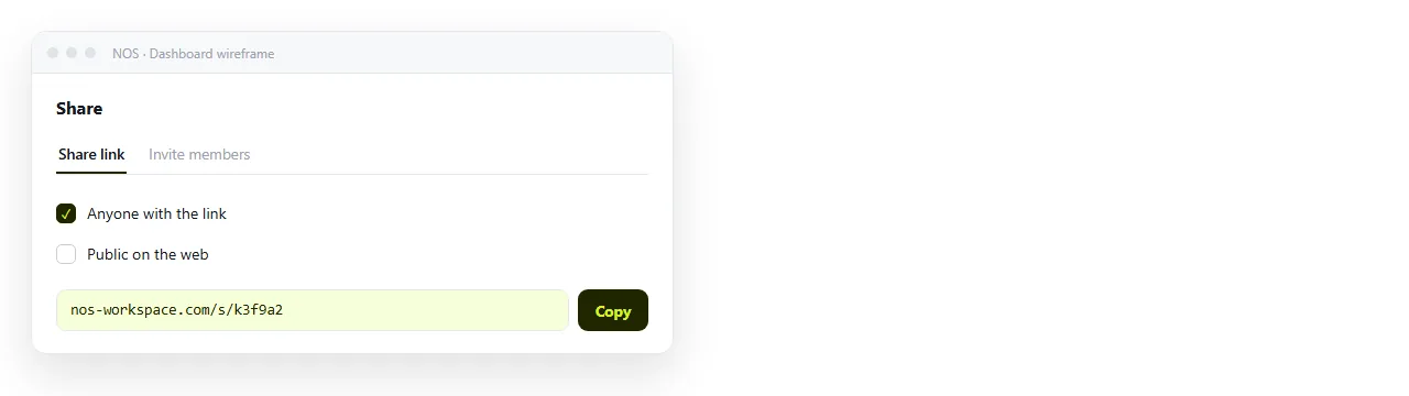
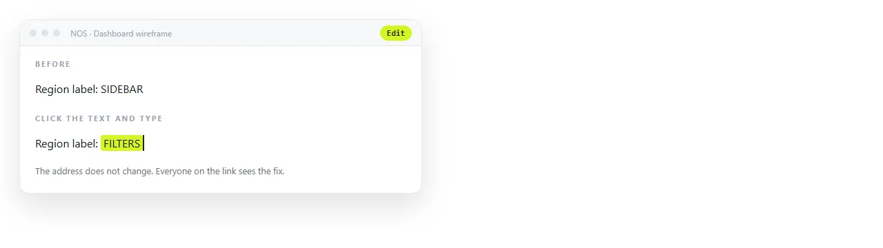
Between rounds, edit the same document. The address does not change, so round three is on the link you already sent, and nobody is reviewing version one by mistake.
Put the date and round number in the draft banner so a forwarded link is never ambiguous.
Before you send it
- Does the page read sensibly as plain HTML with the stylesheet removed?
- Is every region labelled so reviewers can name it?
- Does the phone order put the right things first?
- Is the content approximately real rather than Latin?
- Is there a round number and date on the page?
- Is the link unlisted, since this is an internal draft?