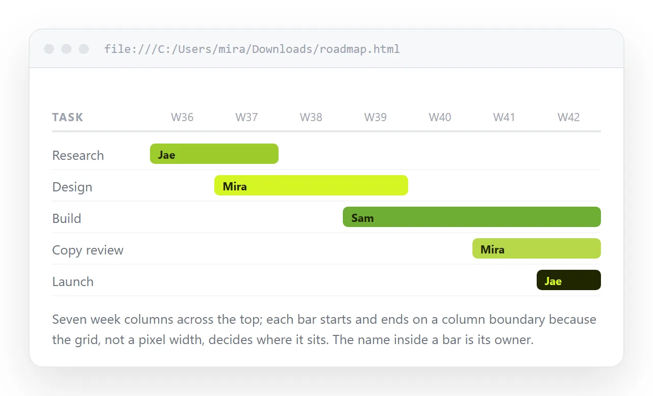
An HTML gantt chart is a CSS grid with one column per time unit and one bar per task, placed with grid-column. For a schedule that is read rather than dragged around, that is the whole technique.
The alternative most people reach for is a screenshot of a project tool. It is out of date the moment a date moves, and it cuts off at the bottom.
Lay out the grid first
Decide the unit before you write any markup. Days for a two-week launch, weeks for a quarter, months for a roadmap.
Then build one grid with a label column and one equal track per unit.
.gantt {
  display: grid;
  grid-template-columns: 180px repeat(12, 1fr);
  gap: 4px 0;
  align-items: center;
}
Twelve tracks is twelve weeks. The 180px column holds the task names and does not move when the timeline does.
Place the bars
Each task is two elements: the name in column 1, and the bar spanning its date range.
<div class="name">Data migration</div>
<div class="bar" style="grid-column: 4 / 8">Weeks 3-6</div>
Grid columns are one-indexed and the label occupies track 1, so week 3 starts at track 4. The end value is exclusive, which is where almost every gantt layout goes wrong by one column.
Write that rule down next to the markup. Start track equals week number plus one, end track equals last week plus two.
Header row, today line, milestones
The header is the same grid with a cell per unit, so labels sit exactly above the bars they describe.
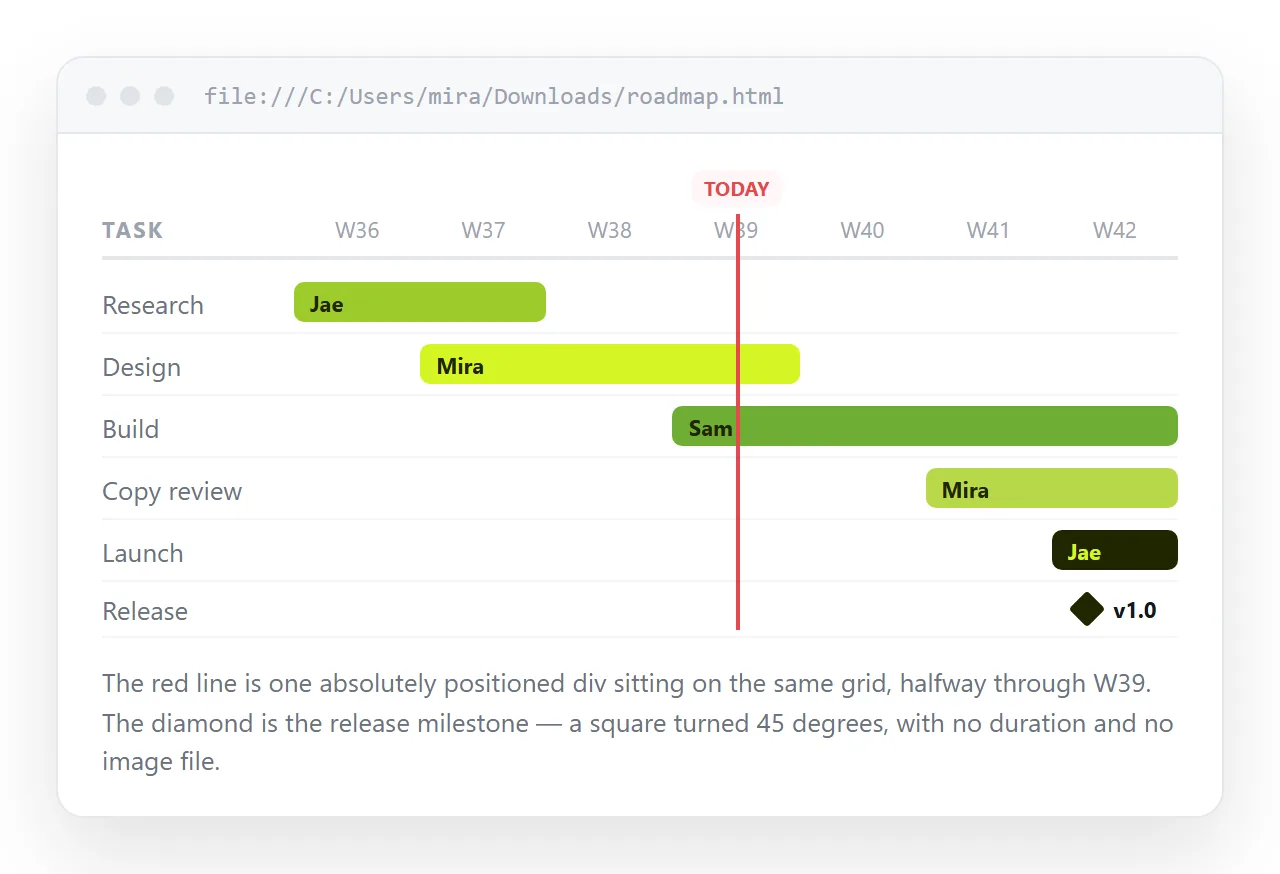
A today marker is one absolutely positioned line inside a relatively positioned grid. Its left offset is the fraction of the timeline already elapsed.
Milestones are zero-width bars. Give the cell a single grid track and render a diamond with a rotated square, so it reads as a point rather than a duration.
What to use, by what you need
| What you need | CSS grid gantt | Charting library | Project tool screenshot |
|---|---|---|---|
| Read-only schedule for stakeholders | Fits | Heavier than needed | Goes stale |
| Dependency arrows between tasks | Needs SVG work | Built in | Built in |
| Drag a bar to change a date | No | Built in | Built in |
| Opens with no login | Yes | Yes | No |
| Still correct next week | Yes, if you edit the page | Yes | No |
| Prints cleanly | Yes, with a print rule | Varies | Usually cropped |
Most schedules that get shared are read-only. The reader wants to know when their part starts, not to reorganise the plan.
Colour by status, not by team
A gantt chart with eight team colours is decoration. A gantt chart with three status colours answers a question.
- Done. Muted fill, no border. It is context, not news.
- In progress. Solid fill, the strongest colour on the page.
- Not started. Outline only, no fill.
- At risk. One accent colour, used nowhere else on the page.
Keep the count at four or fewer and add a legend row above the grid. If you support dark mode, check the muted fill has not disappeared into the background there.
Narrow screens
A twelve-week grid at readable size is wider than a phone. There are two honest answers and one bad one.
The bad one is shrinking the whole grid until the labels are unreadable. Do not scale a timeline to fit.
Instead, wrap the grid in a container with overflow-x: auto and give the grid a minimum width, so the timeline scrolls sideways inside the page. Or below the breakpoint, swap to a plain list of task, start date, end date.
Either way the viewport meta tag has to be present, or the phone renders the desktop width and shrinks it.
Share the HTML gantt chart as a link, not a file
A schedule changes. That is what schedules do, and it is the reason a gantt chart should live at an address rather than in an attachment.
- Open the file in the HTML file opener to confirm it renders outside your folder.
- Paste the HTML into a NOS document. The grid, the colours and any script render as written.
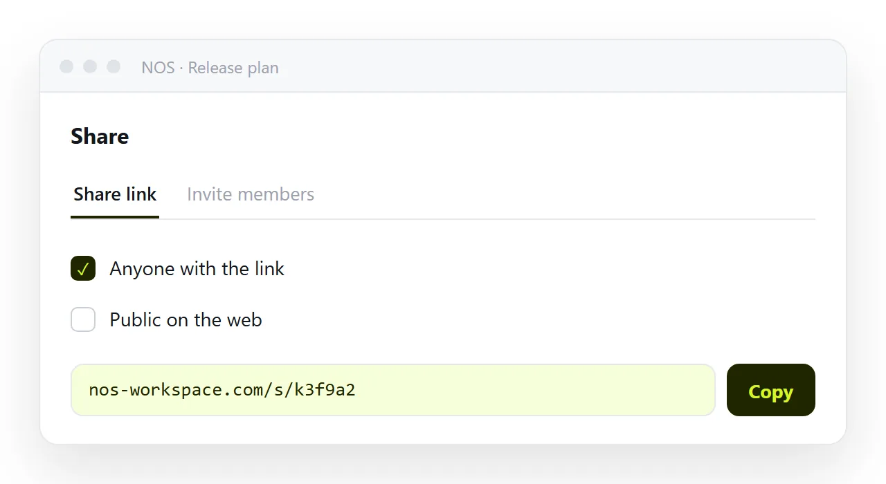
- Share, then Share link, then Create link. Leave it unlisted for an internal plan.
- Put the link in the project channel. Reference the same link in every status update.
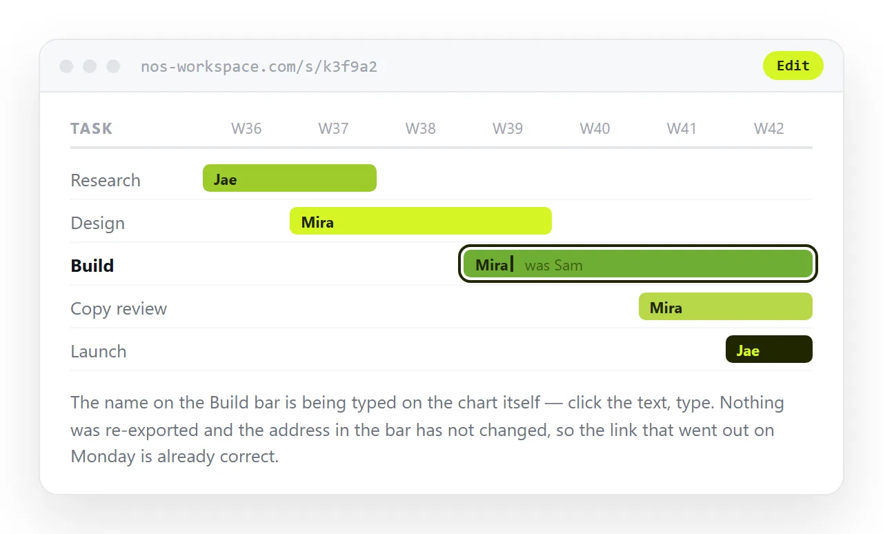
When a milestone slips, click the bar label in the document and change it. The link you sent in week one still points at the current schedule in week nine.
That is the difference between this and a screenshot of a live page, which freezes the moment you took it.
Where a gantt chart is the wrong picture
Not every schedule is a gantt. Two common mismatches.
If the tasks have no duration, only dates, you want a timeline. Turning a timeline into a link covers that shape.
If the question is how much of each thing, not when, you want a bar chart instead.
Before you send it
- Does the first bar line up with the header cell you think it does? Check the off-by-one.
- Is there a
<title>, so the tab and preview card are not blank? - Does the timeline scroll rather than shrink on a narrow window?
- Are the status colours distinguishable without relying on hue alone?
- Is the link unlisted if the plan names clients or unannounced dates?