Decide what the page is for
Start with the decision the dashboard supports, because that sets both the metrics and how often anyone looks at it. An active paid campaign may need daily checks, while a broader strategy review can happen monthly. This guide follows the monthly case: one page you send ahead of a results meeting.
For that page, a workable core is the goal and how close you came, spend by channel, results by channel, cost per result, and a comparison with last month. A result with no target or earlier period beside it is hard to judge, so pair each headline figure with one. Put the most important figures at the top and the channel breakdown beneath them.
Choose a build that matches how fresh the numbers must be
A spreadsheet can work for a small set of metrics you compile and review periodically. A visualization platform suits more detailed reporting, but it needs data connections and setup, so check whether those connections cost extra or require technical help. Connected tools can refresh automatically, depending on the source and the refresh settings.
The approach here sits between those options. You copy the month's figures from each source, then ask an AI chat assistant to turn them into a clean page. The result is a snapshot, and nothing on it updates by itself. If your team watches paid spend every day, a connected tool fits better; if the question is how September went, a well-built snapshot is often enough.
What one month looks like on a single page
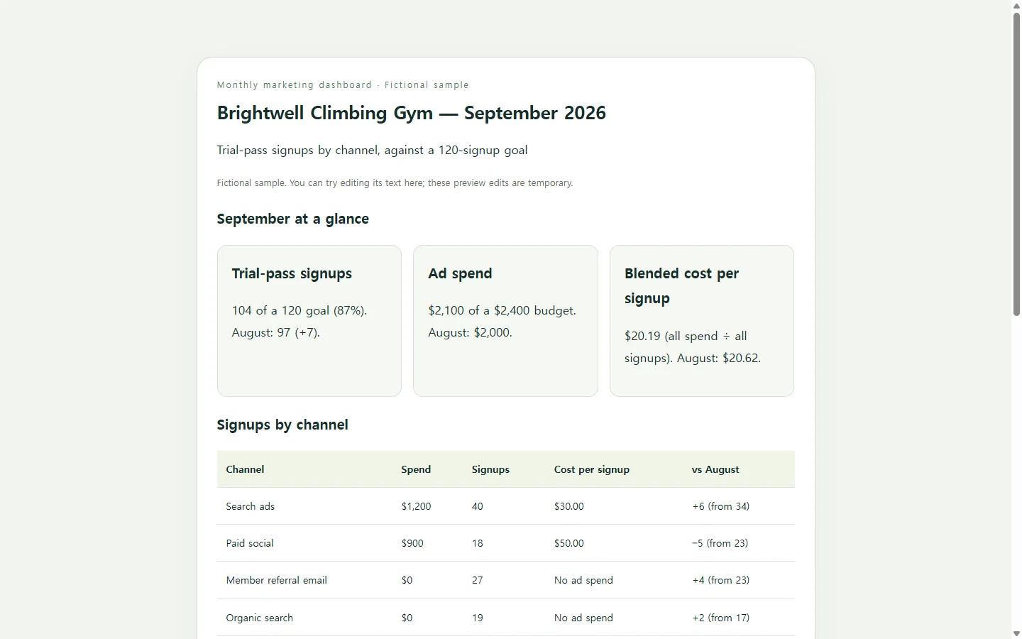
The example below is a September dashboard for a climbing gym; the gym, its figures and its plans are all invented for this guide. Its goal was 120 trial-pass signups, and the top of the page shows 104 next to August's 97, so the shortfall and the improvement are visible at once.
The channel table is where decisions come from. Search ads produced signups at $30 each, while paid social cost $50 per signup. In the sample, paid social also drew 1,150 clicks but only 18 signups. When an ad attracts clicks but few conversions, that is a reason to look at the landing page and whether the offer matches the ad, which is exactly the first item on the gym's October list.
Notice the data note at the bottom as well. It states the date range, the day the figures were compiled and where they came from. Before you share your own version, compare a few figures with their original sources and confirm the date ranges and metric definitions match.
Build your version with AI
Your job is the facts; the assistant's job is the layout. Gather the reporting period, the goal, each channel's spend, results and last month's results, plus one to three observations you actually stand behind. Don't ask the assistant to guess missing figures or write conclusions you haven't checked.
The prompt asks for an HTML file, the kind of file a web page is made of. Save the reply as a file ending in .html and open it in your browser to check every number against your sources.
One requirement matters later: totals and cost per result are written into the page as plain text rather than calculated by a script. That keeps every figure something you can correct by editing words.
After you send it: correct a figure at the same link
Say you share the page with the owner and the front-desk lead before Monday's meeting, and the next morning you find three email signups that were logged twice. The email row should now read 24, the total 101, progress 84% of the goal, and the blended cost per signup $20.79.
If the page is kept in NOS, you can edit that rendered text directly instead of asking AI to regenerate the whole page. The published sharing link stays the same after the edit, so the people you sent it to open the corrected numbers from the link they already have. They don't need an account to open it.
Don't count on a text edit to recalculate anything; that is why the prompt keeps totals as plain text, and why you change the total, the percentage and the cost per signup yourself when one row changes. If the meeting pack has to be a PDF or DOCX, send that file. The example page doesn't produce one, and the link can serve as the working view people check between meetings.
When October closes, you can update the same page so the link people saved keeps showing the latest month, or start a separate page if you want to keep September on record.
A prompt to adapt
Build a one-page monthly marketing dashboard as a single self-contained HTML file. Put all CSS in one <style> tag. Use no external libraries, fonts, images or scripts.

Business: [BUSINESS NAME] - [ONE-LINE DESCRIPTION]
Reporting period: [START DATE] to [END DATE]
Compiled on: [DATE], from: [SOURCES, e.g. search ad account, social ad account, email tool, signup log]
Goal for the period: [GOAL, e.g. 120 trial-pass signups]
Budget for the period: [BUDGET]
What counts as a result: [DEFINITION, e.g. a trial pass booked online]

Channel data (one line per channel):
[CHANNEL] | spend [AMOUNT] | results [NUMBER] | previous period results [NUMBER] | previous period spend [AMOUNT]
[CHANNEL] | spend [AMOUNT] | results [NUMBER] | previous period results [NUMBER] | previous period spend [AMOUNT]

Observations and next steps, in my words (use them as written, do not add new ones):
[1-3 OBSERVATIONS AND NEXT STEPS]

Requirements:
- Use only the numbers above. If a value is missing, show "Not provided". Never estimate or invent figures, names or results.
- Top of the page: results vs goal (with percentage), total spend vs budget, and blended cost per result (total spend divided by total results), each with the previous-period figure beside it.
- A channel table with spend, results, cost per result and change vs the previous period. For channels with no spend, write "No ad spend" instead of a cost.
- Calculate every derived number yourself and write it into the HTML as plain text. Do not calculate anything with JavaScript.
- A simple bar chart comparing results by channel, made with HTML/CSS or inline SVG, with the exact value printed as text next to each bar.
- A short "What we're changing next month" checklist built from my notes.
- A data note at the bottom with the reporting period, compile date, sources and the definition of a result.
- Accessibility: a real <table> with <th> headers and a <caption>; headings in logical order; strong text contrast against the background; never use color alone to show up or down (add + or - and a word); give the chart a text alternative.
- Mobile: readable on a 360px-wide phone with no sideways page scrolling; stack the summary figures in one column; if the table is too wide, let it scroll horizontally inside its own container.
- No forms, buttons, download links, live data connections or external API calls.
- Return only the complete HTML.