In short
Put the arrival route before the welcome message. A new student should be able to find the entrance, check-in point, first session, and first class without piecing together several files.
Add a short packing list, support contacts, and only the links needed before day one. Keep private student records off a page shared by address.
We built a fictional orientation page, shared it, changed one route instruction, and confirmed that the same public address showed the correction.
For this guide, NOS Team made a fictional page for North Harbor College. The task was narrow: guide a new student from the campus entrance to the first class, while keeping preparation and support details close enough to find on a phone.
What should a new student orientation website include?
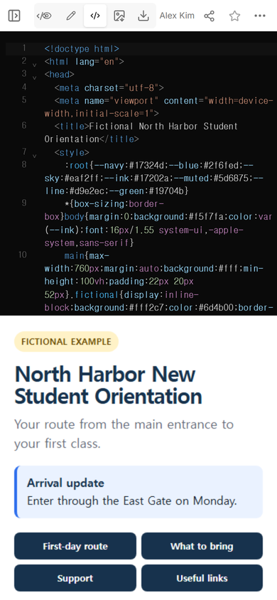
Start with the decisions a student must make before arriving. In our example, those decisions became four blocks:
- First-day route: entrance, check-in, welcome session, and the walk to class.
- What to bring: a welcome message, notebook, water bottle, and any accessibility item the student already uses.
- Support: where to go when delayed, when accessibility help is needed, or when technology access fails.
- Useful links: direct jumps to those three sections instead of a large directory.
The example marks itself as fictional and uses invented school details. It contains no student name, identification number, personal schedule, or real contact record.
How do you organize orientation information for the first day?
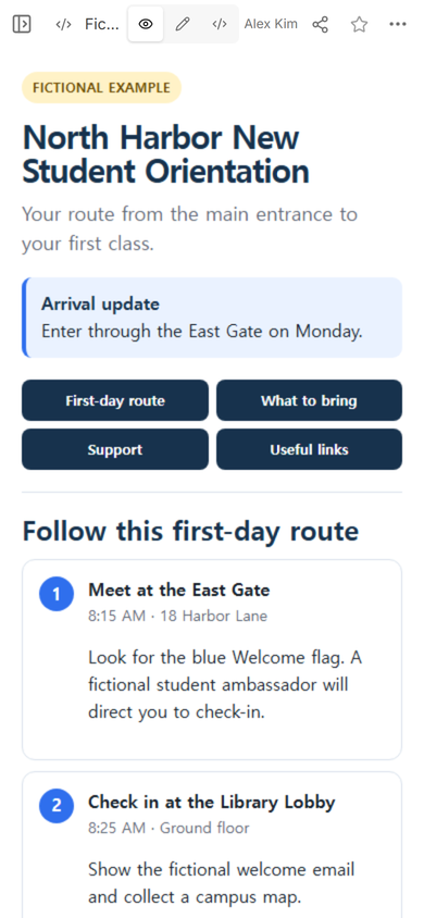
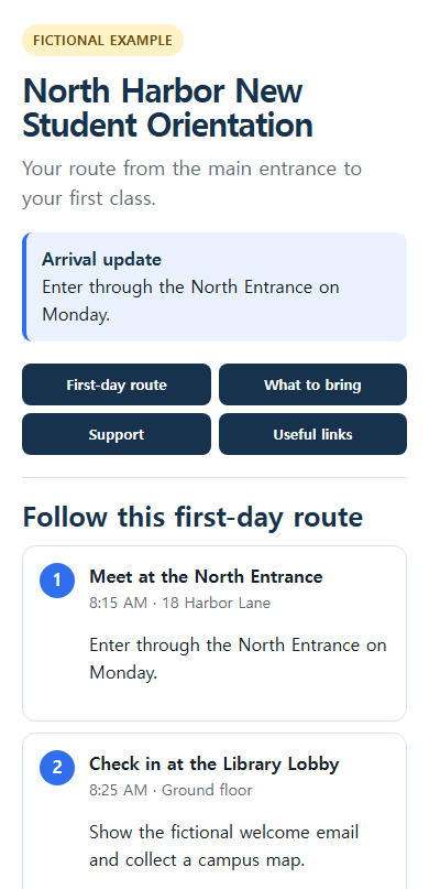
Write the page as a route, not as a brochure. “Meet at the East Gate” is a starting action. “Check in at the Library Lobby” tells the student what comes next. Each step in the example also names a time and a place, so the route still makes sense when someone opens it midway through the morning.
Put promotional background after the practical route, if it belongs at all. A long welcome from leadership does not answer where to enter. The first screen in this example instead shows an arrival notice and four clear section buttons.
Use the completed example as a starting point, then replace every fictional detail with reviewed information from your own institution. Download the fictional orientation HTML.
How was the orientation page shared?
After checking the layout in View, we opened Share on the same NOS page. The panel displayed the existing public address and said that anyone with the address could read the page without signing in, while visitors could not edit it.
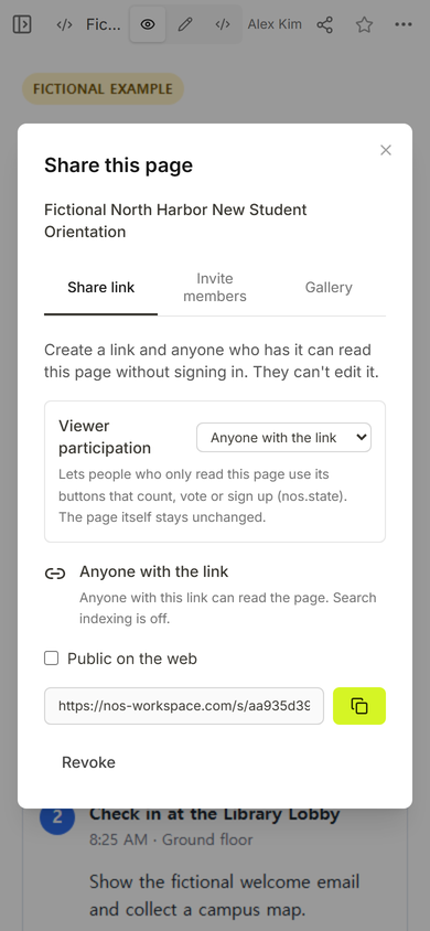
That distinction matters for an orientation guide. Staff maintain the page in the workspace. Students receive the public address. The page in this test did not collect a response, reserve a place, or store a checklist for each visitor.
Can you correct the route after sending the link?
We tested one realistic correction on the existing page. Edit mode opened with the arrival route visible, and we selected the first step’s instruction. The original line told students to look for a blue welcome flag.
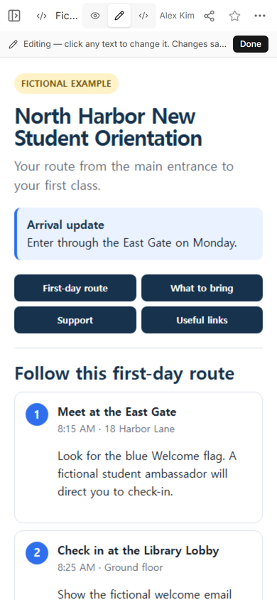
We replaced that line with “Enter through the North Entrance on Monday,” then chose Done. We also aligned the matching arrival notice and step heading with the North Entrance. The page title, time, address, and remaining route steps stayed in place.
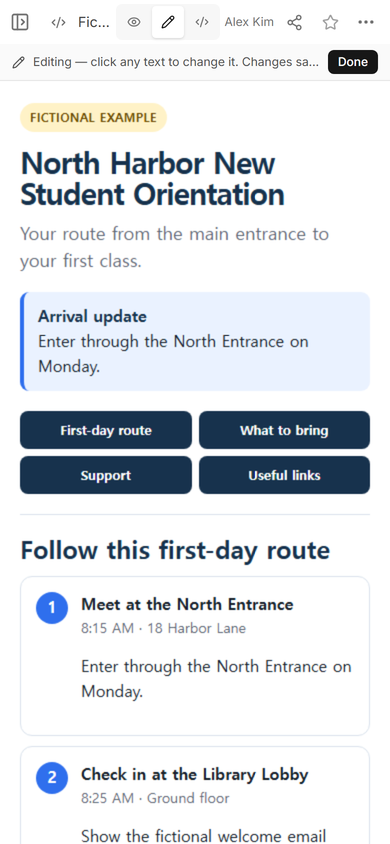
Next, we reopened the original public address. It showed the North Entrance instruction. This confirms what happened in this example: editing the existing page updated the content behind the address that had already been created.
What makes the page useful after the first screen?
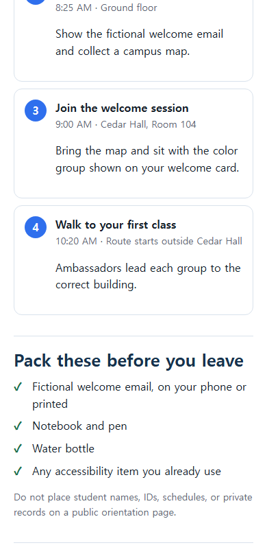
A student may return to the page for a different reason later. The lower part of this example continues the route through the welcome session and the walk to class, then presents the packing list. The support section follows that list rather than being hidden in a general contact directory.
Keep each support entry specific. “Lost or delayed” should point to a desk or approved contact. “Accessibility support” should name the team or location that can help. If details are still unconfirmed, leave the item out until an owner checks it; a confident placeholder is worse than a visible gap in the draft.
How should you check the page before students receive it?
- Follow the route from top to bottom and confirm that every place comes after the place before it.
- Open the page at phone width and check that buttons, times, and room names stay readable.
- Ask the owner of each support contact to verify the wording and destination.
- Remove student records, private links, passwords, and anything meant only for staff.
- Open the public address rather than relying only on the workspace preview.
If you need a broader home for weekly teaching links, see the one-page classroom website guide. For a longer set of questions students can open one by one, use the FAQ page pattern. To turn the finished address into a handout code, continue with the QR code link guide.
When not to do this
Do not use a public orientation page for enrollment records, personal schedules, accommodation records, payments, attendance, or anything that requires a student-specific sign-in. A static page also does not manage registrations or save each visitor’s progress. Use the institution’s approved system when the task needs identity, private data, submissions, or a reliable record of completion.
Where NOS fits
NOS was used here to hold one complete HTML page, preview it, open a reader-sharing panel, and correct the existing page. The public address showed the correction after the edit. That makes the page suitable for reviewed orientation information that must remain easy to reopen, while the school keeps private and transactional work in its approved systems. Current plan details belong on the NOS pricing page.