Start with the answer your reader came for
Whoever opens a progress report is usually asking two things: are we on track, and if not, what do I need to do? One project-management template guide builds the whole document around that question, and it works as a filter for every line you write.
That guide's list of parts makes a sensible starting checklist: a header with the project, period and overall status; work completed; work underway; risks and issues; budget against plan; next steps; and decisions you need from the reader. They don't all need equal space. Put the status and a two- to four-sentence summary first, and write that summary last, after everything else is filled in.
Use counts instead of adjectives. “Three of five milestones complete” tells a reader more than “good progress,” and a delay stated plainly, with its new date and your proposed response, is easier to act on than one softened into neutral wording. For senior readers, the same guide suggests two pages is almost always enough.
A filled example: one month of a cold-storage build
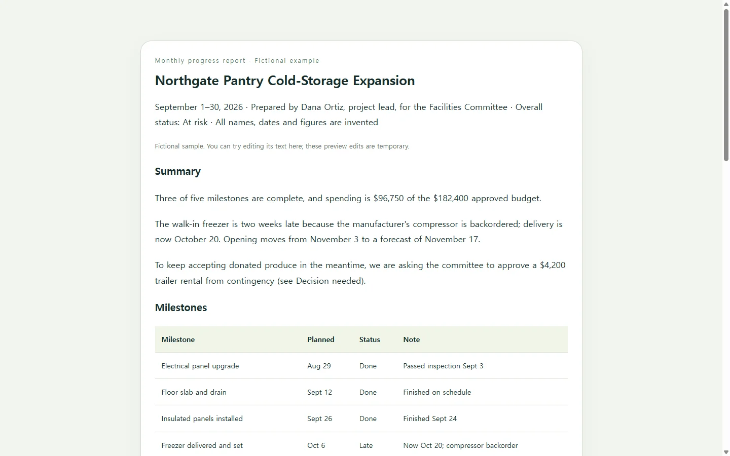
The example below is fictional: an invented food pantry adding a walk-in freezer, reporting September to its facilities committee. Every name, date and dollar figure was made up to show how a month reads; none comes from a real organization.
Rather than walk through the whole layout, notice three choices. The status reads “At risk” in words, not only as a color, so it still works in a black-and-white printout. The late freezer shows up in the summary, the milestone table and the risk cards with the same new date each time, so nobody has to reconcile two versions. And the one decision gets its own block with an amount and a deadline, because that is the line the committee has to act on.
Adjust from there. If you don't control a budget, drop that table instead of filling it with guesses. If nothing needs approval, write “No decisions needed this period” so the reader knows you checked.
Pick the format your reader will actually open
Many results for this search are downloadable Word, Excel or PDF files and design-tool galleries, and each fits a different situation. If your sponsor, funder or school requires a PDF or DOCX, submit that; a web page is not a substitute for a required file. A spreadsheet suits reports where the budget lines carry most of the weight. A design tool makes sense when the report will be presented or printed as a polished piece. If your team already works in a project tool, posting a status update marked on track or at risk there may be enough.
A single web page fits when your readers will open a link on a laptop or phone and you want the tables to stay readable on both.
Have AI lay out the page from your facts
If you take the page route, an AI assistant can handle layout and styling while you supply the substance. HTML is the format web pages are written in: you ask for one file, open it in a browser and check it.
The prompt below asks for that file and sets the rules that matter here: use only the numbers you provide, mark anything missing as [TBD] instead of inventing it, state status in words, and keep tables usable on a narrow phone screen. Replace the bracketed parts with your project; the sample values show a workable level of detail, so delete them once yours are in.
Before you send anything, check every figure against your source sheet. A neatly formatted table can still contain a transposed number.
When a date changes after you've sent it
Say the committee chair opens the report the night before the meeting, and the next morning the supplier confirms the freezer for October 16 instead of the 20th. If the page lives in a NOS workspace, you can edit that date directly in the rendered page, in the summary, the table and the card, without asking AI to rebuild it.
The link you already sent stays the same, so the chair sees the corrected date when they open it again, and committee members don't need an account to read it. That leaves one current version instead of an attachment plus a correction email people have to match up.
For October, start a new page rather than overwriting September. NOS keeps pages and subpages together in a workspace, so each month's report can sit under the project as a record of what you told the committee. If the committee's packet also requires a PDF, prepare it the way your organization normally does, and use the link for updates between meetings.
A prompt to adapt
Create a one-page progress report as a single self-contained HTML file. Use only the facts I give below. If a section has no information, write [TBD] there; do not invent numbers, names, dates, percentages or outcomes.

Project: [project name, e.g., Northgate Pantry cold-storage expansion]
Read by: [audience, e.g., Facilities Committee, 6 members]
Reporting period: [e.g., September 1–30, 2026]
Prepared by: [your name and role]
Overall status: [On track / At risk / Off track] because [one-sentence reason]
Summary: [2–4 sentences, written after everything else is filled in]
Milestones, one per line: [name | planned date | status | note, e.g., Freezer delivered and set | Oct 6 | Late | Now Oct 20; compressor backorder]
Work in progress: [item | percent complete if known]
Budget, one per line: [category | approved | spent to date | forecast at finish, e.g., Equipment | $52,400 | $18,200 | $52,400]
Risks and issues: [type | description | owner | response]
Next period: [date | planned step]
Decisions needed: [what, amount, deadline, and what happens if declined, or None this period]

Layout and output requirements:
- Section order: header with status, summary, milestones, work in progress, budget, risks and issues, next period, decisions needed. Mention any decision in the summary too.
- Show status as a text label such as At risk. Color may reinforce it but must never be the only signal.
- Use one h1 and headings in order. Build milestones and budget as real HTML tables with header cells and a caption; right-align currency and add a total row only if I give a total.
- Body text at least 16px; dark text on a light background with a contrast ratio of at least 4.5:1.
- On a 375px-wide screen, nothing scrolls sideways except tables, which scroll inside their own container; risk cards stack in one column.
- Include print styles so it fits on no more than two US letter pages with no table row split across pages.
- Put all CSS in one style tag. No JavaScript, external fonts, images, CDNs, forms, download or export buttons, or links to outside services.
- Return only the complete HTML file, starting with <!DOCTYPE html>.