Start with the goal, then keep three or four numbers
A sales dashboard is a visual summary of sales metrics that shows progress toward a goal at a glance. Lists of possible metrics run long, so work backward from the goal instead. One sales guide recommends sticking to three or four metrics per goal, since more makes a dashboard harder to set up and harder to interpret.
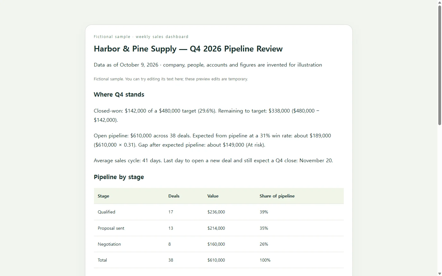
A set that fits a weekly team review: revenue closed against target, open pipeline value by stage, win rate, and average sales cycle length. Add one list that's easy to miss in rows of data: open deals that have gone quiet.
What those numbers say together
In the sample, Harbor & Pine Supply, an invented coffee wholesaler, has closed $142,000 of a $480,000 Q4 target as of October 9. Open pipeline is $610,000, which looks comfortable next to the $338,000 still needed.
Win rate changes that picture. At the team's 31% win rate, $610,000 of pipeline points to about $189,000 in new revenue, roughly $149,000 short. Cycle length adds a deadline: with deals averaging 41 days, anything opened after about November 20 will likely close in Q1, not Q4.
Treat pipeline times win rate as a rough check, not a forecast, because it weighs a deal you qualified yesterday the same as one in negotiation. Its value is the conversation it starts: the gap points the meeting toward prospecting now and toward the seven deals that have gone quiet.
Choose where the dashboard lives
If your CRM has built-in dashboards, start there for live numbers. Many CRM tools offer pre-built templates and drag-and-drop builders, and the dashboard pulls data from the CRM instead of from a copy you paste each week.
A spreadsheet dashboard makes sense when the team already works in that file and someone has time to build the charts. The route this guide follows suits a different case: you have the numbers but no dashboard tool, and you want a clean page for a weekly review. You paste the figures into an AI assistant and ask for a single HTML page, the page format NOS keeps in a workspace. The trade-off is that it's a snapshot you update, not a live feed connected to your CRM.
Build yours with the prompt
Gather what the prompt asks for first: your target, closed revenue to date, one row per open deal with owner, stage, value and last activity date, plus your win rate and average cycle from recent quarters. Leave out anything you don't have; the prompt tells the AI to print “not provided” rather than guess.
Two requirements do more work than they seem to. Printing the arithmetic under each headline number lets you check the math before the team sees it. Showing every figure as text, with bars as decoration and a word like “At risk” beside any status color, keeps the page readable on a small screen and with a screen reader.
Then compare the page against your sheet. If a total is wrong, correct the rows you pasted and run the prompt again rather than patching around a bad number.
Build a one-page sales dashboard as a single HTML file.

Context: I manage [TEAM NAME] at [COMPANY]. We review this page in a weekly pipeline meeting, and some people read it on their phones.

Period: [PERIOD, e.g. Q4 2026], data as of [DATE].
Target for the period: [TARGET $].
Closed-won so far: [CLOSED $].
Win rate over [LAST N QUARTERS]: [WIN RATE %].
Average sales cycle: [DAYS] days.
Quiet-deal threshold: no activity for [N, e.g. 14] days.
Open deals, one per line (account | owner | stage | value | last activity date | next step):
[PASTE ROWS]

Build:
1. A header with the team name, period and the “data as of” date.
2. Four headline figures: closed vs. target (with % of target), remaining to target, open pipeline value, and expected from pipeline = pipeline × win rate. Print the arithmetic under each figure so I can check it.
3. Pipeline by stage as a table: deal count, value and share of pipeline per stage, with a simple horizontal bar beside each value.
4. A table by owner: closed, open pipeline, and number of quiet deals, with a team total row.
5. “Needs attention”: quiet deals sorted by value, each showing account, owner, value, stage, days without activity and next step.
6. One line stating the last date a new deal can be opened and still close this period, given the average cycle.

Rules:
- Use only the figures above. If something is missing, show “not provided”. Never estimate or invent deals, names or numbers.
- One self-contained file: inline CSS only, no JavaScript, no external libraries, fonts or images, no forms, no links to live data.
- Every number appears as readable text; bars are decoration only.
- Never signal status by color alone; add a word such as “At risk”.
- Strong text contrast, body text at least 16px, one h1 followed by h2 headings in order, tables with header cells.
- Mobile: single column below 600px wide; wide tables scroll sideways inside their own box instead of shrinking the text.
- Return only the HTML.
Share it before Monday, keep it current after
Send the page as a link ahead of the meeting so each rep can check their own row. If finance or leadership wants a PDF in a quarterly pack, send them the PDF they asked for; the link is for the team's weekly view.
Meetings change the facts. Suppose Marcus, one of the sample's reps, says Lakeview Bistro Group pushed its decision to November. With the page in NOS, you can edit the rendered text directly and change that deal's status and next step yourself, with no new AI request for a one-line fix. Direct edits are for text, so don't expect a bar or a calculated total to follow when you type a new number; adjust those too.
The published link stays the same after those edits, so the team keeps one bookmark and sees the corrected page there. People you send it to can open it without creating an account. Next Monday, type the week's figures into that same page, and the question you started with gets a fresh answer at the address everyone already has.