In short
A useful style guide website puts the decisions people copy or compare on one page: color roles and values, type specimens, button states, voice examples, and visible examples of what not to do.
Use a fictional or approved example while you test the layout. Keep private drafts, unreleased assets, and licensed files out of a public reader link.
NOS Team built one fictional guide, shared it, found a vague button label, corrected the full page in Code, and confirmed the change at the same reader address.
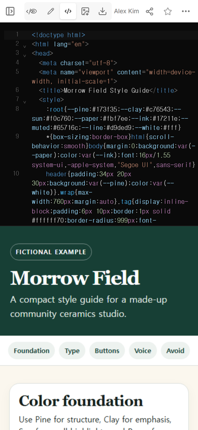
Our example is for Morrow Field, a made-up community ceramics studio. The page gives each color a job, shows two type treatments, renders three button states, contrasts a direct sentence with a vague one, and draws two logo mistakes instead of only naming them. It is a complete fictional reference, not a record of a real studio or client project.
What should a style guide website contain?
Start with the choices another person must apply. A visitor should be able to see the color, read the exact value, compare the heading and body styles, and recognize the intended button state without translating a paragraph of abstract rules.
For this page, the minimum useful set was:
- Color: four named swatches, exact web values, and a short role for each one.
- Typography: a display specimen and a body specimen shown at readable sizes.
- Components: filled, outlined, and unavailable buttons with their labels visible.
- Voice: one direct instruction beside a sentence the studio should avoid.
- Misuse: a stretched wordmark and a busy background rendered as examples.
You can inspect the finished page in the complete fictional HTML example.
How do you make color guidance usable?
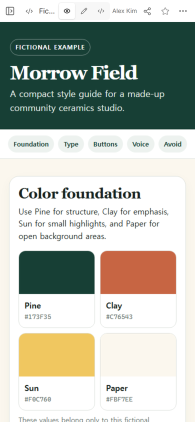
Do not stop at four attractive blocks. Name each color, print its exact value as text, and state what the color is for. Morrow Field uses Pine for structure, Clay for emphasis, Sun for small highlights, and Paper for open background areas.
The phone view kept the four swatches in a two-column grid. Each label and value remained below its swatch, so the reader did not have to infer a color from its position alone.
How do you share a style guide without creating another version?
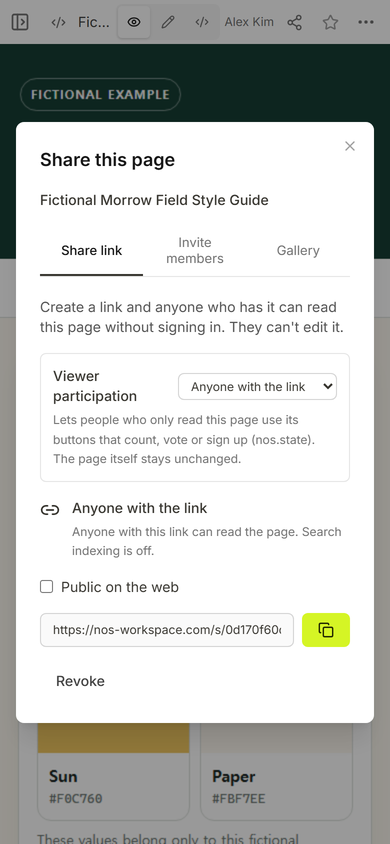
Create the reader link from the finished page, then open that exact address before sending it. The captured NOS Share panel says that anyone with the link can read the page without signing in and cannot edit it. It also identifies the address as the share link, which keeps the editor address out of the handoff.
We created the reader link while the primary button still said “Learn more.” That label did not follow the page's own rule that button text should name the next screen or action. The example therefore exposed a real editorial problem before the guide was handed off.
How do you correct the page after the link exists?
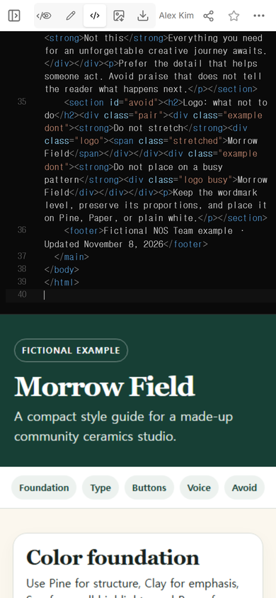
We reopened Code on the same page, selected the complete source, and replaced it with the corrected version. The primary button now says “See open-studio dates.” The final Code screen ended at line 39, with no duplicate document appended below it.
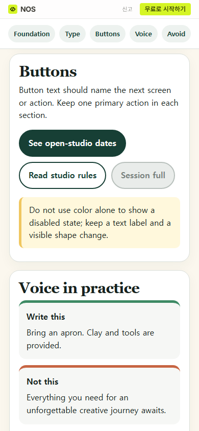
The original reader address then showed the revised button beside “Read studio rules” and the unavailable “Session full” state. The page also explains that the unavailable state needs a text label and a visible shape change instead of relying on color alone.
How should typography and voice be demonstrated?
Show the type doing the work it will do. The example uses a large Georgia heading for short display text and a system sans serif for instructions. This is a specimen for the fictional page, not a claim that those fonts fit every brand.
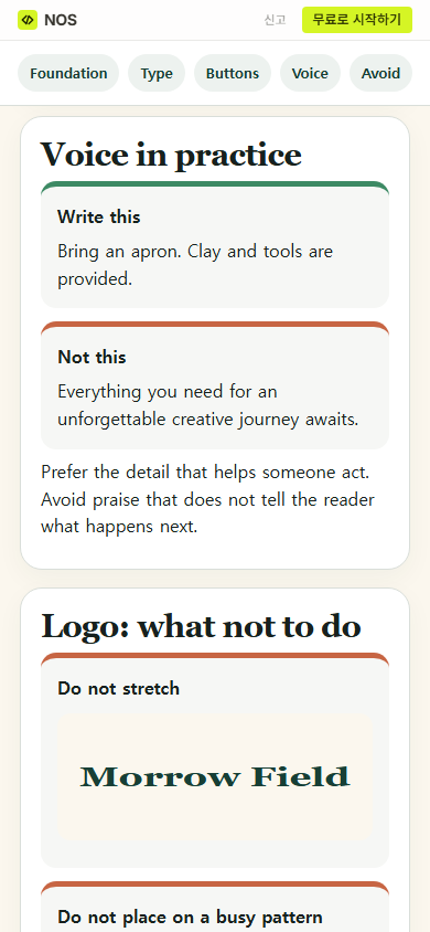
Voice rules become easier to apply when the reader can compare two sentences. “Bring an apron. Clay and tools are provided.” gives the visitor an action and a condition. The rejected sentence offers praise but no next step.
Why show the wrong use instead of only describing it?
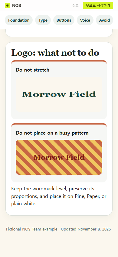
A sentence such as “do not distort the logo” still asks the reader to imagine the failure. The example draws a stretched wordmark and a wordmark over a striped background. The rule beneath them says to preserve proportions and use Pine, Paper, or plain white.
If you are deciding what belongs above the fold, read what useful brand guidelines have in common. For a stable handoff, use the workflow in sharing brand guidelines as a link. If the reasoning behind the identity is longer than the working rules, publish the brand book separately and connect the two pages.
When not to do this
- Do not publish unreleased marks, private client work, licensed font files, or internal approval notes on a public reader page.
- Do not describe a color pair as accessible without testing the actual text size, weight, background, and interaction state.
- Do not turn every preference into a prohibition. Reserve the “do not” section for failures another person can recognize and avoid.
- Do not treat the guide as proof that every existing page, file, or supplier has adopted the current rules.
Using NOS for a style guide website
NOS let us keep the complete fictional guide in one HTML document, compare the source with the rendered page, and create a separate reader link. After we replaced the source on the original page, that reader address showed the corrected button wording. The guide remains a reference page; approvals, licensed assets, and private working files still belong in the systems chosen for those records.