Brand guidelines exist to be looked up, not read. A designer at an agency needs one value, quickly, and whatever stands between them and that value is where the brand gets broken.
This guide covers what to put first, copyable values, and keeping it current.
The lookup is the use case
Picture the actual moment. Somebody is building a slide, an ad or a sign, at four in the afternoon, and they need the brand blue.
If the answer is in a downloadable document, the sequence is: find the email, download, open, scroll, zoom, read, retype. Seven steps for one value.
If the answer is at an address, it is: open, tap the swatch, paste.
The second one gets used. The first one gets guessed at, and the guess is what appears in the finished work.
Put the four things people came for at the top
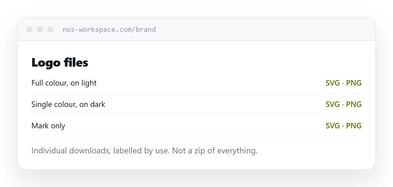
Logo downloads. Every variant, clearly labelled, each a direct download. Not a zip of everything.
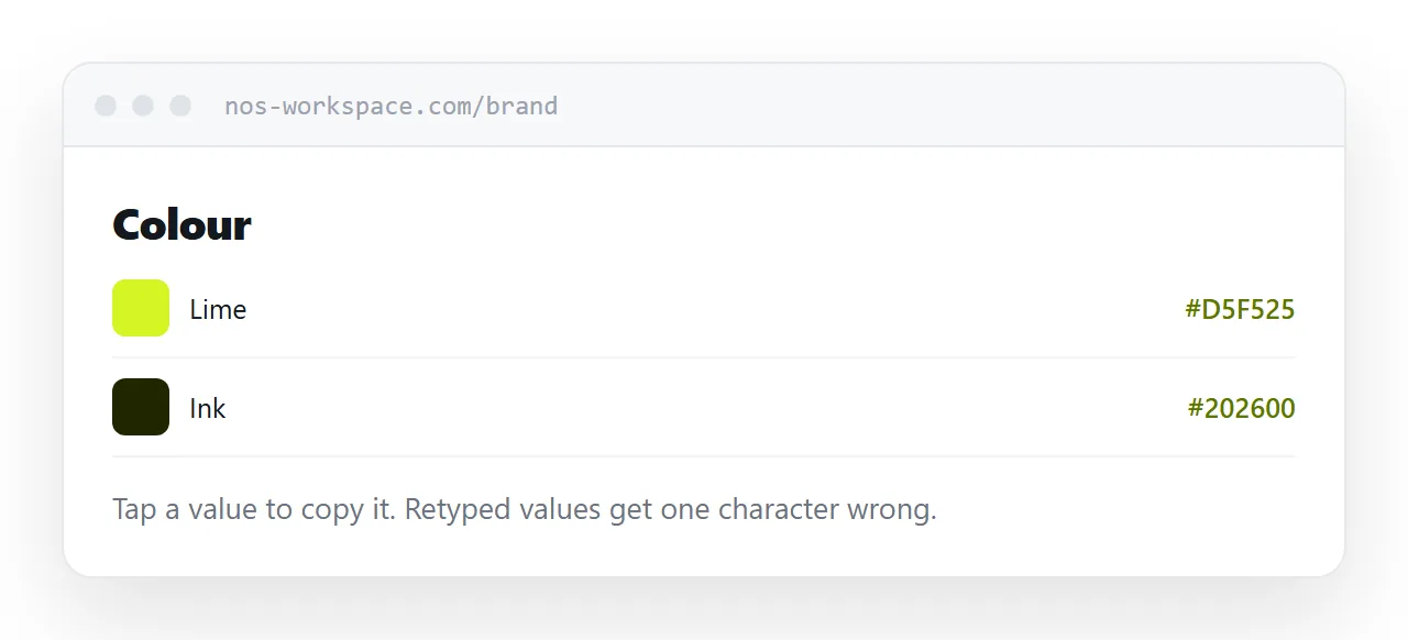
Colour values. Copyable, in the formats people actually need: screen, print, and the web value.
Fonts. Where to get them, what the licence allows, and what to substitute when the real font is unavailable.
The non-negotiables. Two or three rules that genuinely matter. Minimum size, clear space, what must never be done to the logo.
Everything else, the tone of voice, the photography principles, the history of the mark, goes below. It is reference material and it is read once by the person who wants context.
| Guidelines as a PDF | Guidelines at an address | |
|---|---|---|
| Looking up one colour | Seven steps | Two |
| Copying a value | Retyped by hand | Tap to copy |
| Logo files | Inside a zip | Individual downloads |
| Updating a rule | Version five, emailed | Edit the page |
| Supplier from two years ago | Has version two | Has the current one |
Copyable values
This is a small detail that changes behaviour.
A colour value printed inside a document is an image of a value. It gets read and retyped, and retyping produces mistakes that nobody catches until something is printed.
At an address, the value is text. Tapping it copies it. The designer pastes it and it is correct.
Do the same for the font stack, the logo file names, and anything else that gets transferred by hand.
Rules, then reference
Most guidelines documents fail by treating everything as equally important.
Forty pages of equal weight means a supplier has no way to tell which rules are genuine constraints and which are preferences. So they either follow none of it or ask you about all of it.
State the small number of things that are actually not allowed, plainly, near the top. Then let the rest be reference for people who want it.
Old versions never get recalled
A guidelines PDF emailed to a supplier in 2024 is still on their server.
They are still using it. They have no way of knowing there is a version five, and you have no way of reaching them. The brand drifts, and the drift is discovered in printed material.
One permanent address removes this entirely. Everyone who has ever been given the link has the current rules, including the agency you stopped working with and the printer who kept your details.
For the surrounding ground, see How to share a media kit as a link and How to share a press kit as a link.
Put it at an address
Logo downloads and copyable colours at the top, the non-negotiables stated plainly, reference material below, one permanent address, and edits in place rather than a version five.
Then the designer at four in the afternoon gets it right.