The published guidelines that circulate as examples are from organisations with hundreds of people applying a brand across dozens of contexts. Their length is a symptom of that, not a standard to meet.
What is worth copying is the structure.
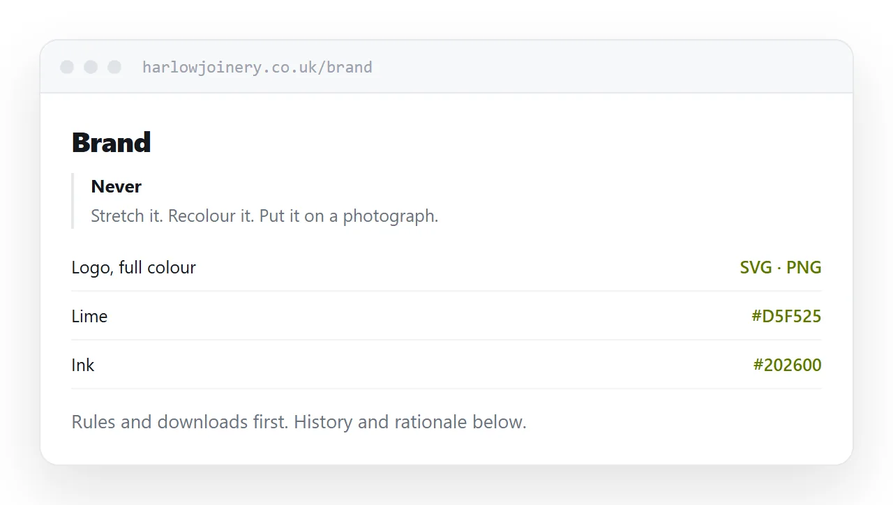
What the good ones do
Rules first. The small number of things that are genuinely not allowed, stated plainly, near the top. Not buried on page sixty.
Downloads without asking. Every logo variant, every colour value, the fonts. Reachable in one tap by a supplier who does not work for you.
Examples of wrong. A logo stretched, a logo on a busy photograph, a logo recoloured. Showing the failure is more effective than describing the rule.
Reference below. The history, the rationale, the photography principles. Present for anyone who wants it, out of the way of somebody looking up a hexadecimal value.
| Long document | Working guidelines | |
|---|---|---|
| Rules findable | Page sixty | First screen |
| Logo files | Inside a zip | Individual downloads |
| Colour values | Printed in an image | Copyable text |
| Used by suppliers | Rarely | Constantly |
What a small business needs
Four things and a folder.
The logo, with clear space and a minimum size.
The colours, as copyable values, with which one is primary.
The font, with a substitute for when it is unavailable.
What must never happen. Usually two or three things: do not stretch it, do not recolour it, do not put it on a busy image.
That fits on one page and it prevents nearly all of the damage that actually occurs.
Tone of voice, if it is specific
A list of adjectives is not usable. Friendly, confident and approachable describe every organisation's stated voice and guide nobody.
What works is pairs. A sentence as it should be written, and the same sentence as it should not.
Three or four pairs teach more than a page of description, because the reader can see the difference rather than interpret a word.
Show the failures
The most read part of any guidelines is the page of things not to do.
Stretched, recoloured, on a photograph, too small, too close to other elements. Each one shown, each one marked, each with one line saying why.
It is faster to produce than prose and it is what people actually consult.
Publish it, do not send it
A guidelines document emailed to a supplier is permanent. They keep using it, they have no way to know there is a newer version, and you have no way to reach them.
One permanent address means everybody who has ever been given the link has the current rules, including the agency you stopped working with and the printer who kept your details.
Closely related: How to share brand guidelines as a link, and How to host a press kit for the adjacent problem.
Put it at an address
State the non-negotiables first, put downloads before explanation, make colour values copyable, show the failures, and publish at a permanent address.
Then the designer at four in the afternoon gets it right.