A filled-in example: a donation app for pantry volunteers
The sample manual covers Pantry Ledger 2.3, an app that volunteers use to log donations at a neighborhood food pantry. The app, the pantry, the people and every figure in the manual are invented for this article.
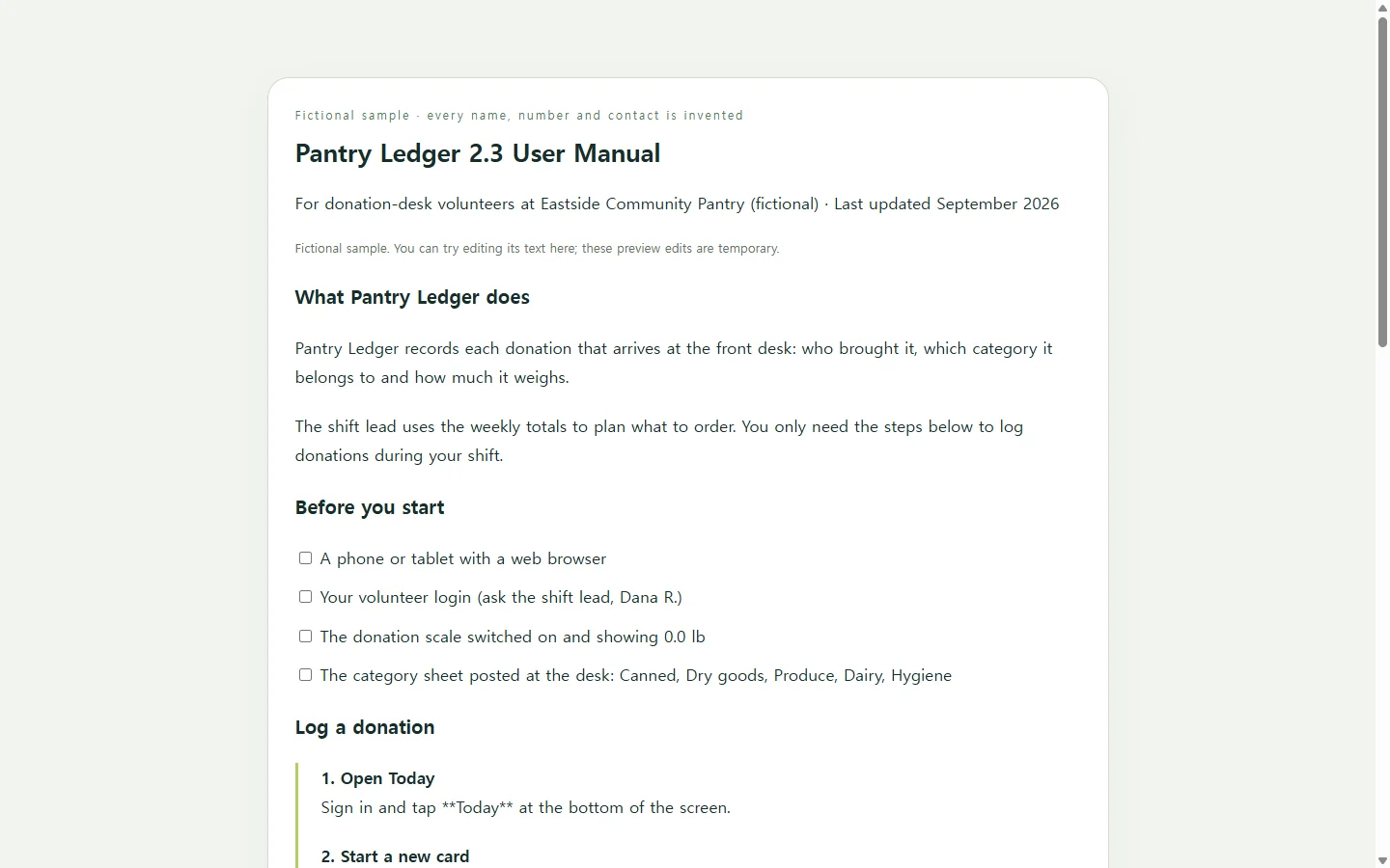
Picture the reader as a volunteer on their first shift, with a phone in one hand and a box of canned goods on the table. Three choices do most of the work for that person.
The opening checklist answers “can I start?” before “how does it work?” It lists what the volunteer needs first, including a login from the shift lead, so nobody gets stuck at step three.
Each task is a short numbered list. Every step starts with a verb and names the exact button. The last step says what the screen should show: the donation appears at the top of Today's list. That line lets a reader confirm they got it right without asking anyone.
Troubleshooting is organized by what the person sees, not by what went wrong inside the app. A volunteer can recognize “the weight field stays blank,” but nobody should expect them to diagnose a dropped scale connection.
Gather the facts a template can't supply
No layout knows your product. Before you choose one, write down the product name and version, who reads the manual and on what device, the few tasks they actually do, what they need before they start, the mistakes you've seen people make, and who they should contact.
Many manual templates are built around an introduction, step-by-step directions, safety information and troubleshooting. Use that as a starting outline and keep only the parts your readers need. A volunteer app doesn't need a safety chapter. If your product can injure someone or damage property, find out what your industry requires instead of relying on any template, including this one.
Then give a draft to someone who has never used the product and watch where they hesitate. Each pause marks a step to rewrite.
Choose a format based on where the manual will be read
If a client, buyer or regulator asks for a DOCX or PDF, start in a word processor. That requirement decides the format, and a web link can't replace the file.
If you already run a help center, the manual may work better there as separate articles.
If people will mostly open the manual on their phones, a single web page is a good fit, and you won't have to fight a word processor's page layout. An AI chat assistant can lay out the page from your notes and give it back as HTML, which is the code a browser reads to display a page. You don't have to edit that code. You only paste it in where the page will live.
The AI should arrange your facts, not make them up. The prompt below says this directly and tells the AI to mark gaps instead of filling them with steps that only sound right.
A prompt for your own manual page
Copy the prompt and replace each bracketed field with your own details. Delete any field that doesn't apply. The bracketed examples come from the fictional pantry manual.
When the page comes back, go through every step on the real product before anyone relies on it. Search for [MISSING] and fill in each one yourself.
Build a user manual as a single, self-contained HTML page.

About the product. Use only these facts. Do not invent features, steps, button labels, settings, contacts or numbers.
- Product name and version: [e.g., Pantry Ledger 2.3]
- Who reads this manual, and where: [e.g., first-time volunteers, mostly on phones at a busy front desk]
- What the product does, in one or two sentences: [e.g., records each donation that arrives: donor, category, weight]
- What a reader needs before starting: [e.g., a phone with a web browser, a login from the shift lead, the scale switched on]
- Tasks to cover, in the order people do them, each written the way I'd explain it out loud: [Task 1: ...; Task 2: ...]
- What the screen shows when each task is done correctly: [e.g., the donation appears at the top of Today's list]
- Problems I've seen and how to fix them, as symptom → fix: [e.g., weight field stays blank → turn the scale off and on, then tap Reconnect scale]
- Terms a new reader may not know: [e.g., Walk-in, Donation card]
- Safety or legal text I've been told to include, word for word: [paste it, or write 'none']
- Help contact: [role, and email or phone]
- Last updated: [month and year]

Structure:
1. A title with the product name and version, and a 'Last updated' line.
2. A short table of contents that links to each section.
3. A 'Before you start' checklist.
4. One section per task. Put each step in a numbered list. Start each step with a verb and show the exact on-screen label in bold. End each task with one sentence saying what the reader should see.
5. A troubleshooting table with the columns What you see / Likely cause / What to do. Use real table header cells.
6. A short glossary and a 'Need help?' section.
Wherever information is missing or unclear, write [MISSING: what's needed] instead of guessing.

Design and accessibility:
- Plain HTML with all CSS in one <style> tag. No JavaScript, external fonts, images, scripts, tracking or calls to outside services.
- Do not add forms, download or print buttons, search boxes, or anything that suggests files can be exported or messages sent.
- Use headings in order (one h1, then h2 and h3) and ordered lists for steps.
- Body text at least 16px, line height around 1.5, and strong contrast between text and background (aim for at least 4.5:1).
- The page must be readable at 360px wide with no sideways scrolling. On narrow screens, let the troubleshooting table scroll inside its own container, or stack each row as a card.
- Make links and table-of-contents items easy to tap (about 44px tall).
- Don't use color alone to signal a warning. Label it with the word 'Warning' or 'Note'.

Return only the complete HTML.
When version 2.4 renames a button
Suppose the next release renames Save to Log donation. Step six is now wrong, and a volunteer following it will look for a button that no longer exists.
If the manual is an HTML page in NOS, you can edit the displayed text directly and change those two words. You don't need to ask the AI to rebuild the whole manual and then recheck steps that were already correct.
The sharing link you published stays the same after the edit. Volunteers who saved the link on their phones, or who type in the address printed at the desk, see the corrected step at that same address. They don't need an account to open it.
Update the version number and the last-updated line at the same time, so everyone knows which edition they're reading. If you also sent someone a PDF or DOCX, that copy won't update itself. Send them a revised file the way you normally would.