텍스트 스크롤을 위한 HTML 태그는 <marquee>입니다. 텍스트를 감싸면 브라우저가 오른쪽에서 왼쪽으로 스크롤합니다.
하지만 이 태그는 구식입니다. HTML 표준에서는 이 태그를 비준수 기능으로 나열하고 MDN에서는 이 태그를 더 이상 사용되지 않는다고 표시합니다. 현대적인 방식은 transform를 사용하여 콘텐츠 스트립을 이동하는 CSS 애니메이션입니다.
둘 다 아래에서 실행 중입니다. 맨 위 줄은 이전 태그이고 맨 아래 줄은 CSS입니다.
<!doctype html>
<html lang="en">
<head>
<meta charset="utf-8">
<meta name="viewport" content="width=device-width, initial-scale=1">
<title>marquee tag vs CSS</title>
<style>
body { margin: 0; padding: 14px; font-family: system-ui, sans-serif; background: #f4f5f7; }
.lane { background: #fff; border-radius: 10px; padding: 12px 14px; margin-bottom: 12px; box-shadow: 0 2px 8px rgba(0, 0, 0, .06); }
.lane h3 { margin: 0 0 2px; font-size: 14px; }
.lane p { margin: 0 0 10px; font-size: 12px; color: #5b6270; }
.strip { background: #eef1f5; border-radius: 6px; padding: 8px 0; font-size: 15px; }
/* The CSS version */
.marquee { overflow: hidden; }
.track {
display: flex; width: max-content; /* as wide as its content */
animation: scroll 12s linear infinite;
}
.track span { padding-right: 48px; white-space: nowrap; } /* the gap lives inside each copy */
@keyframes scroll {
to { transform: translateX(-50%); } /* one copy's width, then it loops */
}
</style>
</head>
<body>
<div class="lane">
<h3><marquee> (obsolete)</h3>
<p>Not part of current HTML. Browsers still render it.</p>
<div class="strip">
<marquee>Free shipping this week · New colours in stock · Open until 8 pm · Gift cards at the till · Returns within 30 days</marquee>
</div>
</div>
<div class="lane">
<h3>CSS animation</h3>
<p>Same effect, no gap, and fully styleable.</p>
<div class="strip marquee">
<div class="track">
<span>Free shipping this week · New colours in stock · Open until 8 pm · Gift cards at the till · Returns within 30 days</span>
<span aria-hidden="true">Free shipping this week · New colours in stock · Open until 8 pm · Gift cards at the till · Returns within 30 days</span>
</div>
</div>
</div>
</body>
</html>
둘은 비슷해 보이지만 각 패스 전에 태그가 빈 상자를 남기고 속도와 모양을 제어하기 어렵습니다. CSS 버전은 스타일을 지정하고, 일시 중지하고, 끌 수 있는 일반 HTML입니다.
marquee 태그 및 사용을 중단해야 하는 이유
태그의 기본 예:
<marquee>Free shipping this week</marquee>
<marquee direction="up" scrollamount="3">Line one<br>Line two</marquee>
이는 자체적으로 몇 가지 속성을 갖습니다.
| 속성 | 기능 | CSS에 해당 |
|---|---|---|
direction |
left, right, up 또는 down |
translateX 또는 translateY 및 animation-direction |
scrollamount |
픽셀은 한 단계씩 이동하므로 속도는 | animation-duration |
behavior |
scroll, slide 또는 alternate |
animation-direction: alternate |
loop |
몇 번이나 실행되는지 | animation-iteration-count |
문제는 오늘 실패했다는 것이 아니다. 유효성 검사기는 이를 오류로 보고합니다.
모션은 CSS 애니메이션이 아닌 요소 자체에 의해 구동되므로 animation-play-state와 같은 일반적인 CSS 도구 및 축소 모션 쿼리는 이를 제어하는 방법이 아닙니다. 그리고 각 패스는 빈 상자에서 시작됩니다. CSS 버전은 세 가지를 모두 수정합니다.
CSS 윤곽: 트랙 1개, 복사본 2개
전체 기술은 몇 줄에 들어 맞습니다. 외부 상자는 넘쳐나는 것을 숨깁니다. 그 안에는 트랙이 콘텐츠를 두 번 보유하고 왼쪽으로 슬라이드됩니다.
<div class="marquee">
  <div class="track">
    <span>Free shipping this week · Returns within 30 days</span>
    <span aria-hidden="true">Free shipping this week · Returns within 30 days</span>
  </div>
</div>
.marquee { overflow: hidden; }
.track {
  display: flex;
  width: max-content;              /* as wide as the content, not the box */
  animation: scroll 20s linear infinite;
}
.track span { padding-right: 48px; white-space: nowrap; }
@keyframes scroll {
  to { transform: translateX(-50%); }
}
translateX()의 백분율은 요소 자체의 너비를 나타냅니다. 트랙은 두 개의 복사본 너비이므로 -50%는 정확히 한 개의 복사본을 이동합니다. 그 순간 두 번째 복사본은 첫 번째 복사본이 시작된 위치에 서 있고 눈에 띄는 점프 없이 애니메이션이 다시 시작됩니다.
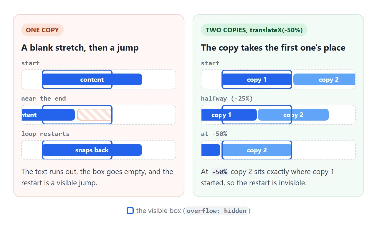
트랙의 gap가 아닌 padding-right와 같이 각 복사본 내부에 간격을 둡니다. 트랙 간격은 복사본 사이에만 나타나므로 두 부분은 하나의 간격만큼 다르며 루프가 끊깁니다.
속도, 방향, 일시 정지 및 수직 버전
속도는 animation-duration입니다. 거리는 복사본 한 장의 너비이므로 동일한 지속 시간은 짧은 스트립보다 긴 스트립을 더 빠르게 이동합니다. 꾸준한 읽기 속도를 위해 너비를 원하는 초당 픽셀로 나눕니다.
const px = group.offsetWidth;          // width of one copy
track.style.animationDuration = px / 60 + 's';   // 60 px per second
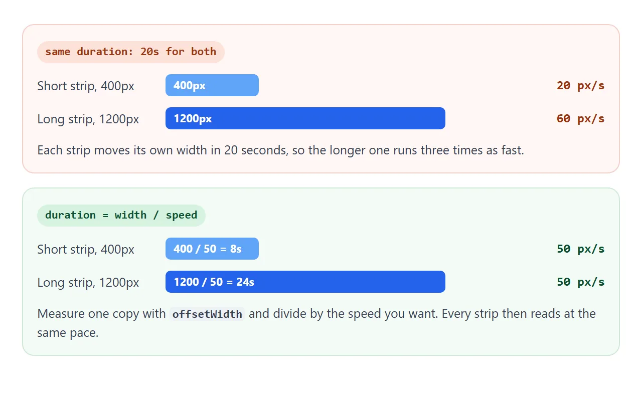
방향은 animation-direction: reverse이며 왼쪽에서 오른쪽으로 스크롤됩니다. 일시중지에는 한 가지 규칙이 적용됩니다.
.marquee:hover .track,
.marquee:focus-within .track { animation-play-state: paused; }
아래 스트립은 세 가지를 모두 사용합니다. 마우스를 올려 일시중지하고 슬라이더를 끌어 초당 픽셀 단위로 속도를 변경합니다.
<!doctype html>
<html lang="en">
<head>
<meta charset="utf-8">
<meta name="viewport" content="width=device-width, initial-scale=1">
<title>Seamless logo strip</title>
<style>
body { margin: 0; padding: 18px 14px; font-family: system-ui, sans-serif; background: #fff; color: #1d2330; }
h3 { margin: 0 0 12px; font-size: 14px; color: #5b6270; text-align: center; font-weight: 600; }
.marquee {
overflow: hidden; padding: 10px 0;
/* fade both edges */
-webkit-mask-image: linear-gradient(90deg, transparent, #000 12%, #000 88%, transparent);
mask-image: linear-gradient(90deg, transparent, #000 12%, #000 88%, transparent);
}
.track {
display: flex; width: max-content;
animation: scroll var(--duration, 20s) linear infinite;
}
.marquee:hover .track, .marquee:focus-within .track { animation-play-state: paused; }
.group { display: flex; gap: 14px; padding-right: 14px; } /* padding = gap, so both halves match */
.logo {
display: flex; align-items: center; gap: 8px; padding: 10px 16px;
border: 1px solid #e1e4ea; border-radius: 10px; font-weight: 700; white-space: nowrap;
}
.logo i { width: 18px; height: 18px; border-radius: 5px; display: inline-block; }
@keyframes scroll { to { transform: translateX(-50%); } }
.controls { display: flex; align-items: center; gap: 10px; justify-content: center; margin-top: 16px; font-size: 13px; }
input[type=range] { width: 160px; }
output { font-variant-numeric: tabular-nums; min-width: 64px; }
@media (prefers-reduced-motion: reduce) { .track { animation: none; } }
</style>
</head>
<body>
<h3>Hover to pause</h3>
<div class="marquee">
<div class="track">
<div class="group">
<span class="logo"><i style="background:#2563eb"></i>Northwind</span>
<span class="logo"><i style="background:#16a34a;border-radius:50%"></i>Greenleaf</span>
<span class="logo"><i style="background:#ea580c"></i>Emberline</span>
<span class="logo"><i style="background:#9333ea;border-radius:50%"></i>Violet&Co</span>
<span class="logo"><i style="background:#0891b2"></i>Tidewater</span>
<span class="logo"><i style="background:#e11d48;border-radius:50%"></i>Redwood</span>
</div>
<!-- the script adds a hidden copy of .group here -->
</div>
</div>
<div class="controls">
<label for="speed">Speed</label>
<input id="speed" type="range" min="20" max="200" value="60">
<output id="out">60 px/s</output>
</div>
<script>
const track = document.querySelector('.track');
const group = track.querySelector('.group');
// Fill at least the width of the box, so no blank stretch shows
const logos = [...group.children];
while (group.offsetWidth < track.parentElement.offsetWidth) {
logos.forEach((el) => group.appendChild(el.cloneNode(true)));
}
// Duplicate the content once, for a seamless loop
const copy = group.cloneNode(true);
copy.setAttribute('aria-hidden', 'true');
track.appendChild(copy);
// Speed in pixels per second, whatever the content width
const speed = document.getElementById('speed');
const out = document.getElementById('out');
function setSpeed() {
const pxPerSec = Number(speed.value);
track.style.setProperty('--duration', group.offsetWidth / pxPerSec + 's');
out.textContent = pxPerSec + ' px/s';
}
speed.addEventListener('input', setSpeed);
setSpeed();
</script>
</body>
</html>
또한 스크립트는 하나의 복사본이 최소한 상자 너비만큼 될 때까지 로고를 반복합니다. 하나의 복사본이 상자보다 좁은 경우 루프 앞에 빈 스트레치가 표시됩니다.
수직 티커는 위에서 아래로 동일한 방식으로 작동합니다. 복사본을 열로 쌓고 외부 상자에 고정 높이를 지정한 다음 translateY를 사용하여 트랙을 이동합니다.
.ticker-v { height: 120px; overflow: hidden; }
.ticker-v .track {
  display: flex; flex-direction: column;
  animation: up 12s linear infinite;
}
@keyframes up { to { transform: translateY(-50%); } }
여기서 트랙의 높이는 2개의 복사본이므로 -50%는 다시 1개의 복사본입니다.
접근성: 복사, 동작, 일시 정지
모든 사람이 스크롤 텍스트를 사용할 수 있게 만드는 세 가지 요소가 있습니다.
- 중복 항목을 숨깁니다. 두 번째 사본을
aria-hidden="true"로 표시하지 않는 한 화면 판독기는 두 사본을 모두 읽습니다. 링크가 포함된 경우inert도 추가하여 아무도 들을 수 없는 링크에 Tab이 연결되지 않도록 하세요. 제목이 없는 경우 aria-label로 지역에 레이블을 지정합니다. - 감소된 동작을 존중합니다. 운영 체제에서 더 적은 움직임을 요구하면
prefers-reduced-motion: reduce가 일치합니다. 거기에서 애니메이션을 끄고 첫 번째 사본을 가만히 두십시오. - 일시 중지를 제공합니다. WCAG는 저절로 시작되어 다른 콘텐츠와 함께 5초 이상 실행되는 모션을 일시 중지, 중지 또는 숨기는 방법을 요구합니다. 터치스크린에는 Hover가 존재하지 않으므로 버튼을 추가합니다.
@media (prefers-reduced-motion: reduce) {
  .track { animation: none; }
  .marquee { overflow-x: auto; }       /* swipe to read the rest */
  .track [aria-hidden] { display: none; }
}
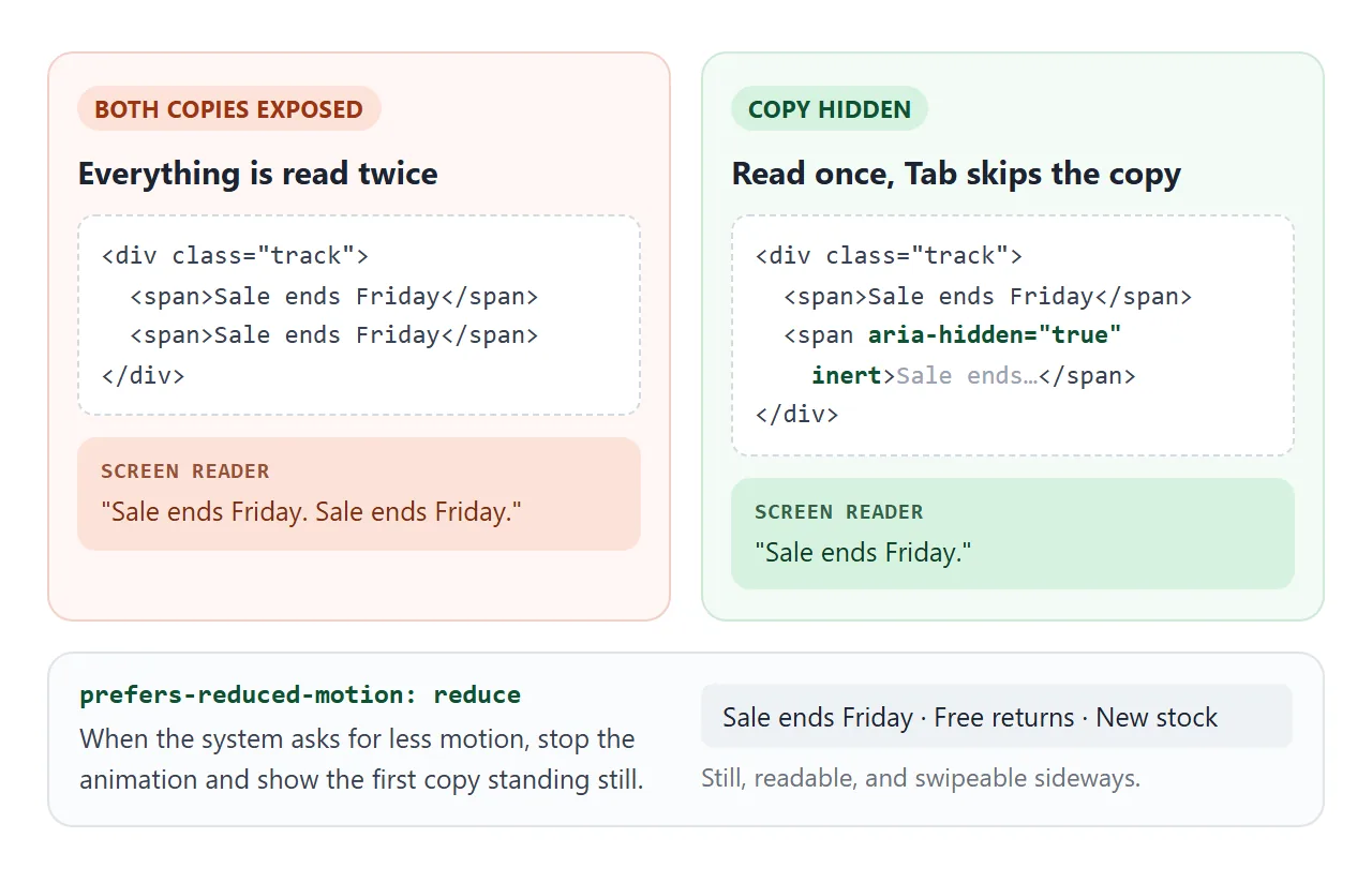
완성된 예: 뉴스 티커
이 알림 표시줄은 조각을 하나로 묶습니다. 두 행은 서로 다른 속도로 반대 방향으로 실행되고, 버튼은 둘 다 일시 중지하며, 사본은 화면 판독기와 Tab 키에서 숨겨집니다.
<!doctype html>
<html lang="en">
<head>
<meta charset="utf-8">
<meta name="viewport" content="width=device-width, initial-scale=1">
<title>News ticker</title>
<style>
body { margin: 0; padding: 14px; font-family: system-ui, sans-serif; background: #f4f5f7; }
.ticker { background: #111827; color: #f9fafb; border-radius: 12px; overflow: hidden; }
.head { display: flex; align-items: center; justify-content: space-between; padding: 10px 14px; border-bottom: 1px solid #1f2937; }
.head b { font-size: 13px; letter-spacing: .4px; color: #fbbf24; }
.head button {
font: 600 12px system-ui, sans-serif; color: #f9fafb; background: #374151;
border: 0; border-radius: 6px; padding: 6px 10px; cursor: pointer;
}
.row { overflow: hidden; padding: 11px 0; }
.row + .row { border-top: 1px solid #1f2937; }
.track { display: flex; width: max-content; animation: scroll 30s linear infinite; }
.row.reverse .track { animation-direction: reverse; animation-duration: 38s; }
.group { display: flex; }
.item { white-space: nowrap; padding-right: 36px; font-size: 14px; }
.item a { color: #93c5fd; }
.tag { font-size: 11px; font-weight: 700; padding: 2px 6px; border-radius: 4px; margin-right: 6px; background: #374151; }
.up { color: #4ade80; } .down { color: #f87171; }
@keyframes scroll { to { transform: translateX(-50%); } }
/* Pause on hover, when a link in the row has focus, and with the button */
.ticker:hover .track, .row:focus-within .track, .ticker.paused .track { animation-play-state: paused; }
/* Reduced motion: no scrolling, the rows can be swiped instead */
@media (prefers-reduced-motion: reduce) {
.track { animation: none; }
.row { overflow-x: auto; }
.group[aria-hidden] { display: none; }
}
</style>
</head>
<body>
<section class="ticker" aria-label="Announcements">
<div class="head">
<b>LIVE UPDATES</b>
<button type="button" id="toggle" aria-pressed="false">Pause</button>
</div>
<div class="row">
<div class="track">
<div class="group">
<span class="item"><span class="tag">NEW</span>Summer timetable starts Monday. <a href="#">Details</a></span>
<span class="item"><span class="tag">OFFICE</span>Level 3 kitchen closed until noon</span>
<span class="item"><span class="tag">EVENT</span>Town hall Thursday 4 pm, room B</span>
</div>
</div>
</div>
<div class="row reverse">
<div class="track">
<div class="group">
<span class="item">Signups <b class="up">▲ 12%</b></span>
<span class="item">Open tickets <b class="down">▼ 8</b></span>
<span class="item">Uptime <b class="up">99.9%</b></span>
<span class="item">Queue wait <b class="down">▼ 40 s</b></span>
</div>
</div>
</div>
</section>
<script>
document.querySelectorAll('.track').forEach((track) => {
const group = track.firstElementChild;
// A short row must fill the box, or a blank stretch shows before the loop
const items = [...group.children];
while (group.offsetWidth < track.parentElement.offsetWidth) {
items.forEach((el) => group.appendChild(el.cloneNode(true)));
}
// Then copy the row once. The copy is hidden from screen readers and skipped by Tab.
const copy = group.cloneNode(true);
copy.setAttribute('aria-hidden', 'true');
copy.inert = true;
track.appendChild(copy);
});
const ticker = document.querySelector('.ticker');
const btn = document.getElementById('toggle');
btn.addEventListener('click', () => {
const paused = ticker.classList.toggle('paused');
btn.textContent = paused ? 'Play' : 'Pause';
btn.setAttribute('aria-pressed', paused);
});
</script>
</body>
</html>
- 반대쪽 행: 두 번째 행에는
animation-direction: reverse가 있고 지속 시간이 더 깁니다. - 둘 모두에 대해 한 번의 일시 중지: 버튼은 막대의
paused클래스를 토글하고 하나의 규칙은 그 안에 있는 모든 트랙을 일시 중지합니다. - 모션 감소: 행이 멈추고 스와이프할 수 있게 되며 사본이 제거됩니다.
애니메이션이 전혀 시작되지 않는 경우 CSS 애니메이션이 작동하지 않음에서 일반적인 원인을 다룹니다.
작동하지 않을 때
| 당신이 보는 것 | 원인 | 수정 |
|---|---|---|
| 루프 지점의 간격 또는 점프 | 콘텐츠가 중복되지 않거나 번역 거리가 한 사본이 아닙니다. | 두 개의 동일한 복사본 및 translateX(-50%)(각 복사본 내부에 padding-right 간격 포함) |
| 텍스트가 다시 오기 전에 빈 스트레치 | 한 장의 사본이 상자보다 좁습니다. | 한 사본이 상자보다 넓어질 때까지 항목을 반복합니다. |
| 텍스트가 두 줄로 줄바꿈됩니다. | 상자 너비에 따라 줄이 끊어집니다. | 아이템의 white-space: nowrap, 트랙의 width: max-content |
| 긴 스트립 경주, 짧은 스트립 경주 | 지속 시간은 고정되어 있지만 거리는 각 스트립의 너비입니다. | 지속 시간을 너비를 초당 픽셀로 나눈 값으로 설정합니다. |
| 애니메이션은 실행되지만 아무것도 움직이지 않습니다. | 트랙은 <span>와 같은 인라인 요소이며 transform는 인라인 상자에 적용되지 않습니다. |
<div>를 사용하거나 display: flex 또는 inline-block를 설정하세요. |
| 일부 방문객에게는 그대로 남아 있습니다. | 그들의 시스템은 움직임 감소를 요구합니다. | 의도. 스틸 버전을 읽을 수 있는지 확인하세요. |
링크로 공유하세요
움직임이 포인트이기 때문에 스크린샷으로는 티커를 판단하기가 어렵습니다. .html 첨부 파일은 전화기에서 일반 코드로 열리거나 전혀 열리지 않을 수 있습니다.
작업 버전을 보내려면 페이지를 NOS 문서에 붙여넣고 공유 링크 만들기를 선택하세요. 링크할 HTML이 이를 안내합니다.
페이지는 작성된 대로 렌더링되고 스크립트가 실행되므로 페이지를 보내는 사람들은 페이지가 스크롤되는 것을 볼 수 있고, 마우스를 올려 일시 중지하고 속도 슬라이더를 사용해 볼 수 있습니다. 나중에 코드를 변경하면 동일한 링크에 새 버전이 표시됩니다.