A comic page is composed at a size. Reproduce it smaller and the composition survives while the lettering does not, which means the reader can see the page and not read it.
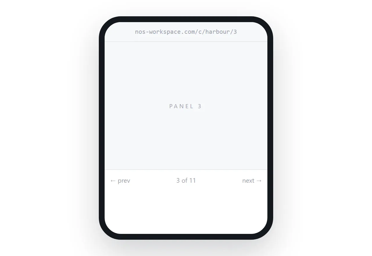
This guide covers panel-at-a-time reading, image weight, and the accessibility gap.
The phone problem
A comic page is roughly A4 and composed to be read at that size. A phone screen is a fraction of it.
Scaled to fit, the lettering drops below readable size. The reader zooms, which shows one region at a time with no indication of where it sits in the page, and the panel sequence is lost. Most readers give up within two pages.
This is not solvable by better scaling. The page is simply larger than the screen.
One panel at a time
The working approach is to show one panel filling the screen on narrow devices, with a tap or swipe moving to the next in the order you specify.
The reader sees each panel at a readable size, in sequence, with the pacing under your control rather than under the control of their zoom level.
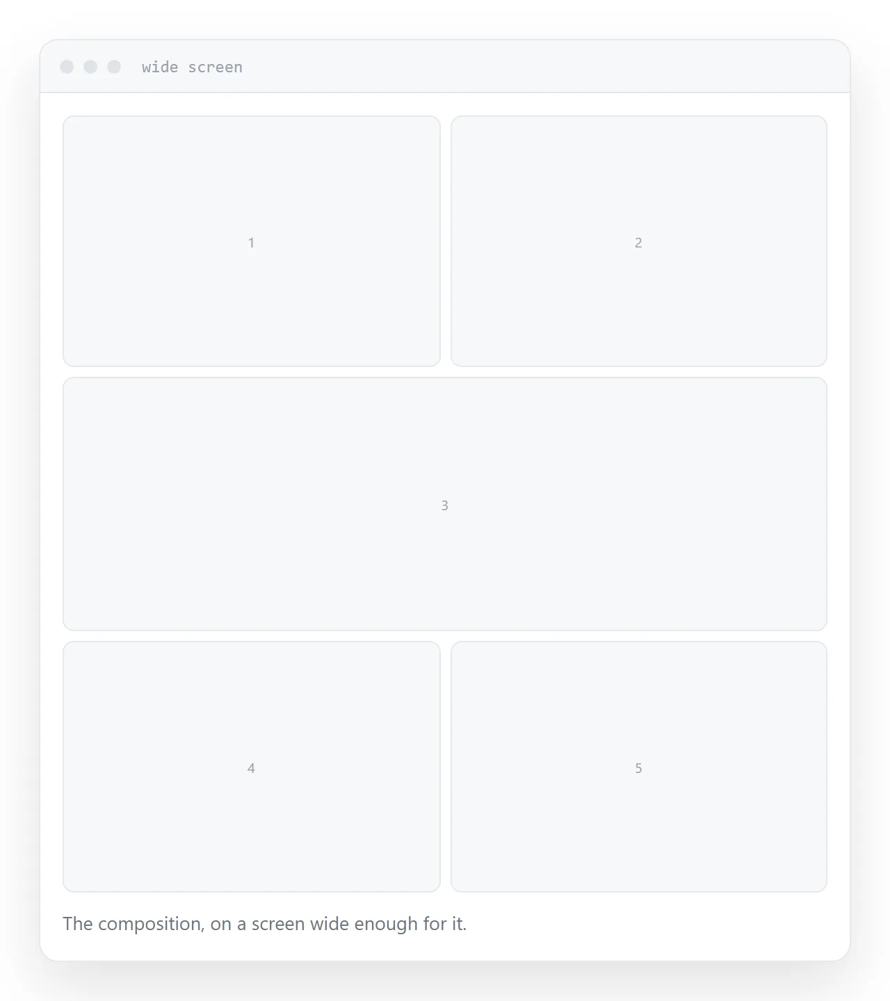
On wide screens, show the full page as composed. The layout works there and the reader sees what you built.
| Full page on a phone | Panel at a time | |
|---|---|---|
| Lettering readable | No | Yes |
| Sequence clear | Lost when zooming | Explicit |
| Page composition | Visible, unreadable | Available as an option |
| Pacing | Reader's zoom | Yours |
Keep the full page available
Some readers want to see the spread, and for pages where the composition is the point, that matters.
A control that switches to the full page, and back, costs little. Default to panels on a phone and let the reader choose.
For a double-page spread, the panel view is the only readable option on a phone, and the full view is worth offering as something to look at rather than to read.
Weight
Comic pages are large images and a chapter is many of them.
Serve screen-sized versions on the page, with a larger version on tap for anyone studying the art. Load the next page ahead of time so the reader is not waiting at each turn, which is the thing that breaks the rhythm of reading.
Do not load the whole chapter at once. A reader on mobile data should not download twenty pages to read three.
The accessibility and search gap
Lettering is part of the artwork, so the dialogue exists only as pixels.
That means screen readers find nothing, and search engines find nothing. A comic published this way is invisible to both.
Provide the dialogue as text alongside each page. It takes time and it makes the work reachable by readers who cannot see it and by anyone searching a line of it. For a serialised comic building an audience, the search part alone is worth the effort.
If this is near what you are doing, How to share a comic as a link and How to share a photo gallery as a link cover the cases on either side.
Put it at an address
Show one panel at a time on narrow screens, keep the full page available, serve screen-sized images with a larger one on tap, preload the next page, and provide the dialogue as text.
Then the comic is readable on the device most readers are holding.