CSS transform 속성은 페이지가 배치된 후 요소를 이동, 회전, 크기 조정 또는 기울입니다. transform: translateX(20px) rotate(15deg)와 같은 기능 목록을 제공하면 브라우저는 해당 변경 사항이 적용된 요소를 그립니다. 주변에는 아무것도 움직이지 않습니다.
먼저 시도해 보세요. 슬라이더를 드래그하고 상자 업데이트 아래의 transform 라인을 살펴보세요.
<!doctype html>
<html lang="en">
<head>
<meta charset="utf-8">
<meta name="viewport" content="width=device-width, initial-scale=1">
<title>CSS transform playground</title>
<style>
  body { margin: 0; padding: 14px; font-family: system-ui, sans-serif; background: #f4f5f7; color: #1d2330; }
  .stage {
    position: relative; height: 170px; border-radius: 12px; overflow: hidden;
    background: #fff; display: flex; align-items: center; justify-content: center; gap: 14px;
  }
  .side, .slot { width: 70px; height: 70px; border-radius: 10px; flex: none; }
  .side { background: #e3e7ed; }
  .slot { position: relative; }
  .ghost { position: absolute; inset: 0; border-radius: 10px; border: 2px dashed #b6bdc8; }  /* where the box sits in the layout */
  .box {
    position: absolute; inset: 0; border-radius: 10px;
    background: linear-gradient(135deg, #2563eb, #7c3aed);
    color: #fff; display: grid; place-items: center; font-weight: 700;
  }
  .controls { display: grid; grid-template-columns: repeat(auto-fit, minmax(230px, 1fr)); gap: 6px 16px; margin: 12px 0 10px; }
  label { font-size: 13px; display: grid; grid-template-columns: 74px 1fr 50px; align-items: center; gap: 6px; }
  label output { font: 12px ui-monospace, Consolas, monospace; text-align: right; }
  input[type=range] { width: 100%; margin: 0; }
  pre {
    margin: 0; padding: 10px 12px; border-radius: 8px; background: #1d2330; color: #d6f2df;
    font: 13px/1.4 ui-monospace, Consolas, monospace; white-space: pre-wrap; word-break: break-word;
  }
  button { margin-top: 8px; font: inherit; font-size: 13px; padding: 5px 12px; border-radius: 7px; border: 1px solid #c9cdd4; background: #fff; cursor: pointer; }
</style>
</head>
<body>
<div class="stage">
  <div class="side"></div>
  <div class="slot"><div class="ghost"></div><div class="box" id="box">A</div></div>
  <div class="side"></div>
</div>

<div class="controls">
  <label>translateX <input type="range" id="tx" min="-100" max="100" value="0"><output id="txv"></output></label>
  <label>translateY <input type="range" id="ty" min="-60" max="60" value="0"><output id="tyv"></output></label>
  <label>rotate <input type="range" id="r" min="-180" max="180" value="0"><output id="rv"></output></label>
  <label>scale <input type="range" id="s" min="0.3" max="2" step="0.1" value="1"><output id="sv"></output></label>
  <label>skewX <input type="range" id="k" min="-45" max="45" value="0"><output id="kv"></output></label>
</div>
<pre id="code"></pre>
<button id="reset" type="button">Reset</button>

<script>
  const box = document.getElementById('box');
  const ids = ['tx', 'ty', 'r', 's', 'k'];
  const el = (id) => document.getElementById(id);

  function update() {
    const tx = el('tx').value, ty = el('ty').value, r = el('r').value, s = el('s').value, k = el('k').value;
    // one transform property holds every function, applied in the order written
    const t = `translate(${tx}px, ${ty}px) rotate(${r}deg) scale(${s}) skewX(${k}deg)`;
    box.style.transform = t;
    el('txv').value = tx + 'px'; el('tyv').value = ty + 'px';
    el('rv').value = r + 'deg'; el('sv').value = s; el('kv').value = k + 'deg';
    el('code').textContent = '.box {\n  transform: ' + t + ';\n}';
  }

  ids.forEach((id) => el(id).addEventListener('input', update));
  el('reset').addEventListener('click', () => {
    ids.forEach((id) => { el(id).value = id === 's' ? 1 : 0; });
    update();
  });
  update();
</script>
</body>
</html>
양쪽에 있는 회색 상자를 확인하세요. 파란색 상자를 아무리 밀어도 절대 이동하지 않습니다. 이것이 transform의 특징이며 호버 효과 및 모션에 대한 일반적인 선택인 이유입니다.
가장 많이 사용하게 될 네 가지 기능
모든 변환은 소수의 함수로 구성됩니다. 하나를 사용하거나 공백으로 구분된 단일 값으로 여러 개를 연결할 수 있습니다.
| 기능 | 기능 | 예 |
|---|---|---|
translate(x, y) |
요소를 이동합니다. | translate(20px, -10px) |
rotate(angle) |
양의 각도를 얻으려면 시계 방향으로 돌립니다. | rotate(45deg) |
scale(n) |
크기를 조정합니다. 1이 보통 크기입니다. | scale(1.2) |
skew(x, y) |
경사지게 하다 | skewX(-10deg) |
1축 버전도 있습니다: translateX, translateY, scaleX, scaleY, skewX 및 skewY. translate의 백분율은 요소의 자체 크기를 기준으로 측정되므로 translateX(100%)는 요소를 자체 너비만큼 정확하게 이동합니다.
.badge {
  transform: translate(-50%, -50%) rotate(-8deg) scale(1.1);
}
호버에서 CSS 변환을 사용하는 방법
가장 일반적인 용도는 포인터가 무언가 위에 있을 때 작은 변화를 주는 것입니다. :hover 규칙에 변환을 적용하고 요소 자체에 전환을 적용하여 양방향으로 애니메이션을 적용합니다.
.card { transition: transform .2s; }
.card:hover { transform: translateY(-4px) scale(1.02); }
글라이딩 대신 움직임이 찰칵 소리를 내는 경우 전환 규칙이 잘못된 것일 수 있습니다. CSS 호버 전환이 해당 위치를 다룹니다.
함수 순서가 중요한 이유
기능은 독립적인 설정이 아닙니다. 각각은 이전 함수가 남겨둔 좌표계 내에서 작동합니다. 먼저 회전하면 x축이 회전하므로 나중에 translateX가 기울어진 축을 따라 이동합니다.
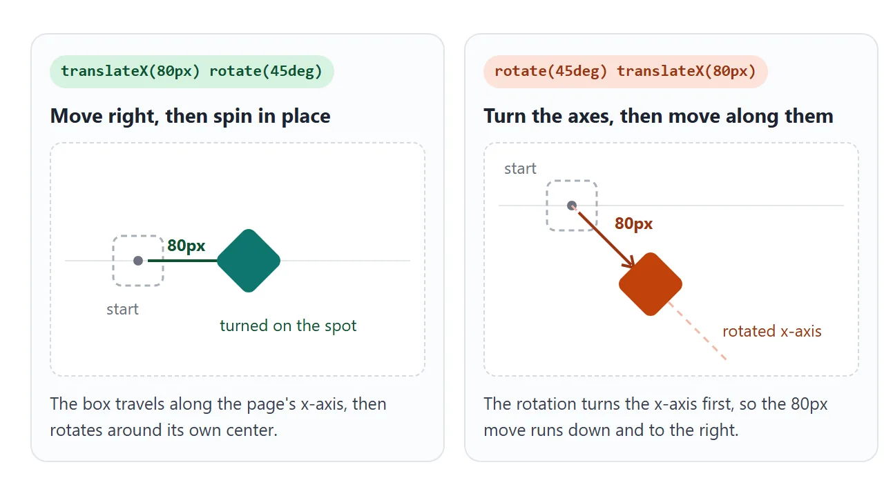
슬라이더를 아래로 이동하세요. 상자 A는 오른쪽으로 이동하고 그 자리에서 회전합니다. 상자 B는 회전이 이동 방향을 계속 회전시키기 때문에 시작점을 중심으로 원을 그리며 회전합니다.
<!doctype html>
<html lang="en">
<head>
<meta charset="utf-8">
<meta name="viewport" content="width=device-width, initial-scale=1">
<title>Transform order matters</title>
<style>
  body { margin: 0; padding: 12px; font-family: system-ui, sans-serif; background: #f4f5f7; color: #1d2330; }
  .lanes { display: grid; grid-template-columns: 1fr 1fr; gap: 10px; }
  .lane { background: #fff; border-radius: 12px; padding: 10px; min-width: 0; }
  .lane code { display: block; font: 12px/1.35 ui-monospace, Consolas, monospace; min-height: 34px; color: #374151; }
  .area { position: relative; height: 180px; overflow: hidden; }
  .dot { position: absolute; left: 50%; top: 50%; width: 8px; height: 8px; margin: -4px; border-radius: 50%; background: #9aa3b2; }
  .box {
    position: absolute; left: 50%; top: 50%; width: 36px; height: 36px; margin: -18px;
    border-radius: 7px; color: #fff; font: 700 13px system-ui, sans-serif; display: grid; place-items: center;
  }
  .a { background: #0f766e; }
  .b { background: #c2410c; }
  label { display: flex; align-items: center; gap: 8px; margin-top: 10px; font-size: 13px; }
  input { flex: 1; }
  output { font: 12px ui-monospace, Consolas, monospace; width: 52px; text-align: right; }
</style>
</head>
<body>
<div class="lanes">
  <div class="lane">
    <code id="ca"></code>
    <div class="area"><div class="dot"></div><div class="box a" id="a">A</div></div>
  </div>
  <div class="lane">
    <code id="cb"></code>
    <div class="area"><div class="dot"></div><div class="box b" id="b">B</div></div>
  </div>
</div>
<label>angle <input type="range" id="angle" min="0" max="360" value="45"><output id="av"></output></label>

<script>
  const angle = document.getElementById('angle');

  function update() {
    const d = angle.value + 'deg';
    // same two functions, opposite order
    const ta = `translateX(50px) rotate(${d})`;  // move right, then spin in place
    const tb = `rotate(${d}) translateX(50px)`;  // turn the axes, then move along the turned x-axis
    document.getElementById('a').style.transform = ta;
    document.getElementById('b').style.transform = tb;
    document.getElementById('ca').textContent = 'transform: ' + ta;
    document.getElementById('cb').textContent = 'transform: ' + tb;
    document.getElementById('av').value = d;
  }

  angle.addEventListener('input', update);
  update();
</script>
</body>
</html>
실용적인 규칙: 페이지 자체 방향을 따라 이동하려면 translate를 먼저 입력하세요. 궤도를 그리거나 기울어진 선을 따라 이동하려면 rotate를 먼저 넣으세요.
변환 원본: 피벗이 있는 위치
회전 및 크기 조정은 변환 원점이라는 점을 중심으로 발생합니다. HTML 요소의 경우 기본값은 중앙인 50% 50%입니다. 키워드, 백분율 또는 길이를 사용하여 transform-origin로 변경하십시오.
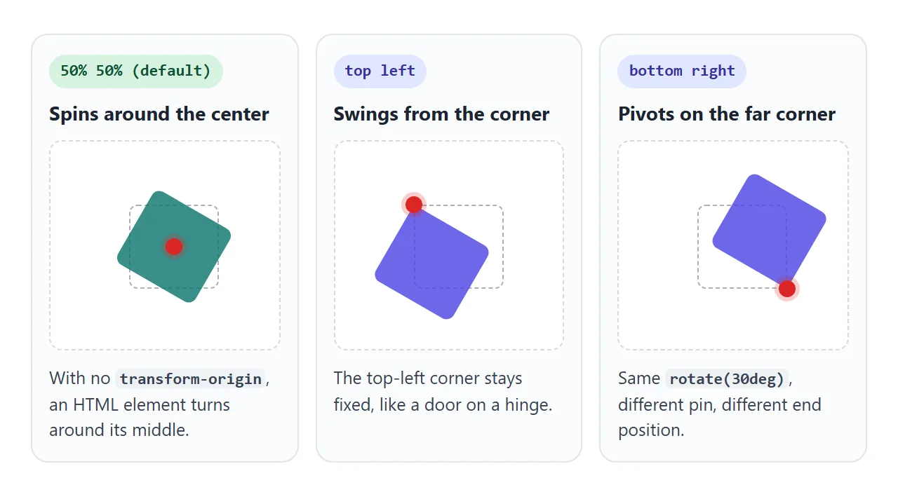
.tag { transform-origin: top left; }
.tag:hover { transform: rotate(-8deg); }
요소가 "잘못된 위치에서" 회전하거나 커지는 것처럼 보이면 무엇보다 먼저 원점을 확인하세요. 또한 코너 원점을 사용하면 scale가 균일한 바깥쪽이 아닌 해당 코너에서 멀어지는 방향으로 요소를 성장시킵니다.
변형과 왼쪽, 위쪽 또는 너비 변경
변환은 요소가 그려지는 방식만 변경합니다. 레이아웃의 상자는 원래 위치와 크기를 유지합니다. left, top, width 또는 margin를 변경하면 레이아웃 자체가 변경됩니다.
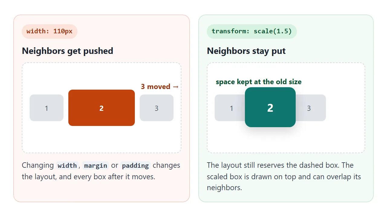
transform |
left / top / width |
|
|---|---|---|
| 이웃이 이사하다 | 아니요 | 예, 크기 및 여백 변경의 경우 |
position 필요 |
아니요 | left 및 top에는 위치 지정 요소가 필요합니다. |
| 다음에 좋습니다 | 호버 효과, 모션, 뒤집기 | 실제 크기 또는 위치 변경 |
| 다른 것과 겹칠 수 있음 | 예 | 예, 요소가 배치되면 |
브라우저는 레이아웃을 다시 계산하지 않고도 transform에 애니메이션을 적용할 수 있어 모션이 원활하게 유지되는 데 도움이 됩니다. 페이지의 나머지 부분에 공간을 확보해야 하는 경우 레이아웃 속성을 사용하세요.
완성된 예: 뒤집는 카드
3D 플립은 rotateY와 동일한 속성을 사용합니다. 세 개의 추가 선으로 인해 입체적으로 보입니다. 상위 항목의 perspective는 깊이를 더하고, transform-style: preserve-3d는 두 면을 모두 3D로 유지하며, backface-visibility: hidden는 멀리 있는 면을 숨깁니다.
<!doctype html>
<html lang="en">
<head>
<meta charset="utf-8">
<meta name="viewport" content="width=device-width, initial-scale=1">
<title>Flip card with CSS transform</title>
<style>
  body {
    margin: 0; min-height: 100vh; display: grid; place-items: center;
    font-family: system-ui, sans-serif; background: #eceef1;
  }
  .card {
    width: 220px; height: 260px; cursor: pointer;
    perspective: 800px;               /* depth, so the turn looks 3D */
  }
  .inner {
    position: relative; width: 100%; height: 100%;
    transform-style: preserve-3d;     /* keep both faces in 3D space */
    transition: transform .6s;
  }
  .face {
    position: absolute; inset: 0; border-radius: 14px; padding: 20px;
    box-sizing: border-box; box-shadow: 0 8px 24px rgba(0, 0, 0, .15);
    backface-visibility: hidden;      /* hide a face while it points away */
    display: flex; flex-direction: column; justify-content: flex-end;
  }
  .front { background: linear-gradient(160deg, #6366f1, #0ea5e9); color: #fff; }
  .back  { background: #fff; color: #1d2330; transform: rotateY(180deg); justify-content: center; }
  .face h3 { margin: 0 0 6px; font-size: 20px; }
  .face p { margin: 0; font-size: 14px; line-height: 1.45; }

  /* flip on hover where a mouse exists, and on tap or Enter everywhere */
  @media (hover: hover) { .card:hover .inner { transform: rotateY(180deg); } }
  .card.flipped .inner { transform: rotateY(180deg); }
</style>
</head>
<body>
<div class="card" id="card" role="button" tabindex="0" aria-pressed="false">
  <div class="inner">
    <div class="face front"><h3>Front</h3><p>Hover, or tap on a phone.</p></div>
    <div class="face back"><h3>Back</h3><p>rotateY(180deg) on the inner box. This face started already turned.</p></div>
  </div>
</div>

<script>
  const card = document.getElementById('card');
  function toggle() {
    const on = card.classList.toggle('flipped');
    card.setAttribute('aria-pressed', on);
  }
  card.addEventListener('click', toggle);
  card.addEventListener('keydown', (e) => {
    if (e.key === 'Enter' || e.key === ' ') { e.preventDefault(); toggle(); }
  });
</script>
</body>
</html>
뒷면에는 처음부터 자체 rotateY(180deg)가 있습니다. 내부 상자가 다시 180도 회전하면 두 상자가 상쇄되고 뒷면이 올바른 방향으로 읽혀집니다. 탭 핸들러는 클래스를 토글하므로 마우스 오버가 없는 전화기도 동일한 플립을 얻습니다.
마우스 오버가 아닌 로드 시 페이지가 이동하도록 하려면 페이지 로드 시 HTML 애니메이션을 참조하세요.
작동하지 않을 때
| 당신이 보는 것 | 원인 | 수정 |
|---|---|---|
span 또는 a에서는 아무 일도 일어나지 않습니다. |
일반 인라인 상자에는 변환이 적용되지 않습니다. | display: inline-block(또는 블록, 플렉스 아이템) |
| 호버 스케일은 회전을 제거합니다. | 두 번째 transform 규칙이 첫 번째 규칙을 대체합니다. 가치가 합산되지 않는다 |
모든 기능 반복: rotate(10deg) scale(1.1) |
| 이상한 지점에서 회전하거나 성장함 | transform-origin는 예상한 위치가 아닙니다. |
명시적으로 설정하세요. transform-origin: center |
| 요소가 이웃을 덮고 있습니다. | 변환은 레이아웃을 변경하지 않습니다. | 예상됨; 다른 사람이 이동해야 하는 경우 width/margin를 사용하세요. |
자식의 z-index는 부모 외부의 것보다 높아질 수 없습니다. |
변환은 새로운 스택 컨텍스트를 생성합니다. | 변환된 상위 항목에 position: relative 및 z-index를 넣습니다. |
position: fixed 하위 항목은 상위 항목과 함께 스크롤됩니다. |
변환된 조상은 포함 블록이 됩니다. | 고정된 요소를 변환된 요소 밖으로 이동 |
| 변화는 즉각적이며 애니메이션이 아닙니다. | 기본 규칙에 transition: transform가 없습니다. |
요소에 transition: transform .3s 추가 |
두 번째 줄은 많은 사람들을 사로잡습니다. transform는 하나의 속성이므로 .icon:hover { transform: scale(1.2); }는 .icon에 설정된 모든 rotate를 삭제합니다. 호버 규칙에 전체 목록을 다시 작성하거나 별도의 rotate 및 scale 속성을 사용하여 각각이 단독으로 변경할 수 있도록 합니다.
링크로 공유하세요
변환은 스크린샷으로 설명하는 것보다 움직이는 모습을 보여주는 것이 더 쉽습니다. 첨부된 .html 파일이 휴대폰에서 일반 텍스트로 열릴 수 있으며 호버나 탭이 발생하지 않습니다.
작업 버전을 보내려면 페이지를 NOS 문서에 붙여넣고 공유 링크 만들기를 선택하세요. 링크할 HTML이 이를 안내합니다.
페이지는 작성된 대로 렌더링되고 스크립트가 실행되므로 페이지를 받는 사람은 슬라이더를 끌어 카드를 직접 뒤집을 수 있습니다. 나중에 코드를 변경하면 동일한 링크에 새 버전이 표시됩니다.