CSS opacity는 0(보이지 않음)에서 1(단색)까지 요소의 투명도를 설정합니다. opacity: 0.5는 반투명하게 만듭니다. 전체 요소에 적용됩니다. 배경, 테두리, 텍스트 및 하위 요소가 함께 페이드됩니다.
배경만 흐리게 하려면 알파 값이 있는 색상을 대신 사용하세요.
슬라이더를 이동합니다. 두 카드 모두 동일한 번호를 가지며 두 가지 다른 방식으로 적용됩니다.
<!doctype html>
<html lang="en">
<head>
<meta charset="utf-8">
<meta name="viewport" content="width=device-width, initial-scale=1">
<title>opacity vs background alpha</title>
<style>
  body {
    margin: 0; padding: 14px; box-sizing: border-box; min-height: 100vh;
    font-family: system-ui, sans-serif; color: #1d2330;
    /* a striped backdrop so you can see what shows through */
    background: repeating-linear-gradient(45deg, #2563eb 0 14px, #f59e0b 14px 28px);
  }
  .controls {
    background: #fff; border-radius: 10px; padding: 10px 12px; margin-bottom: 14px;
    display: flex; align-items: center; gap: 10px; flex-wrap: wrap; font-size: 14px;
  }
  .controls input { flex: 1; min-width: 140px; }
  .row { display: grid; grid-template-columns: repeat(auto-fit, minmax(150px, 1fr)); gap: 14px; }
  .card { border-radius: 12px; padding: 14px 16px; }
  .card h3 { margin: 0 0 6px; font-size: 16px; }
  .card p { margin: 0 0 8px; font-size: 14px; line-height: 1.4; }
  .card code { font-size: 13px; background: #eef1f5; padding: 1px 4px; border-radius: 4px; }

  /* A: opacity fades the whole card, text and children included */
  #a { background: #fff; opacity: var(--v); }

  /* B: only the background color is see-through; the text stays solid */
  #b { background: rgb(255 255 255 / var(--v)); }
</style>
</head>
<body style="--v: 0.5">
<div class="controls">
  <label for="v">Transparency</label>
  <input id="v" type="range" min="0" max="1" step="0.05" value="0.5">
  <output id="out">0.5</output>
</div>
<div class="row">
  <div class="card" id="a">
    <h3>opacity</h3>
    <p>The text fades with the card.</p>
    <code id="ca">opacity: 0.5</code>
  </div>
  <div class="card" id="b">
    <h3>background alpha</h3>
    <p>Only the white fill fades.</p>
    <code id="cb">rgb(255 255 255 / 0.5)</code>
  </div>
</div>

<script>
  const slider = document.getElementById('v');
  slider.addEventListener('input', () => {
    const v = slider.value;
    document.body.style.setProperty('--v', v);  // both cards read the same value
    document.getElementById('out').textContent = v;
    document.getElementById('ca').textContent = 'opacity: ' + v;
    document.getElementById('cb').textContent = 'rgb(255 255 255 / ' + v + ')';
  });
</script>
</body>
</html>
값: 0~1 또는 백분율
opacity는 하나의 숫자를 사용합니다. 0는 완전히 투명하고, 1는 완전히 불투명하며, 그 사이의 모든 부분은 부분적으로 투명합니다. 백분율도 작동하므로 opacity: 50%는 opacity: 0.5와 같습니다.
.faded  { opacity: 0.5; }
.ghost  { opacity: 20%; }
.solid  { opacity: 1; }   /* the default */
범위 밖의 값은 고정됩니다. 1.5는 1처럼 작동하고 -1는 0처럼 작동합니다. HTML에는 요소에 대한 opacity 속성이 없으므로 인라인으로 style="opacity: 0.5"를 작성합니다.
텍스트도 희미해지는 이유
브라우저는 요소와 모든 하위 요소를 하나의 그림으로 그린 다음 해당 그림을 페이드합니다. 이것이 카드의 제목이 흰색 채우기와 함께 투명하게 변하는 이유입니다.
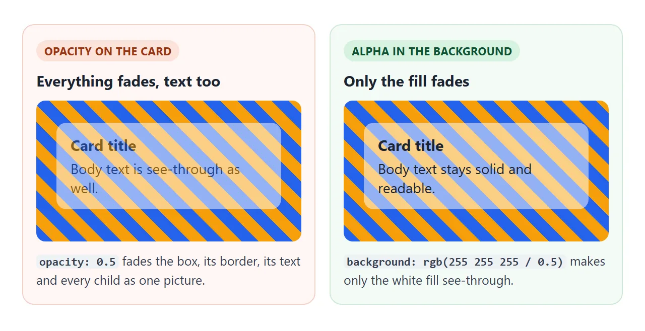
목표가 읽을 수 있는 텍스트가 포함된 사진 위의 투명 패널인 경우 투명도를 색상으로 이동합니다.
.panel { background: rgb(255 255 255 / 0.6); }   /* same as rgba(255, 255, 255, 0.6) */
.dark  { background: hsl(220 30% 10% / 60%); }
.hex   { background: #ffffff99; }                /* last two digits are the alpha */
.mix   { background: color-mix(in srgb, white 60%, transparent); }
네 개 모두 배경만 페이드됩니다. 테두리, 텍스트 및 그림자에도 동일한 아이디어가 적용됩니다. 해당 색상에 알파 값을 지정합니다. 별도의 배경 불투명도 속성이 존재하지 않기 때문에 이는 "CSS의 배경 불투명도"에 대한 답변이기도 합니다.
불투명도: 0 대 가시성: 숨김 대 표시: 없음
세 가지 모두 요소가 보기에서 사라지도록 합니다. 그들은 남겨진 것이 다릅니다. 아래 세 개의 버튼을 숨긴 다음 해당 위치를 클릭하고 여기서 시작 버튼에서 Tab 키를 누르세요.
<!doctype html>
<html lang="en">
<head>
<meta charset="utf-8">
<meta name="viewport" content="width=device-width, initial-scale=1">
<title>opacity: 0 vs visibility: hidden vs display: none</title>
<style>
  body { margin: 0; padding: 14px; font-family: system-ui, sans-serif; color: #1d2330; background: #f4f5f7; }
  .bar { display: flex; gap: 8px; flex-wrap: wrap; margin-bottom: 12px; }
  .bar button { font: inherit; font-size: 14px; padding: 8px 12px; border-radius: 8px; border: 1px solid #c9cdd4; background: #fff; cursor: pointer; }
  .row {
    display: flex; align-items: center; gap: 8px; flex-wrap: wrap;
    background: #fff; border-radius: 10px; padding: 10px 12px; margin-bottom: 8px;
  }
  .row code { width: 150px; font-size: 13px; font-weight: 600; }
  .t { font: inherit; font-size: 14px; padding: 7px 12px; border-radius: 8px; border: 0; background: #2563eb; color: #fff; cursor: pointer; }
  .next { font-size: 13px; padding: 6px 10px; border-radius: 6px; background: #e8ebf0; }
  .status { flex-basis: 100%; font-size: 13px; color: #5b6270; min-height: 1.2em; }

  /* the three ways to hide, switched on by the "hidden" class on body */
  .hidden #op  { opacity: 0; }
  .hidden #vis { visibility: hidden; }
  .hidden #dis { display: none; }
</style>
</head>
<body>
<div class="bar">
  <button id="toggle">Hide the blue buttons</button>
  <button id="start">Start here, then press Tab</button>
</div>

<div class="row" data-name="opacity: 0"><code>opacity: 0</code><button class="t" id="op">Click me</button><span class="next">next item</span><div class="status"></div></div>
<div class="row" data-name="visibility: hidden"><code>visibility: hidden</code><button class="t" id="vis">Click me</button><span class="next">next item</span><div class="status"></div></div>
<div class="row" data-name="display: none"><code>display: none</code><button class="t" id="dis">Click me</button><span class="next">next item</span><div class="status"></div></div>

<script>
  const toggle = document.getElementById('toggle');
  toggle.addEventListener('click', () => {
    const on = document.body.classList.toggle('hidden');
    toggle.textContent = on ? 'Show the blue buttons' : 'Hide the blue buttons';
    document.querySelectorAll('.status').forEach((s) => (s.textContent = on
      ? 'Hidden. Click where the button was, or press Tab.' : ''));
  });

  document.querySelectorAll('.row').forEach((row) => {
    const status = row.querySelector('.status');
    const btn = row.querySelector('.t');
    // a click that reaches the button
    btn.addEventListener('click', (e) => {
      e.stopPropagation();
      status.textContent = 'The button got the click.';
    });
    // a click anywhere else in the row, including the empty spot
    row.addEventListener('click', () => {
      status.textContent = 'The click hit the empty row. The button did not get it.';
    });
    btn.addEventListener('focus', () => {
      status.textContent = 'Tab stopped on this button.';
    });
  });
</script>
</body>
</html>
opacity: 0 |
visibility: hidden |
display: none |
|
|---|---|---|---|
| 공간을 유지합니다 | 예 | 예 | 아니요 |
| 클릭과 탭을 얻습니다 | 예 | 아니요 | 아니요 |
| Tab 키가 거기서 멈춥니다. | 예 | 아니요 | 아니요 |
| 스크린 리더가 도달합니다. | 예 | 아니요 | 아니요 |
| 전환으로 희미해질 수 있음 | 예 | 온/오프 단계로만 사용 가능 | 아니요 |
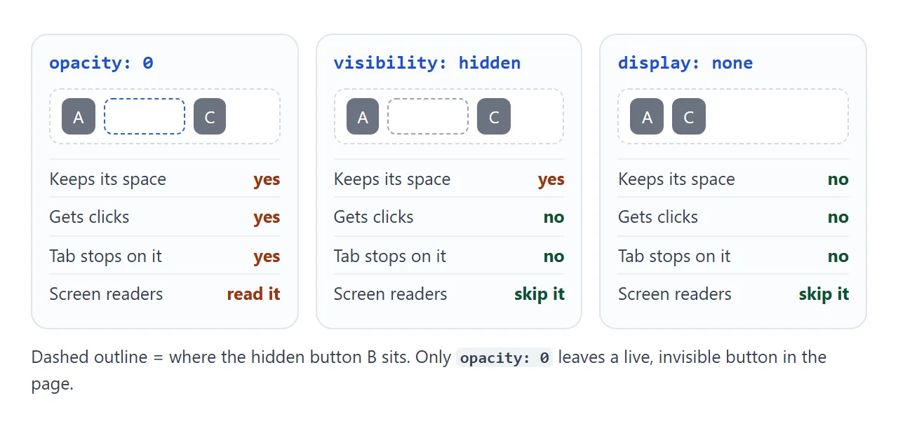
페이드의 시작이나 끝을 위해 opacity: 0를 사용하세요. 공간이 유지되어야 하지만 아무것도 응답하지 않아야 하는 경우 visibility: hidden를 사용하십시오. 요소가 페이지에서 완전히 사라져야 하는 경우 display: none를 사용하세요.
전환과 함께 페이드 인 및 아웃
opacity는 두 값 사이에서 원활하게 애니메이션을 적용합니다. transition를 요소의 일반 상태에 놓고 마우스를 올리거나 클래스를 사용하여 값을 변경합니다.
.toast {
  opacity: 0;
  visibility: hidden;
  transition: opacity .3s, visibility .3s;
}
.toast.show {
  opacity: 1;
  visibility: visible;
}
visibility와 opacity를 페어링하면 클릭 문제가 해결됩니다. visibility는 한 단계로 전환되며 브라우저는 전체 전환 동안 이를 표시하므로 페이드는 여전히 양방향으로 재생됩니다. CSS 호버 전환은 전환 규칙이 이동하는 위치를 다룹니다.
불투명도는 스태킹 컨텍스트를 생성합니다.
1 아래의 모든 opacity, 심지어 0.99도 요소를 새로운 스태킹 컨텍스트로 만듭니다. 그 자식은 그들 사이에만 계층화됩니다. 자녀의 z-index: 999는 더 이상 부모 외부의 어떤 것 위로 들어올릴 수 없습니다.
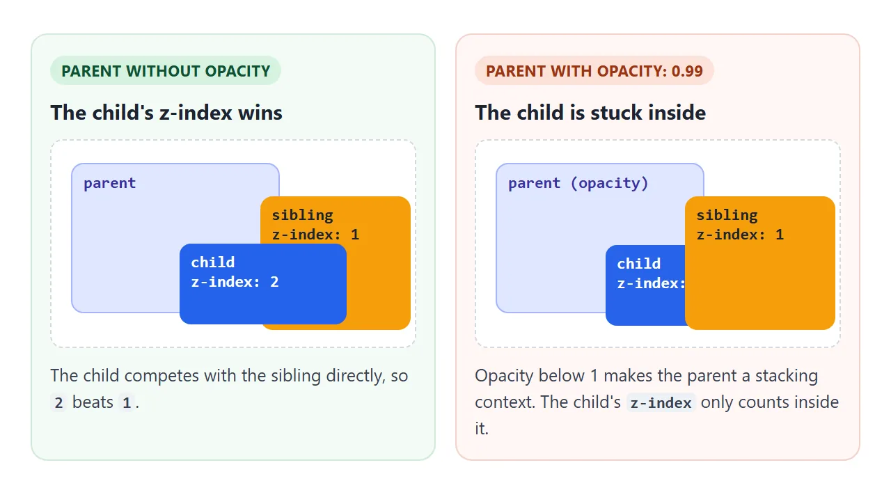
페이드를 추가한 후 드롭다운이나 도구 설명이 이웃 뒤로 미끄러지는 경우가 바로 이것이 이유입니다. CSS z-index는 스태킹 컨텍스트를 전체적으로 설명합니다.
마우스를 올리면 이미지 불투명도
마우스를 올리면 사진이 어두워지는 것은 한 줄에 전환이 추가된 것입니다. 이미지 뒤의 어두운 배경은 흐린 버전을 퇴색시키는 대신 더 어둡게 만듭니다. 아래의 완성된 타일은 이미지를 낮추고 캡션을 높입니다.
<!doctype html>
<html lang="en">
<head>
<meta charset="utf-8">
<meta name="viewport" content="width=device-width, initial-scale=1">
<title>Image caption that fades in on hover</title>
<style>
  body { margin: 0; padding: 14px; font-family: system-ui, sans-serif; background: #f4f5f7; }
  .hint { margin: 0 0 10px; font-size: 14px; color: #5b6270; }
  .grid { display: grid; grid-template-columns: repeat(auto-fill, minmax(150px, 1fr)); gap: 12px; }

  .tile {
    position: relative; margin: 0; border-radius: 12px; overflow: hidden;
    background: #111;  /* shows through when the image fades */
    aspect-ratio: 4 / 3;
  }
  .tile svg { display: block; width: 100%; height: 100%; transition: opacity .3s; }
  .tile figcaption {
    position: absolute; left: 0; right: 0; bottom: 0; padding: 10px 12px;
    color: #fff; font-size: 14px; line-height: 1.35;
    background: rgb(0 0 0 / .55);  /* see-through fill, solid text */
    opacity: 0;                    /* hidden, but still read by screen readers */
    transition: opacity .3s;
  }
  .tile figcaption b { display: block; font-size: 15px; }

  /* mouse over the tile, or keyboard focus on it */
  .tile:hover figcaption, .tile:focus-visible figcaption { opacity: 1; }
  .tile:hover svg, .tile:focus-visible svg { opacity: .7; }
  .tile:focus-visible { outline: 3px solid #2563eb; outline-offset: 2px; }

  /* touch screens have no hover: show the captions all the time */
  @media (hover: none) {
    .tile figcaption { opacity: 1; }
  }
  /* respect the "reduce motion" setting: switch instantly */
  @media (prefers-reduced-motion: reduce) {
    .tile svg, .tile figcaption { transition: none; }
  }
</style>
</head>
<body>
<p class="hint">Hover a picture, or press Tab to move between them.</p>
<div class="grid">
  <figure class="tile" tabindex="0">
    <svg viewBox="0 0 120 90" preserveAspectRatio="xMidYMid slice" aria-hidden="true">
      <rect width="120" height="90" fill="#7dd3fc"/><circle cx="92" cy="22" r="10" fill="#fde047"/>
      <path d="M0 90 L38 40 L62 70 L84 48 L120 90Z" fill="#166534"/>
    </svg>
    <figcaption><b>Ridge</b>Morning light over the pass.</figcaption>
  </figure>
  <figure class="tile" tabindex="0">
    <svg viewBox="0 0 120 90" preserveAspectRatio="xMidYMid slice" aria-hidden="true">
      <rect width="120" height="90" fill="#fb923c"/><circle cx="60" cy="58" r="20" fill="#fef08a"/>
      <rect y="62" width="120" height="28" fill="#1e3a8a"/>
    </svg>
    <figcaption><b>Harbour</b>Sunset from the pier.</figcaption>
  </figure>
  <figure class="tile" tabindex="0">
    <svg viewBox="0 0 120 90" preserveAspectRatio="xMidYMid slice" aria-hidden="true">
      <rect width="120" height="90" fill="#bbf7d0"/>
      <rect x="18" y="30" width="14" height="60" fill="#78350f"/><circle cx="25" cy="30" r="18" fill="#15803d"/>
      <rect x="74" y="40" width="12" height="50" fill="#78350f"/><circle cx="80" cy="40" r="15" fill="#16a34a"/>
    </svg>
    <figcaption><b>Orchard</b>Two trees, late spring.</figcaption>
  </figure>
</div>
</body>
</html>
- 호버 및 키보드: 동일한 규칙에는
:hover및:focus-visible가 나열되며 각 타일에는tabindex="0"가 있습니다. - 캡션 채우기: 캡션 뒤에
rgb(0 0 0 / .55)가 있어 채우기가 투명해 보이지만 흰색 텍스트는 그대로 유지됩니다. - 터치 스크린:
@media (hover: none)는 손가락으로 호버링할 수 없기 때문에 항상 캡션을 표시합니다. - 모션 감소:
@media (prefers-reduced-motion: reduce)는 전환을 끕니다.
opacity: 0의 캡션은 갤러리에 적합한 스크린 리더로 여전히 읽혀집니다. 전체 그리드를 보려면 HTML 이미지 갤러리를 참조하세요.
작동하지 않을 때
| 당신이 보는 것 | 원인 | 수정 |
|---|---|---|
| 텍스트가 배경과 함께 희미해집니다. | opacity는 요소와 모든 하위 항목을 페이드합니다. |
대신 background에서 알파 색상을 사용하세요. |
| 보이지 않는 요소가 여전히 클릭을 포착합니다. | opacity: 0는 클릭 가능하고 집중 가능하도록 유지합니다. |
visibility: hidden 또는 pointer-events: none 추가 |
opacity: 1를 사용해도 아이는 계속 희미해집니다 |
부모는 하나의 그룹으로 페이드됩니다. | 자식을 부모 밖으로 이동하거나 부모의 배경만 흐리게 합니다. |
| 요소를 표시할 때 페이드가 재생되지 않습니다. | 전환되지 않는 display: none에서 시작됩니다. |
opacity: 0 및 visibility: hidden로 숨기기 |
| 페이드를 추가한 후 드롭다운이 다른 콘텐츠 뒤로 슬라이드됩니다. | 1 미만의 불투명도는 스태킹 컨텍스트를 생성합니다. | 페이드된 상위 요소에 z-index를 배치하거나 다른 요소를 페이드합니다. |
display: none 사례의 경우 최신 CSS는 @starting-style 및 transition-behavior: allow-discrete를 추가하여 애니메이션을 적용합니다. 위의 visibility 페어링은 이들 없이도 작동합니다.
링크로 공유하세요
페이드는 설명하는 것보다 보여주는 것이 더 쉽습니다. 스크린샷은 한 프레임을 포착하고 .html 첨부 파일은 전화기에서 일반 코드로 열릴 수 있습니다.
작업 버전을 보내려면 페이지를 NOS 문서에 붙여넣고 공유 링크 만들기를 선택하세요. 링크할 HTML이 이를 안내합니다. 페이지는 작성된 대로 렌더링되고 해당 스크립트가 실행되므로 페이지를 받는 사람은 슬라이더를 끌고 타일 자체를 가리킬 수 있습니다.
나중에 코드를 변경하면 동일한 링크에 새 버전이 표시됩니다.