CSS position 속성은 top, right, bottom 및 left를 측정하는 대상을 결정합니다. static(기본값)는 이를 무시합니다. relative는 요소 자체의 법선 지점에서 측정합니다.
absolute는 가장 가까운 위치의 조상부터 측정합니다. fixed는 뷰포트에서 측정합니다. sticky는 정상적으로 스크롤한 다음 사용자가 지정한 오프셋에서 유지됩니다.
먼저 시도해 보세요. 값을 전환하고 위쪽과 왼쪽을 변경합니다. 녹색 윤곽선은 상자의 측정 단위를 보여줍니다.
<!doctype html>
<html lang="en">
<head>
<meta charset="utf-8">
<meta name="viewport" content="width=device-width, initial-scale=1">
<title>CSS position playground</title>
<style>
  body { margin: 0; font-family: system-ui, sans-serif; background: #f4f5f7; color: #1d2330; }
  .controls { display: flex; flex-wrap: wrap; gap: 8px 14px; align-items: center; padding: 12px 14px 8px; }
  .modes { display: flex; flex-wrap: wrap; gap: 4px; }
  .modes label {
    padding: 6px 10px; border-radius: 8px; background: #fff; border: 1px solid #d5d9e0;
    font: 600 13px ui-monospace, Consolas, monospace; cursor: pointer;
  }
  .modes input { position: absolute; opacity: 0; }
  .modes label:has(input:checked) { background: #1d2330; color: #fff; border-color: #1d2330; }
  .num { font: 600 13px ui-monospace, Consolas, monospace; }
  .num input { width: 52px; padding: 5px; font: inherit; border: 1px solid #d5d9e0; border-radius: 6px; }
  #note { margin: 0 14px 8px; font-size: 14px; line-height: 1.4; min-height: 40px; }

  .scroller {                      /* the scrolling container */
    height: 260px; margin: 0 14px; overflow: auto;
    background: #fff; border: 1px solid #d5d9e0; border-radius: 10px; padding: 0 12px;
  }
  .scroller p { margin: 12px 0; color: #6b7280; font-size: 14px; }
  .parent {                        /* the positioned ancestor */
    position: relative;
    padding: 10px; margin: 12px 0; background: #eef4ff; border-radius: 8px;
  }
  .parent code { font-size: 12px; color: #1d4ed8; }
  .box {
    position: static; top: 20px; left: 20px;   /* the demo changes these */
    width: 90px; padding: 10px 0; text-align: center; border-radius: 8px;
    background: #2563eb; color: #fff; font-weight: 700; z-index: 2;
    pointer-events: none;   /* so it never blocks the buttons when it lands on them */
  }
  .ghost { position: fixed; pointer-events: none; border: 2px dashed #16a34a; border-radius: 8px; z-index: 3; }
  .ghost span {
    position: absolute; top: -2px; left: -2px; padding: 2px 6px; border-radius: 6px 0 6px 0;
    background: #16a34a; color: #fff; font: 700 11px ui-monospace, Consolas, monospace;
  }
</style>
</head>
<body>
<div class="controls">
  <div class="modes" id="modes">
    <label><input type="radio" name="pos" value="static" checked>static</label>
    <label><input type="radio" name="pos" value="relative">relative</label>
    <label><input type="radio" name="pos" value="absolute">absolute</label>
    <label><input type="radio" name="pos" value="fixed">fixed</label>
    <label><input type="radio" name="pos" value="sticky">sticky</label>
  </div>
  <label class="num">top <input type="number" id="top" value="20" step="10"></label>
  <label class="num">left <input type="number" id="left" value="20" step="10"></label>
</div>
<p id="note"></p>

<div class="scroller" id="scroller">
  <p>Scroll this box. Line 1.</p>
  <p>Line 2 of the scrolling container.</p>
  <div class="parent" id="parent">
    <code>.parent { position: relative }</code>
    <p>Text before the box.</p>
    <div class="box" id="box">box</div>
    <p>Text after the box.</p>
    <p>More text inside the parent.</p>
    <p>Still inside the parent.</p>
    <p>End of the parent.</p>
  </div>
  <p>Line 3, after the parent.</p>
  <p>Line 4.</p>
  <p>Line 5.</p>
  <p>Line 6.</p>
  <p>Line 7.</p>
  <p>Line 8, the end.</p>
</div>

<!-- green outline: what top and left are measured from -->
<div class="ghost" id="ghost"><span id="ghostLabel"></span></div>

<script>
  const box = document.getElementById('box');
  const parent = document.getElementById('parent');
  const scroller = document.getElementById('scroller');
  const ghost = document.getElementById('ghost');
  const ghostLabel = document.getElementById('ghostLabel');
  const note = document.getElementById('note');
  const topIn = document.getElementById('top');
  const leftIn = document.getElementById('left');

  const notes = {
    static: 'static: the default. The box sits in the normal flow and top/left are ignored.',
    relative: 'relative: moved from its own normal spot. The gap it left behind stays empty.',
    absolute: 'absolute: taken out of the flow, placed from the nearest positioned ancestor (.parent).',
    fixed: 'fixed: placed from the viewport. Scroll the box: it does not move.',
    sticky: 'sticky: scrolls normally until it is top px from the scroller\'s edge, then sticks until .parent ends.'
  };

  // Outline the padding box of an element (the edges top/left are measured from)
  function outline(el, label) {
    const r = el.getBoundingClientRect();
    ghost.style.display = 'block';
    ghost.style.left = (r.left + el.clientLeft) + 'px';
    ghost.style.top = (r.top + el.clientTop) + 'px';
    ghost.style.width = el.clientWidth + 'px';
    ghost.style.height = el.clientHeight + 'px';
    ghostLabel.textContent = label;
  }

  function update() {
    const mode = document.querySelector('input[name=pos]:checked').value;
    box.style.position = mode;
    box.style.top = topIn.value + 'px';
    box.style.left = leftIn.value + 'px';
    note.textContent = notes[mode];
    ghost.style.clipPath = 'none';

    if (mode === 'static') {
      ghost.style.display = 'none';
    } else if (mode === 'relative') {
      // the normal spot = where the box is now, minus the offset
      const r = box.getBoundingClientRect();
      Object.assign(ghost.style, {
        display: 'block', left: (r.left - topLeft().left) + 'px', top: (r.top - topLeft().top) + 'px',
        width: r.width + 'px', height: r.height + 'px'
      });
      ghostLabel.textContent = 'normal spot';
      clipTo(scroller);
    } else if (mode === 'absolute') {
      outline(parent, '.parent');
      clipTo(scroller);
    } else if (mode === 'fixed') {
      Object.assign(ghost.style, { display: 'block', left: '0px', top: '0px', width: innerWidth + 'px', height: innerHeight + 'px' });
      ghostLabel.textContent = 'viewport';
    } else {
      outline(scroller, 'scroller');
    }
  }

  // Hide the part of the outline that has scrolled out of the scroller
  function clipTo(el) {
    const c = el.getBoundingClientRect(), g = ghost.getBoundingClientRect();
    const px = (n) => Math.max(0, n) + 'px';
    ghost.style.clipPath = 'inset(' + [px(c.top - g.top), px(g.right - c.right), px(g.bottom - c.bottom), px(c.left - g.left)].join(' ') + ')';
  }

  function topLeft() {
    return { top: Number(topIn.value) || 0, left: Number(leftIn.value) || 0 };
  }

  document.getElementById('modes').addEventListener('change', update);
  topIn.addEventListener('input', update);
  leftIn.addEventListener('input', update);
  scroller.addEventListener('scroll', update);
  window.addEventListener('resize', update);
  update();
</script>
</body>
</html>
static는 두 숫자 필드를 모두 무시하고 absolute 및 fixed를 사용하면 상자가 있던 위치에서 텍스트가 닫힙니다.
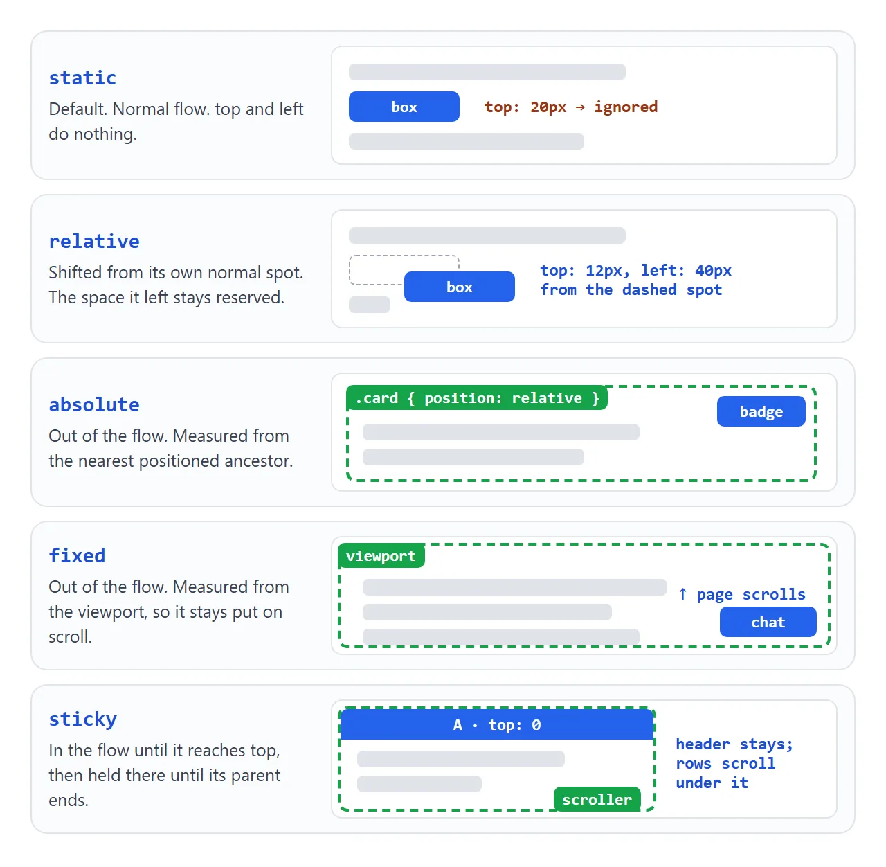
| 가치 | 흐름을 유지하시나요? | 위쪽/왼쪽부터 측정 | 일반적인 사용 |
|---|---|---|---|
static |
예 | 무시됨 | 기본적으로 모든 것 |
relative |
응, 공간은 유지됐어 | 그 자체의 정상적인 지점 | 작은 넛지; 절대자녀의 부모 |
absolute |
아니요 | 가장 가까운 위치의 조상 | 배지, 오버레이, 닫기 버튼 |
fixed |
아니요 | 뷰포트 | 채팅 버튼, 쿠키 바, 고정 헤더 |
sticky |
예 | 스크롤 상자의 가장자리 | 섹션 제목, 표 헤더 |
"흐름에서 벗어났다"는 것은 다른 요소가 상자가 거기에 없는 것처럼 동작한다는 것을 의미합니다. 공간을 닫으면 상자가 공간 위에 놓일 수 있습니다.
절대 및 가장 가까운 위치의 조상
절대 요소는 상위 요소로부터 측정되지 않습니다. position가 static가 아닌 가장 가까운 조상인 포함 블록에서 측정합니다. 사용되는 가장자리는 테두리 내부에 있는 조상의 패딩 가장자리입니다.
브라우저는 모든 static 조상을 건너뛰고 요소에서 트리 위로 이동합니다. 찾지 못한 채 맨 위에 도달하면 페이지 맨 위에 있는 뷰포트 크기의 직사각형인 초기 포함 블록을 사용합니다.
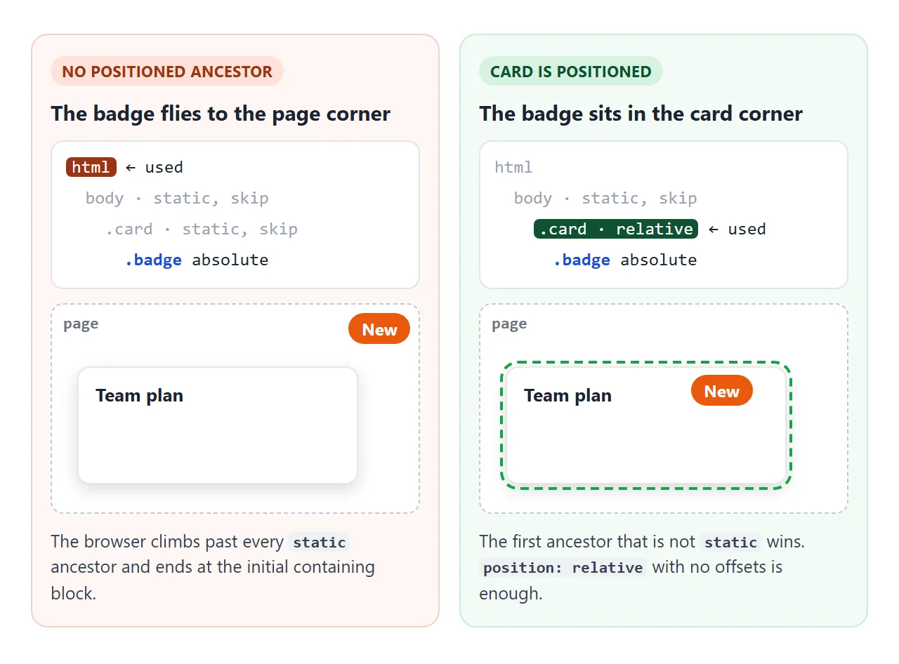
그렇기 때문에 카드 모서리에 쓰여진 배지가 페이지 모서리에 놓이게 됩니다. 확인란을 전환하고 움직이는 것을 지켜보세요.
<!doctype html>
<html lang="en">
<head>
<meta charset="utf-8">
<meta name="viewport" content="width=device-width, initial-scale=1">
<title>Absolute badge and its parent</title>
<style>
  body { margin: 0; padding: 16px; font-family: system-ui, sans-serif; background: #f4f5f7; color: #1d2330; }
  .toggle { display: flex; gap: 8px; align-items: center; font-size: 15px; cursor: pointer; }
  .toggle input { width: 18px; height: 18px; }
  pre {
    margin: 10px 0 18px; padding: 10px 12px; border-radius: 8px; background: #1d2330; color: #e5e7eb;
    font: 13px/1.5 ui-monospace, Consolas, monospace; white-space: pre-wrap;
  }
  .card {
    max-width: 300px; padding: 18px; border-radius: 12px;
    background: #fff; box-shadow: 0 4px 14px rgba(0, 0, 0, .1);
  }
  .card.positioned { position: relative; }   /* the switch: now the badge measures from the card */
  .card h3 { margin: 0 0 6px; }
  .card p { margin: 0; color: #6b7280; }
  .badge {
    position: absolute; top: 8px; right: 8px;  /* 8px from the top-right corner of... what? */
    padding: 4px 10px; border-radius: 99px;
    background: #ea580c; color: #fff; font: 700 12px system-ui, sans-serif;
  }
</style>
</head>
<body>
<label class="toggle"><input type="checkbox" id="fix"> Give the card <b>position: relative</b></label>
<pre id="code"></pre>

<div class="card" id="card">
  <h3>Team plan</h3>
  <p>Up to 10 people, shared folders.</p>
  <span class="badge">New</span>
</div>

<script>
  const card = document.getElementById('card');
  const code = document.getElementById('code');

  function update() {
    const on = document.getElementById('fix').checked;
    card.classList.toggle('positioned', on);
    code.textContent = on
      ? '.card  { position: relative; }\n.badge { position: absolute; top: 8px; right: 8px; }\n/* badge sits in the card corner */'
      : '.card  { }  /* static */\n.badge { position: absolute; top: 8px; right: 8px; }\n/* no positioned ancestor: badge goes to the page corner */';
  }

  document.getElementById('fix').addEventListener('change', update);
  update();
</script>
</body>
</html>
오프셋이 없는 position: relative가 일반적인 수정 사항입니다. 카드가 전혀 움직이지 않습니다. 이는 카드를 그 안에 있는 모든 것에 대한 참조로 만들 뿐입니다. transform가 있는 조상은 static에 머무르는 동안에도 포함 블록이 됩니다.
배지, 오버레이 및 센터링
모든 배지, 리본 및 캡션 스트립 뒤에 있는 패턴은 동일한 4단계입니다.
position: relative카드를 주세요.- 배지
position: absolute를 제공합니다. top: 10px; right: 10px와 같이 코너에 대해 두 개의 오프셋을 설정합니다.- 모서리가 둥글거나 오버레이를 잘라야 하는 경우 카드에
overflow: hidden를 추가하세요.
.card    { position: relative; overflow: hidden; }
.badge   { position: absolute; top: 10px; right: 10px; }
.caption { position: absolute; left: 0; right: 0; bottom: 0; }
절대 요소에 left 및 right를 모두 설정하면 두 가장자리 사이에 요소가 늘어납니다. 이것이 width 값 없이 캡션이 전체 너비에 걸쳐 있는 방식입니다.
inset: 0는 0으로 설정된 4개의 오프셋 모두에 대한 약식이며 전체 카드를 덮는 오버레이를 만듭니다.
위치가 지정된 두 요소가 겹치면 HTML의 뒷부분이 맨 위에 그려집니다. 해당 순서를 변경하려면 z-index를 사용하세요. CSS z-index는 때때로 많은 수가 여전히 손실되는 이유를 설명합니다.
재생 버튼과 같은 요소를 카드 중앙에 배치하려면 두 가지 레시피를 사용하세요. 둘 다 상위 위치를 지정해야 합니다.
/* 1. Known size: stretch to all four edges, then let margin: auto center it */
.center { position: absolute; inset: 0; margin: auto; width: 52px; height: 52px; }

/* 2. Any size: move the top-left corner to the middle, then pull back by half */
.center { position: absolute; top: 50%; left: 50%; transform: translate(-50%, -50%); }
첫 번째에는 너비와 높이가 필요합니다. 그것들이 없으면 div는 단순히 부모를 채우기 위해 늘어납니다.
두 번째 것은 translate 백분율이 요소의 자체 크기를 참조하기 때문에 모든 크기에서 작동합니다. 요소가 오버레이가 아니고 흐름에 머무를 수 있는 경우 일반적으로 flexbox 센터링이 더 간단합니다.
수정되었으며 가끔 스크롤되는 이유
고정 요소는 뷰포트에서 배치되므로 페이지가 스크롤되는 동안 화면의 동일한 위치에 유지됩니다. 따라서 채팅 버튼이나 하단 가장자리의 바에 적합합니다.
한 가지 문제가 있습니다. 조상에 none 이외의 transform, perspective 또는 filter가 있는 경우 몇 가지 다른 속성 중에서 해당 조상은 고정 자손에 대한 포함 블록이 됩니다. 그런 다음 요소는 조상에 고정되고 조상과 함께 스크롤됩니다.
.page-wrapper { transform: translateZ(0); } /* fixed children now stick to this, not the screen */
해결 방법은 해당 조상에서 고정 요소를 이동하거나(예: body의 마지막 하위 요소로) 변환을 삭제하는 것입니다. CSS 변환은 변환이 변경하는 다른 사항을 설명합니다.
끈적임: 임계값, 스크롤러 및 부모
고정 요소는 흐름에 유지되며 사용자가 지정한 오프셋에 도달할 때까지 정적 요소처럼 스크롤됩니다. 그런 다음 해당 위치에 유지되지만 해당 부모가 화면에 있는 동안에만 유지됩니다.
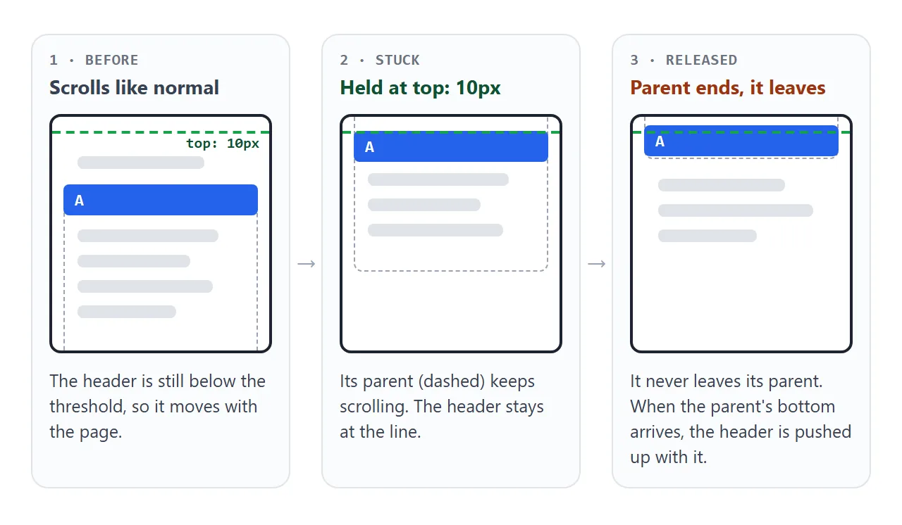
그것이 지속되려면 세 가지가 사실이어야 합니다:
- 임계값.
top: 0(또는bottom,left,right). 아무 것도 설정하지 않으면 끈적거리는relative처럼 동작합니다. - 오른쪽 스크롤러.
overflow가hidden,auto또는scroll로 설정된 가장 가까운 조상 내부에 고정됩니다. 해당 조상이 실제로 스크롤되지 않으면 아무 일도 일어나지 않습니다. - 부모의 공간. 부모를 떠나지 않습니다. 상위 요소의 키가 끈적 요소만큼만 큰 경우 이동할 거리가 없습니다.
특히 페이지 헤더의 경우 HTML 고정 헤더는 고정 선택과 고정 선택 및 그 아래에 있는 앵커 링크를 다룹니다.
완성된 예: 배지, 오버레이 및 고정 제목
위의 패턴을 결합한 것입니다. 카드에는 모서리 배지, 중앙에 있는 재생 버튼, 하단에 캡션이 포함되어 있으며 모두 relative 카드 내부에 있습니다. 옆에 있는 목록은 자체적으로 스크롤되며 각 문자 제목은 해당 섹션 내부에 고정됩니다.
<!doctype html>
<html lang="en">
<head>
<meta charset="utf-8">
<meta name="viewport" content="width=device-width, initial-scale=1">
<title>Badge, overlay caption and sticky headers</title>
<style>
body { margin: 0; padding: 16px; font-family: system-ui, sans-serif; background: #f4f5f7; color: #1d2330; }
.wrap { display: flex; flex-wrap: wrap; gap: 16px; align-items: flex-start; }
/* 1. Card with a corner badge and an overlay caption */
.card {
position: relative; /* containing block for the badge and caption */
width: 260px; height: 180px; border-radius: 12px; overflow: hidden;
background: linear-gradient(135deg, #0ea5e9, #6366f1 60%, #a855f7);
}
.badge {
position: absolute; top: 10px; right: 10px;
padding: 4px 10px; border-radius: 99px; background: #fff; color: #1d2330;
font-size: 12px; font-weight: 700;
}
.play { /* centered: inset 0 + margin auto + a fixed size */
position: absolute; inset: 0; margin: auto;
width: 52px; height: 52px; border-radius: 50%; border: 0;
background: rgba(255, 255, 255, .9); font-size: 20px; cursor: pointer;
}
.caption {
position: absolute; left: 0; right: 0; bottom: 0; /* stretched along the bottom edge */
padding: 22px 12px 10px; color: #fff;
background: linear-gradient(transparent, rgba(0, 0, 0, .65));
}
.caption b { display: block; }
.caption small { opacity: .85; }
/* 2. Scrolling list with sticky section headers */
.list {
width: 260px; height: 260px; overflow: auto; /* the scrolling ancestor */
border-radius: 12px; background: #fff; box-shadow: 0 4px 14px rgba(0, 0, 0, .08);
}
.list h4 {
position: sticky; top: 0; /* sticks to the top of .list, until its section ends */
margin: 0; padding: 6px 12px; background: #1d2330; color: #fff; font-size: 13px;
}
.list ul { margin: 0; padding: 0; list-style: none; }
.list li { padding: 10px 12px; border-bottom: 1px solid #eef1f5; font-size: 14px; }
#log { flex-basis: 100%; margin: 0; font-size: 14px; color: #374151; }
</style>
</head>
<body>
<div class="wrap">
<div class="card">
<span class="badge">4K</span>
<button class="play" id="play" aria-label="Play">▶</button>
<div class="caption"><b>Harbour at dawn</b><small>2 min 14 s</small></div>
</div>
<div class="list" id="list">
<section><h4>A</h4><ul><li>Ada</li><li>Alan</li><li>Amir</li><li>Anna</li></ul></section>
<section><h4>B</h4><ul><li>Bea</li><li>Ben</li><li>Bora</li></ul></section>
<section><h4>C</h4><ul><li>Cara</li><li>Chen</li><li>Cleo</li><li>Cyrus</li></ul></section>
<section><h4>D</h4><ul><li>Dana</li><li>Dev</li><li>Dora</li></ul></section>
</div>
<p id="log">Scroll the list: each letter sticks, then the next one pushes it away.</p>
</div>
<script>
document.getElementById('play').addEventListener('click', () => {
document.getElementById('log').textContent = 'Play clicked. The button stays centered at any card size.';
});
</script>
</body>
</html>
각 제목은 해당 이름과 함께 <section>로 묶입니다. 해당 래퍼는 끝나는 상위 항목이므로 섹션 A가 스크롤되면 제목 A가 떠나고 제목 B가 그 자리를 차지합니다.
작동하지 않을 때
| 당신이 보는 것 | 원인 | 수정 |
|---|---|---|
| 절대 요소가 페이지 모서리로 이동합니다. | 상위 항목이 배치되지 않았습니다. | 의도된 상위의 position: relative |
top 및 left는 아무 작업도 수행하지 않습니다. |
요소는 position: static입니다. |
relative, absolute, fixed 또는 sticky 설정 |
| 끈적끈적한 스크롤은 평소처럼 사라집니다. | top(또는 기타 오프셋) 값 없음 |
top: 0 추가 |
| Sticky는 래퍼 내부에서 아무 작업도 수행하지 않습니다. | 조상에 overflow: hidden 또는 auto가 있습니다. |
제거하거나 overflow: clip를 사용하세요. |
| 스티키는 거의 한 번에 놔버린다. | 부모 요소는 끈적한 요소보다 거의 크지 않습니다. | 이동해야 하는 더 큰 용기에 끈적끈적한 요소를 넣으세요. |
| 고정 요소가 페이지와 함께 스크롤됩니다. | 조상에는 transform, filter 또는 perspective가 있습니다. |
해당 조상에서 요소를 이동합니다. |
| 콘텐츠가 고정 헤더 아래에 숨겨져 있습니다. | 수정은 흐름에서 헤더를 제거합니다. | 헤더 높이와 동일한 본문의 padding-top 또는 sticky 사용 |
| 앵커 링크는 헤더 아래에 위치합니다. | 브라우저는 대상을 맨 위로 스크롤합니다. | html의 scroll-padding-top |
링크로 공유하세요
포지셔닝은 설명하는 것보다 보여주는 것이 더 쉽습니다. 스크린샷은 스크롤할 수 없으므로 고정된 제목이나 고정된 버튼을 표시할 수 없으며 .html 첨부 파일은 전화기에서 일반 코드로 열릴 수 있습니다.
작업 버전을 보내려면 페이지를 NOS 문서에 붙여넣고 공유 링크 만들기를 선택하세요. 링크할 HTML이 이를 안내합니다.
페이지는 작성된 대로 렌더링되고 해당 스크립트가 실행되므로 페이지를 받는 사람이 직접 스크롤하고 클릭할 수 있습니다. 나중에 코드를 변경하면 동일한 링크에 새 버전이 표시됩니다.