A virtual tour lets somebody understand a space without visiting. Most fail for two reasons, and neither is the technology.

This guide covers shooting, orientation, and publishing weight.
Shoot fewer viewpoints
The instinct is to capture everything. Twenty viewpoints in a three-bedroom house turns a tour into a maze, and viewers give up trying to work out which arrow leads where.
One per room. The entrance. Anything that explains how the space connects, such as a landing or a hallway junction.
That is usually six to nine for a house, and it reads as a walkthrough rather than as a puzzle.
Where the camera goes
Eye height. Standing height, about 1.6 metres. Lower makes ceilings loom; higher makes rooms feel like a model.
Near the middle. Corners are tempting because they see more, and they distort the proportions so the room looks smaller.
Facing the way somebody walks in. The viewer arrives oriented rather than facing a wall.
Keep the tripod in the same position between shots if you are merging exposures, and get yourself out of frame, which is harder than it sounds with a 360 camera.
| Common mistake | Better | |
|---|---|---|
| Number of viewpoints | Twenty | Six to nine |
| Camera position | Corner | Near the middle |
| Height | Chest or tripod default | Eye height |
| Facing | Arbitrary | The way you walk in |
| Lighting | Whenever | Brightest day |
Lighting beats equipment
A modest camera on a bright day produces a better tour than an expensive one in poor light.
Open every curtain. Turn every light on. Shoot when the sun is high enough not to blow out the windows but bright enough to fill the room.
Empty spaces photograph badly. A room with nothing in it gives the eye no sense of scale, so leaving some furniture, or adding a chair, helps more than any setting.
Orientation is the whole problem
A viewer dropped into a panorama has no idea which room they are in or how it relates to the last one.
Three things fix it.
Name every viewpoint. Kitchen, first floor landing, garden.
Keep a plan visible, with a marker showing where they are.
Make the arrows obvious. Where an arrow leads should be labelled, not guessed.
Publishing weight
Panoramas are very large. A tour that loads several before showing anything takes seconds, and the viewer arrived from a link out of mild curiosity.
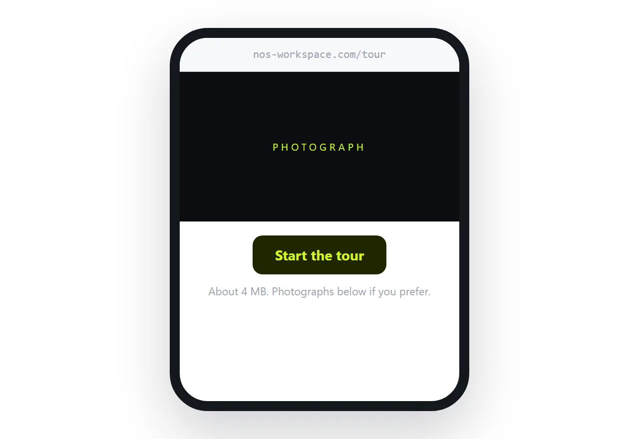
Show a photograph immediately with an obvious control to start the tour. The page is useful in the first second, and the heavy loading happens only for people who asked.
Give the tour its own address so it can be sent on its own, and keep a photograph set as the fallback for anyone whose device cannot run it.
Closely related: How to share a virtual tour as a link, and How to advertise a property with a link for the adjacent problem.
Put it at an address
Shoot six to nine viewpoints at eye height on a bright day, label every position, keep a plan visible, and publish with a photograph first.
Then the viewer gets through the tour and understands the space.