A floor plan is the one image on a property page that gets examined rather than scrolled past. Everything about how it is published should follow from that.
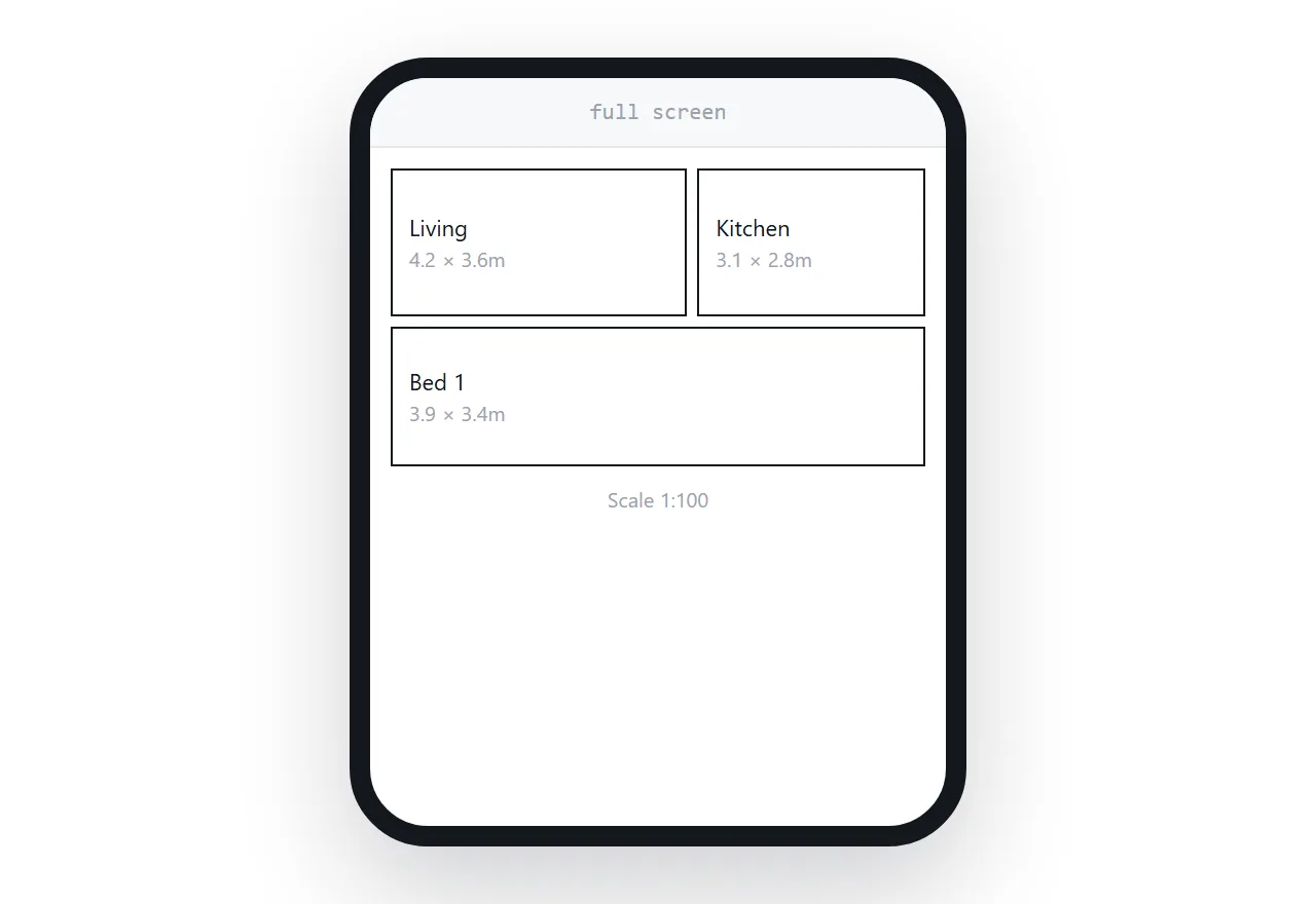
This guide covers format, the two-size approach, and multiple floors.
The plan is read, not viewed
A photograph answers what a room looks like. A plan answers questions the buyer is actually asking.
Does the sofa fit. Is the second bedroom a real bedroom. How far is the kitchen from the back door. Is there anywhere to put a washing machine.
All of those require reading numbers, and the numbers on a plan are set small because a plan is designed for a large sheet. Shrink it to a phone screen and the diagram survives while the information does not.
Two sizes, on purpose
Publish the plan twice.
A moderate version sits on the page, enough to show the shape and let the reader see there is a plan. It loads quickly and does not hold up the rest of the page.
A large version opens when the reader taps it, full screen, at a resolution where the dimension text is crisp under a zoom.
That split matters because the large version can be several megabytes, and making every visitor download it before the page appears is the usual reason a property page feels slow.
| One size | Two sizes | |
|---|---|---|
| Page loads quickly | No | Yes |
| Dimensions readable | Only if huge | Yes, on tap |
| Reader zooms comfortably | Blurry | Sharp |
| Mobile data used | Always | Only if asked |
Format
If the plan came from drafting software, get a vector version. It stays sharp at any zoom, the text remains readable however far the reader goes in, and the file is usually smaller than a large image.
If all you have is an image, keep it generous. Plans that arrive as a small compressed image from a third party are often unusable, and it is worth asking for the original rather than publishing something nobody can read.
Avoid putting the plan inside a document if the reader is on a phone, because the document viewer adds a layer between the reader and the zoom.
Several floors
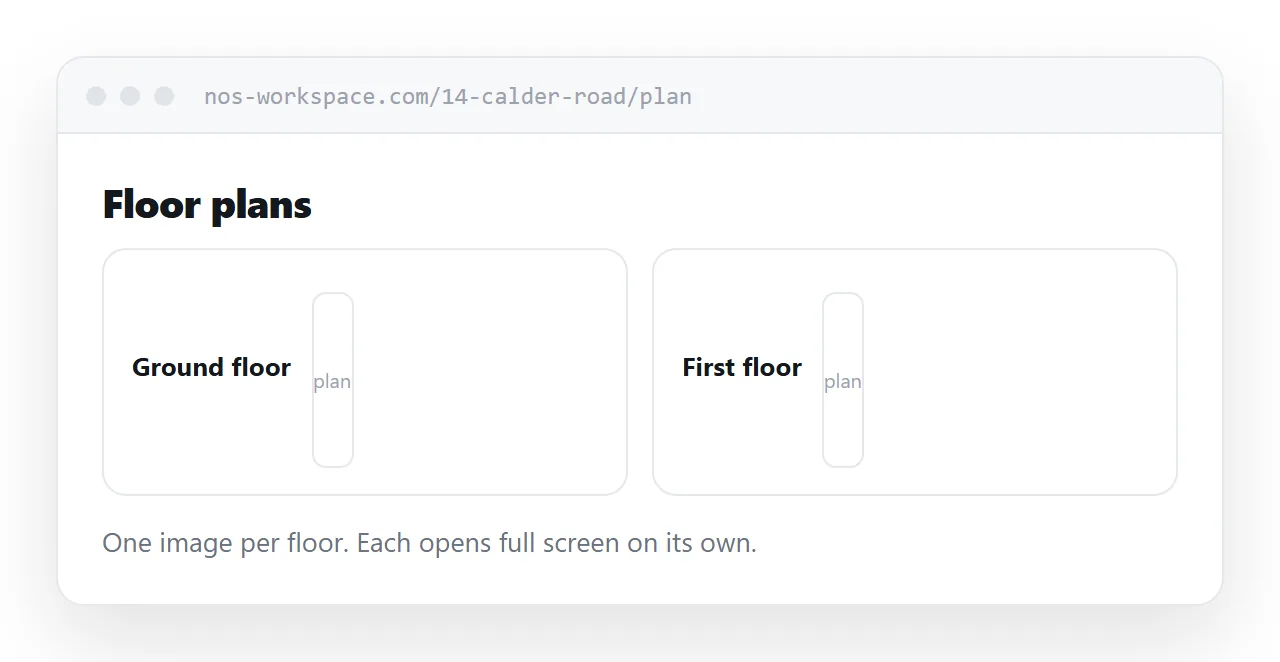
Publish one image per floor, each clearly labelled.
A single combined image forces the reader to look at three floors while thinking about one, and on a phone it means each floor is a third of the available width.
Label them the way a reader would say them out loud: ground floor, first floor, loft. Not sheet one, sheet two.
Printing
Some buyers print the plan and measure furniture against it.
Mark the scale on the plan itself, and include the key dimensions as text as well as on the drawing. A printed page at an unknown scale is worse than useless because it produces confident wrong answers.
Keep it next to the photographs
Buyers move back and forth: a photograph, then the plan to work out which room that was, then back to the photograph.
Keep the plan reachable from the photographs without a page change. Every navigation step between them is a step where someone gives up and stays confused about the layout.
For the surrounding ground, see How to advertise a property with a link and How to share a photo gallery as a link. How to password protect a presentation is also close.
Put it at an address
Use a vector plan if one exists, publish a small version on the page and a large one for full screen, label each floor separately, mark the scale, and keep it beside the photographs.
Then the numbers that the plan exists for are actually readable.