HTML popover 속성은 모든 요소를 페이지 상단에 열리는 패널로 전환합니다. id를 제공하고 해당 ID로 popovertarget 버튼을 제공하면 버튼이 열리고 닫힙니다. 관리할 JavaScript나 z-index가 없습니다.
<button popovertarget="info">Info</button>
<div id="info" popover>Opens on top. Esc or a click outside closes it.</div>
아래 두 종류를 모두 시도해 보세요. 각 항목을 연 다음 페이지의 다른 곳을 클릭하세요.
<!doctype html>
<html lang="en">
<head>
<meta charset="utf-8">
<meta name="viewport" content="width=device-width, initial-scale=1">
<title>Popover without JavaScript</title>
<style>
  body {
    margin: 0; padding: 16px; font-family: system-ui, sans-serif;
    background: #f4f5f7; color: #1d2330;
  }
  .cols { display: grid; grid-template-columns: 1fr 1fr; gap: 12px; }
  .col { background: #fff; border-radius: 12px; padding: 12px; }
  h2 { font-size: 15px; margin: 0 0 4px; }
  p { font-size: 13px; color: #555; margin: 0 0 10px; }
  button {
    font: inherit; font-size: 14px; padding: 7px 12px; margin: 0 4px 6px 0;
    border: 1px solid #c9ced8; border-radius: 8px; background: #fff; cursor: pointer;
  }
  /* A popover is position: fixed and centred by default. Place these two by hand. */
  [popover] {
    inset: auto; top: 190px; margin: 0; width: calc(50% - 50px);
    border: 0; border-radius: 10px; padding: 12px;
    box-shadow: 0 10px 30px rgba(0, 0, 0, .18); font-size: 14px;
  }
  #auto-pop { left: 24px; background: #e8f1ff; }
  #manual-pop { right: 24px; background: #fff4e0; }
</style>
</head>
<body>
<div class="cols">
  <div class="col">
    <h2>popover (auto)</h2>
    <p>Closes on a click outside or Esc.</p>
    <button popovertarget="auto-pop">Toggle</button>
  </div>
  <div class="col">
    <h2>popover="manual"</h2>
    <p>Stays open until a button closes it.</p>
    <button popovertarget="manual-pop" popovertargetaction="show">Show</button>
    <button popovertarget="manual-pop" popovertargetaction="hide">Hide</button>
  </div>
</div>

<div id="auto-pop" popover>
  <b>Auto popover</b><br>Click anywhere else, or press Esc.
</div>

<div id="manual-pop" popover="manual">
  <b>Manual popover</b><br>Clicks outside do nothing. Use Hide.
</div>
</body>
</html>
팝오버(자동) 및 popover="수동"
속성에는 두 가지 공통 값이 있으며 패널을 닫는 항목만 다릅니다. 값이 없는 popover는 popover="auto"와 동일합니다.
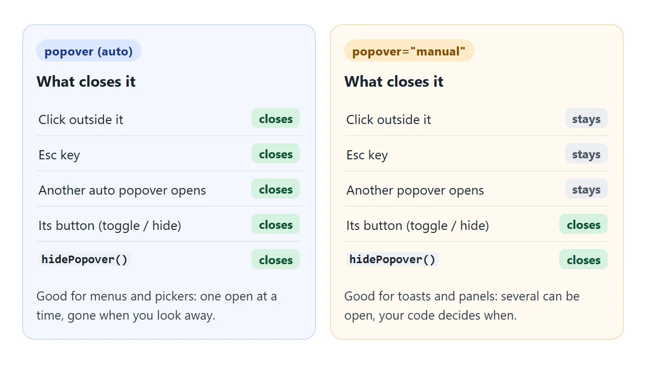
자동 팝오버에는 가벼운 해제 기능이 있습니다. 팝오버 외부를 클릭하거나 Esc 키를 누르면 닫힙니다.
두 번째 자동 팝오버를 열면 첫 번째 팝업이 닫힙니다. 단, 하위 메뉴처럼 두 번째 팝업이 첫 번째 팝오버 내부에 있지 않는 한은 아닙니다. 이것이 메뉴, 선택기 및 작은 정보 패널에서 원하는 동작입니다.
수동 팝오버는 외부 클릭과 Esc를 무시합니다. 여러 개를 함께 열 수 있으며 버튼이나 hidePopover()가 닫힐 때까지 유지됩니다. 토스트, 고정된 도움말 패널 또는 사용자가 다른 곳에서 작업하는 동안 사라지지 않아야 하는 모든 것에 적합합니다.
열고 닫기: 버튼 먼저, 필요할 때 JavaScript
<button>의 세 가지 속성은 스크립트 없이 대부분의 경우를 다룹니다.
| 버튼의 속성 | 기능 |
|---|---|
popovertarget="menu" |
id="menu"로 팝오버를 토글합니다. |
popovertargetaction="show" |
열기만 합니다(열려 있으면 아무 작업도 수행하지 않음). |
popovertargetaction="hide" |
패널 내부의 닫기 버튼과 같이 닫기만 하면 됩니다. |
또한 버튼은 브라우저가 확장된 상태를 설정하므로 팝오버가 열려 있는지 여부를 화면 판독기에 알려줍니다. 대상은 <button>(또는 <input type="button">)여야 합니다. 이 속성은 링크나 div에서는 아무 작업도 수행하지 않습니다.
JavaScript에서는 세 가지 메서드가 동일한 작업을 수행합니다.
const menu = document.getElementById('menu');
menu.showPopover();           // open
menu.hidePopover();           // close
const isOpen = menu.togglePopover();  // flip, returns true if now open

menu.addEventListener('toggle', (e) => {
  console.log(e.oldState, '->', e.newState);  // "closed" -> "open"
});
toggle 이벤트는 팝오버가 열리거나 닫힌 후 발생합니다. 원인이 무엇이든(버튼, Esc, 외부 클릭 또는 자체 코드). beforetoggle는 위치를 정하는 순간인 직전에 발사됩니다.
최상위 레이어: z-index가 더 이상 중요하지 않은 이유
열린 팝오버는 전체 페이지 위의 레이어인 브라우저의 최상위 레이어에 그려집니다. overflow: hidden가 있는 상위 항목은 클립할 수 없으며 다른 곳에서는 z-index가 이를 덮을 수 없습니다.
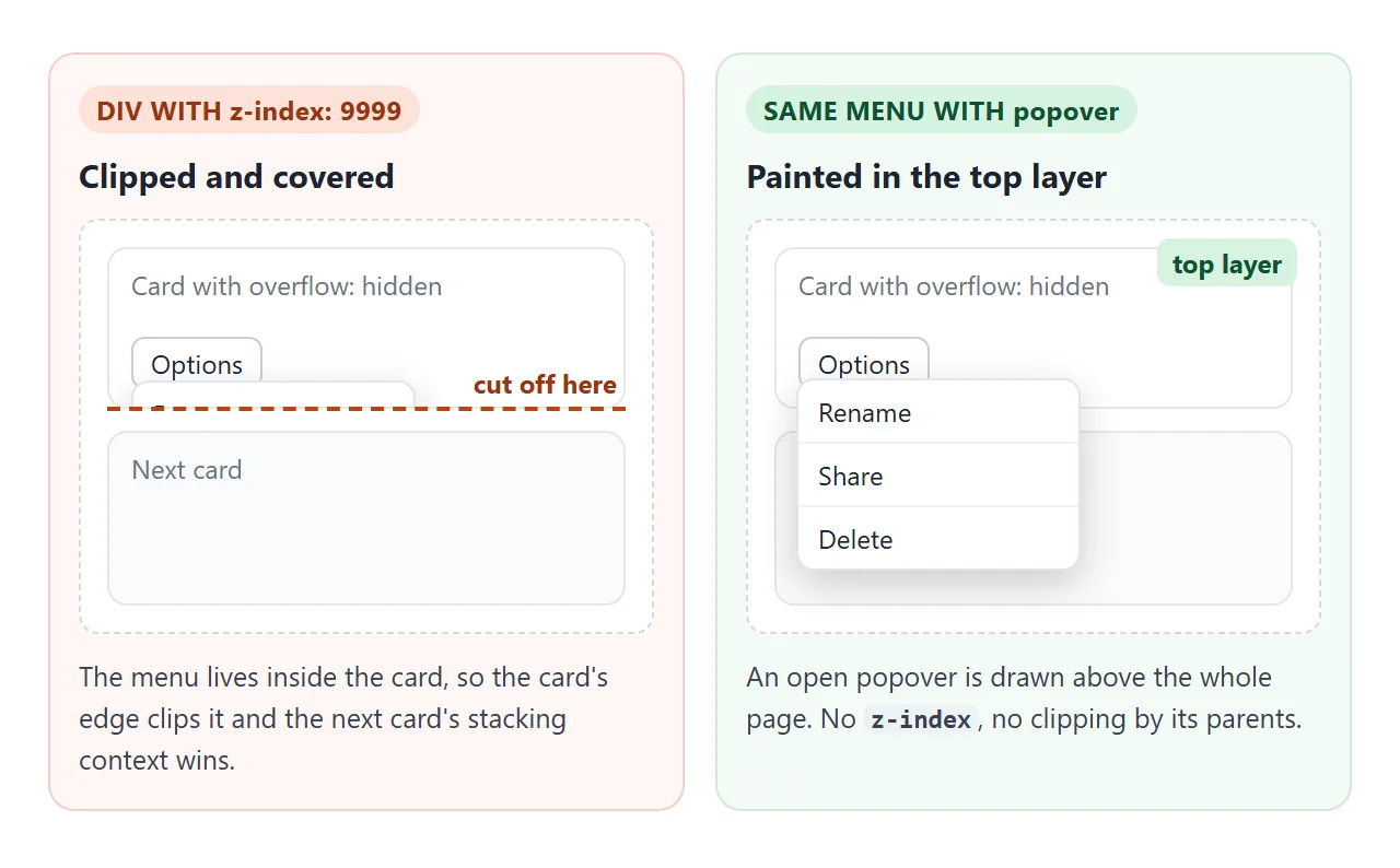
이는 메뉴나 도구 설명이 다음 섹션 뒤에서 사라지는 가장 일반적인 이유를 제거합니다. CSS z-index는 이를 발생시키는 스택 컨텍스트와 숫자를 9999로 올리면 아무 일도 일어나지 않는 이유를 설명합니다.
최상위 레이어는 팝오버가 열려 있는 동안에만 적용됩니다. 닫힌 팝오버는 display: none입니다.
스타일링: :popover-open, ::backdrop 및 진입 애니메이션
요소 자체의 모양을 스타일화하고, :popover-open는 열려 있을 때 달라지는 요소를 스타일화하고, ::backdrop는 요소와 페이지 사이의 레이어를 스타일화합니다. 배경을 지정하기 전까지는 배경이 보이지 않습니다.
<!doctype html>
<html lang="en">
<head>
<meta charset="utf-8">
<meta name="viewport" content="width=device-width, initial-scale=1">
<title>Styling a popover</title>
<style>
  body {
    margin: 0; padding: 16px; font-family: system-ui, sans-serif;
    background: #f4f5f7; color: #1d2330;
  }
  button {
    font: inherit; font-size: 14px; padding: 8px 14px; border-radius: 8px;
    border: 1px solid #c9ced8; background: #fff; cursor: pointer;
  }
  .open-btn { background: #2563eb; border-color: #2563eb; color: #fff; }
  #note, #log { font-size: 13px; color: #555; margin: 12px 0 0; }
  #log { font-family: ui-monospace, Consolas, monospace; }

  /* Closed state: also the state it animates from and back to */
  #tip {
    width: min(300px, 80vw); border: 0; border-radius: 14px; padding: 18px;
    box-shadow: 0 18px 40px rgba(0, 0, 0, .25);
    opacity: 0; translate: 0 16px;
    transition: opacity .25s, translate .25s,
                display .25s allow-discrete, overlay .25s allow-discrete;
  }
  /* Open state */
  #tip:popover-open { opacity: 1; translate: 0 0; }
  /* Where the entry animation starts (browsers without @starting-style skip it) */
  @starting-style {
    #tip:popover-open { opacity: 0; translate: 0 16px; }
  }
  /* The layer between the popover and the page */
  #tip::backdrop { background: rgba(15, 23, 42, .45); }
  #tip h3 { margin: 0 0 6px; font-size: 17px; }
  #tip p { margin: 0 0 14px; font-size: 14px; line-height: 1.45; }
</style>
</head>
<body>
<button class="open-btn" popovertarget="tip">What's new</button>
<p id="note"></p>
<p id="log">toggle events will show here</p>

<div id="tip" popover>
  <h3>Popovers can be styled</h3>
  <p>This one fades in, dims the page with ::backdrop and still closes on Esc or a click outside.</p>
  <button popovertarget="tip" popovertargetaction="hide">Got it</button>
</div>

<script>
  // Feature check: does this browser know @starting-style?
  const hasStart = 'CSSStartingStyleRule' in window;
  document.getElementById('note').textContent = hasStart
    ? '@starting-style is supported here: the popover fades in and out.'
    : 'No @starting-style here: the popover appears without the fade-in.';

  // toggle fires after the popover opens or closes
  const log = document.getElementById('log');
  document.getElementById('tip').addEventListener('toggle', (e) => {
    log.textContent = 'toggle: ' + e.oldState + ' -> ' + e.newState;
  });
</script>
</body>
</html>
#tip {                                /* closed, and where it animates from */
  opacity: 0; translate: 0 16px;
  transition: opacity .25s, translate .25s,
              display .25s allow-discrete, overlay .25s allow-discrete;
}
#tip:popover-open { opacity: 1; translate: 0 0; }
@starting-style {                     /* first frame after opening */
  #tip:popover-open { opacity: 0; translate: 0 16px; }
}
#tip::backdrop { background: rgb(15 23 42 / .45); }
@starting-style는 조금 전에 요소에 상자가 없었기 때문에 애니메이션의 첫 번째 프레임을 제공합니다. display 및 overlay의 allow-discrete는 페이드 아웃이 끝날 때까지 최상위 레이어에 페인트된 상태를 유지합니다.
@starting-style가 없는 브라우저는 페이드 없이 팝오버만 표시합니다. 데모에서는 이를 확인하고 귀하가 어떤 경우에 해당하는지 알려줍니다.
버튼 아래에 배치
기본적으로 팝오버는 버튼 옆이 아닌 뷰포트 중앙에서 열립니다. 브라우저는 position: fixed, inset: 0 및 margin: auto와 함께 얇은 테두리, 약간의 패딩 및 일반 배경을 제공합니다.
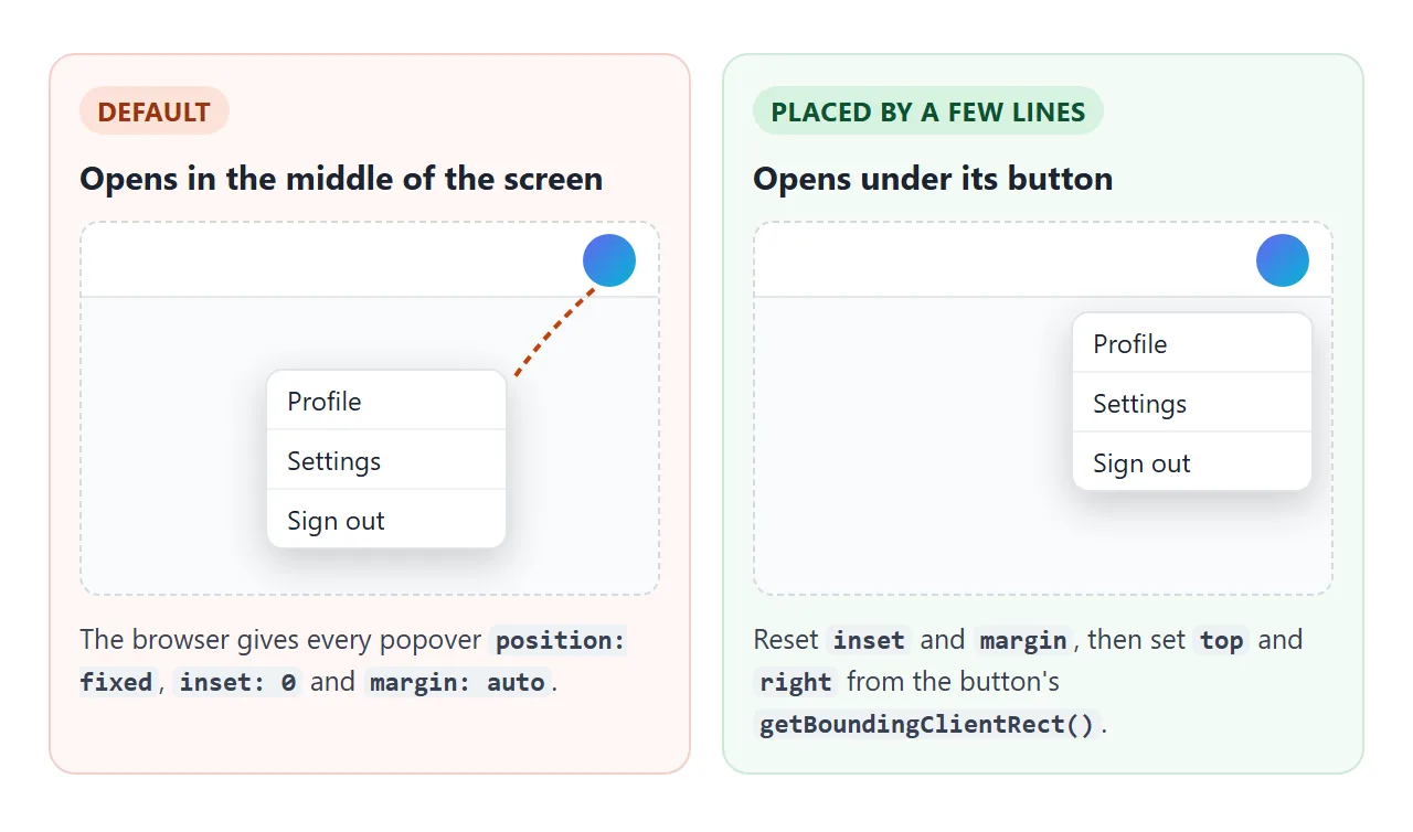
몇 줄을 버튼 아래에 넣습니다. CSS에서 기본값을 재설정한 다음 팝오버가 열리기 직전에 버튼 상자를 읽습니다.
#menu { inset: auto; margin: 0; }
menu.addEventListener('beforetoggle', (e) => {
  if (e.newState !== 'open') return;
  const r = avatar.getBoundingClientRect();
  menu.style.top = (r.bottom + 8) + 'px';
  menu.style.right = (innerWidth - r.right) + 'px';  // right edges lined up
});
팝오버는 fixed이므로 이는 뷰포트 좌표이며, 이는 정확히 getBoundingClientRect()가 반환하는 것입니다.
CSS 앵커 위치 지정은 스크립트 없이 이 작업을 수행하는 새로운 방법입니다. 버튼의 anchor-name, 팝오버의 position-anchor 및 anchor()입니다. 독자가 사용하는 브라우저에서 지원을 확인하고 의존하기 전에 스크립트를 대체용으로 유지하세요.
완성된 예: 계정 메뉴 및 토스트 스택
두 종류가 함께 잘 작동합니다. 계정 메뉴는 자동 팝오버이므로 클릭하면 닫힙니다. 각 알림은 수동 팝오버이므로 다른 곳을 클릭하거나 Esc를 누르면 시간이 초과되거나 닫힐 때까지 그대로 유지됩니다.
<!doctype html>
<html lang="en">
<head>
<meta charset="utf-8">
<meta name="viewport" content="width=device-width, initial-scale=1">
<title>Account menu and toasts with popover</title>
<style>
  body { margin: 0; font-family: system-ui, sans-serif; background: #f4f5f7; color: #1d2330; }
  header {
    display: flex; align-items: center; justify-content: space-between;
    padding: 10px 16px; background: #fff; box-shadow: 0 1px 0 #e1e4ea;
  }
  .logo { font-weight: 700; }
  .avatar {
    width: 38px; height: 38px; border-radius: 50%; border: 0; cursor: pointer;
    background: linear-gradient(135deg, #6366f1, #06b6d4); color: #fff; font-weight: 700;
  }
  main { padding: 16px; }
  main p { font-size: 14px; color: #555; margin: 0 0 10px; }
  .act {
    font: inherit; font-size: 14px; padding: 8px 12px; margin: 0 6px 6px 0;
    border: 1px solid #c9ced8; border-radius: 8px; background: #fff; cursor: pointer;
  }

  /* Account menu: an auto popover placed by the script under the avatar */
  #menu {
    inset: auto; margin: 0; padding: 6px; min-width: 190px;
    border: 1px solid #e1e4ea; border-radius: 12px;
    box-shadow: 0 12px 30px rgba(0, 0, 0, .16);
  }
  #menu .who { padding: 8px 10px; font-size: 13px; color: #555; border-bottom: 1px solid #eef0f3; }
  #menu button {
    display: block; width: 100%; text-align: left; font: inherit; font-size: 14px;
    padding: 9px 10px; border: 0; border-radius: 8px; background: none; cursor: pointer;
  }
  #menu button:hover, #menu button:focus-visible { background: #f1f4f9; }

  /* Toasts: manual popovers stacked in the bottom-right corner */
  .toast {
    inset: auto; right: 12px; margin: 0; width: min(260px, calc(100vw - 24px));
    box-sizing: border-box; padding: 12px 36px 12px 14px; border: 0; border-radius: 10px;
    background: #1d2330; color: #fff; font-size: 14px;
    box-shadow: 0 8px 24px rgba(0, 0, 0, .25); transition: bottom .2s;
  }
  .toast button {
    position: absolute; top: 6px; right: 6px; border: 0; background: none;
    color: #cbd5e1; font-size: 18px; line-height: 1; cursor: pointer;
  }
</style>
</head>
<body>
<header>
  <span class="logo">Acme</span>
  <button class="avatar" id="avatar" popovertarget="menu" aria-label="Account">JL</button>
</header>

<main>
  <p>Open the account menu, then click outside it. Buttons below add toasts, which stay until closed or timed out.</p>
  <button class="act" data-msg="Draft saved">Save</button>
  <button class="act" data-msg="Link copied">Copy link</button>
</main>

<div id="menu" popover>
  <div class="who">Signed in as <b>jl@example.com</b></div>
  <button data-msg="Profile opened">Profile</button>
  <button data-msg="Settings opened">Settings</button>
  <button data-msg="Signed out (demo)">Sign out</button>
</div>

<script>
  const avatar = document.getElementById('avatar');
  const menu = document.getElementById('menu');

  // Place the menu under the avatar, right edges lined up, just before it opens
  menu.addEventListener('beforetoggle', (e) => {
    if (e.newState !== 'open') return;
    const r = avatar.getBoundingClientRect();
    menu.style.top = (r.bottom + 8) + 'px';
    menu.style.right = Math.max(8, innerWidth - r.right) + 'px';
  });

  // Menu items: close the menu, then report with a toast
  menu.querySelectorAll('button').forEach((b) => b.addEventListener('click', () => {
    menu.hidePopover();
    toast(b.dataset.msg);
  }));
  document.querySelectorAll('.act').forEach((b) =>
    b.addEventListener('click', () => toast(b.dataset.msg)));

  // Each toast is its own manual popover, so light dismiss never closes it
  const toasts = [];
  function toast(text) {
    const t = document.createElement('div');
    t.className = 'toast';
    t.popover = 'manual';
    t.textContent = text;
    const x = document.createElement('button');
    x.textContent = '×';  // the multiplication sign as a close icon
    x.setAttribute('aria-label', 'Close');
    x.addEventListener('click', () => remove(t));
    t.append(x);
    document.body.append(t);
    t.showPopover();
    toasts.push(t);
    stack();
    setTimeout(() => remove(t), 4000);
  }
  function remove(t) {
    if (!t.isConnected) return;
    t.hidePopover();
    t.remove();
    toasts.splice(toasts.indexOf(t), 1);
    stack();
  }
  // Newest toast at the bottom, older ones pushed up
  function stack() {
    let bottom = 12;
    for (let i = toasts.length - 1; i >= 0; i--) {
      toasts[i].style.bottom = bottom + 'px';
      bottom += toasts[i].offsetHeight + 8;
    }
  }
</script>
</body>
</html>
- 메뉴:
beforetoggle청취자 한 명이 아바타 아래에 배치합니다. 항목을 클릭하면hidePopover()가 호출되고 토스트가 추가됩니다. - 토스트: 각각은
t.popover = 'manual'로 생성된 다음showPopover()로 생성됩니다. 작은 기능은 토스트가 추가되거나 제거될 때마다 모든 토스트의bottom(가장 낮은 값)를 설정합니다. - Z-인덱스는 어디에도 없습니다. 둘 다 최상위 레이어에 있으므로 스택 규칙 없이 헤더와 페이지 위에 위치합니다.
각 항목에 대한 키보드 처리가 포함된 사이트 탐색 메뉴의 경우 HTML 드롭다운 메뉴 가이드를 참조하세요.
팝오버, 대화상자 또는 툴팁?
popover |
<dialog> 및 showModal() |
마우스오버 툴팁 | |
|---|---|---|---|
| 다음 날짜에 열립니다. | 버튼 클릭 또는 스크립트 | 스크립트 | 마우스를 올리거나 초점을 맞추세요. |
| 페이지의 나머지 부분 | 계속 사용 가능 | 닫힐 때까지 불활성 | 계속 사용 가능 |
| Esc를 눌러 닫습니다. | 자동: 그렇죠. 수동: 아니 | 예 | 코딩만 하면 |
| 최상층 | 예 | 예 | 아니요, 팝오버가 아닌 이상 |
| 다음에 좋습니다 | 메뉴, 피커, 토스트, 팁 | 확인서, 응답해야 하는 양식 | 아이콘의 짧은 레이블 |
모달은 무엇보다 먼저 사용자의 답변이 필요하며 HTML CSS 모달은 <dialog> 경로를 다룹니다. 클릭이 아닌 마우스 오버 시 표시되는 라벨의 경우 순수 HTML 툴팁에서 옵션을 비교합니다.
작동하지 않을 때
| 당신이 보는 것 | 원인 | 수정 |
|---|---|---|
| 팝오버가 화면 중앙에 열립니다. | inset: 0 및 margin: auto가 포함된 기본 position: fixed |
inset: auto; margin: 0를 설정하고 직접 배치하세요. |
| 버튼을 누르면 페이지가 새로고침됩니다. | <form> 내부의 버튼은 제출 버튼이며 제출이 승리합니다. |
type="button" 추가 |
| 수동 팝오버는 외부 클릭 시 절대 닫히지 않습니다. | 이것이 manual의 뜻입니다 |
닫기 버튼을 추가하거나 popover(자동)를 사용하세요. |
| 버튼을 클릭해도 아무 일도 일어나지 않습니다 | popovertarget가 id와 정확하게 일치하지 않거나 링크 또는 div에 있습니다. |
ID를 복사하고 <button>를 사용하세요. |
| 패널을 닫아도 패널이 표시됩니다. | CSS가 display를 설정했는데, 이는 브라우저의 숨기기 규칙을 능가합니다. |
:popover-open 아래에 display: flex(또는 그리드)를 넣습니다. |
| 이전 브라우저에서는 항상 표시됩니다. | 브라우저가 속성을 모릅니다 | HTMLElement.prototype.hasOwnProperty('popover')를 확인하고 폴백을 추가하세요. |
링크로 공유하세요
메뉴나 토스트는 설명하는 것보다 보여주는 것이 더 쉽습니다. 스크린샷을 클릭할 수 없으며 전송된 .html 파일이 휴대폰에서 일반 코드로 열릴 수 있습니다.
작업 버전을 보내려면 페이지를 NOS 문서에 붙여넣고 공유 링크 만들기를 선택하세요. 링크할 HTML이 이를 안내합니다.
페이지는 작성된 대로 렌더링되고 해당 스크립트가 실행되므로 페이지를 받는 사람이 메뉴를 열고 직접 토스트를 실행할 수 있습니다. 나중에 코드를 변경하면 동일한 링크에 새 버전이 표시됩니다.