A monospaced typeface is judged on a narrow set of characters, and the ones that matter are the ones that get mistaken for each other.
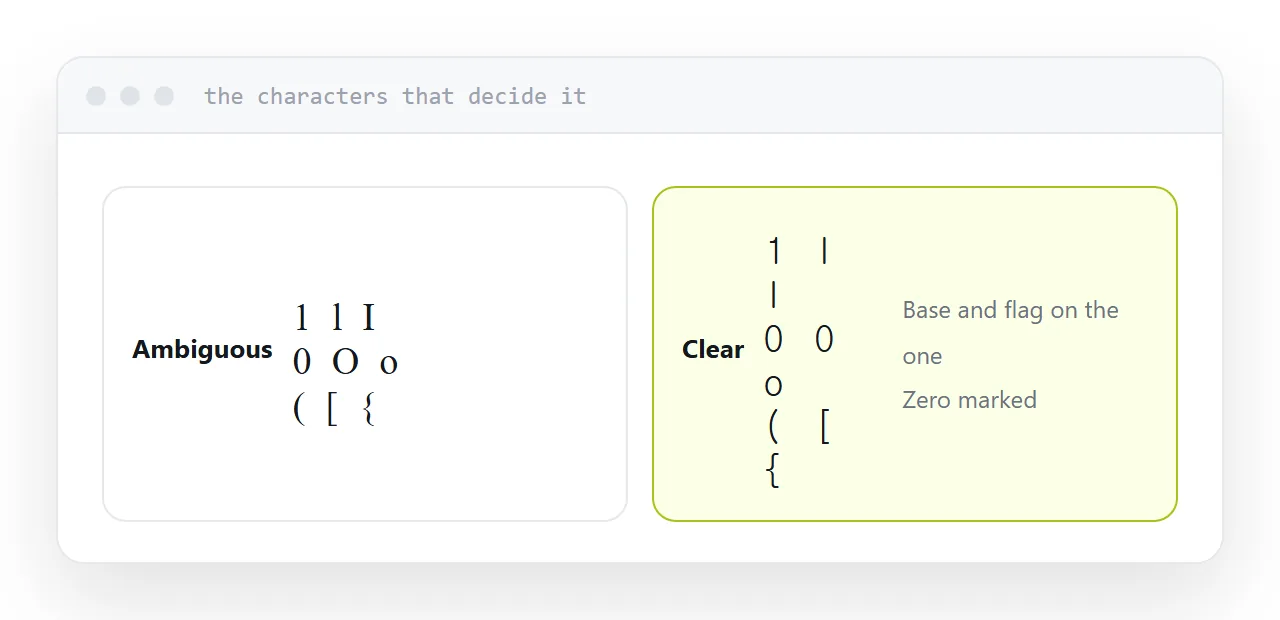
The characters that decide it
One and lowercase L. The most common confusion. A good typeface gives the one a base and a distinct flag.
Zero and capital O. Solved with a slash or a dot through the zero, and typefaces without either are hard to recommend for code.
Brackets. Round, square and curly should be distinguishable at a glance without counting.
Quotes. Straight and curly, single and double, should not be ambiguous.
Compare candidates on those. Everything else is preference.
| Pair | Look for |
|---|---|
| 1 and l | A base and a flag on the one |
| 0 and O | Slash or dot through the zero |
| ( [ { | Distinct at small sizes |
| Quote marks | Unambiguous |
| Full stop and comma | Clearly different |
Ligatures
Some typefaces draw certain character combinations as a single symbol, so two characters become an arrow.
Opinion splits cleanly. Some people find it more readable; others object that the code no longer shows what is actually there, which matters when you are counting characters or debugging.
It is a toggle in every editor. Try both for a week rather than accepting the default.
Test by working, not looking
A specimen page shows a typeface at its best, in short lines, at a large size.
Reading code for eight hours is a different task. Set your editor to the candidate and work normally for a week. The things that become annoying, a period that is too small, a letter that is too wide, only emerge with use.
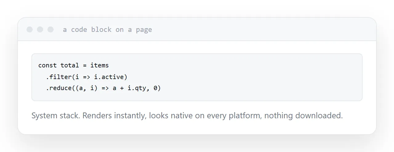
On a web page it is different
In an editor, the font is installed and free.
On a page, a custom monospaced typeface is a file the visitor downloads before the code block renders correctly. For a page with a small amount of code, that is a poor trade.
The system monospaced stack, whatever the device already has, renders immediately, looks native on each platform, and costs nothing. For documentation and articles it is the right default.
If you do ship one
Subset it.
A full font file carries characters for many languages and every symbol in the specification. A code block uses a small fraction of that. Subsetting to the characters actually needed routinely removes most of the file.
Set a system fallback so text is readable while the font loads rather than invisible.
For the surrounding ground, see Formatting and cleaning up markup and An alternative to Confluence for documentation.
Put it at an address
Compare on the confusable characters, decide about ligatures rather than inheriting them, test by working for a week, use the system stack on pages, and subset anything you do ship.