AI generated websites look the same because they share four defaults: one section order, one palette family, one type scale and one set of copy patterns.
Why do AI generated websites look the same when the prompts are all different? Because the prompt rarely specifies any of those four, so the model supplies its most probable version of each.
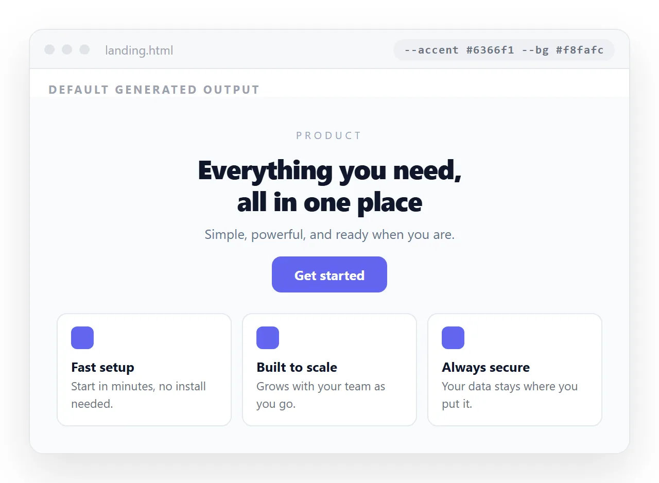
The result is competent and anonymous. All four are replaceable, and three of them in under ten minutes.
Why do AI generated websites look the same: four defaults
The skeleton. Centred hero, subheading, two buttons, three feature cards, a testimonial strip, a pricing table, a closing call to action. The order is so consistent that readers predict the next section while scrolling.
The palette. A violet or indigo accent on slate greys, usually with one gradient. It is a safe, accessible default, which is why it turns up so often.
The type scale. A geometric sans, large heading, generous line height, one weight for emphasis. Nothing is wrong with it and nothing is yours.
The copy. Short benefit lines built from the same handful of shapes. "Everything you need to", "built for teams who", a three word heading followed by a two line paragraph.
What each default costs, and what fixing it costs
| Default | How visible | Effort to change |
|---|---|---|
| Section order | Very | Minutes, reorder blocks |
| Palette | Very | Minutes, replace values |
| Type scale | Moderate | Minutes, one font and two sizes |
| Copy patterns | Very to a careful reader | Hours, it is writing |
| Icon set | Moderate | Minutes |
| Stock imagery | Very | Depends on what you have |
| Spacing rhythm | Low | Not worth it |
The pattern is worth noticing. The most visible defaults are the cheapest to fix, and the one that takes real time, the writing, is also the one that separates a page from every other page in its category.
Replacing the palette
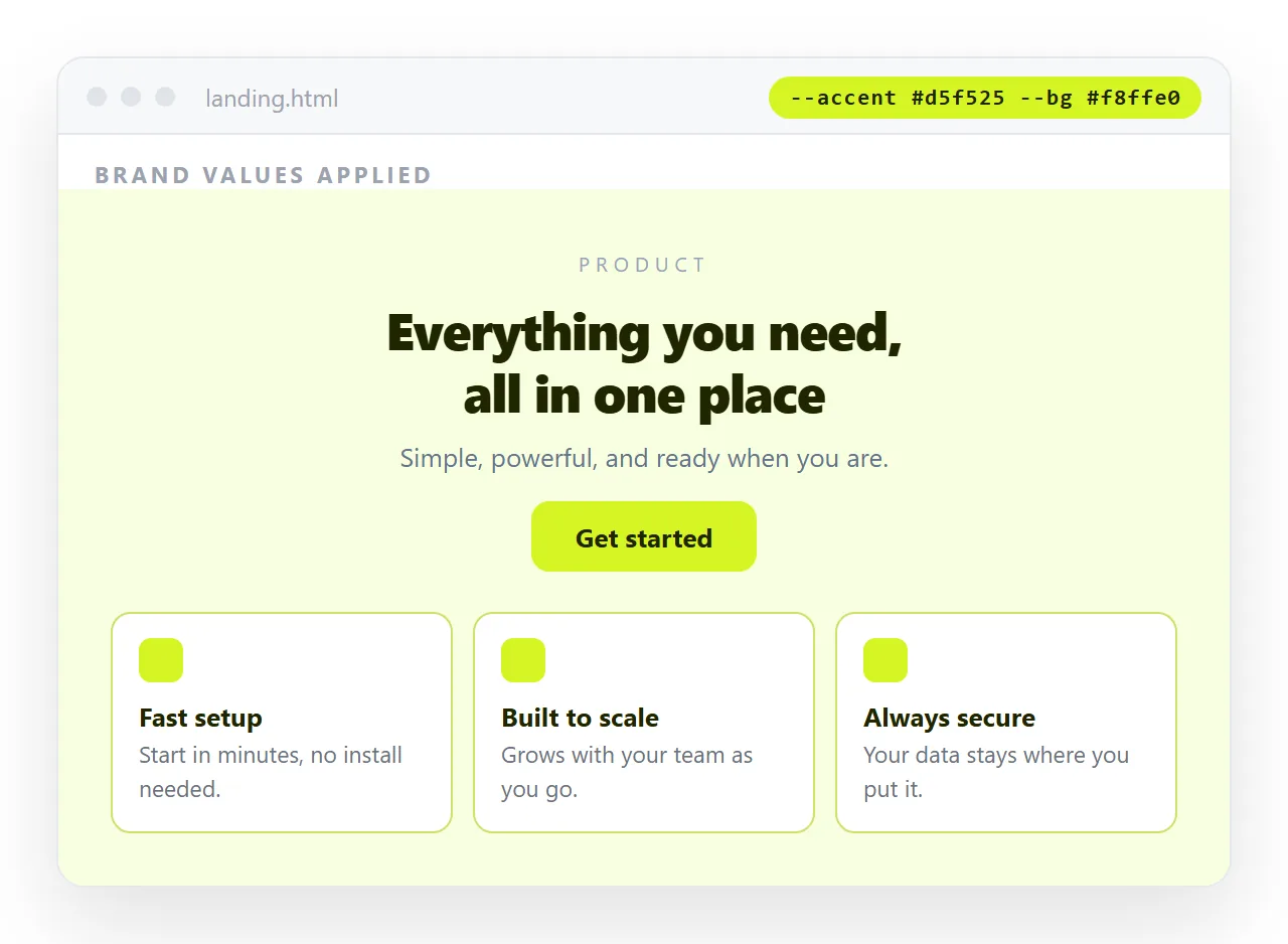
This is the single highest return change. Take your actual brand values, replace the accent and the background, and check contrast on text over both.
Ask for the colours as named custom properties at the top of the style block so there is one place to edit. AI HTML brand colours covers doing it without breaking the dark sections.
Two habits to drop while you are in there: the diagonal gradient behind the hero, and the glow effect under the primary button. Both are strongly associated with generated pages.
Breaking the skeleton
The section order is a template, and templates are visible precisely because they repeat.
- Do not open with a centred hero. Start with the thing the reader came for, a price, a screenshot, a number, a specific claim.
- Use an uneven number of items. Three cards is the default. Five, or two, or one, reads as content rather than layout.
- Delete a section. Most generated pages have one block that exists because the template has it. The testimonial strip with no testimonials is the usual candidate.
- Put the proof high. Whatever you can actually evidence should not be below the fold.
The copy is the real signal
Layout gets noticed first and copy is what makes a page forgettable. Generated marketing prose is fluent, general and unfalsifiable, which is a precise description of what nobody remembers.
The correction is specificity. Replace every claim that could belong to any company in your category with something only you could write: a number, a constraint, a named customer, a thing your product does not do.
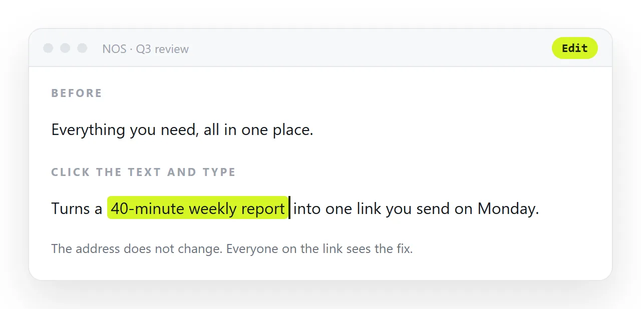
A page that says what it will not do reads as written by a person, because a model asked for marketing copy will not volunteer a limitation.
Where sameness does not matter
The premise deserves a check. Distinctiveness is worth paying for on pages that ask for trust, and it is close to worthless on pages that carry information.
An internal report, a status dashboard, a spec, a changelog or a prototype is judged on whether the numbers are right and whether the page opens. A default palette on a report is not a problem, it is a neutral container.
Spend the effort where a reader is deciding whether to believe you, and take the default everywhere else. That allocation is more useful than trying to make every page distinctive.
The same logic applies inside a page. The hero and the pricing section carry the judgement, so they are worth rewriting. The frequently asked questions block below them is not.
Keep the version you fixed
Once you have replaced the palette, the type scale and the section order, you have something more useful than one page. You have a template.
Regenerating from scratch each time restores the defaults, and a set of pages generated separately will not match each other either. Keeping one corrected base and changing the content is what makes a group of pages look related.
Put that base at an address you can copy from, using HTML to link, and keep editing it in place as the style settles. Reusing an AI HTML template covers the mechanics.
If the question is whether a specific site was generated rather than how to avoid looking generated, the markers are listed in the AI generated website detector, and the source level version is in the AI HTML code detector.