An email capture page asks a stranger to give you a way to contact them, repeatedly, forever. Treated as that, the design decisions become obvious.
This guide covers the number of fields, the promise, and the first sixty seconds.
One field
Each additional field costs submissions. The effect is consistent and larger than people expect.
A first name feels harmless and is not free. Company, role and phone number are considerably worse, and each one signals that this is the beginning of a sales process rather than a newsletter.
Collect the address. Everything else can be asked later, from someone who has already received something useful from you and has a reason to answer.
| Fields | What you gain | What it costs |
|---|---|---|
| Email only | Nothing extra | Nothing |
| Plus first name | Greeting personalisation | A share of signups |
| Plus company | Segmentation | A larger share |
| Plus phone | A calling list | Most of them |
Say what arrives and how often
The visitor's actual question is how much of my attention is this going to take.
"Join our community" does not answer it. "Subscribe for updates" does not answer it. Both are vague in a way that reads as evasive, and the visitor assumes the worst.
Answer it plainly. What arrives, how often, and what it is not.
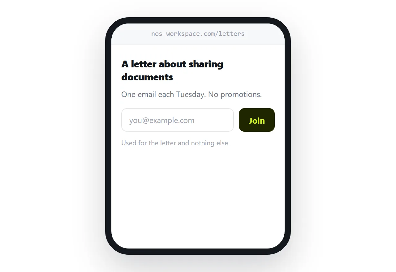
One email each Tuesday, about how teams share documents. No promotions, no sales calls.
Three facts, and the hesitation is gone. This single change usually does more than any redesign of the form.
The privacy line
Next to the button, one sentence in normal text: what you do with the address and what you will not do with it.
A short honest line reassures. A paragraph of legal language does the opposite, because nobody reads it and its presence suggests there is something to read.
The first sixty seconds
Somebody submits their address and then nothing visible happens. They are not sure it worked. They wonder if they typed it correctly.
Two things fix this.
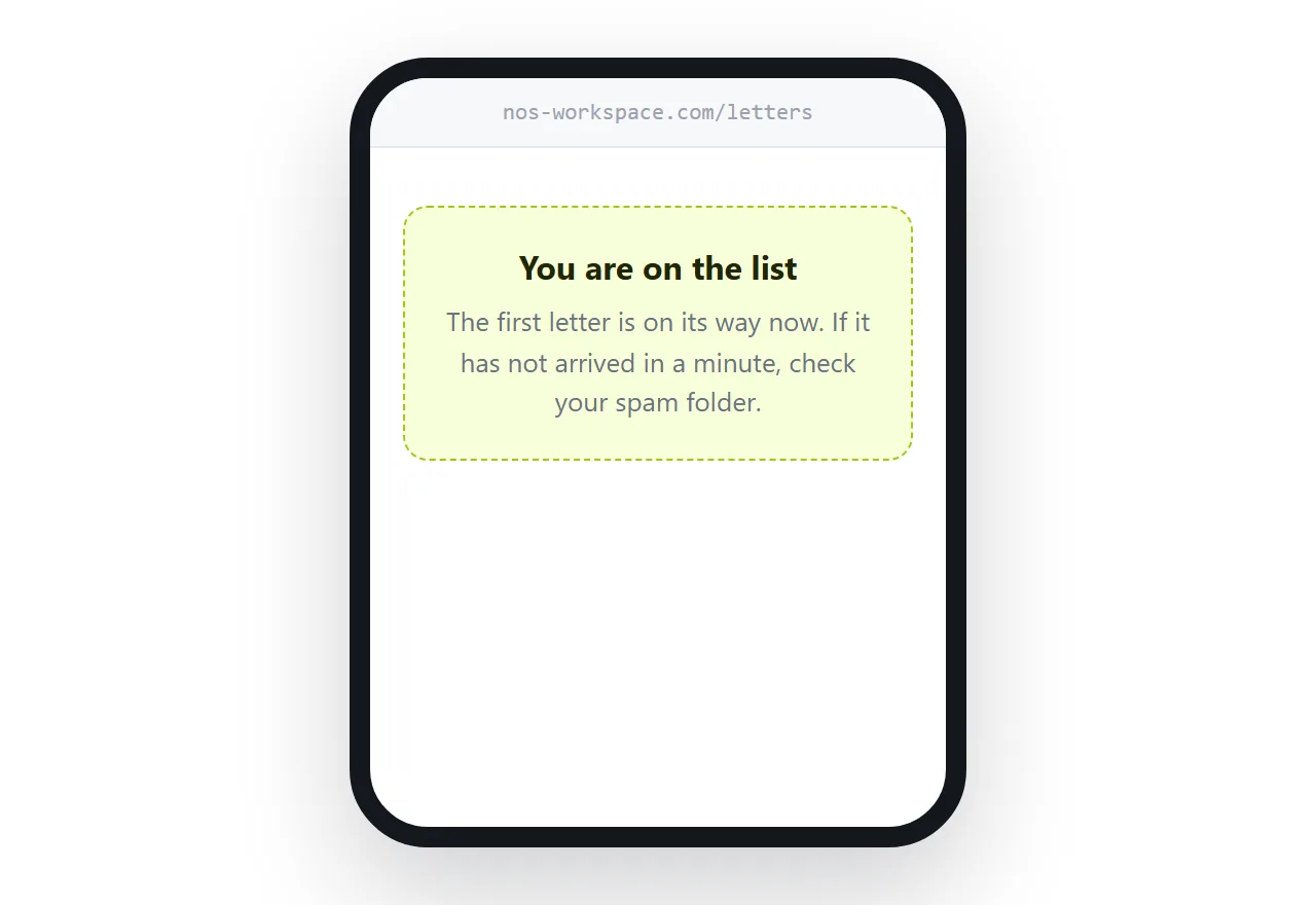
Confirm on the page, clearly, where the form was. Not a small line at the top that a phone visitor never scrolls back to.
Send something within a minute. The gap between submitting and receiving is where people forget they signed up, and someone who has forgotten reports your first email as spam.
Incentives, honestly
Offering a guide in exchange for an address increases signups. It also changes who signs up.
A proportion of them wanted the guide and nothing else. They take it, never open an email again, and quietly damage your engagement figures, which affects whether your mail reaches anyone's inbox at all.
If you use one, judge it on how many are still opening a month later, not on the signup count on the day. Sometimes an incentive is clearly worth it. Often the plain honest promise performs better on the measure that matters.
If this is near what you are doing, How to make a product landing page and How to publish a digital newsletter cover the cases on either side.
Put it at an address
One field, a promise that states frequency, one honest privacy line, visible confirmation, and something sent within a minute.
Then the people who sign up actually wanted what you send.