A landing page has one job. Somebody arrived from a specific promise, and the page either delivers on that promise and asks for one thing, or it loses them.
This guide covers the first screen, why a second action costs you, and testing variants.
The first screen carries the whole page
A visitor arriving from an advert or a link gives the page a couple of seconds to confirm they are in the right place.
So the first screen needs two things. A sentence saying what the product is, written for someone who has never heard of it. And the action you want them to take.
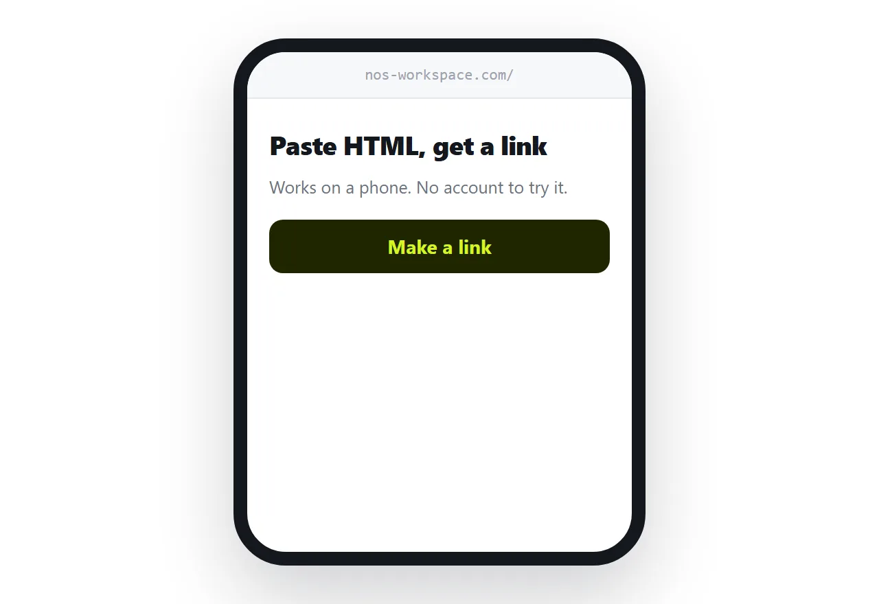
Write the sentence for a stranger, not for someone who already knows the category. "Paste HTML, get a shareable link" tells a stranger what happens. "The modern workspace for teams" tells them nothing at all, and it is the kind of line that survives internal review precisely because it offends nobody.
Match the promise that sent them
The most common landing page failure is not design. It is a mismatch.
The advert said one thing. The page says something broader, because the page was written for everybody. The visitor arrives, cannot find the thing they clicked for, and leaves.
Use the same words as the advert in the headline. If you run four adverts with four angles, that is an argument for four pages, each at its own address, each matching one advert.
| One page for all traffic | A page per promise | |
|---|---|---|
| Headline matches the advert | Sometimes | Always |
| Visitor confirms they are right | Slowly | Immediately |
| You learn which angle works | No | Per address |
| Effort | Low | Moderate |
One action, repeated
Repeating the same action down the page is good. Offering a different one is not.
Sign up and book a demo and download the guide and read the case study is four decisions. Visitors who are asked to choose between four things mostly choose to leave.
Pick the single next step. Repeat it after each section so it is always within reach, particularly on a phone where the visitor's decision point is unpredictable.
Remove the navigation
A landing page is not part of a site the visitor is browsing. They arrived at it directly, for one reason.
A navigation bar offers them pricing, about, blog, careers. Every one of those is a route away from the decision, and the ones who wander off mostly do not come back.
Keep a small link to the main site for the people who genuinely want context, and give it no prominence.
Test at a separate address
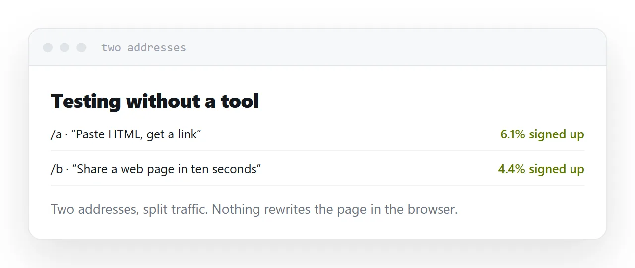
Testing tools that rewrite the page in the browser add weight, occasionally flicker, and can break the page for a subset of visitors.
Publishing the variant at its own address avoids all of that. Send a share of traffic to the variant, compare, and keep whichever wins. Nothing about the original changes while the test runs, and rolling back means sending traffic back to the original.
It is cruder than a testing platform and it is honest, cheap, and hard to break.
Speed is a conversion factor
Visitors from advertising are on mobile data and have low commitment. Every second before the page becomes useful loses a measurable share of them.
Hero video is the usual culprit, followed by photographs exported at print resolution and three web fonts loading before any text renders.
A fast plain page beats a slow impressive one, reliably, and the gap is larger than most teams expect.
Closely related: How to make an event landing page, and Publishing an HTML landing page for the adjacent problem.
Put it at an address
One sentence for a stranger and the action above the fold, one action repeated, no navigation, the headline matched to the advert, and variants at their own addresses.
Then the visitor who arrived for one thing finds it immediately.