A survey link is a set of questions published at an address, so people answer on a phone without an account and without a platform interface between them and the questions.
Completion is the only measure that matters, and most of it is decided before the first question.
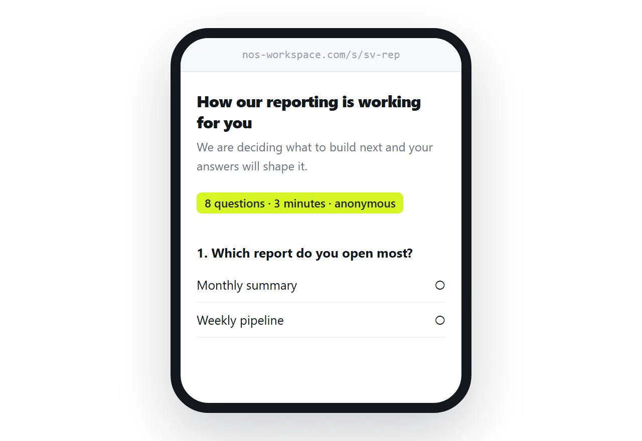
This guide covers the first screen, question order, input types that respect the phone keyboard, and the one thing a page cannot do.
The first screen decides completion
Three lines, before any question.
<header>
<h1>How our reporting is working for you</h1>
<p class="why">We are deciding what to build next and your answers
will shape it.</p>
<p class="len">8 questions · about 3 minutes · answers are anonymous</p>
</header>
The length is the important one. A respondent facing an unknown commitment either does not start or abandons at the point where their patience runs out. Told it is eight questions, they finish.
Say why you are asking, in a sentence that is true. "To improve our service" is not a reason; "we are deciding what to build next" is.
Demographics go last
The instinct is to open with age, role and company size, because that is how the data will be cut.
It is the worst possible opening. The respondent has not yet been given a reason to care and is already being asked about themselves. A proportion leave on that screen.
Put the interesting questions first, while attention is highest, and the classification questions at the end when the respondent has already invested five minutes and will finish.
| Position | What belongs there |
|---|---|
| First | The one question you most need answered |
| Middle | Supporting questions, easiest first |
| Near the end | Anything open-ended |
| Last | Demographics and classification |
Input types matter more on a phone
The phone keyboard should match what you are asking for.
<label for="email">Email, if you want a copy of the results</label>
<input id="email" name="email" type="email" autocomplete="email" inputmode="email">

<label for="team">How many people in your team?</label>
<input id="team" name="team" type="number" inputmode="numeric" min="1" max="999">
Get this wrong and the respondent types a number on an alphabetic keyboard, or an email address without an at sign in easy reach. Each one is a small friction and they accumulate.
Use radio buttons rather than a dropdown for five options or fewer. A dropdown on a phone opens a picker, which is two taps instead of one.
Label everything properly. It is what a screen reader announces and it makes the whole label tappable, which matters for small radio buttons.
Open questions, one at most
Free-text questions produce the most useful answers and cost the most to answer.
One is worth having, placed near the end, phrased specifically. "What is the most annoying part of the monthly report?" gets answers; "any other comments?" gets blanks.
Two or more open questions reliably reduce completion.
The answers have to go somewhere
This is the one thing a page cannot do by itself.
A form needs an endpoint: a form service, a spreadsheet handler, or your own receiver. Decide which before you build the survey, because it shapes the field names and the validation.
Options are covered in sending HTML form data to Google Sheets, and the behaviour of a form with no destination in HTML form without action.
Validate before submitting so a respondent does not lose their answers to a rejected field. Guidance in HTML form validation.
Say what you collect
Respondents are entitled to know, and accuracy matters more than reassurance.
If responses are anonymous, do not also record an identifier. If you are collecting an email address, say what it will be used for. If you are logging anything beyond the answers, say so.
Where personal data is involved, the legal requirements depend on where your respondents are, and a survey is one of the easier places to collect more than you needed.
When to use a platform
Branching logic, quotas, response limits, panels, or more than about twenty questions. Those are what survey platforms are for and rebuilding them on a page is a poor use of your time.
Below that, a page is lighter, faster on a phone, and looks like you. For a short survey to a client list, that is worth more than the features you are not using.
Put it at an address
State the purpose and the length, put the best question first and demographics last, match the input types to the questions, wire up an endpoint, and create a share link.
Then people finish it.