A favicon appears in tabs, bookmarks, history, home screens and search results. It is the most-displayed thing you publish and it is usually an afterthought.
This guide covers the three files, caching, and designing for sixteen pixels.
Three files
<link rel="icon" href="/icon.svg" type="image/svg+xml">
<link rel="apple-touch-icon" href="/apple-touch-icon.png">
<link rel="icon" href="/favicon.ico" sizes="32x32">
The SVG scales to any size and adapts to dark mode if you build it to.
The 180 pixel PNG is used when somebody adds the page to a phone home screen.
The ICO at the root is the fallback, and it is requested automatically by browsers even if you never declare it. Having one there stops a 404 appearing in your logs on every visit.
Three files, one head block, done.
Design it at sixteen pixels
The icon is rendered at sixteen pixels in a tab. That is where it is actually seen.
A full logo with a wordmark, fine lines or gradients becomes an unreadable smudge at that size. What works is a single shape, a letter, or a simplified mark with strong contrast.
Design it at sixteen pixels and then scale up, rather than shrinking the logo and hoping.
| Full logo shrunk | Simplified mark | |
|---|---|---|
| Readable at 16px | No | Yes |
| Recognisable | Not really | Yes |
| Works on dark tabs | Varies | If designed for it |
Caching is unusually aggressive
Favicons are cached harder than almost anything else, frequently beyond a normal refresh and sometimes across browser restarts.
So changing the icon and seeing the old one is normal and does not mean it failed.
The reliable fix is to change the filename, which makes it a new file.
<link rel="icon" href="/icon-v2.svg" type="image/svg+xml">
For the ICO at the root, which is requested by convention rather than by declaration, the only options are waiting or testing in a fresh profile.
Check it on dark backgrounds
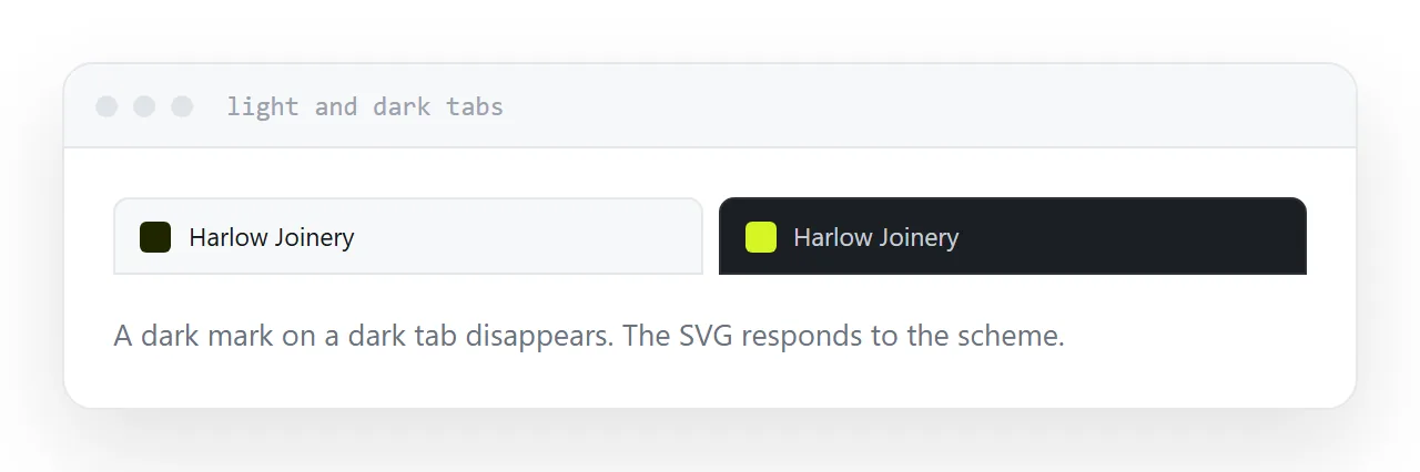
Many people use dark browser themes, and a dark icon on a dark tab disappears.
An SVG can respond to the colour scheme, which is the cleanest solution. Otherwise choose a mark with enough contrast to work on both, or give it a subtle background shape.
Look at it in both themes before publishing. It takes ten seconds and it is the check nobody does.
It matters for one page too
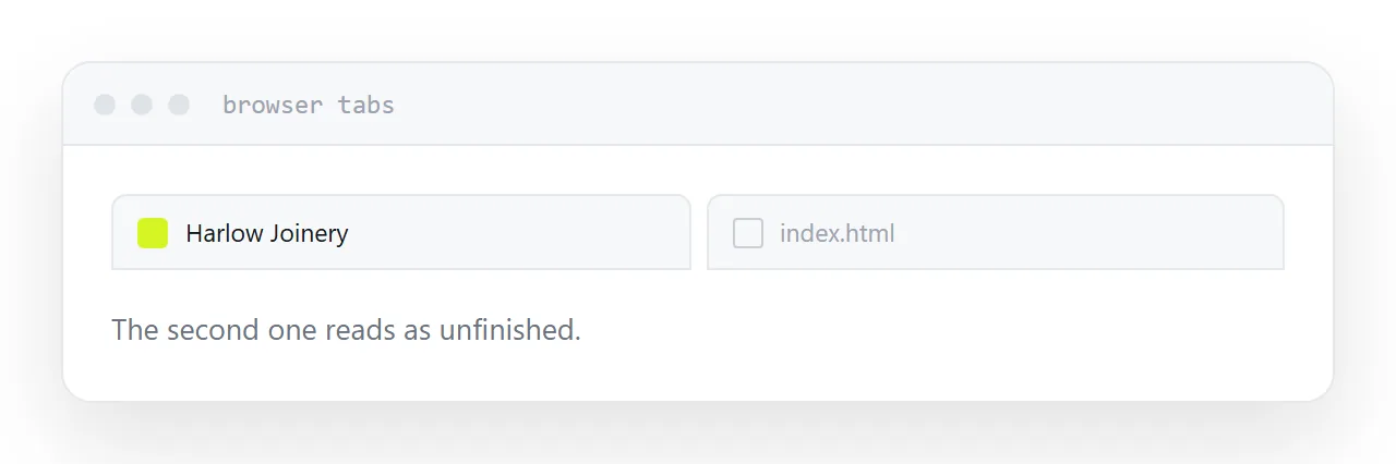
A single published page without an icon shows a blank document icon in every tab and bookmark.
That reads as unfinished, particularly next to tabs that have one. For something you are sending to a client, it is a small signal worth not sending.
Closely related: Favicon in HTML: the tab icon, and the minimum you need, and HTML use SVG as favicon for the adjacent problem.
Put it at an address
Design it at sixteen pixels, provide an SVG, a 180 pixel PNG and an ICO at the root, change the filename when you update it, and check it against a dark background.
Then the page looks finished in every place it appears.