A design image is a picture. A page is structured text that a browser arranges. Converting one to the other is rebuilding rather than transforming.
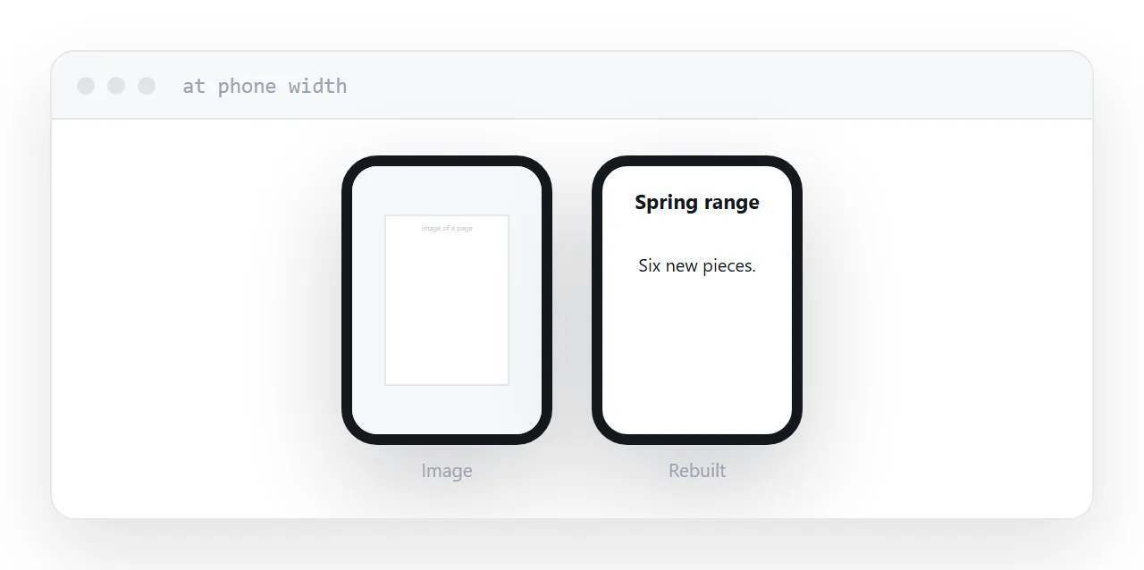
This guide covers what an image lacks, what the tools produce, and what the work actually is.
What an image lacks
Everything that is not pixels.
Text. A headline in an image is a shape. It cannot be selected, copied, searched, translated or read aloud.
Links. Nothing in an image is tappable.
Reflow. The image is one size. On a phone it shrinks until unreadable or requires panning.
Meaning. Search engines and screen readers see an image with no idea what is in it.
So a page that is one large image is technically a page and functionally a picture of one. For anything with words in it, that is not acceptable.
| Image on a page | Rebuilt as a page | |
|---|---|---|
| Text selectable | No | Yes |
| Search engines read it | No | Yes |
| Screen readers | Nothing | Everything |
| Links work | No | Yes |
| Reflows to a phone | No | Yes |
| Translation | No | Yes |
What the automatic tools produce
Image-to-code tools reproduce the appearance.
The output is usually absolutely positioned elements at fixed coordinates, with fixed widths, matching the image at the width it was made for. Generated class names, nested containers, and a structure that describes where things are rather than what they are.
It looks correct in a screenshot and breaks at every other screen size, which is most of them.
It is a starting point for someone who is going to restructure it. As a finished page it carries every problem of the image plus worse markup.
The actual work
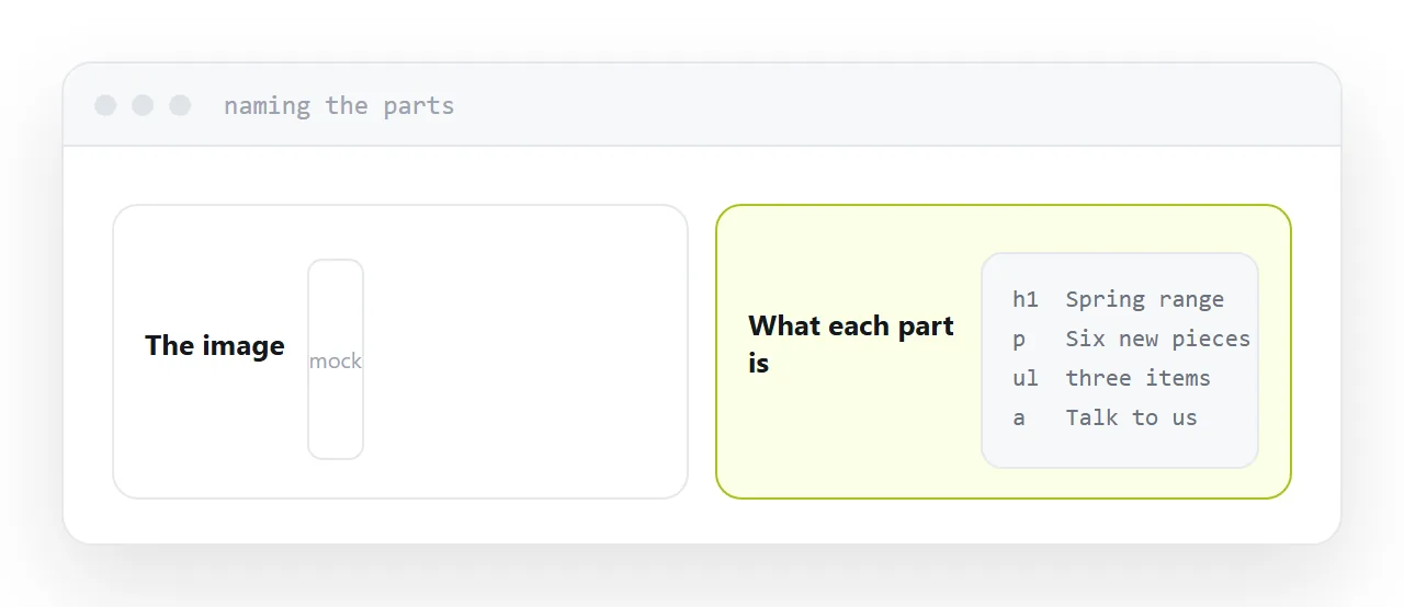
Look at the image and name the parts.
That is a heading. That is a paragraph. That is a list of three things. That is a button. That is a form with two fields.
Write each one as what it is. Then style it so it reflows: one column on a phone, wider on a desktop.
The layout is the output of that process, not the input. Working the other way, positioning things to match a picture, is what produces a page that only works at one width.
It does not have to match exactly
The mock was drawn at one size, usually a wide desktop.
A page has no single size. It will be seen at phone width, at tablet width, at laptop width, on a large monitor, and at whatever font size the reader has chosen.
So the goal is that it works at all of them, which means it will differ from the mock at most of them. A page that reflows sensibly and is slightly different from the image is better than one that matches the image and breaks on a phone.
Say this to whoever supplied the mock. Most designers already know it and are relieved to hear it said.
When an image is fine
Genuinely pictorial content. A photograph, an illustration, a diagram that is a drawing rather than a layout.
Give it alt text describing what it shows, and keep any information it carries available as text as well.
Never an image as the only version of something containing words.
Two neighbouring cases are worth a look: AI HTML generator from image: screenshot to page and Publishing an HTML landing page.
Put it at an address
Name what each element is, write it as real text in that structure, style it to reflow rather than to match one width, check it at phone width, and keep images for the parts that are genuinely pictures.
Then the page has everything the picture was missing.