Export turns a layout into markup and does it by fixing every element in place, which is the opposite of how a page works.
What the export does
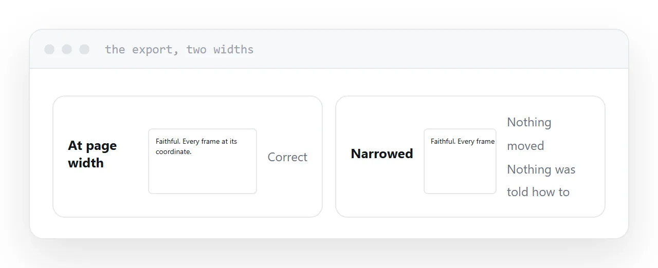
It reads the layout and writes markup that reproduces it: each text frame and image placed at coordinates, sized as designed.
At the original width it is a faithful reproduction. Narrow the window and nothing moves, because nothing was told how to move. The layout stays at page width and the reader pans.
That is not a fault in the export. A fixed layout is what the source is, and there is no information in it about what should happen at other widths, because the designer never decided.
| Exported layout | Page built from content | |
|---|---|---|
| Faithful at one width | Yes | Approximately |
| Reflows | No | Yes |
| Readable on a phone | No | Yes |
| Searchable text | Sometimes | Yes |
| Editable afterwards | Awkwardly | Yes |
| Time to produce | Minutes | Half a day |
The extension tools
Some plugins produce richer output: page turning, animation, elements that respond to taps.
It is still fixed layout with behaviour on top. The text is still at page width on a phone and still requires zooming. What has been added is interactivity, which is not what the reader was struggling with.
Judge any of these by opening the output on a phone before committing to the workflow.
What export is actually useful for
Extraction.
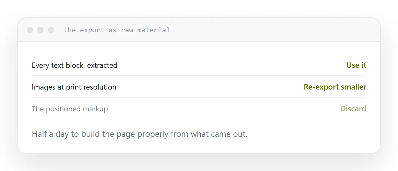
It gets every piece of text and every image out of the layout in one operation, in a structure that shows what belongs with what. That is a genuine saving over copying frames by hand.
Treat the result as raw material. The text goes into a proper page; the images are re-exported at screen sizes.
Check the image sizes
Images from a print layout come out at print resolution, which is roughly four times what a screen needs.
Published as they are, the page is several megabytes and slow on a phone. Re-export at about twice the display width and compress.
This is the most common reason a converted publication feels sluggish, and it is fixed in one pass.
Building the page
Half a day for a typical publication.
One column, generous spacing, headings that are headings, images sized for the screen, tables that work at narrow widths. The text reflows, the page is searchable, a specific section can be linked to, and a correction is an edit.
Link the fixed document from the page for anyone who wants to print it.
If this is near what you are doing, Publishing a print layout digitally and Turning a layout file into something anyone can open cover the cases on either side.
Put it at an address
Export to get the material out, do not publish the export itself, re-export the images at screen sizes, build the page from the content, and keep the document linked for printing.