A design file is a set of layers positioned on a canvas of one size. A page is structured content that a browser arranges for whatever width it is given.
Those are different kinds of object, and going from one to the other is rebuilding.
What automatic conversion produces
Tools reproduce the appearance. The output is absolutely positioned elements at fixed coordinates, fixed widths, and generated class names describing where things are rather than what they are.
At the design's width it matches. At any other width, and there are many, it breaks: overlapping text, elements off screen, nothing reflowing.
It is a starting point for somebody who is going to restructure it. As a finished page it carries every limitation of the image plus worse markup.
| Converted | Rebuilt | |
|---|---|---|
| Matches the mock exactly | At one width | Approximately |
| Works at phone width | No | Yes |
| Text selectable and searchable | Sometimes | Yes |
| Editable later | Painfully | Yes |
| Screen readers | Poorly | Properly |
The actual work
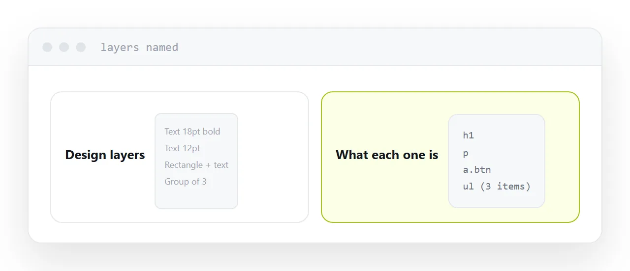
Open the design and name the parts.
That is a heading. That is body text. That is a list of three features. That is a button. That is a form with two fields and a submit.
Write each one as what it is, with the real content. Then style it: one column on a phone, more room on a desktop.
The layout comes out of that. Working the other way, positioning boxes to match a picture, is what produces a page that only works at one size.
What to get from the designer
Four things remove most of the guessing.
The type scale. The sizes actually used, not measured from the canvas.
Spacing values. The rhythm the design uses, usually multiples of a base.
The colours, as values rather than picked from the image.
What happens at narrow widths. If the designer has not thought about it, that is the conversation to have before building rather than after.
It will not match exactly
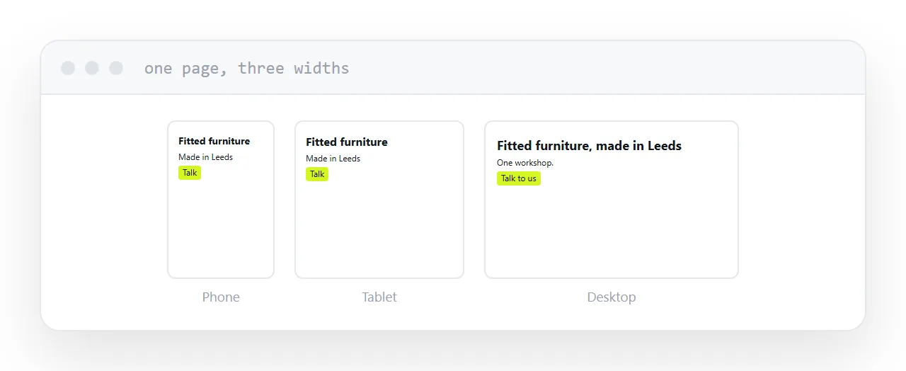
The mock is one width, usually a wide desktop.
The page will be seen at phone width, tablet width, laptop width, on a large monitor, and at whatever font size the reader has chosen. It cannot match the mock at all of those.
Say this early. Most designers know it and are relieved to have it said rather than discovering it at review.
What stays an image
Photographs. Illustrations. Complex graphics that are genuinely pictures.
Never text, because it is then unselectable, unsearchable, unreadable by screen readers and blurry when zoomed. Never buttons. Never anything carrying information.
If a heading needs a specific typeface, use a web font rather than an image of the words.
For the surrounding ground, see How to turn an image into a website and How to open a PSD file without Photoshop.
Put it at an address
Name what each layer is, write the content before the styling, get the type scale and spacing rather than pixel positions, ask what happens at narrow widths, and keep images for actual pictures.
Then the page works at the widths people actually use.