Lazy loading images means the browser waits to download a picture until the reader scrolls close to it. In HTML you ask for it with one attribute on the <img> tag, and no script is needed.
<img src="photo.jpg" alt="Harbour at dusk" width="400" height="300" loading="lazy">
Try it. Scroll the list, watch the counter, then switch to eager, press Rebuild and watch every picture load at once.
<!doctype html>
<html lang="en">
<head>
<meta charset="utf-8">
<meta name="viewport" content="width=device-width, initial-scale=1">
<title>loading="lazy" counter</title>
<style>
  body { margin: 0; font-family: system-ui, sans-serif; background: #f4f5f7; color: #1d2330; }
  .bar {
    position: sticky; top: 0; z-index: 2; display: flex; flex-wrap: wrap; align-items: center; gap: 8px;
    padding: 10px 14px; background: #fff; border-bottom: 1px solid #e1e4ea; font-size: 14px;
  }
  select, button { font: 600 14px system-ui, sans-serif; padding: 6px 10px; border-radius: 8px; border: 1px solid #1d2330; }
  button { background: #1d2330; color: #fff; cursor: pointer; }
  #count { font-weight: 700; }
  .list { padding: 14px; display: grid; gap: 14px; max-width: 460px; margin: 0 auto; }
  .card { background: #e9edf2; border: 1px solid #e1e4ea; border-radius: 12px; overflow: hidden; }
  .card img { display: block; width: 100%; height: auto; }
  .cap { background: #fff; padding: 8px 12px; font-size: 14px; color: #4b5563; }
  .cap.done { color: #0f5132; }
</style>
</head>
<body>
<div class="bar">
  <label>loading=
    <select id="mode"><option>lazy</option><option>eager</option></select>
  </label>
  <button id="go">Rebuild</button>
  <span id="count"></span>
</div>
<div class="list" id="list"></div>

<script>
  // Stand-in pictures drawn in SVG (400 x 300). In your page: src="photo-3.jpg"
  let run = 0;                                   // new colours per rebuild, so the browser cannot reuse a cached copy
  const pic = (n) => 'data:image/svg+xml,' + encodeURIComponent(
    '<svg xmlns="http://www.w3.org/2000/svg" width="400" height="300">' +
    '<rect width="400" height="300" fill="hsl(' + (n * 47 + run * 90) + ' 60% 72%)"/>' +
    '<text x="200" y="175" font-size="90" font-family="sans-serif" fill="#fff" text-anchor="middle">' + n + '</text></svg>');

  const TOTAL = 30;
  const list = document.getElementById('list');
  const count = document.getElementById('count');
  const mode = document.getElementById('mode');

  function build() {
    run++;
    list.textContent = '';
    let loaded = 0;
    count.textContent = 'Loaded 0 of ' + TOTAL;
    for (let n = 1; n <= TOTAL; n++) {
      const card = document.createElement('div');
      card.className = 'card';
      const img = document.createElement('img');
      img.width = 400; img.height = 300;     // reserves the space before the file arrives
      img.alt = 'Picture number ' + n;
      img.loading = mode.value;              // "lazy" or "eager"
      const cap = document.createElement('div');
      cap.className = 'cap';
      cap.textContent = 'Picture ' + n + ': not loaded yet';
      img.addEventListener('load', () => {
        loaded++;
        cap.textContent = 'Picture ' + n + ': loaded';
        cap.classList.add('done');
        count.textContent = 'Loaded ' + loaded + ' of ' + TOTAL;
      });
      img.src = pic(n);
      card.append(img, cap);
      list.append(card);
    }
  }

  document.getElementById('go').addEventListener('click', () => { window.scrollTo(0, 0); build(); });
  build();
</script>
</body>
</html>
How many pictures load before you scroll depends on your browser and screen. The distance is the browser's choice, so treat the first number you see as an example, not a rule.
How lazy loading works, step by step
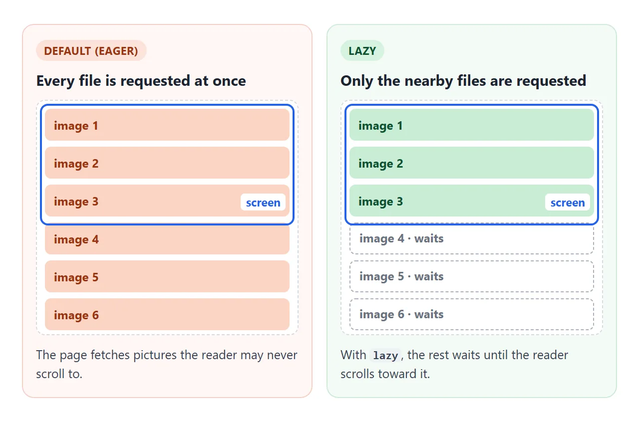
An img has two loading modes. eager is the default and fetches the file immediately. lazy defers it until the image is a calculated distance from the viewport, and the browser calculates that distance.
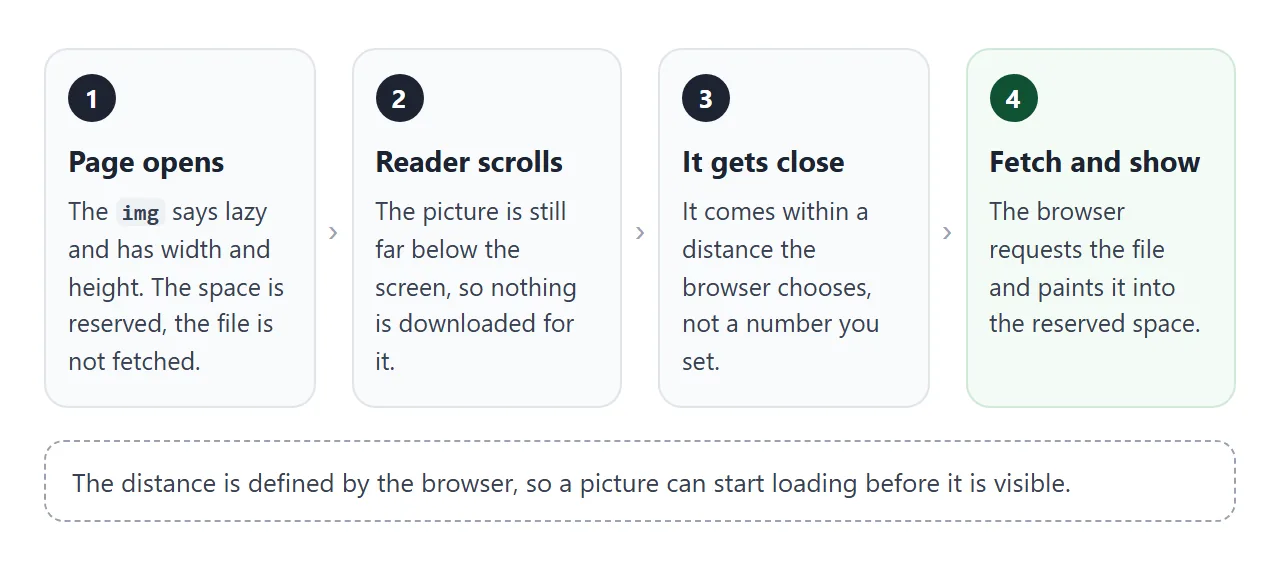
- Write a normal img tag. Give it
src, a meaningfulalt, and thewidthandheightof the file. - Add
loading="lazy". Put it on every image below the first screen. - Let the browser reserve the space. The width and height give it the aspect ratio before the file arrives.
- Scroll. Once the image is near enough, the browser fetches and shows it.
The attribute works on img and iframe elements. The same line on an iframe defers a whole embedded page.
Keep the first screen eager
Do not put loading="lazy" on pictures that are likely to be visible when the page opens. They gain nothing from waiting.
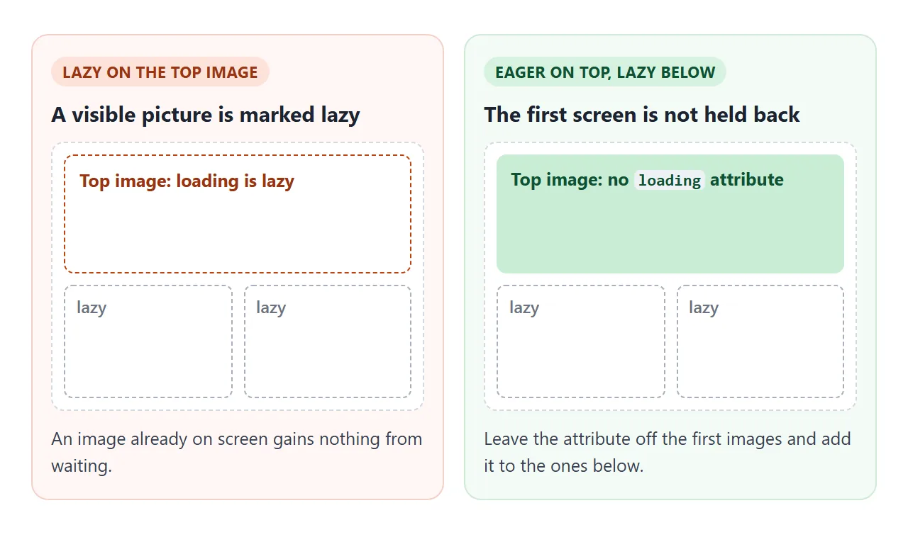
The rule is simple: no attribute on the top image or two, loading="lazy" on the rest. The gallery near the end of this page does it that way.
Always give width and height
Lazy images arrive late by design, so the page must hold their place. Setting width and height lets the browser work out the aspect ratio before the file loads and reserve that space, which reduces or prevents layout shift.
Without them, a lazy image has no size until it loads, and everything under it jumps when it arrives. The attributes describe the file; CSS can still scale it, as covered in making images responsive and CSS aspect-ratio.
Lazy loading with a script (and CSS backgrounds)
The attribute covers img and iframe, not a background-image written in CSS. For a background, use IntersectionObserver: it calls your function when an element gets near the screen, and you start the load then.
const io = new IntersectionObserver((entries) => {
  entries.forEach((e) => {
    if (!e.isIntersecting) return;
    e.target.src = e.target.dataset.src;   // for a background, add a class instead
    io.unobserve(e.target);                // one job per element
  });
}, { rootMargin: '200px' });

document.querySelectorAll('img[data-src]').forEach((img) => io.observe(img));
rootMargin grows the observed area, so 200px makes the callback fire before the element reaches the screen. Here you set the distance yourself; change the select to compare values.
<!doctype html>
<html lang="en">
<head>
<meta charset="utf-8">
<meta name="viewport" content="width=device-width, initial-scale=1">
<title>Lazy loading with IntersectionObserver</title>
<style>
  body { margin: 0; font-family: system-ui, sans-serif; background: #f4f5f7; color: #1d2330; }
  .bar {
    position: sticky; top: 0; z-index: 2; display: flex; flex-wrap: wrap; align-items: center; gap: 8px;
    padding: 10px 14px; background: #fff; border-bottom: 1px solid #e1e4ea; font-size: 14px;
  }
  select, button { font: 600 14px system-ui, sans-serif; padding: 6px 10px; border-radius: 8px; border: 1px solid #1d2330; }
  button { background: #1d2330; color: #fff; cursor: pointer; }
  #count { font-weight: 700; }
  .list { padding: 14px; display: grid; gap: 14px; max-width: 460px; margin: 0 auto; }
  .item { background: #fff; border: 1px solid #e1e4ea; border-radius: 12px; overflow: hidden; }
  .item h3 { margin: 0; padding: 8px 12px; font-size: 14px; }
  .item img { display: block; width: 100%; height: auto; background: #e9edf2; }
  /* A CSS background cannot use loading="lazy", so the class decides when it is fetched */
  .tile { aspect-ratio: 4 / 3; background: #e9edf2 center / cover no-repeat; }
  .tile.on { background-image: var(--pic); }
</style>
</head>
<body>
<div class="bar">
  <label>rootMargin
    <select id="margin"><option>0px</option><option selected>200px</option><option>600px</option></select>
  </label>
  <button id="go">Rebuild</button>
  <span id="count"></span>
</div>
<div class="list" id="list"></div>

<script>
  const pic = (n) => 'data:image/svg+xml,' + encodeURIComponent(
    '<svg xmlns="http://www.w3.org/2000/svg" width="400" height="300">' +
    '<rect width="400" height="300" fill="hsl(' + (n * 47 + 20) + ' 55% 70%)"/>' +
    '<text x="200" y="175" font-size="90" font-family="sans-serif" fill="#fff" text-anchor="middle">' + n + '</text></svg>');

  const TOTAL = 10;
  const list = document.getElementById('list');
  const count = document.getElementById('count');
  let observer, loaded;

  function show(el) {
    if (el.tagName === 'IMG') {
      el.src = el.dataset.src;                       // img: swap data-src into src
    } else {
      el.style.setProperty('--pic', 'url("' + el.dataset.bg + '")');
      el.classList.add('on');                        // background: switch the class on
    }
    loaded++;
    count.textContent = 'Loaded ' + loaded + ' of ' + TOTAL;
  }

  function build() {
    if (observer) observer.disconnect();
    list.textContent = '';
    loaded = 0;
    count.textContent = 'Loaded 0 of ' + TOTAL;

    observer = new IntersectionObserver((entries) => {
      entries.forEach((entry) => {
        if (!entry.isIntersecting) return;
        show(entry.target);
        observer.unobserve(entry.target);            // one job per element
      });
    }, { rootMargin: document.getElementById('margin').value });

    for (let n = 1; n <= TOTAL; n++) {
      const item = document.createElement('div');
      item.className = 'item';
      const title = document.createElement('h3');
      let el;
      if (n % 2) {
        title.textContent = n + ': img with data-src';
        el = document.createElement('img');
        el.width = 400; el.height = 300; el.alt = 'Picture number ' + n;
        el.dataset.src = pic(n);
      } else {
        title.textContent = n + ': CSS background';
        el = document.createElement('div');
        el.className = 'tile';
        el.setAttribute('role', 'img');
        el.setAttribute('aria-label', 'Picture number ' + n);
        el.dataset.bg = pic(n);
      }
      item.append(title, el);
      list.append(item);
      observer.observe(el);
    }
  }

  document.getElementById('go').addEventListener('click', () => { window.scrollTo(0, 0); build(); });
  build();
</script>
</body>
</html>
Two cautions. An img that only has data-src stays empty when scripting is off, so add a plain img inside a <noscript> element as a fallback.
And for ordinary pictures the native attribute is the simpler tool. The IntersectionObserver guide covers what else an observer can do.
Lazy loading images in React, Angular and CSS
These searches all have the same answer. The loading attribute is part of the img element, so a React or Angular component that renders an img can set loading="lazy" on it like any other attribute. Check your framework's image component for the options it adds.
CSS has no lazy loading switch for pictures. loading is an HTML attribute, so a picture written as a CSS background needs the observer and a class, as in the example above.
A finished example: a lazy gallery
This gallery puts the pieces together. It is a short version of the pattern in the HTML image gallery guide.
<!doctype html>
<html lang="en">
<head>
<meta charset="utf-8">
<meta name="viewport" content="width=device-width, initial-scale=1">
<title>Lazy photo gallery</title>
<style>
  body { margin: 0; font-family: system-ui, sans-serif; background: #f4f5f7; color: #1d2330; }
  header {
    position: sticky; top: 0; z-index: 2; padding: 10px 14px; background: #fff;
    border-bottom: 1px solid #e1e4ea; font-size: 14px; line-height: 1.45;
  }
  #count { font-weight: 700; }
  .grid { padding: 14px; display: grid; grid-template-columns: repeat(auto-fill, minmax(220px, 1fr)); gap: 12px; }
  figure { margin: 0; background: #fff; border: 1px solid #e1e4ea; border-radius: 10px; overflow: hidden; }
  .frame {
    aspect-ratio: 4 / 3; background: linear-gradient(100deg, #e9edf2 30%, #f6f8fa 50%, #e9edf2 70%) 0 0 / 200% 100%;
    animation: shimmer 1.4s linear infinite;
  }
  .frame.ready { animation: none; background: #e9edf2; }
  .frame img { display: block; width: 100%; height: auto; opacity: 0; transition: opacity .4s; }
  .frame.ready img { opacity: 1; }
  .frame.failed { animation: none; display: grid; place-items: center; font-size: 13px; color: #9a3412; background: #fff7f5; }
  figcaption { padding: 6px 10px 8px; font-size: 13px; color: #4b5563; }
  @keyframes shimmer { to { background-position: -200% 0; } }
  @media (prefers-reduced-motion: reduce) { .frame { animation: none; } .frame img { transition: none; } }
</style>
</head>
<body>
<header>
  The first 3 photos are <code>eager</code>, the rest are <code>lazy</code>.
  <span id="count"></span>
</header>
<div class="grid" id="grid"></div>

<script>
  const pic = (n) => 'data:image/svg+xml,' + encodeURIComponent(
    '<svg xmlns="http://www.w3.org/2000/svg" width="400" height="300">' +
    '<rect width="400" height="300" fill="hsl(' + (n * 31 + 200) + ' 50% 66%)"/>' +
    '<circle cx="' + (60 + n * 25) + '" cy="110" r="46" fill="#fff" opacity=".55"/>' +
    '<text x="200" y="240" font-size="56" font-family="sans-serif" fill="#fff" text-anchor="middle">Photo ' + n + '</text></svg>');

  const TOTAL = 36, EAGER = 3, BROKEN = 9;     // photo 9 points at a file that cannot load
  const grid = document.getElementById('grid');
  const count = document.getElementById('count');
  let loaded = 0;

  for (let n = 1; n <= TOTAL; n++) {
    const fig = document.createElement('figure');
    const frame = document.createElement('div');
    frame.className = 'frame';
    const img = document.createElement('img');
    img.width = 400; img.height = 300;            // space is reserved, so nothing jumps
    img.alt = 'Photo ' + n;
    img.decoding = 'async';
    img.loading = n <= EAGER ? 'eager' : 'lazy';  // first screen now, the rest on demand

    img.addEventListener('load', () => {
      frame.classList.add('ready');
      count.textContent = 'Loaded ' + (++loaded) + ' of ' + TOTAL;
    });
    img.addEventListener('error', () => {
      img.remove();
      frame.classList.add('failed');
      frame.textContent = 'Photo ' + n + ' unavailable';
    });
    img.src = n === BROKEN ? 'data:image/png;base64,AAAA' : pic(n);

    frame.append(img);
    const cap = document.createElement('figcaption');
    cap.textContent = 'Photo ' + n;
    fig.append(frame, cap);
    grid.append(fig);
  }
  count.textContent = 'Loaded ' + loaded + ' of ' + TOTAL;
</script>
</body>
</html>
- First three eager, the rest lazy: the top of the page is ready at once, and the long tail waits.
- Width and height on every photo: the grid does not jump as pictures arrive.
- A placeholder and a fade-in: the frame shimmers until the
loadevent, then the photo fades in. - An
errorhandler: a file that cannot load shows a message instead of a hole. decoding="async": a hint that the next paint need not wait for the image to decode.
For the other img attributes, see the img tag guide.
When it does not work
| What you see | Cause | Fix |
|---|---|---|
| Every image loads at once | The page is short, so all images are already near the screen | Test on a longer page |
| Lazy loading does nothing | Scripting is off; browsers then load images normally | Nothing to fix, the images still show |
| The top image is held back | loading="lazy" on an image visible when the page opens |
Remove it from the first images |
| The page jumps as pictures arrive | No width and height |
Add both attributes |
| A CSS background never defers | The attribute does not work on CSS | Observer plus a class |
| An image stays empty | It only has data-src and the script did not run |
Add a noscript fallback |
| A picture loads before it is visible | The browser starts early on purpose | Use rootMargin for your own distance |
Share it as a link
A lazy page is hard to judge from a screenshot, because the point is what happens as you scroll. To send the working version, paste the page into a NOS document and choose Create share link. HTML to link walks through it.
The page renders as written and its scripts run, so the people you send it to can scroll it and watch the counter themselves. If you change the code later, the same link shows the new version.