To preview an HTML email in multiple clients, send the message to a set of real test accounts and open it in each one. A browser preview shows the HTML as written, and no mail client renders it as written.
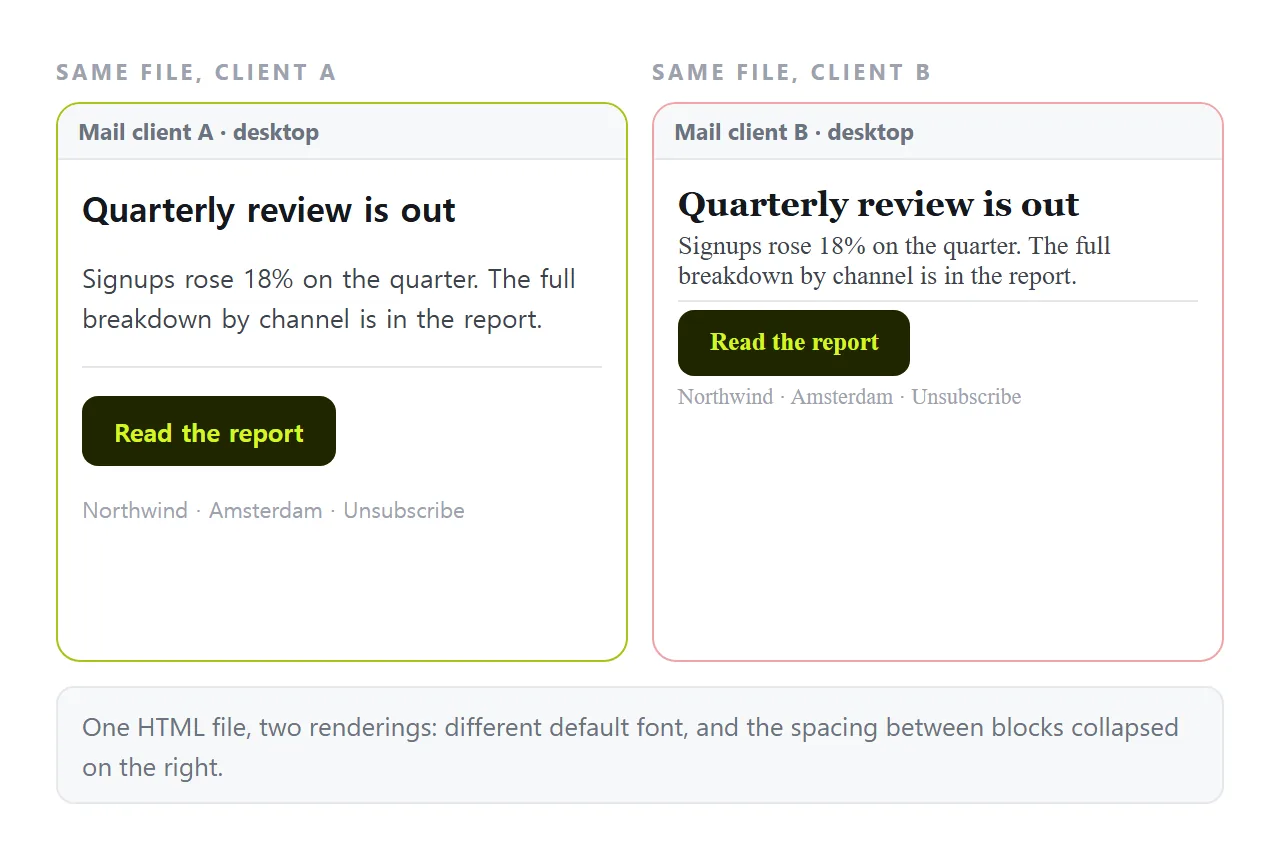
That gap is the whole problem. Your sending tool's preview pane, and the file opened in a browser, both show a document that nobody will actually receive.
What clients do to your markup
Mail clients are not browsers. They rewrite the message before displaying it, and they each rewrite it differently.
| Behaviour | Effect on the email |
|---|---|
<style> blocks removed |
Styling must be inline on each element |
<head> discarded |
Anything declared there is gone |
| Images blocked until allowed | The layout must read without them |
| Custom fonts ignored | A fallback font changes every line length |
| Media queries partly supported | Mobile layout rules may not apply |
| Dark mode colour inversion | Your background and text colours change |
The first row is why email markup looks dated. Styling has to travel on the element itself as a style attribute, because the block a browser would read is removed. Inline CSS covers the mechanics.
How to preview HTML email in multiple clients: pick the five
Test the clients your readers use, not a long list of everything that exists. Your sending tool reports opens by client, and that report is the test plan.
For most business lists the set is small:
- Gmail in a browser. The strictest about stripped styles.
- Gmail on Android. Different again from Gmail on the web.
- Outlook on Windows. Renders through a word processing engine with limited CSS support. Backgrounds, spacing and rounded corners are the usual casualties.
- Outlook on the web. Closer to a browser, and not the same as the desktop client.
- Apple Mail on iPhone. The most capable of the group, and often a large share of opens.
Five checks cover the large majority of opens for a typical list. Adding ten more clients adds work and very little information.
Check the split between desktop and mobile in the same report before you design anything. If most opens are on a phone, a two column layout is a decision to reconsider rather than a rendering problem to solve.
Internal sends are a different list. If the audience is your own company, the client mix is whatever the company issues, and one test account is enough.
Testing with real accounts
The method costs nothing but setup time.
Create one free account on each major provider. Add them all to a seed list in your sending tool. Send the campaign as a test to that list, then open each account and look at what arrived.
This is better than any simulation, because it is not a simulation. The message went through the same path a subscriber's copy will take, including whatever the provider decided to strip.
Check each one twice: once as it arrives with images blocked, and once with images loaded. A design that only reads with images loaded is a design that many readers will never see.
Also look at the message in the list view before opening it. The subject line and the preheader text decide whether the email is opened at all.
The preheader is the text the client pulls from the top of the body. If you did not set it deliberately, the client shows whatever is there, often an unsubscribe line or a view-in-browser link.
Two more checks belong in the same pass. Reply to the test message and confirm the reply address is the one you intended, and click the unsubscribe link to confirm it resolves.
Keep the seed list between campaigns. The setup cost is paid once, and after that a full client check is one extra send.
The differences that cause most breakage
- Spacing built with CSS margin. Desktop Outlook handles it unevenly. Table cell padding is the durable route.
- Background images. Widely unsupported. Use a solid colour and put the image in a normal
<img>tag. - Web fonts. Loaded by some clients, ignored by others. Pick a fallback that does not change the layout when it takes over.
- Fixed pixel widths. A fixed 700 pixel table on a phone means horizontal scrolling. Constrain the width and let cells stack.
- Dark mode. Several clients invert colours. Transparent logos on a light background turn into dark logos on a dark background.
Where browser previews still help
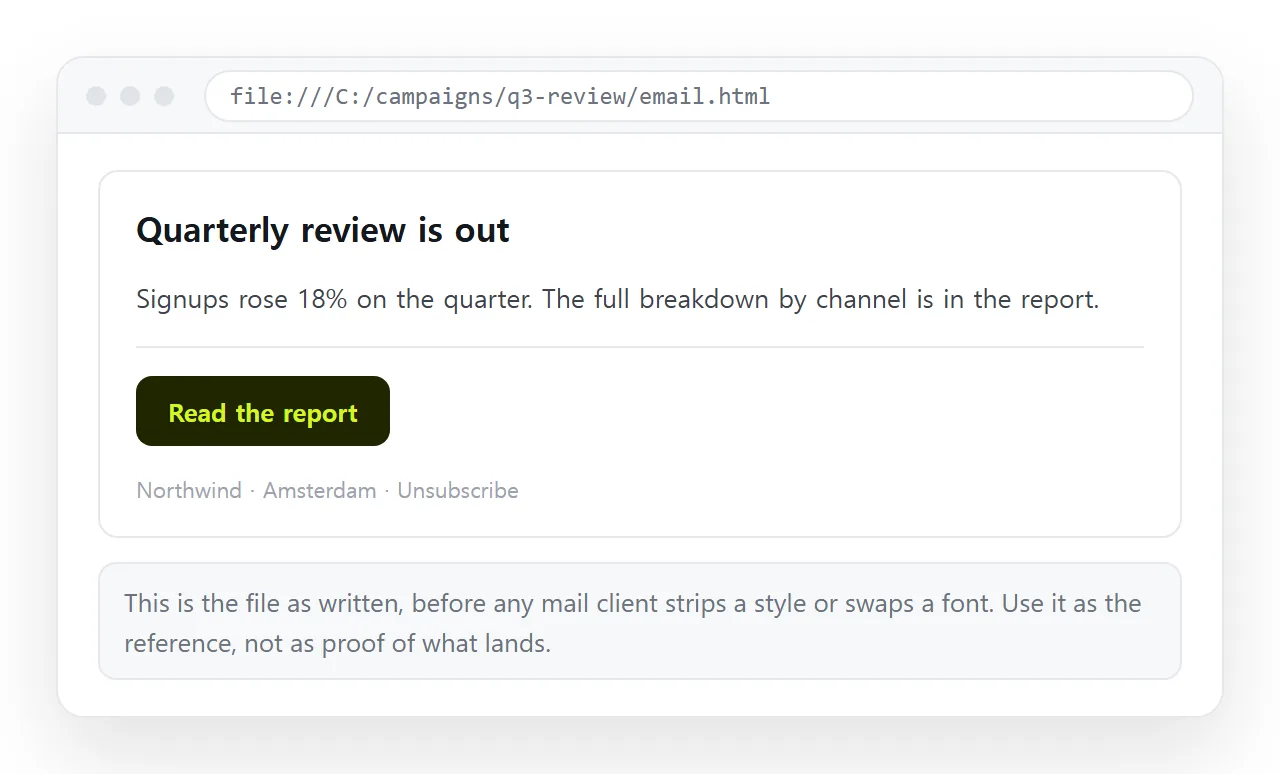
They are not useless. They are just testing something different.
Open the email HTML in a browser to check the content: typos, wrong figures, broken links, missing images. That pass is faster in a browser than in five mail clients.
Online HTML email preview covers the tools that render pasted email markup without a send, and where their approximation stops being trustworthy.
The alternative to fighting all of it
Every constraint above exists because the content is inside the email. A link has none of them.
Send a short message with the point and a link to the full page. The page opens in a browser, where the HTML renders as written, images load, and the layout works on a phone.
Paste the HTML into a NOS document and it renders as a page of its own, then Share, Share link, Create link gives you the address.
The link is unlisted by default, so it opens for the people you sent it to without being listed anywhere.
The second benefit shows up after the send. A number in an email is frozen the moment it leaves. A number on a page can be corrected by clicking the text, and the link you already sent points at the correction.
Email versus link for documents covers where the line falls, and sharing an HTML file by email covers the attachment route and why gateways tend to remove it.