Horror is the genre most damaged by a page that behaves badly, because the whole effect depends on the reader staying inside the sentence.
The technical part that is actually craft
A page that moves while it finishes loading is the single worst thing a reading page can do.
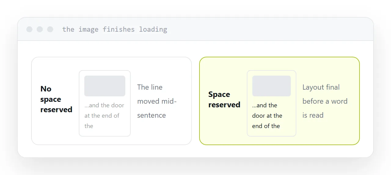
An image with no dimensions arrives, takes its space, and shoves the paragraph down. The reader loses their line. Whatever the sentence was building is gone, and it does not come back on re-reading.
Reserve the space for every image so the layout is final before a word is read. It is a small technical detail and in this genre it is the difference between a scene working and not.
The same applies to a font that swaps after loading, and to anything that animates on scroll.
| Fault | What the reader loses |
|---|---|
| Layout shift | Their place, mid-sentence |
| Late-loading font | The whole first paragraph |
| Scroll animation | The pace you set |
| Pop-up | The scene |
| Stuttering scroll | Attention |
Chapter length
Shorter than you would set in print.
Horror works in controlled units, and control means the chapter ends where you decided rather than where a reader put the phone down. A tight chapter that ends on the image you chose is stronger than a long one abandoned two thirds through.
Fifteen hundred to three thousand words holds well on a screen.
Dark themes
Offer one. Do not force one.
Light text on a black background is genuinely harder to read at length for a large number of people, and the fatigue arrives before the scare does.
A toggle costs nothing and lets the reader choose the conditions in which they will keep reading, which is the only condition that matters.
Content warnings
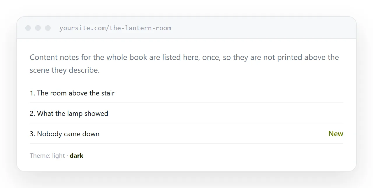
Put them on the contents page, not above the chapter.
Somebody who needs to know finds them before starting. Somebody who does not want to know is not handed a label immediately before the scene it describes, which is the version that spoils the effect for everyone.
A short line at the top of the contents page covers it.
Nothing else on the page
A share bar, a related-reading strip, a newsletter box that slides in at forty percent scroll. Each is one interruption, and one interruption undoes a page of work.
Put the email field at the end, where the chapter has already finished doing its job.
Closely related: How to publish a thriller, and Publishing a crime novel online for the adjacent problem.
Put it at an address
Reserve space for every image, keep chapters to a controlled length, offer a dark theme rather than imposing it, keep warnings on the contents page, and remove everything that interrupts.