A presentation is the largest thing most people email and the thing most likely to be opened on a phone. Those two facts pull in opposite directions.
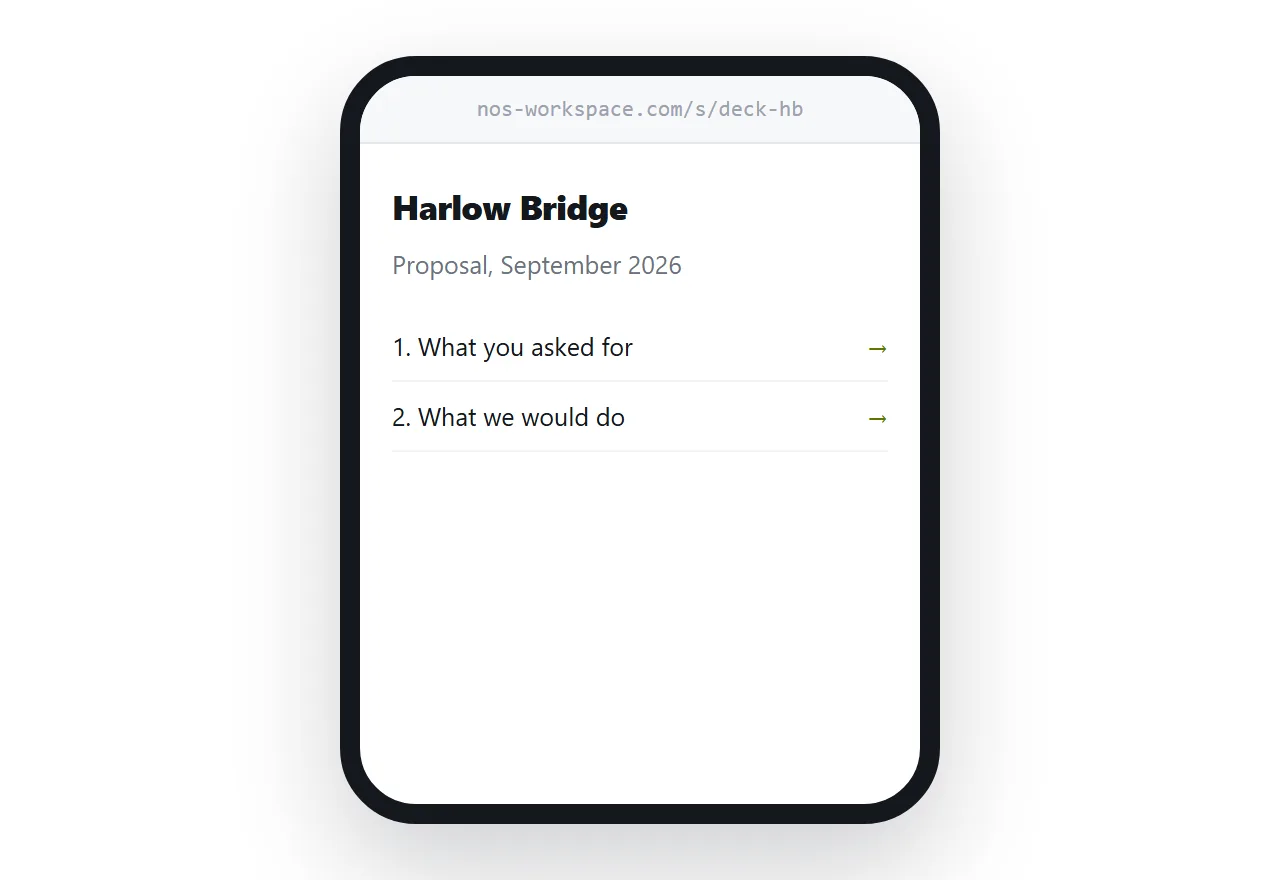
This guide covers why decks bounce, what happens on the recipient's machine, and the reading-versus-editing question.
Why decks bounce
A deck carries its images inside it. Photographs pasted in at full resolution, a logo repeated on every slide, sometimes an embedded video.
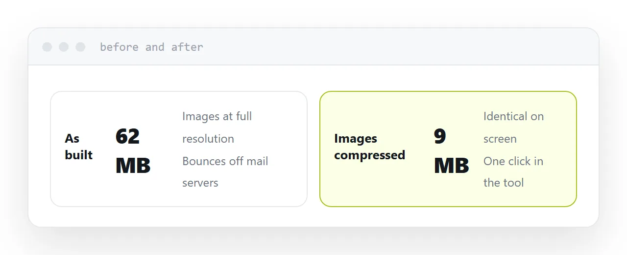
Then the attachment is encoded for email, which adds 33% to the size. A 20MB deck leaves as roughly 27MB, and mail servers that advertise a 25MB limit reject it.
Corporate servers commonly cut that to 10MB, and many reject silently. The sender sees the message in their sent folder and assumes it arrived.
Compressing the images inside the deck usually cuts it by more than half and costs nothing visible on a screen.
What the recipient actually gets
Assume a phone, because that is where a meaningful share of decks are first opened.
The file downloads. It opens in whichever app the phone has. It renders at a size designed for a projector, scaled down to a hand. Transitions and animations mostly do not survive. Fonts the recipient does not have are substituted, shifting the layout.
The result is your deck, subtly wrong, several taps away, on a screen it was never designed for.
| Deck as an attachment | PDF attachment | Address | |
|---|---|---|---|
| Size limit | About 10MB | About 10MB | None |
| Fonts correct | Only if installed | Yes | Yes |
| Opens on a phone | Downloads | Downloads | Opens |
| Editable | Yes | No | No |
| Correct after sending | No | No | Yes |
Reading or editing
This is the question that decides everything.
Editing. A colleague is going to change slides. Send the editable file. Nothing else is appropriate and the size problem is one to solve with compression.
Reading. They are going to look at it and form an opinion. This is almost everyone, and for them the editable file is the wrong artefact: heavy, fragile, and offering an ability they do not want.
Most decks are sent to readers and shaped for editors, which is the root of the whole problem.
For readers, use an address
No size limit, so the photography stays. No download, so it opens in a tap. No font substitution, because the page carries what it needs. It reflows to a phone rather than being scaled to one.
And it can be corrected. The wrong figure on slide nine, spotted an hour after sending, becomes an edit rather than an apology and a version two that half the recipients never open.
If it must be an attachment
Some organisations require a file. In that case send a PDF rather than the editable deck.
Fonts are embedded so the layout is what you built. It cannot be accidentally modified. It is smaller. And it opens in more places without a specific application.
Put the address on the first page so the file still leads back to the current version.
Two neighbouring cases are worth a look: How to share a digital presentation and How to share a pitch deck as a link.
Put it at an address
Work out whether they are reading or editing, compress the images either way, publish at an address for readers, send a PDF when a file is required, and correct mistakes at the address.
Then the deck arrives looking the way you built it.