font-size 속성을 사용하여 CSS에서 텍스트 크기를 설정합니다(예: p { font-size: 1rem; }). 단위는 숫자가 무엇으로 측정되는지 결정합니다.
px는 고정 길이이고, em 및 %는 상위 크기를 곱하고, rem는 루트(html) 크기를 곱하고, vw는 화면 너비의 공유입니다.
두 개의 슬라이더를 이동합니다. 상위 슬라이더는 em 및 % 행만 변경합니다. 루트 슬라이더는 rem 행만 변경합니다.
<!doctype html>
<html lang="en">
<head>
<meta charset="utf-8">
<meta name="viewport" content="width=device-width, initial-scale=1">
<title>font-size units compared</title>
<style>
  html { font-size: 16px; }  /* the root: rem is measured from here */
  body { margin: 0; padding: 14px; font: 14px/1.4 system-ui, sans-serif; background: #f4f5f7; color: #1d2330; }
  .controls { display: grid; gap: 6px; margin-bottom: 12px; font-size: 13px; }
  .controls label { display: flex; align-items: center; gap: 8px; }
  .controls input { flex: 1; min-width: 0; }
  .controls b { width: 42px; text-align: right; }
  .parent { background: #fff; border: 2px dashed #9aa3b2; border-radius: 10px; padding: 8px 12px; }
  .parent > small { display: block; font-size: 12px; color: #5b6270; margin-bottom: 4px; }
  .row { display: flex; align-items: baseline; gap: 10px; border-top: 1px solid #eceef2; padding: 4px 0; }
  .row code { flex: 0 0 116px; font: 12px ui-monospace, Consolas, monospace; color: #5b6270; }
  .row span { flex: 1; min-width: 0; line-height: 1.15; }
  .row output { font: 700 12px ui-monospace, Consolas, monospace; color: #0f5132; }
  /* the five rules being compared */
  .px  { font-size: 20px; }
  .em  { font-size: 1.25em; }  /* 1.25 x the parent's size */
  .pc  { font-size: 125%; }    /* same as 1.25em */
  .rem { font-size: 1.25rem; } /* 1.25 x the root (html) size */
  .vw  { font-size: 3vw; }     /* 3% of the viewport width */
</style>
</head>
<body>
<div class="controls">
  <label>Parent font-size <input type="range" id="parent" min="10" max="30" value="16"> <b id="pv">16px</b></label>
  <label>Root (html) font-size <input type="range" id="root" min="12" max="24" value="16"> <b id="rv">16px</b></label>
</div>

<div class="parent" id="box">
  <small>Parent box</small>
  <div class="row"><code>20px</code><span class="px">Sample</span><output></output></div>
  <div class="row"><code>1.25em</code><span class="em">Sample</span><output></output></div>
  <div class="row"><code>125%</code><span class="pc">Sample</span><output></output></div>
  <div class="row"><code>1.25rem</code><span class="rem">Sample</span><output></output></div>
  <div class="row"><code>3vw</code><span class="vw">Sample</span><output></output></div>
</div>

<script>
  const box = document.getElementById('box');
  const parent = document.getElementById('parent');
  const root = document.getElementById('root');

  function update() {
    box.style.fontSize = parent.value + 'px';
    document.documentElement.style.fontSize = root.value + 'px';
    document.getElementById('pv').textContent = parent.value + 'px';
    document.getElementById('rv').textContent = root.value + 'px';
    // show the size the browser actually computed for each sample
    document.querySelectorAll('.row').forEach((row) => {
      const px = parseFloat(getComputedStyle(row.querySelector('span')).fontSize);
      row.querySelector('output').textContent = '= ' + Math.round(px * 10) / 10 + 'px';
    });
  }
  parent.addEventListener('input', update);
  root.addEventListener('input', update);
  window.addEventListener('resize', update);
  update();
</script>
</body>
</html>
이전 <font size="4"> 태그는 HTML에서 더 이상 사용되지 않습니다. 대신 스타일시트나 style 속성에서 CSS를 사용하여 텍스트 크기를 조정하세요. HTML에서 글꼴을 변경하는 방법에서는 해당 CSS를 어디에 넣을지 다룹니다.
각 단위는 무엇으로 측정되나요?
| 단위 | 예 | 에서 측정 | 독자의 텍스트 설정을 따릅니다. |
|---|---|---|---|
px |
16px |
없음, 고정된 길이 | 아니요 |
em |
1.25em |
부모의 글꼴 크기 | 예 |
% |
125% |
부모의 글꼴 크기(em과 동일) | 예 |
rem |
1.25rem |
html 요소의 글꼴 크기 |
예 |
vw |
3vw |
뷰포트 너비(1vw는 1%) | 아니요 |
| 키워드 | small, large |
브라우저 기본 크기 | 예 |
font-size에서 em은 요소에 아직 자체 크기가 없기 때문에 부모의 크기를 의미합니다. padding: 1em와 같은 다른 모든 속성에서 em은 요소의 자체 글꼴 크기를 의미합니다. 이것이 바로 버튼의 em 패딩이 버튼의 텍스트와 함께 커지는 이유입니다.
중첩된 목록에서 em 텍스트가 축소되는 이유
li { font-size: 0.8em }와 같은 규칙은 무해해 보입니다. 그러나 중첩 목록에서는 내부 li의 상위가 외부 li입니다. 각 레벨은 위 레벨이 이미 축소한 크기를 곱합니다.
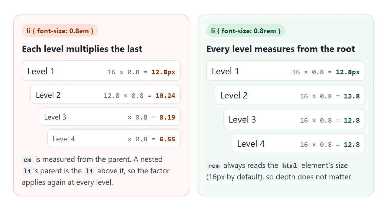
반대의 경우를 보려면 요소를 1보다 높게 드래그하세요. 동일한 규칙이 깊은 항목을 거대하게 만듭니다.
<!doctype html>
<html lang="en">
<head>
<meta charset="utf-8">
<meta name="viewport" content="width=device-width, initial-scale=1">
<title>The em compounding trap in nested lists</title>
<style>
  body { margin: 0; padding: 14px; font: 16px/1.4 system-ui, sans-serif; background: #f4f5f7; color: #1d2330; }
  .controls { font-size: 13px; display: flex; align-items: center; gap: 8px; margin-bottom: 12px; }
  .controls input { flex: 1; min-width: 0; }
  .cols { display: grid; grid-template-columns: 1fr 1fr; gap: 10px; }
  .col { background: #fff; border-radius: 10px; padding: 10px 8px 10px 10px; border: 1px solid #e1e4ea; overflow: hidden; }
  .col h3 { margin: 0 0 4px 8px; font-size: 13px; }
  .col h3 code { font-size: 12px; }
  .bad  h3 { color: #9a3412; }
  .good h3 { color: #0f5132; }
  ul { margin: 0; padding-left: 14px; }
  li { overflow-wrap: anywhere; }
  li output { font: 11px ui-monospace, Consolas, monospace; color: #6b7280; margin-left: 4px; }

  /* the only difference between the two lists */
  .bad  li { font-size: calc(var(--f) * 1em); }   /* times the PARENT li: compounds */
  .good li { font-size: calc(var(--f) * 1rem); }  /* times the ROOT: same at every level */
</style>
</head>
<body>
<div class="controls">
  <label for="f">Size factor</label>
  <input type="range" id="f" min="0.7" max="1.3" step="0.05" value="0.8">
  <b id="fv">0.8</b>
</div>

<div class="cols">
  <div class="col bad"><h3>li { font-size: <code id="c1">0.8em</code> }</h3><div class="list"></div></div>
  <div class="col good"><h3>li { font-size: <code id="c2">0.8rem</code> }</h3><div class="list"></div></div>
</div>

<script>
  // the same four-level list goes into both columns
  const html = '<ul><li>Level 1<ul><li>Level 2<ul><li>Level 3<ul><li>Level 4</li></ul></li></ul></li></ul></li></ul>';
  document.querySelectorAll('.list').forEach((el) => { el.innerHTML = html; });

  const f = document.getElementById('f');
  function update() {
    document.body.style.setProperty('--f', f.value);
    document.getElementById('fv').textContent = f.value;
    document.getElementById('c1').textContent = f.value + 'em';
    document.getElementById('c2').textContent = f.value + 'rem';
    // label every item with the size the browser computed
    document.querySelectorAll('li').forEach((li) => {
      let out = li.querySelector(':scope > output');
      if (!out) { out = document.createElement('output'); li.firstChild.after(out); }
      out.textContent = Math.round(parseFloat(getComputedStyle(li).fontSize) * 10) / 10 + 'px';
    });
  }
  f.addEventListener('input', update);
  update();
</script>
</body>
</html>
수정 사항은 rem입니다. 부모를 건너뛰고 루트를 읽으므로 깊이는 더 이상 중요하지 않습니다. 단락 내부의 small나 레이블 옆의 아이콘과 같이 주변의 텍스트에 맞춰 크기가 조정되어야 하는 항목에 대해 em를 유지하세요.
rem과 독자의 텍스트 크기 설정
브라우저에서는 독자가 기본 글꼴 크기를 선택할 수 있습니다. 해당 설정은 html 요소가 시작되는 medium 키워드의 크기를 변경합니다. 직접적으로 또는 부모를 통해 측정된 모든 것은 다음과 같습니다. px 값은 측정되지 않았으므로 그대로 유지됩니다.
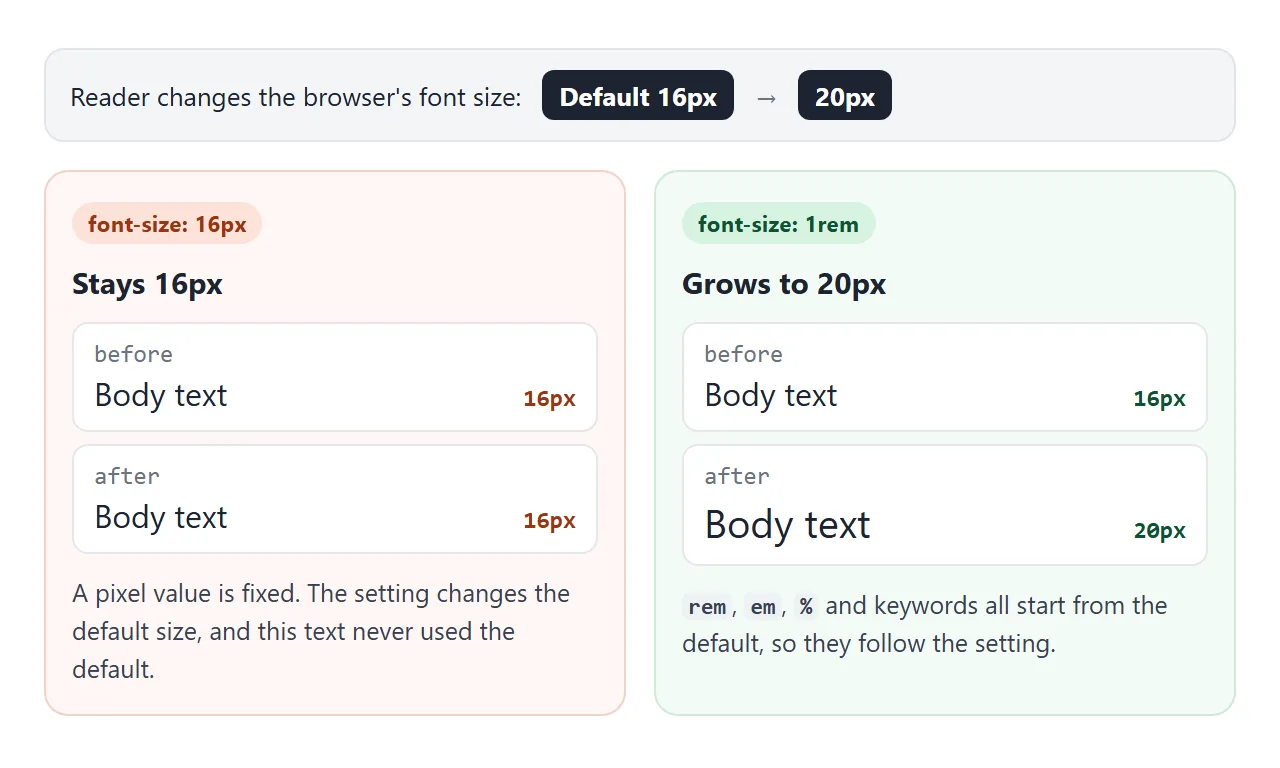
브라우저 확대/축소는 별도의 컨트롤입니다. 확대/축소는 페이지의 모든 길이(px 포함)의 크기를 조정하므로 독자가 확대/축소하면 px 텍스트가 계속 커집니다. 텍스트 크기 설정은 무시되는 px입니다.
html {font-size: 62.5% } 트릭
일부 스타일시트는 루트를 62.5%로 설정합니다. 1rem을 10px로 만드는 16px 기본값에서는 1.6rem가 16px로 읽힙니다. 백분율이기 때문에 여전히 독자의 설정을 따릅니다. 20px 기본값에서 1rem은 12.5px가 됩니다.
비용은 사용자가 직접 크기를 지정하지 않은 모든 텍스트 조각이 이제 10px를 상속한다는 것입니다. 여기에는 일반 단락과 위젯이나 삽입이 가져오는 모든 것이 포함됩니다. body { font-size: 1.6rem; }를 사용하는 경우 즉시 설정하세요.
html { font-size: 10px; }를 픽셀 단위로 쓰는 것은 다릅니다. 픽셀 루트는 독자의 설정을 무시하고 페이지의 모든 rem은 이를 상속합니다.
키워드: 작다, 크다, 더 크다, 더 작다
medium는 독자가 변경하지 않는 한 브라우저 기본값인 16px입니다. small, large, x-large 및 나머지는 주변의 고정 단계이며 브라우저는 정확한 크기를 선택합니다.
larger 및 smaller는 상위 항목을 기준으로 한 단계 위 또는 아래입니다. 빠른 일회성 작업에 편리하지만 비율을 제어할 수 없으므로 문자 척도를 일관되게 유지하는 것이 더 쉽습니다.
클램프가 있는 유체 유형()
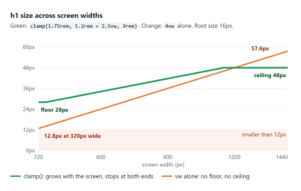
vw의 크기만으로도 제한 없이 화면을 따릅니다. 4vw는 320px 휴대폰에서는 12.8px이고 1440px 데스크탑에서는 57.6px입니다. clamp(min, preferred, max)는 성장을 유지하지만 바닥과 천장을 추가합니다.
body  { font-size: clamp(1rem, 0.95rem + 0.25vw, 1.125rem); }
h1    { font-size: clamp(1.75rem, 1.2rem + 2.5vw, 3rem); }
h2    { font-size: clamp(1.3rem, 1.1rem + 1vw, 1.875rem); }
small { font-size: 0.875em; }
rem에 바닥과 천장을 쓰고 중간 값에 rem 부분을 추가합니다. 그렇게 하면 전체 규모가 여전히 독자의 텍스트 설정을 따릅니다. vw 단독으로 크기가 지정된 텍스트는 해당 설정으로 커지지 않습니다.
아래의 두 가지 컨트롤을 모두 사용해 보세요. 미리보기는 자체의 작은 페이지이므로 실제 페이지가 화면을 따르는 것처럼 vw 값은 미리보기의 너비를 따릅니다.
<!doctype html>
<html lang="en">
<head>
<meta charset="utf-8">
<meta name="viewport" content="width=device-width, initial-scale=1">
<title>A fluid type scale with clamp()</title>
<style>
  body { margin: 0; padding: 12px; font: 13px/1.4 system-ui, sans-serif; background: #f4f5f7; color: #1d2330; }
  .controls { display: grid; gap: 8px; margin-bottom: 10px; }
  .controls label { display: flex; align-items: center; gap: 8px; }
  .controls input { flex: 1; min-width: 0; }
  .seg { display: flex; gap: 4px; flex-wrap: wrap; align-items: center; }
  .seg button { font: inherit; padding: 5px 9px; border: 1px solid #c9cdd4; border-radius: 7px; background: #fff; cursor: pointer; }
  .seg button[aria-pressed="true"] { background: #1d2330; color: #fff; border-color: #1d2330; }
  #stage { overflow: hidden; }
  iframe { display: block; height: 380px; border: 2px solid #9aa3b2; border-radius: 10px; background: #fff; }
</style>
</head>
<body>
<div class="controls">
  <label>Screen width <input type="range" id="w" min="300" max="760"> <b id="wv"></b></label>
  <div class="seg">Reader's text size:
    <button data-root="16" aria-pressed="true">Default 16px</button>
    <button data-root="20" aria-pressed="false">Larger 20px</button>
    <button data-root="24" aria-pressed="false">Largest 24px</button>
  </div>
</div>
<div id="stage"><iframe id="page" title="Preview page"></iframe></div>

<script>
  // The type scale. Every size has a rem floor and ceiling, so it follows
  // the reader's text size, and a vw part, so it grows with the screen.
  const SCALE = `
    body  { font-size: clamp(1rem, 0.95rem + 0.25vw, 1.125rem); line-height: 1.55; }
    h1    { font-size: clamp(1.75rem, 1.2rem + 2.5vw, 3rem); line-height: 1.15; }
    h2    { font-size: clamp(1.3rem, 1.1rem + 1vw, 1.875rem); line-height: 1.25; }
    small { font-size: 0.875em; }  /* em: relative to the text around it */
  `;

  // Inside the preview, a script reports the computed sizes.
  function pageHtml(rootPx) {
    return `<!doctype html><meta name="viewport" content="width=device-width">
<style>
  html { font-size: ${rootPx}px; }  /* stands in for the browser text-size setting */
  body { margin: 0; padding: 14px 16px; font-family: system-ui, sans-serif; color: #1d2330; }
  h1, h2 { margin: 0 0 8px; } p { margin: 0 0 8px; }
  #sizes { font: 12px ui-monospace, Consolas, monospace; color: #0f5132; background: #eef7f1; padding: 6px 8px; border-radius: 6px; white-space: pre-wrap; }
  ${SCALE}
</style>
<pre id="sizes"></pre>
<h1>Fluid type</h1>
<h2>Section heading</h2>
<p>Body text sits at 1rem on a phone and grows a little on wide screens.
<small>Small print stays 0.875 of the text around it.</small></p>
<script>
  function show() {
    const px = (s) => Math.round(parseFloat(getComputedStyle(document.querySelector(s)).fontSize) * 10) / 10;
    document.getElementById('sizes').textContent =
      'width ' + innerWidth + 'px   h1 ' + px('h1') + '  h2 ' + px('h2') + '  body ' + px('p') + '  small ' + px('small');
  }
  addEventListener('resize', show); show();
<\/script>`;
  }

  const frame = document.getElementById('page');
  const w = document.getElementById('w');
  const stage = document.getElementById('stage');

  function setWidth() {
    w.max = stage.clientWidth - 4;  // fit the preview (and its 2px border) in the demo
    if (+w.value > +w.max) w.value = w.max;
    frame.style.width = w.value + 'px';
    document.getElementById('wv').textContent = w.value + 'px';
  }

  document.querySelectorAll('.seg button').forEach((btn) => {
    btn.addEventListener('click', () => {
      document.querySelectorAll('.seg button').forEach((b) => b.setAttribute('aria-pressed', b === btn));
      frame.srcdoc = pageHtml(btn.dataset.root);
    });
  });
  w.addEventListener('input', setWidth);
  window.addEventListener('resize', setWidth);
  frame.srcdoc = pageHtml(16);
  w.max = stage.clientWidth - 4;
  w.value = w.max;  // start at the widest the demo allows
  setWidth();
</script>
</body>
</html>
제목 수준과 h1의 크기는 h1 태그를 참조하세요. 이 페이지는 단위에 관한 것입니다.
휴대폰에서 읽을 수 있는 텍스트
브라우저의 16px 기본값은 전화기의 본문 텍스트에 적합한 최소값입니다. 캡션이나 라벨과 같은 짧은 내용의 경우 더 작은 크기를 유지하세요. 12px의 긴 단락은 작은 화면에서 읽기 어렵습니다.
전화기는 페이지에 뷰포트 메타 태그가 있는 경우에만 이 크기를 작성된 대로 사용합니다. 이 기능이 없으면 모바일 브라우저는 넓은 데스크톱 화면에 페이지를 배치하고 결과를 축소합니다.
입력 및 버튼의 글꼴 크기
양식 컨트롤은 페이지의 글꼴 크기를 선택하지 않습니다. 브라우저 기본 스타일은 고유한 크기(기본 설정에서 Chromium의 경우 13.33px)를 더 작게 제공하므로 양식이 주변의 텍스트보다 더 작게 보일 수 있습니다.
input, button, select, textarea { font: inherit; }
일부 모바일 브라우저는 16px 미만의 텍스트 상자에 초점이 맞춰지면 페이지를 확대하기도 합니다. 1rem 이상의 크기는 이를 방지합니다. HTML로 텍스트 입력은 상자 스타일의 나머지 부분을 다룹니다.
작동하지 않을 때
| 당신이 보는 것 | 원인 | 수정 |
|---|---|---|
| 중첩된 목록 항목이 작거나 커짐 | em는 각 레벨에서 곱해집니다. |
중첩된 요소에 rem를 사용하세요. |
| 텍스트는 독자의 더 큰 텍스트 설정을 무시합니다. | px에 설정된 크기 또는 px에 설정된 루트 |
rem를 사용하고 html를 100% 또는 백분율로 유지합니다. |
| 휴대전화에서는 제목이 작고 데스크톱에서는 크게 표시됩니다. | vw 단독으로 설정된 사이즈 |
rem 제한을 사용하여 clamp()로 래핑합니다. |
| 한 줄은 다른 줄보다 간격이 더 큽니다. | 더 큰 인라인 요소(또는 sup)에는 더 큰 라인이 필요합니다. |
해당 요소에 더 작은 line-height를 설정하고 sup에 대해 0를 설정합니다. |
| 입력 내용이 본문 텍스트보다 작습니다. | 양식 컨트롤이 font-size를 상속하지 않습니다. |
양식 컨트롤의 font: inherit |
| 휴대폰 사용자가 상자를 탭하면 페이지가 확대됩니다. | 입력의 글꼴 크기가 16px 미만입니다. | 입력에 font-size: 1rem 이상 |
| 스타일시트 변경 후 모든 것이 10px입니다. | body 크기가 없는 html { font-size: 62.5% } |
body { font-size: 1.6rem } 설정 |
줄 간격 문제는 line-height에서 발생합니다. 텍스트가 더 큰 범위는 줄도 더 길어집니다. CSS line-height는 라인 상자가 어떻게 커지는지 설명합니다.
링크로 공유하세요
스크린샷에는 하나의 너비와 하나의 텍스트 설정이 있으므로 글꼴 크기는 스크린샷에서 판단하기 어렵습니다. 공유 페이지를 사용하면 사람들이 창을 드래그하고 확대/축소하고 자신의 휴대폰에서 사용해 볼 수 있습니다.
페이지를 NOS 문서에 붙여넣고 공유 링크 만들기를 선택합니다. 링크할 HTML이 이를 안내합니다.
페이지는 작성된 대로 렌더링되고 해당 스크립트가 실행되므로 이 예제의 슬라이더는 링크를 여는 모든 사람에게 작동합니다. 나중에 코드를 변경하면 동일한 링크에 새 버전이 표시됩니다.