text-shadow는 텍스트 뒤의 문자 복사본을 이동하고 흐리게 그립니다. 값은 x 오프셋, y 오프셋, 흐림, 색상입니다(예: text-shadow: 2px 3px 4px rgba(0, 0, 0, .3)). 여러 개의 그림자를 쉼표로 구분하여 쌓습니다.
먼저 시도해 보세요. 슬라이더를 이동하고 두 번째 그림자를 추가한 다음 인쇄되는 CSS를 선택하세요.
<!doctype html>
<html lang="en">
<head>
<meta charset="utf-8">
<meta name="viewport" content="width=device-width, initial-scale=1">
<title>Text shadow generator</title>
<style>
  body { margin: 0; padding: 14px; font-family: system-ui, sans-serif; background: #eef0f3; color: #1d2330; }
  .preview {
    display: grid; place-items: center; height: 130px; border-radius: 12px;
    background: #f7f7f2; font: 800 clamp(34px, 11vw, 64px)/1 system-ui, sans-serif; color: #1d2330;
  }
  .layer {
    display: grid; grid-template-columns: auto 1fr; gap: 4px 10px; align-items: center;
    margin-top: 10px; padding: 10px 12px; border-radius: 10px; background: #fff; font-size: 13px;
  }
  .layer b { grid-column: 1 / -1; display: flex; justify-content: space-between; }
  .layer input[type=range] { width: 100%; }
  .layer button { border: 0; background: none; color: #9a3412; cursor: pointer; font-size: 13px; }
  .row { display: flex; gap: 8px; margin-top: 10px; }
  .row button { padding: 8px 12px; border: 0; border-radius: 8px; background: #1d2330; color: #fff; font-size: 14px; cursor: pointer; }
  output { display: block; margin-top: 10px; padding: 10px 12px; border-radius: 8px; background: #1d2330; color: #d6f2df; font: 13px/1.5 ui-monospace, Consolas, monospace; word-break: break-word; }
</style>
</head>
<body>
<div class="preview" id="preview">Shadow</div>
<div id="layers"></div>
<div class="row">
  <button id="add" type="button">+ Add another shadow</button>
  <button id="copy" type="button">Select CSS</button>
</div>
<output id="css"></output>

<script>
  const layers = document.getElementById('layers');
  const preview = document.getElementById('preview');
  const out = document.getElementById('css');

  // One row of controls per shadow: x, y, blur, colour, opacity
  function addLayer(x, y, blur, color, alpha) {
    const div = document.createElement('div');
    div.className = 'layer';
    div.innerHTML = `
      <b>Shadow <button type="button" class="del">remove</button></b>
      x <input type="range" class="x" min="-20" max="20" value="${x}">
      y <input type="range" class="y" min="-20" max="20" value="${y}">
      blur <input type="range" class="blur" min="0" max="30" value="${blur}">
      colour <span><input type="color" class="color" value="${color}">
      <input type="range" class="alpha" min="0" max="100" value="${alpha}" style="width:55%"></span>`;
    div.querySelector('.del').addEventListener('click', () => { div.remove(); update(); });
    layers.append(div);
    update();
  }

  function rgba(hex, alpha) {
    const n = parseInt(hex.slice(1), 16);
    return `rgba(${n >> 16}, ${(n >> 8) & 255}, ${n & 255}, ${alpha / 100})`;
  }

  function update() {
    const parts = [...layers.children].map((l) => {
      const v = (c) => l.querySelector(c).value;
      return `${v('.x')}px ${v('.y')}px ${v('.blur')}px ${rgba(v('.color'), v('.alpha'))}`;
    });
    const value = parts.length ? parts.join(',\n             ') : 'none';
    preview.style.textShadow = value;  // first shadow in the list is painted on top
    out.textContent = `text-shadow: ${value};`;
  }

  layers.addEventListener('input', update);
  document.getElementById('add').addEventListener('click', () => addLayer(0, 0, 12, '#2563eb', 60));
  document.getElementById('copy').addEventListener('click', () => {
    getSelection().selectAllChildren(out);  // then Ctrl+C / Cmd+C
  });

  addLayer(2, 3, 4, '#000000', 30);
</script>
</body>
</html>
네 가지 가치
각 그림자는 2~3가지 길이와 색상을 사용합니다. 두 개의 오프셋이 필요합니다. 흐림 및 색상은 선택 사항입니다.
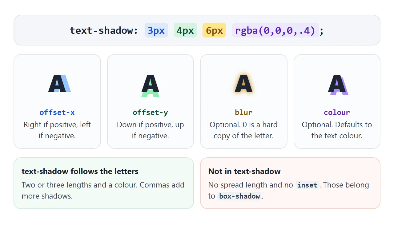
| 가치 | 기능 | 놔두면 |
|---|---|---|
| 오프셋-x | 그림자를 오른쪽(양수) 또는 왼쪽(음수)으로 이동합니다. | 필수 |
| 오프셋 Y | 그림자를 아래(양수) 또는 위로(음수) 이동합니다. | 필수 |
| 흐림 | 가장자리를 부드럽게 합니다. 숫자가 클수록 그림자가 더 넓어지고 희미해집니다. | 0, 하드카피 |
| 색깔 | 길이 앞이나 뒤의 모든 CSS 색상 | 텍스트 색상 |
rgba(0, 0, 0, .3)와 같은 반투명 색상은 일반적으로 단색 검정색보다 더 좋아 보입니다. 문자 위에 칠하는 대신 문자 뒤에 있는 내용을 어둡게 합니다.
텍스트 그림자와 상자 그림자의 차이점
box-shadow는 요소의 직사각형 주위를 그립니다. text-shadow는 각 문자의 모양을 따릅니다. 구문은 비슷해 보이지만 두 부분이 누락되었습니다.
- 확산 없음. 네 번째 길이로 인해 전체 선언이 무효화되고 브라우저가 해당 선언을 삭제합니다. 그림자를 더 두껍게 보이게 하려면 그림자를 여러 개 쌓아두세요.
- 삽입 없음. 문자 내부의 내부 그림자는
text-shadow의 일부가 아닙니다.
상자 그림자와 마찬가지로 텍스트 그림자는 레이아웃에서 공간을 차지하지 않습니다. 인접한 텍스트를 추가해도 이동되지 않습니다.
효과를 위한 그림자 쌓기
대부분의 텍스트 효과는 쉼표로 구분된 하나의 값에 여러 개의 그림자가 있습니다. 목록의 첫 번째 그림자가 맨 위에 그려지고 그 이후의 각 그림자는 더 뒤로 이동합니다.
<!doctype html>
<html lang="en">
<head>
<meta charset="utf-8">
<meta name="viewport" content="width=device-width, initial-scale=1">
<title>Text shadow effects</title>
<style>
  body { margin: 0; padding: 12px; font-family: system-ui, sans-serif; background: #eef0f3; }
  .grid { display: grid; grid-template-columns: repeat(auto-fill, minmax(170px, 1fr)); gap: 10px; }
  .tile { border-radius: 12px; padding: 14px 12px 10px; text-align: center; }
  .tile p { margin: 0; font: 800 40px/1.1 system-ui, sans-serif; }
  .tile small { display: block; margin-top: 8px; font: 12px ui-monospace, Consolas, monospace; opacity: .75; }

  /* 1. Subtle lift: one small, soft, dark shadow */
  .lift { background: #fff; color: #1d2330; }
  .lift p { text-shadow: 0 2px 3px rgba(0, 0, 0, .25); }

  /* 2. Glow: zero offset, blur only, light colour on dark */
  .glow { background: #111827; color: #fff; }
  .glow p { text-shadow: 0 0 12px rgba(255, 255, 255, .8); }

  /* 3. Neon: white-ish text, a few coloured blurs of growing size */
  .neon { background: #0b0b16; color: #fff0fb; }
  .neon p { text-shadow: 0 0 4px #fff, 0 0 10px #ff2ec4, 0 0 22px #ff2ec4, 0 0 40px #b0128a; }

  /* 4a. Outline with 8 shadows, one per direction */
  .out-sh { background: #fde68a; color: #fff; }
  .out-sh p {
    text-shadow: -2px -2px 0 #1d2330, 0 -2px 0 #1d2330, 2px -2px 0 #1d2330, 2px 0 0 #1d2330,
                 2px 2px 0 #1d2330, 0 2px 0 #1d2330, -2px 2px 0 #1d2330, -2px 0 0 #1d2330;
  }
  /* 4b. Outline with text-stroke (prefixed, centred on the letter edge) */
  .out-st { background: #fde68a; color: #fff; }
  .out-st p { -webkit-text-stroke: 2px #1d2330; }

  /* 5. Letterpress: dark text, 1px light shadow below */
  .press { background: #6b7280; color: #374151; }
  .press p { text-shadow: 0 1px 0 rgba(255, 255, 255, .45); }

  /* 6. Long shadow: many 1px steps, no blur (built in the script below) */
  .long { background: #2563eb; color: #fff; overflow: hidden; }

  /* 7. Blurred text: transparent colour, only the shadow is painted */
  .blurred { background: #fff; color: transparent; }
  .blurred p { text-shadow: 0 0 6px #1d2330; }
</style>
</head>
<body>
<div class="grid">
  <div class="tile lift"><p>Lift</p><small>0 2px 3px</small></div>
  <div class="tile glow"><p>Glow</p><small>0 0 12px white</small></div>
  <div class="tile neon"><p>Neon</p><small>4 coloured blurs</small></div>
  <div class="tile out-sh"><p>Outline</p><small>8 shadows</small></div>
  <div class="tile out-st"><p>Outline</p><small>-webkit-text-stroke</small></div>
  <div class="tile press"><p>Press</p><small>0 1px 0 light</small></div>
  <div class="tile long"><p id="long">Long</p><small>40 steps, built by JS</small></div>
  <div class="tile blurred"><p>Blurred</p><small style="color:#1d2330">color: transparent</small></div>
</div>

<script>
  // A long shadow is the same shadow repeated 1px further each time.
  const steps = [];
  for (let i = 1; i <= 40; i++) steps.push(`${i}px ${i}px 0 #1e40af`);
  document.getElementById('long').style.textShadow = steps.join(', ');
</script>
</body>
</html>
- 리프트:
0 2px 3px rgba(0, 0, 0, .25)와 같이 텍스트 아래에 작고 부드럽고 어두운 그림자가 하나 있습니다. - 빛남: 어두운 배경에 밝은 색상으로 오프셋이 0이고 흐림 효과만 나타납니다.
- 네온: 밝은 텍스트와 크기가 커지는 한 가지 색상의 흐림 효과 3~4개입니다.
- 활판 인쇄: 아래에 1px 밝은 그림자가 있는 중간색 배경의 어두운 텍스트입니다. 글자가 표면에 눌려 있는 것처럼 보입니다.
- 긴 그림자: 동일한 하드 그림자가 매번 1px 더 반복되었습니다. 루프가 목록을 작성합니다.
복사할 예제의 네온 값은 다음과 같습니다.
.neon {
  color: #fff0fb;
  text-shadow:
    0 0 4px #fff,
    0 0 10px #ff2ec4,
    0 0 22px #ff2ec4,
    0 0 40px #b0128a;
}
윤곽선 텍스트: 그림자 또는 텍스트 획
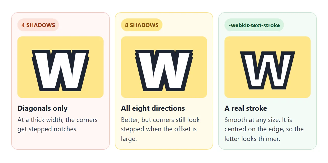
확산이 없는 경우 텍스트 윤곽선을 그리는 그림자 방법은 여러 방향으로 밀어낸 여러 개의 단단한 그림자입니다. 네 개의 대각선 그림자가 노치를 남깁니다. 8개 방향이 간격을 좁힙니다.
/* 8 directions, 2px outline */
.outline {
  color: #fff;
  text-shadow:
    -2px -2px 0 #1d2330, 0 -2px 0 #1d2330, 2px -2px 0 #1d2330, 2px 0 0 #1d2330,
    2px 2px 0 #1d2330, 0 2px 0 #1d2330, -2px 2px 0 #1d2330, -2px 0 0 #1d2330;
}
-webkit-text-stroke: 2px #1d2330는 대신 문자 가장자리를 따라 실제 선을 그립니다. -webkit- 접두사로 작성됩니다. 선은 가장자리 중앙에 있으므로 선의 절반이 채우기를 덮습니다. CSS 테두리 가이드에서는 테두리가 이 작업을 수행할 수 없는 이유를 설명합니다.
1px~2px의 얇은 윤곽선에는 그림자를 사용하세요. 큰 표시 텍스트에 두꺼운 윤곽선을 적용하려면 텍스트 획을 사용하세요.
투명한 색상으로 흐릿하고 고스트 텍스트
color: transparent를 설정하고 그림자에 고유한 색상을 지정합니다. 글자는 사라지고 그림자만 칠해져 0 0 6px #1d2330는 부드럽고 흐릿한 글자를 표현해줍니다.
흐림 효과가 없고 오프셋이 있는 동일한 트릭을 사용하면 원본 없이 문자의 평면 복사본을 그립니다.
여기서 그림자에는 명시적인 색상이 필요합니다. 하나도 없으면 이제 투명해지고 아무것도 표시되지 않는 텍스트 색상을 사용합니다.
이미지 위의 텍스트: 그림자 또는 오버레이
사진의 흰색 텍스트는 어두운 영역에서는 잘 읽히고 밝은 영역에서는 사라집니다. 두 가지 일반적인 수정 사항이 있습니다.
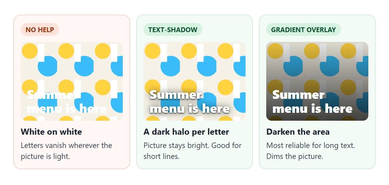
- text-shadow: 촘촘하고 어두운 그림자 하나와 더 넓고 부드러운 그림자 하나. 그림은 밝게 유지되며 짧은 헤드라인도 읽을 수 있습니다.
- 그라디언트 오버레이: 그림과 텍스트 사이에 있는
::before레이어의 어두운 그라데이션입니다. 그림이 더 어두워지면 더 긴 텍스트에도 작동합니다.
의도적으로 바쁜 배경에서 두 가지를 비교하십시오.
<!doctype html>
<html lang="en">
<head>
<meta charset="utf-8">
<meta name="viewport" content="width=device-width, initial-scale=1">
<title>Readable hero headline</title>
<style>
  body { margin: 0; padding: 12px; font-family: system-ui, sans-serif; background: #eef0f3; }
  .modes { display: flex; flex-wrap: wrap; gap: 6px; margin-bottom: 10px; }
  .modes button {
    padding: 8px 12px; border: 1px solid #c9ced6; border-radius: 99px;
    background: #fff; font-size: 14px; cursor: pointer;
  }
  .modes button[aria-pressed="true"] { background: #1d2330; border-color: #1d2330; color: #fff; }

  .hero {
    position: relative; display: grid; align-content: center; min-height: 380px; padding: 24px;
    border-radius: 14px; overflow: hidden; color: #fff;
    /* a busy, high-contrast background drawn with inline SVG */
    background: url("data:image/svg+xml,%3Csvg xmlns='http://www.w3.org/2000/svg' width='120' height='120'%3E%3Crect width='120' height='120' fill='%23f5f1e6'/%3E%3Ccircle cx='30' cy='30' r='26' fill='%23ffd23f'/%3E%3Ccircle cx='90' cy='80' r='34' fill='%2338bdf8'/%3E%3Crect x='56' y='6' width='22' height='60' fill='%23ffffff'/%3E%3Cpath d='M0 110 L120 70' stroke='%23fb7185' stroke-width='10'/%3E%3C/svg%3E") 0 0 / 120px 120px;
  }
  .hero::before {               /* the overlay, off until .overlay is set */
    content: ""; position: absolute; inset: 0;
    background: linear-gradient(to top, rgba(0, 0, 0, .75), rgba(0, 0, 0, .15));
    opacity: 0; transition: opacity .2s;
  }
  .hero > * { position: relative; }  /* keep text above the overlay */
  .hero h1 { margin: 0 0 8px; font-size: clamp(30px, 8vw, 48px); line-height: 1.1; }
  .hero p { margin: 0; font-size: 18px; max-width: 30ch; }

  .hero.shadow h1, .hero.shadow p {
    text-shadow: 0 1px 2px rgba(0, 0, 0, .8), 0 0 12px rgba(0, 0, 0, .6);
  }
  .hero.overlay::before { opacity: 1; }
</style>
</head>
<body>
<div class="modes" id="modes">
  <button type="button" data-mode="" aria-pressed="false">No shadow</button>
  <button type="button" data-mode="shadow" aria-pressed="true">text-shadow</button>
  <button type="button" data-mode="overlay" aria-pressed="false">Gradient overlay</button>
</div>
<section class="hero shadow" id="hero">
  <h1>Summer menu is here</h1>
  <p>Twelve new dishes, one long table, every Friday night.</p>
</section>

<script>
  const hero = document.getElementById('hero');
  document.getElementById('modes').addEventListener('click', (e) => {
    const btn = e.target.closest('button');
    if (!btn) return;
    hero.className = ('hero ' + btn.dataset.mode).trim();
    document.querySelectorAll('#modes button').forEach((b) => b.setAttribute('aria-pressed', b === btn));
  });
</script>
</body>
</html>
실제 사진의 경우 섹션 배경으로 설정하세요. CSS 배경 이미지는 크기 조정 및 배치를 다룹니다. 그림자와 오버레이를 결합할 수도 있습니다.
성능에 대한 참고 사항
큰 흐림 효과는 작은 흐림 효과보다 페인트 작업 비용이 더 많이 들고 각 레이어마다 더 많은 작업이 추가됩니다. 긴 텍스트 블록에서 또는 그림자가 움직이는 경우 레이어 수를 줄이고 흐림 효과를 적당하게 유지하세요. 헤드라인이나 버튼 라벨의 경우에는 거의 중요하지 않습니다.
작동하지 않을 때
| 당신이 보는 것 | 원인 | 수정 |
|---|---|---|
| 네 번째 길이를 추가한 후 전혀 그림자가 없습니다. | text-shadow에는 스프레드가 없으므로 값이 유효하지 않으며 무시됩니다. | 세 가지 길이를 사용하고 두께에 따라 그림자를 쌓습니다. |
| 그림자는 있지만 보이지 않는다 | 배경과 동일한 색상 또는 제로 오프셋 및 제로 블러 | 색상을 변경하거나 오프셋 또는 흐림 효과를 추가하세요. |
| 투명한 텍스트에는 아무것도 표시되지 않습니다. | 그림자에는 색상이 없으며 투명한 텍스트 색상을 사용합니다. | 그림자에 고유한 색상을 부여하세요. |
| 링크와 내부의 작은 텍스트에도 그림자가 생깁니다. | 텍스트 그림자가 상속됩니다. | 아이의 text-shadow: none |
| 큰 텍스트에서 윤곽선이 들쭉날쭉하거나 톱니 모양으로 보입니다. | 그림자는 획이 아닌 오프셋 복사본입니다. | 8방향 또는 -webkit-text-stroke 사용 |
| 글로우가 탁하고 회색으로 보입니다. | 레이어가 너무 많거나, 어두운 색상이 여러 번 겹쳐진 경우 | 2~4개의 레이어, 밝은 색상, 점차 흐려짐 |
링크로 공유하세요
네온 제목이나 읽을 수 있는 영웅은 설명하는 것보다 보여주는 것이 더 쉽습니다. 스크린샷에는 슬라이더가 표시되지 않으며 .html 첨부 파일은 전화기에서 일반 코드로 열리거나 전혀 열리지 않을 수 있습니다.
작업 버전을 보내려면 페이지를 NOS 문서에 붙여넣고 공유 링크 만들기를 선택하세요. 링크할 HTML이 이를 안내합니다.
페이지는 작성된 대로 렌더링되고 해당 스크립트가 실행되므로 페이지를 받는 사람이 슬라이더를 직접 이동할 수 있습니다. 나중에 코드를 변경하면 동일한 링크에 새 버전이 표시됩니다.